


// The contents of views
// Only the content associated with the selected tab is displayed on the screen
final List _mainContents = [
// Content for Home tab
Container(
color: Colors.yellow.shade100,
alignment: Alignment.center,
child: const Text(
‘Home’,
style: TextStyle(fontSize: 40),
),
),
// Content for Feed tab
Container(
color: Colors.purple.shade100,
alignment: Alignment.center,
child: const Text(
‘Feed’,
style: TextStyle(fontSize: 40),
),
),
// Content for Favorites tab
Container(
color: Colors.red.shade100,
alignment: Alignment.center,
child: const Text(
‘Favorites’,
style: TextStyle(fontSize: 40),
),
),
// Content for Settings tab
Container(
color: Colors.pink.shade300,
alignment: Alignment.center,
child: const Text(
‘Settings’,
style: TextStyle(fontSize: 40),
),
)
];
// The index of the selected tab
// In the beginning, the Home tab is selected
int _selectedIndex = 0;
@override
Widget build(BuildContext context) {
return Scaffold(
appBar: AppBar(
title: const Text(‘大前端之旅’),
),
// Show the bottom tab bar if screen width < 640
bottomNavigationBar: MediaQuery.of(context).size.width < 640
? BottomNavigationBar(
currentIndex: _selectedIndex,
unselectedItemColor: Colors.grey,
selectedItemColor: Colors.indigoAccent,
// called when one tab is selected
onTap: (int index) {
setState(() {
_selectedIndex = index;
});
},
// bottom tab items
items: const [
BottomNavigationBarItem(
icon: Icon(Icons.home), label: ‘Home’),
BottomNavigationBarItem(
icon: Icon(Icons.feed), label: ‘Feed’),
BottomNavigationBarItem(
icon: Icon(Icons.favorite), label: ‘Favorites’),
BottomNavigationBarItem(
icon: Icon(Icons.settings), label: ‘Settings’)
-
])
- null,
body: Row(
mainAxisSize: MainAxisSize.max,
children: [
// Show the navigaiton rail if screen width >= 640
if (MediaQuery.of(context).size.width >= 640)
NavigationRail(
minWidth: 55.0,
selectedIndex: _selectedIndex,
// Called when one tab is selected
onDestinationSelected: (int index) {
setState(() {
_selectedIndex = index;
});
},
labelType: NavigationRailLabelType.all,
selectedLabelTextStyle: const TextStyle(
color: Colors.amber,
),
leading: Column(
children: const [
SizedBox(
height: 8,
),
CircleAvatar(
radius: 20,
child: Icon(Icons.person),
),
],
),
unselectedLabelTextStyle: const TextStyle(),
// navigation rail items
destinations: const [
NavigationRailDestination(
icon: Icon(Icons.home), label: Text(‘Home’)),
NavigationRailDestination(
icon: Icon(Icons.feed), label: Text(‘Feed’)),
NavigationRailDestination(
icon: Icon(Icons.favorite), label: Text(‘Favorites’)),
NavigationRailDestination(
icon: Icon(Icons.settings), label: Text(‘Settings’)),
],
),
// Main content
// This part is always shown
// You will see it on both small and wide screen
Expanded(child: _mainContents[_selectedIndex]),
],
),
);
}
}
NavigationRail 构造函数:
NavigationRail({
Key? key,
Color? backgroundColor,
bool extended = false,
Widget? leading,
Widget? trailing,
required List destinations,
required int selectedIndex,
ValueChanged? onDestinationSelected,
double? elevation,
double? groupAlignment,
NavigationRailLabelType? labelType,
TextStyle? unselectedLabelTextStyle,
TextStyle? selectedLabelTextStyle,
IconThemeData? unselectedIconTheme,
IconThemeData? selectedIconTheme,
double? minWidth,
double? minExtendedWidth,
bool? useIndicator,
Color? indicatorColor
})
BottomNavigationBar 构造函数:
BottomNavigationBar({
Key? key,
required List items,
ValueChanged? onTap,
int currentIndex = 0,
double? elevation,
BottomNavigationBarType? type,
Color? fixedColor,
Color? backgroundColor,
double iconSize = 24.0,
Color? selectedItemColor,
Color? unselectedItemColor,
IconThemeData? selectedIconTheme,
IconThemeData? unselectedIconTheme,
double selectedFontSize = 14.0,
double unselectedFontSize = 12.0,
TextStyle? selectedLabelStyle,
TextStyle? unselectedLabelStyle,
bool? showSelectedLabels,
bool? showUnselectedLabels,
自我介绍一下,小编13年上海交大毕业,曾经在小公司待过,也去过华为、OPPO等大厂,18年进入阿里一直到现在。
深知大多数初中级Android工程师,想要提升技能,往往是自己摸索成长或者是报班学习,但对于培训机构动则近万的学费,着实压力不小。自己不成体系的自学效果低效又漫长,而且极易碰到天花板技术停滞不前!
因此收集整理了一份《2024年Android移动开发全套学习资料》,初衷也很简单,就是希望能够帮助到想自学提升又不知道该从何学起的朋友,同时减轻大家的负担。
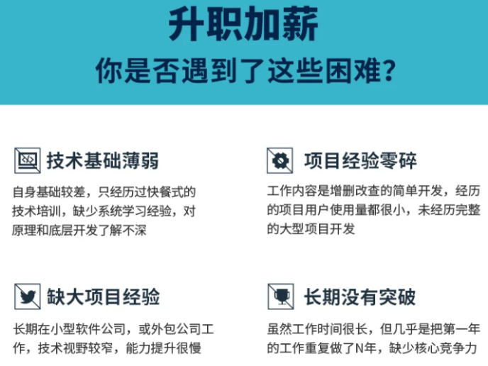
既有适合小白学习的零基础资料,也有适合3年以上经验的小伙伴深入学习提升的进阶课程,基本涵盖了95%以上Android开发知识点,真正体系化!
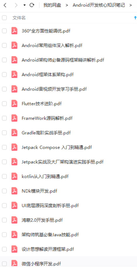
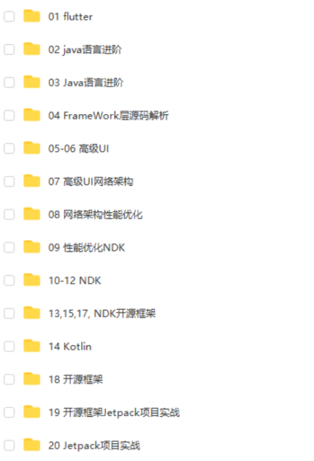
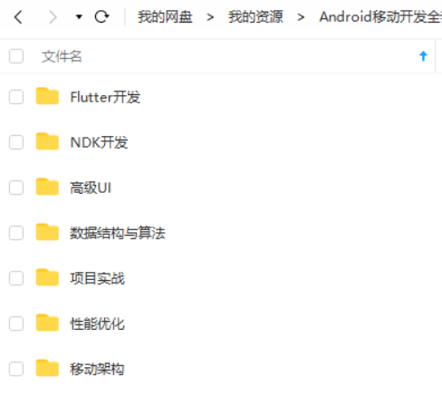
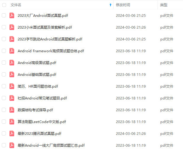
由于文件比较大,这里只是将部分目录截图出来,每个节点里面都包含大厂面经、学习笔记、源码讲义、实战项目、讲解视频,并且会持续更新!
如果你觉得这些内容对你有帮助,可以扫码获取!!(备注:Android)

学习分享
①「Android面试真题解析大全」PDF完整高清版+②「Android面试知识体系」学习思维导图压缩包


《互联网大厂面试真题解析、进阶开发核心学习笔记、全套讲解视频、实战项目源码讲义》点击传送门即可获取!
学习分享
①「Android面试真题解析大全」PDF完整高清版+②「Android面试知识体系」学习思维导图压缩包
[外链图片转存中…(img-V1fCKagE-1713536575187)]
[外链图片转存中…(img-fWw1My2B-1713536575188)]
[外链图片转存中…(img-kuUPSGlT-1713536575189)]
《互联网大厂面试真题解析、进阶开发核心学习笔记、全套讲解视频、实战项目源码讲义》点击传送门即可获取!


 6202
6202

 被折叠的 条评论
为什么被折叠?
被折叠的 条评论
为什么被折叠?
 到【灌水乐园】发言


