


box-shadow
/* x 偏移量 | y 偏移量 | 阴影颜色 */
box-shadow: 60px -16px teal;

/* x 偏移量 | y 偏移量 | 阴影模糊半径 | 阴影颜色 */
box-shadow: 10px 5px 5px black;

/* x 偏移量 | y 偏移量 | 阴影模糊半径 | 阴影扩散半径 | 阴影颜色 */
box-shadow: 2px 2px 2px 1px rgba(0, 0, 0, 0.2);

/* 插页 (阴影向内) | x 偏移量 | y 偏移量 | 阴影颜色 */
box-shadow: inset 5em 1em gold;

/* 任意数量的阴影,以逗号分隔 */
box-shadow:
  3px 3px red,
  -1em 0 0.4em olive;

/* 全局关键字 */
box-shadow: inherit;
box-shadow: initial;
box-shadow: unset;
transform:
skew() 函数定义了一个元素在二维平面上的倾斜转换。
transform: skewX(-12deg);
//选择了当前元素的所有直接子元素
& > * {
  transform: skewX(12deg);
}
文字环绕shape-outside
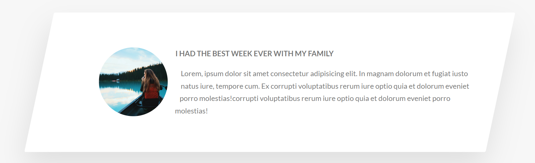
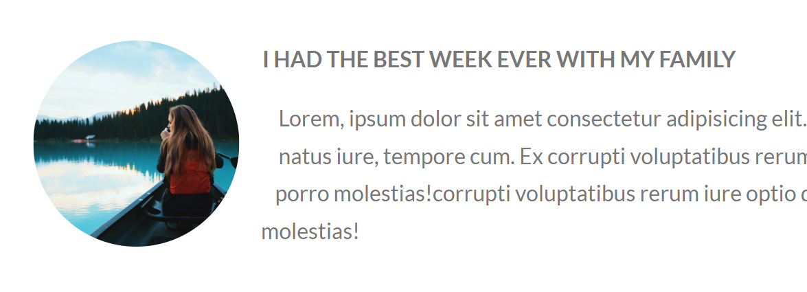
shape-outside 的 CSS 属性定义了一个可以是非矩形的形状,相邻的内联内容应围绕该形状进行包装。默认情况下,内联内容包围其边距框; shape-outside提供了一种自定义此包装的方法,可以将文本包装在复杂对象周围而不是简单的框中。
<figure class="story__shape">
  <img
    src="img/nat-8.jpg"
    alt="Person on a tour"
    class="story__img"
    />
</figure>
&__shape {
width: 15rem;
height: 15rem;
float: left;
//文字环绕
shape-outside: circle(50% at 50% 50%);
clip-path: circle(50% at 50% 50%);
}
<figure>:可附标题内容元素
- 通常,<figure> 的内容为图像、插图、图表、代码片段等,在文档的主内容流中引用,但可以移动到文档的另一部分或附录而不影响主内容流。
- 通过在其中插入 <figcaption>(作为第一个或最后一个子元素),可以将标题与 <figure> 元素相关联。图中找到的第一个 <figcaption> 元素显示为图的标题。
<figcaption>:
- <figcaption> 元素 是与其相关联的图片的说明/标题,用于描述其父节点 <figure> 元素里的其他数据。这意味着 <figcaption> 在<figure> 块里是第一个或最后一个。同时 HTML Figcaption 元素是可选的;如果没有该元素,这个父节点的图片只是会没有说明/标题。
<figure>
  <figcaption><b>Edsger Dijkstra:</b></figcaption>
  <blockquote>
    If debugging is the process of removing software bugs, then programming must
    be the process of putting them in.
  </blockquote>
</figure>


 1810
1810


 被折叠的 条评论
为什么被折叠?
被折叠的 条评论
为什么被折叠?
 到【灌水乐园】发言


