


<ul>
    <li>正常的</li>
    <li>旋转的</li>
    <li>平移的</li>
    <li>缩放的</li>
    <li>综合的</li>
</ul>


ul li{
  list-style: none;
width:100px; height:50px;
background-color: red;
margin: 0 auto; //五个li水平居中
margin-top:50px;
text-align: center;
line-height: 50px; }

ul li:nth-child(2){  // 旋转
  /*其中deg是单位, 代表多少度*/
   transform: rotate(45deg);}


ul li:nth-child(3){   // 移动
/*第一个参数:水平方向,参数正右移,负左移 第二个参数:垂直方向,参数正下移,负上移*/
  transform:translate(100px, 0px);}

 ul li:nth-child(4){  //缩放
 /*第一个参数:水平方向 第二个参数:垂直方向
   注意点:如果取值是1, 代表不变,如果取值大于1, 代表需要放大,如果取值小于1, 代表需要缩小。如果水平和垂直缩放都一样, 那么可以简写为一个参数*/
/*transform: scale(0.5, 0.5);*/
 transform: scale(1.5);  }


ul li:nth-child(5){  // 连写
 /*注意点: 1.如果需要进行多个转换, 那么用空格隔开 2.2D的转换模块会修改元素的坐标系, 所以旋转之后再平移就不是水平平移的*/
transform:rotate(45deg) translate(100px,0px) scale(1.5, 1.5);  }
2D转换模块-形变中心点
<ul>
<li></li>
<li></li>
<li></li>
</ul>
ul{
width: 200px; height: 200px;
border: 1px solid #000;
margin: 100px auto;
position: relative; }
ul li{
list-style: none;
width: 200px; height: 200px;
position: absolute;left: 0;top: 0;
//这三句是子绝父相,以ul为参考点,三个li覆盖在同一位置
/*形变中心点 第一个参数:水平方向,第二个参数:垂直方向 注意点:取值有三种形式:具体像素;百分比; 特殊关键字*/
/*transform-origin: 200px 0px;*/
/*transform-origin: 50% 50%;*/
/*transform-origin: 0% 0%;*/
/*transform-origin:center center;*/
transform-origin: left top; }
/*默认情况下所有的元素都是以自己的中心点作为参考来旋转的, 我们可以通过形变中心点属性来修改它的参考点
*/
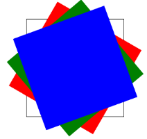
ul li:nth-child(1){
background-color: red;
transform: rotate(30deg); }
ul li:nth-child(2){
background-color: green;
transform: rotate(50deg); }
ul li:nth-child(3){
background-color: blue;
transform: rotate(70deg); }
参考点:中心点 参考点:左上角

2D转换模块-旋转轴向
<ul>
    <li><img src="rotateZ.jpg" alt=""></li>
    <li><img src="rotateX.jpg" alt=""></li>
    <li><img src="rotateY.jpg" alt=""></li>
</ul>

ul{
   width: 800px;  height: 500px;
   margin: 0 auto;  }
 ul li{
     list-style: none;
     width: 200px;  height: 200px;
     margin: 0 auto;  margin-top: 50px;
     border: 1px solid #000;
   /*1.什么是透视:近大远小
2.注意点:透视属性必须添加到需要呈现近大远小效果的元素的父元素上面
3.透视:为了使旋转效果更明显*/
     perspective: 500px;        }


ul li:nth-child(1){
  /*默认情况下所有元素都是围绕Z轴进行旋转*/
transform: rotateZ(45deg); }

ul li:nth-child(2) img{
transform: rotateX(45deg); }

 ul li:nth-child(3) img{
 /*总结:想围绕哪个轴旋转, 那么只需要在rotate后面加上哪个轴即可*/
    transform: rotateY(45deg);  }
结果展示:

2D转换模块-盒子阴影和字体阴影
1.如何给盒子添加阴影
box-shadow: 水平偏移 垂直偏移 模糊度 阴影扩展 阴影颜色 内外阴影;
2.注意点
2.1盒子的阴影分为内外阴影, 默认情况下就是外阴影
2.2快速添加阴影只需要编写三个参数即可
box-shadow: 水平偏移 垂直偏移 模糊度;
默认情况下阴影的颜色和盒子内容的颜色一致
3.如何给文字添加阴影
text-shadow: 水平偏移 垂直偏移 模糊度 阴影颜色 ;
<div class="box1">我是盒子</div>
<div class="box2">我是盒子</div>

.box1{
  width: 200px;  height: 200px;
  background-color: red;  margin: 100px auto;
  text-align: center;  line-height: 200px;
  /*box-shadow:10px 10px 10px 10px skyblue;*/
  /*box-shadow: 10px 10px 10px 10px skyblue inset;*/
  box-shadow: 10px 10px 10px;//颜色默认和字体内容保持一致
   color: yellow;        }


.box2{
 width: 200px;  height: 200px;
 margin: 0 auto; background-color: pink;
 text-align: center;  line-height: 200px;
 font-size: 40px;
 /*text-shadow: 10px 10px 10px black;*/
 text-shadow: 10px 10px 10px;
 color: purple;
        }
结果展示:


 782
782


 被折叠的 条评论
为什么被折叠?
被折叠的 条评论
为什么被折叠?
 到【灌水乐园】发言


