


废话不多说,直接上代码:
<!DOCTYPE html>
<html>
	<head>
		<meta charset="UTF-8">
		<title></title>
		<style type="text/css">
			*{
				padding: 0;
				margin: 0;
				box-sizing: border-box;
			}
			body{
				background: yellow;
			}
			#box{
				width: 600px;
				height: 600px;
				margin: 20px auto;
				display: grid;
				grid-template-rows: repeat(3,1fr);
				grid-template-columns:repeat(3,1fr);
				grid-gap:0.5em
			}
			.image{
				position: relative;
			}
			img{
				position: absolute;
				left: 0;
				top: 0;
				width: 100%;
				height: 100%;
			}
			.image img:nth-child(1){
				filter: grayscale(1)brightness(40%);

			}
			.image img:nth-child(2){
				clip-path: var(--clipstart);
				transition: clip-path 0.5s;
			}
			.image:hover img:nth-child(2){
				clip-path: var(--clipend);
			}
		</style>
	</head>
	<body>
		<div id="box">
			<div class="image">
				<img src="img/00.jpg" alt="" />
				<img src="img/00.jpg" alt="" style="--clipstart:circle(0 at 0 0); --clipend: circle(150% at 0 0);"/>
			</div>
			<div class="image">
				<img src="img/01.jpg" alt="" />
				<img src="img/01.jpg" alt=""style="--clipstart: circle(0 at 100% 100%); --clipend: circle(150% at 100% 100%);" />
			</div>
			<div class="image">
				<img src="img/02.jpg" alt="" />
				<img src="img/02.jpg" alt="" style="--clipstart: ellipse(0 0 at 100% 0); --clipend: ellipse(150% 150% at 100% 0);"/>
			</div>
			<div class="image">
				<img src="img/11.jpg"imalt="" />
				<img src="img/11.jpg" alt=""style="--clipstart: polygon(50% 50%, 50% 50%, 50% 50%, 50% 50%); --clipend: polygon(-50% 50%, 50% -50%, 150% 50%, 50% 150%);" />
			</div>
			<div class="image">
				<img src="img/12.jpg" alt="" />
				<img src="img/12.jpg" alt="" style="--clipstart: circle(0 at 50% 50%); --clipend: circle(125% at 50% 50%);"/>
			</div>
			<div class="image">
				<img src="img/20.jpg" alt="" />
				<img src="img/20.jpg" alt="" style="--clipstart: inset(50% 50% 50% 50%); --clipend: inset(0 0 0 0);"/>
			</div>
			<div class="image">
				<img src="img/22.jpg" alt="" />
				<img src="img/22.jpg" alt=""style="--clipstart: inset(0 100% 0 0); --clipend: inset(0 0 0 0);" />
			</div>
			<div class="image">
				<img src="img/21.jpg" alt="" />
				<img src="img/21.jpg" alt="" style="--clipstart: inset(0 0 100% 0); --clipend: inset(0 0 0 0);"/>
			</div>
			<div class="image">
				<img src="img/10.jpg" alt="" />
				<img src="img/10.jpg" alt="" style="--clipstart:inset(100% 0 0 0);--clipend:inset(0 0 0 0);"/>
			</div>
		</div>
	</body>
</html>
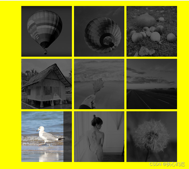
以上是运行结果。
当然,只想单纯的图片亮起而不用多种方式,可以在源代码中做出以下修改:
.image img:nth-child(1){
				filter: grayscale(1)brightness(40%);
				transition: clip-path 0.5s;/*从下面移到1这里*/
			}
			.image img:nth-child(2){
				clip-path: var(--clipstart);

			}


 1233
1233


 被折叠的 条评论
为什么被折叠?
被折叠的 条评论
为什么被折叠?
 到【灌水乐园】发言


