


4.1组件的定义及属性
•组件是页面视图层(WXML) 的基本组成单元, 组件组合可以构建功能强大的页面结构。 小程序框架为开发者提供了容器视图、基础内容、表单、导航、多媒体、地图、画布、开放能力等8 类(30 多个) 基础组件。
•每一个组件都由一对标签组成, 有开始标签和结束标签, 内容放置在开始标签和结束标签之间, 内容也可以是组件。 组件的语法格式如下:
•< 标签名 属性名= ”属性值” > 内容< /标签名>
•组件通过属性来进一步细化
4.2容器视图组件
容器视图组件是能容纳其他组件的组件, 是构建小程序页面布局的基础组件, 主要包括view、scroll - view 和swiper组件。
4.2.1 view
view 组件是块级组件, 没有特殊功能, 主要用于布局展示, 相当于HTML 中的div, 是布局中最基本的用户界面(User Interface, UI) 组件, 通过设置view 的CSS 属性可以实现各种复杂的布局
<!--index.wxml-->
<!--<view style="text-align: center;">默认flex布局</view>-->
<view style="display: flex;">
<View style="border: 1px solid #f00;flex-grow: 1;">1</View>
<View style="border: 1px solid #f00;flex-grow: 1;">2</View>
<View style="border: 1px solid #f00;flex-grow: 1;">3</View>
</view>
<view style="text-align: center;">上下混合布局</view>
<view style="display: flex; flex-direction: column;">
<view style="border: 1px solid #f00;">1</view>
<view style="display: flex;">
<view style="border: 1px solid #f00;flex-grow: 1;"></view>
<view style="border: 1px solid #f00;flex-grow: 2;"></view>
</view>
</view>
<view style="text-align: center;">左右混合布局</view>
<view style="display: flex;">
<view style="border:1px solid #f00;flex-grow: 1;">1</view>
<view style="display: flex;flex-direction: column;flex-grow: 1;">
<view style="border: 1px solid #f00;flex-grow: 1;">2</view>
<view style="border: 1px solid #f00;flex-grow: 2;">3</view>
</view>
</view>
运行结果:

4.2.2 scroll-view
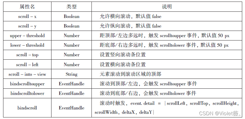
(1) 在使用竖向滚动时, 如果需要给scroll - view 组件设置一个固定高度, 可以通过WXSS设置height 来完成。
(2) 请勿在scroll - view 组件中使用textarea、map、canvas、video 组件。
3) scroll - into - view 属性的优先级高于scroll - top。
(4) 由于在使用scroll - view 组件时会阻止页面回弹, 所以在scroll - view 组件滚动时无法触发onPullDownRefresh。
(5) 如果要实现页面下拉刷新, 请使用页面的滚动, 而不是设置scroll - view 组件。 这样做, 能通过单击顶部状态栏回到页面顶部。
示例代码:
<view class="container" style="padding: 0rpx;">
<!-- 垂直滚动,这里必须设置高度 -->
  <scroll-view scroll-top="{{scrollTop}}"scroll-y="true" -style="height: {{scrollHeight}}px;" class="list" bind-scrolltolower="bindDownLoad" bindscrolltoupper="topLoad" bindscroll="scroll">
    <view class="item" wx:for="{{list}}">
      <image class="img" src="{{item.pic_url}}"></image>
      <view class="text">
       <text class="title">{{item.name}}</text>
       <text class="description">{{item.short_description}}</text>
      </view>
    </view>
  </scroll-view>
  <view class="body-view">
    <losding hidden="{{hidden}}" bindchange="loadingChange">
      加载中……
    </losding>
  </view>
</view>-->
.userinfo{
display: flex;
flex-direction: column;
align-items: center;
}
.userinfo-avatar{
width: 128rpx;
height: 128rpx;
margin: 20rpx;
border-radius: 50%;
}
.userinfo-nickname{
color:#aaa;
}
.usermotto{
margin-top: 200px;
}
scroll-view{
width: 100%;
}
.item{
width: 90%;
height: 300rpx;
margin: 20rpx auto;
background: brown;
overflow: hidden;
}
.item.img{
width: 430rpx;
margin-right: 20rpx;
float: left;
}
.title{
font-size: 30rpx;
display: block;
margin: 30rpx auto;
}
.description{
font-size: 26rpx;
line-height: 15rpx;
}page {
height: 100vh;
display: flex;
flex-direction: column;
}
.scrollarea {
flex: 1;
overflow-y: hidden;
}
.userinfo {
display: flex;
flex-direction: column;
align-items: center;
color: #aaa;
width: 80%;
}
.userinfo-avatar {
overflow: hidden;
width: 128rpx;
height: 128rpx;
margin: 20rpx;
border-radius: 50%;
}
.usermotto {
margin-top: 200px;
}
.avatar-wrapper {
padding: 0;
width: 56px !important;
border-radius: 8px;
margin-top: 40px;
margin-bottom: 40px;
}
.avatar {
display: block;
width: 56px;
height: 56px;
}
.nickname-wrapper {
display: flex;
width: 100%;
padding: 16px;
box-sizing: border-box;
border-top: .5px solid rgba(0, 0, 0, 0.1);
border-bottom: .5px solid rgba(0, 0, 0, 0.1);
color: black;
}
.nickname-label {
width: 105px;
}
.nickname-input {
flex: 1;
}var url = "http://www.imooc.com/course/ajaxlist";
var page = 0;
var page_size = 5;
var sort = "last";
var is_easy = 0;
var lang_id = 0;
var pos_id = 0;
var unlearn = 0;
//请求数据
var losdMore = function(that){
that.setData({
hidden:false
});
wx.request({
url: 'url',
data:{
page:page,
page_size:page_size,
sort:sort,
is_easy:is_easy,
lang_id:lang_id,
pos_id:pos_id,
unlearn:unlearn
},
success:function(res){
var list = that.data.list;
for(var i=0;i<res.data.list.length;i++){
list.push(res.data.list[i]);
}
that.setData({
list:list
});
page++;
that.setData({
hidden:true
});
}
});
}
Page({
data:{
hidden:true,
list:[],
scrollTop:0,
scrollHeigt:0
},
onLoad:function(){
//这里要注意,微信的scroll-view必须设置高度才能监听滚动事件,所以需要在页面的onLoad事件中为scroll-view的高度赋值
var that = this;
wx.getSystemInfo({
success:function(res){
that.setData({
scrollHeigt:res.windowHeight
});
}
});
loadMore(that);
},
//页面滑动到底部
bindDownLoad:function(){
var that = this;
loadMore(that);
console.log("lower");
},
scroll:function(event){
//该方法绑定了页面滚动时的事件,这里记录了当前的position.y的值,为了在请求数据后把页面定位到这里
this.setData({
scrollTop:event.detail.scrollTop
});
},
topLoad:function(event){
//该方法绑定了页面滑动到顶部的时间,然后做页面上拉刷新
page = 0;
this.setData({
list:[],
scrollTop:0
});
loadMore(this);
console.log("lower");
}
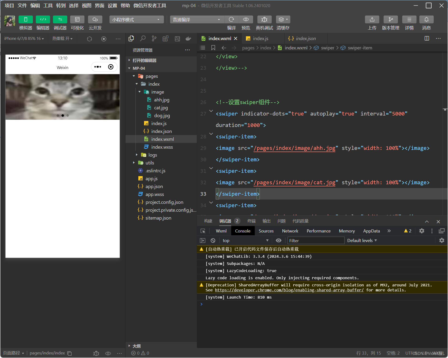
}) 4.2.3 swiper
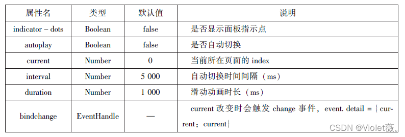
swiper 组件可以实现轮播图、图片预览、滑动页面等效果。 一个完整的swiper 组件由< swiper/ > 和< swiper - item/ > 两个标签组成, 它们不能单独使用。 < swiper/ > 中只能放置一个或多个< swiper - item/ > , 若放置其他组件则会被删除; < swiper - item/ > 内部可以放置任何组件, 默认宽高自动设置为100%。
示例代码:
<swiper indicator-dots="true" autoplay="true" interval="5000" duration="1000">
<swiper-item>
<image src="/pages/index/image/ahh.jpg" style="width: 100%"></image>
</swiper-item>
<swiper-item>
<image src="/pages/index/image/cat.jpg" style="width: 100%"></image>
</swiper-item>
<swiper-item>
<image src="/pages/index/image/dog.jpg" style="width: 100%"></image>
</swiper-item>
</swiper>
运行结果
4.3基础内容组件
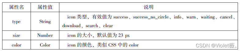
4.3.1 icon
icon 组件即图标组件, 通常用于表示一种状态, 如success、info、warn、waiting、cancel等。
示例代码:
<view>icon 类型:
<block wx:for="{{iconType}}">
<icon type="{{item}}"/>{{item}}
</block>
</view>
<view>icon 大小:
<block wx:for="{{iconSize}}">
<icon type="success" size="{{type}}"/>{{item}}
</block>
</view>
<view>icon 大小:
<block wx:for="{{iconColor}}">
<icon type="success" size="30" color="{{item}}"/>{{item}}
</block>
</view>
Page({
data: {
iconType: ["success", "success_no_circle", "info", "warn", "warn", "cancel", "download", "search", "clear"],
iconSize: [10, 20, 30, 40],
iconColor: ['#f00', '#0f0', '#00f']
}
}) 
4.3.2 text
text 组件用于展示内容, 类似HTML 中的< span > , text 组件中的内容支持长按选中, 支持转义字符“ \”, 属于行内元素。

示例代码:
<block wx:for="{{x}}" wx:for-item="x">
<view class="aa">
<block wx:for = "{{1-x}}" wx:for-item="x">
<text decode = "{{true}}" space="{{true}}">
</text>
</block>
<block wx:for="{{y}}" wx:for-item="y">
<block wx:if="{{y<=2*x-1}}">
<text>*</text>
</block>
</block>
</view>
</block>
<block wx:for="{{x}}" wx:for-item="x">
<view class="aa">
<block wx:for="{{-5+x}}" wx:for-item="x">
<text decode="{{true}}" space="{{true}}">
</text>
</block>
<block wx:for="{{y}}" wx:for-item="y">
<block wx:if="{{y<=11-2*x}}">
<text>*</text>
</block>
</block>
</view>
</block> Page({
data:{
x:[1,2,3,4,5],
y:[1,2,3,4,5,6,7,8,9]
}})运行结果:

4.3.3 progress
progress 组件用于显示进度状态, 如资源加载、用户资料完成度、媒体资源播放进度等。progress 组件属于块级元素。
<view>显示百分比</view>
<progress percent="80" show-info="80"></progress>
<view>改变宽度</view>
<progress percent="50" stroke-width="2"></progress>
<view>自动显示进度条</view>
<progress percent="80" active=""></progress> 
4.4 表单组件
•表单组件的主要功能是收集用户信息, 并将这些信息传递给后台服务器, 实现小程序与用户之间的沟通。 表单组件不仅可以放置在< form/ > 标签中使用, 还可以作为单独组件和其他组件混合使用。
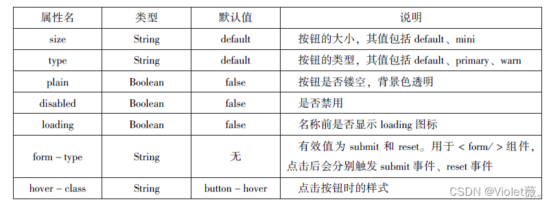
4.4.1 button
•button 组件用来实现用户和应用之间的交互, 同时按钮的颜色起引导作用。 一般来说,在一个程序中一个按钮至少有3 种状态: 默认点击(default)、建议点击(primary)、谨慎点击(warn)。
<button type="default">type:default</button>
<button type="primary">type:primary</button>
<button type="warn">type:warn</button>
<button type="default" bindtap="buttonSize" size="{{size}}">改变size</button>
<button type="default" bindtap="buttonPlain" plain="{{plain}}">改变plain</button>
<button type="default" bindtap="buttonLoading" loading="{{loading}}">改变loading显示</button> 
4.4.2 radio
单选框用来从一组选项中选取一个选项。在小程序中, 单选框由< radio - group/ > (单项选择器) 和< radio/ > ( 单选项目) 两个组件组合而成, 一个包含多个< radio/ > 的< radio - group/ > 表示一组单选项, 在同一组单选项中< radio/ > 是互斥的, 当一个按钮被选中后, 之前选中的按钮就变为非选。

<view>选择您喜爱的城市</view>
<radio-group bindchange="citychange">
 <radio value="西安">西安</radio>
 <radio value="北京">北京</radio>
 <radio value="上海">上海</radio>
 <radio value="广州">广州</radio>
 <radio value="深圳">’深圳</radio>
</radio-group>
<view>你的选择:{{city}}</view>

<view>选择你喜爱的计算机语言:</view>
<radio-group class="radio-group" bindchange="radiochange">
<label class="radio" wx:for="{{radios}}">
<radio value="{{item.value}}" checked="{{item.checked}}"/>
{{item.name}}
</label >
</radio-group>
<view>你的选择:{{lang}}</view>
Page({
data:{
radios:[
{name:'java',value:'JAVA'},
{name:'python',value:'Python',checked:'ture'},
{name:'php',value:'PHP'},
{name:'swif',value:'Swif'},
],
city:"",
lang:""
},
citychange:function(e){
this.setData({city:e.detail.value});
},
radiochange:function(event){
this.setData({lang:event.detail.value});
console.log(event.detail.value)
}
}) 
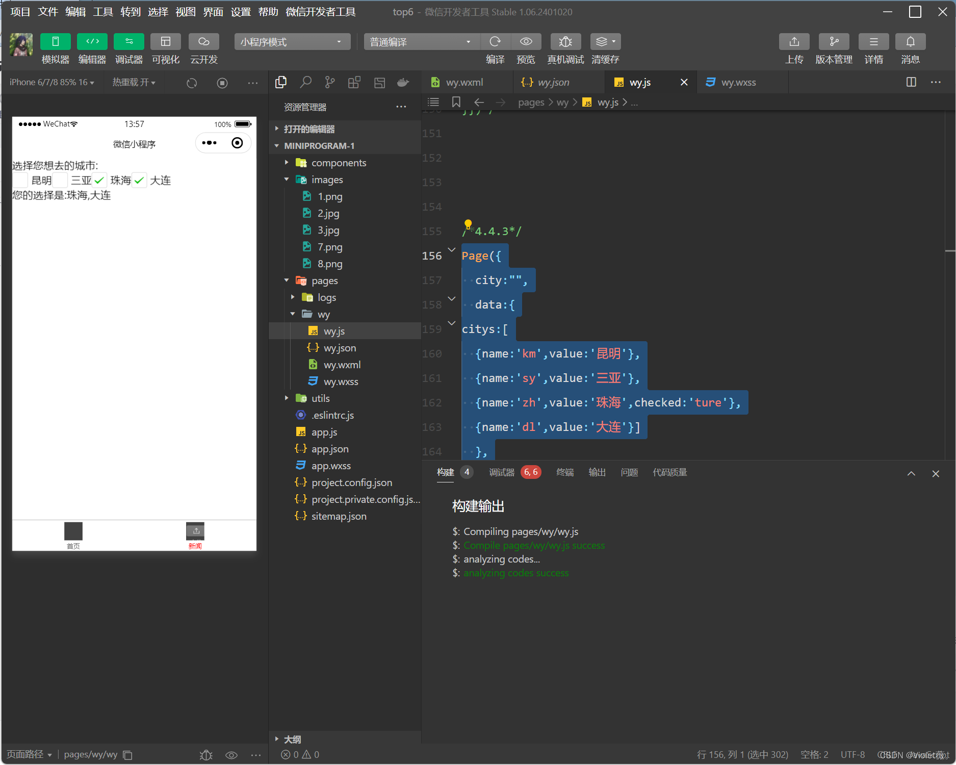
4.4.3 checkbox
复选框用于从一组选项中选取多个选项, 小程序中复选框由< checkbox - group/ > (多项选择器) 和< checkbox/ > (多选项目) 两个组件组合而成。 一个< checkbox - group/ > 表示一组选项, 可以在一组选项中选中多个选项。

<view>选择您想去的城市:</view>
<checkbox-group bindchange="cityChange">
<label wx:for="{{citys}}">
<checkbox value="{{item.value}}" checked="{{item.checked}}">
{{item.value}}
</checkbox>
</label>
</checkbox-group>
<view>您的选择是:{{city}}</view>
Page({
city:"",
data:{
citys:[
{name:'km',value:'昆明'},
{name:'sy',value:'三亚'},
{name:'zh',value:'珠海',checked:'ture'},
{name:'dl',value:'大连'}]
},
cityChange:function(e){
console.log(e.detail.value);
var city=e.detail.value;
this,this.setData({city:city})
}
})
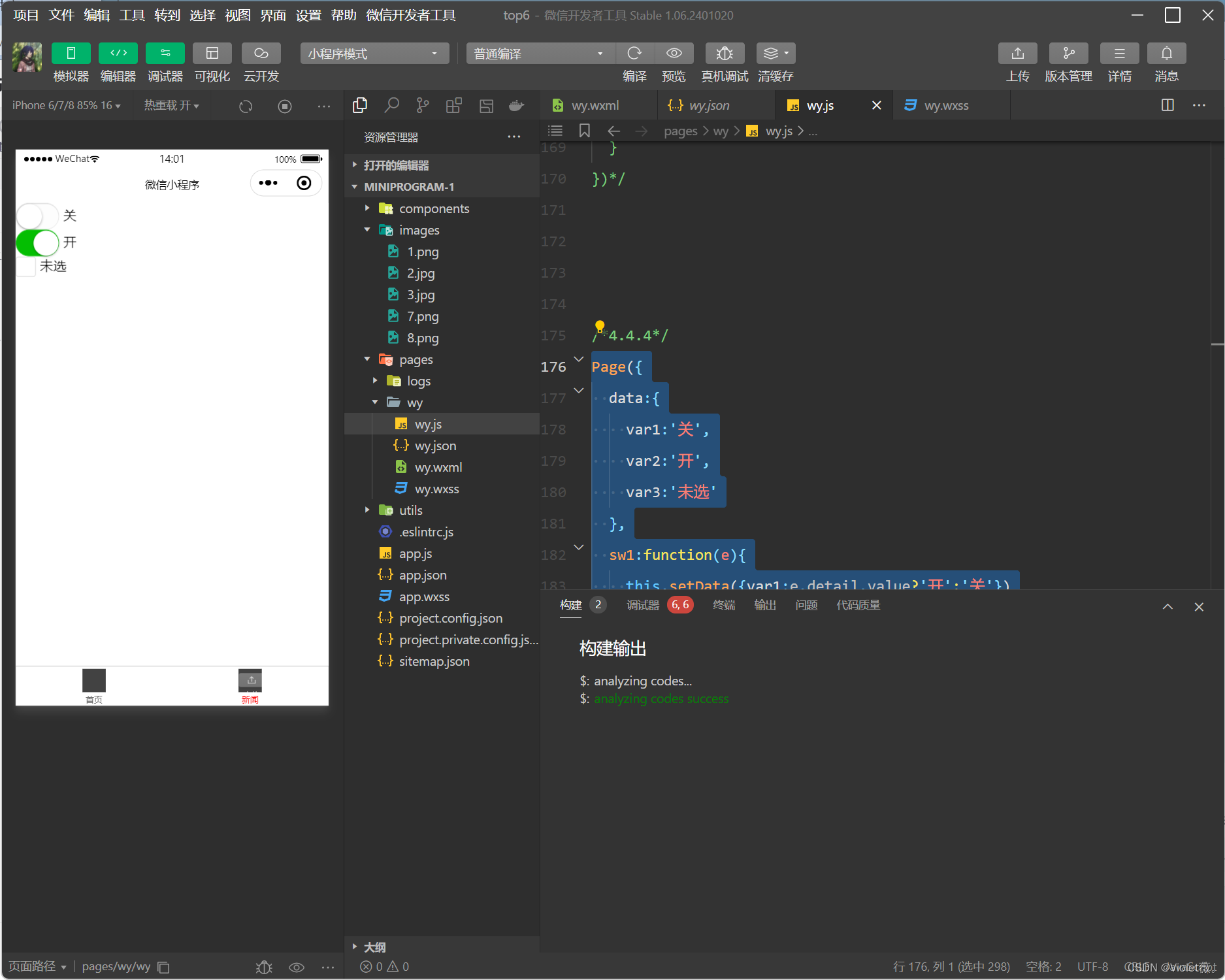
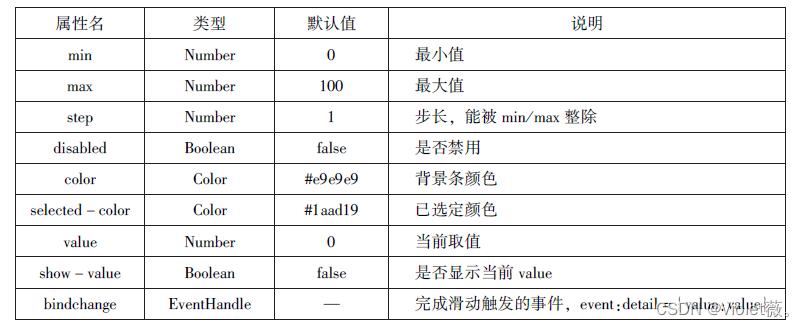
4.4.4 switch
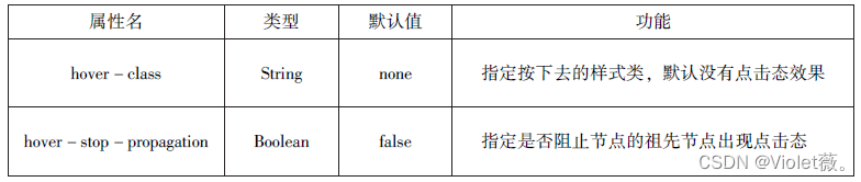
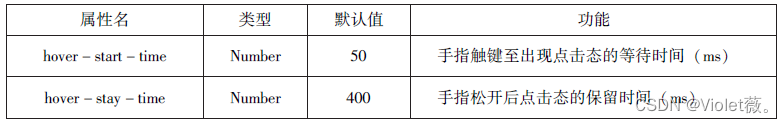
switch 组件的作用类似开关选择器,其属性如表所示:

示例代码如下:
<view>
<switch bindchange="sw1">{{var1}}</switch>
</view>
<view>
<switch checked bindchange="sw2">{{var2}}</switch>
</view>
<view>
<switch type="checkbox" bindchange="sw3">{{var3}}</switch>
</view>
Page({
data:{
var1:'关',
var2:'开',
var3:'未选'
},
sw1:function(e){
this.setData({var1:e.detail.value?'开':'关'})
},
sw2:function(e){
this.setData({var3:e.detail.value?'开':'关'})
},
sw3:function(e){
this.setData({var3:e.detail.value?'已选':'未选'})
},
}) 
4.4.5 slider
slider 组件为滑动选择器, 可以通过滑动来设置相应的值, 其属性如图所示:
示例代码:
<view>默认min=0 max=100 step=1</view>
<slider></slider>
<view>显示当前值</view>
<slider show-value></slider>
<view>设置min=20max=200 step=10</view>
<slider min='0'max='200' step='10' show-value></slider>

<view>背景色红色,已选定颜色绿色</view>
<slider color="#f00" selected-color='#0f0'></slider>

<view>滑动改变icon的大小</view>
<slider show-value bindchange='sliderchange'></slider>
<icon type="success" size='{{size}}'></icon>
Page({
data:{
size:'20'
},
sliderchange:function(e){
this.setData({size:e.detail.value})
}
})
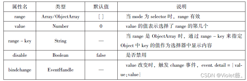
4.4.6 picker
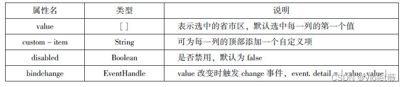
•picker 组件为滚动选择器, 当用户点击picker 组件时, 系统从底部弹出选择器供用户选择。 picker 组件目前支持5 种选择器, 分别是: selector (普通选择器)、multiSelector (多列选择器)、time (时间选择器)、date (日期选择器)、region (省市选择器)。
1. 普通选择器
普通选择器(modelector)的属性如图所示:
<view>--range为数组---</view>
<picker range="{{array}}" value="{{index1}}" bindchange="arrayChange">
当前选择:{{array[index1]}}
</picker>

<view>---range为数组对象---</view>
<picker bindchange="objArrayChange" value="{{index2}}" range-key="name"range="{{objArray}}">
当前选择:{{objArray[index2].name}}
</picker>
Page({
data:{
array:['Java','Python','C','C#'],
objArray:[
{id:0,name:'Java'},
{id:1,name:'Python'},
{id:2,name:'C'},
{id:3,name:'C#'}
],
index1:0,
index2:0
},
arrayChange:function(e){
console.log('picker值变为',e.detail.value)
var index=0;
this.setData({
index1:e.detail.value
})
},
objArrayChange:function(e){
console.log('picker值变为',e.detail.value)
this.setData({
index2:e.detail.value
})
}
})
2.多列选择器
多列选择器(mode = multiSelector) 允许用户从不同列中选择不同的选择项, 其选项是二维数组或数组对象。 多列选择器的属性如图所示:

示例代码:
<view>多列选择器</view>
<picker
rmode="multiSelector"
bindchange="bindMultipickerChange"
bindcolumnchange="bindMultipickerColumnChange"
value="{{multiIndex}}"
range="{{multiArray}}">
  <view>
    当前选择:{{multiArray[0][multiIndex[0]]}},
             {{multiArray[1][multiIndex[1]]}},
             {{multiArray[2][multiIndex[2]]}}
  </view>
</picker>
Page({
data: {
multiArray: [['陕西省', '广东省'], ['西安市', '汉中市', '延安市'], ['雁塔市', '长安市']],
multiIndex: [0, 0, 0]
//绑定Multipicker
},
bindMultipickerChange: function (e) {
console.log('picker 发送选择改变,携带值为', e.detail.value);
this.setData({
multiIndex: e.detail.value
});
},
//绑定MultipickerColumn
bindMultipickerChange: function (e) {
console.log = ('修改的列为', e.detail.console, '值', e.detail.value);
var data = {
multiArray: this.data.multiArray,
multiArray: this.data.multiIndex
};
data.multiIndex[e.detail.column] = e.detail.value;
switch (e.detail.column) {
case 0:
switch (data.multiIndex[0]) {
case 0:
data.multiIndex[1] = ['西安市', '汉中市', '延安市'];
data.multiIndex[2] = ['雁塔市', '长安市'];
break;
case 1:
data.multiIndex[1] = ['深圳市', '珠海市'];
data.multiIndex[2] = ['南山市', '罗湖区'];
break;
}
data.multiIndex[1] = 0;
data.multiIndex[2] = 0;
break;
}
}
}) 
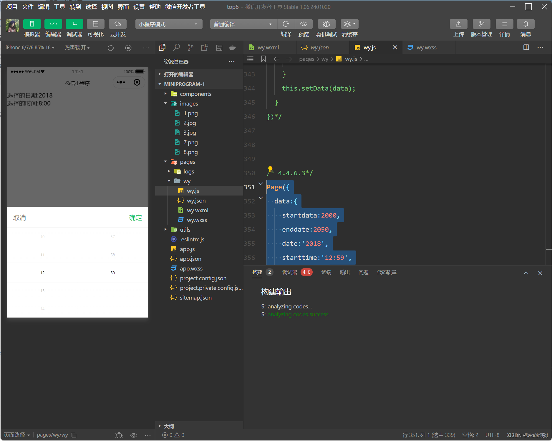
3.时间选择器,日期选择器
时间选择器(mode=time)可以用于从提供的时间选项中选择相应的时间,其属性如表所示。

日期选择器(mode=date)可以用于从提供的日期选项中选择相应的日期,其属性如表所示。

示例代码:
<view>
<picker mode="date" start="{{startdate}}" end="{{enddate}}"
value="{{date}}" bindchange="changedate">
选择的日期:{{date}}
</picker>
</view>
<view>
 <picker mode="time" start="{{starttime}}" end="{{endtime}}"
  bindchange="changetime">
  选择的时间:{{time}}
  </picker>
</view>
Page({
data:{
startdata:2000,
enddate:2050,
date:'2018',
starttime:'12:59',
time:'8:00'
},
changedate:function(e){
this.setData({date:e.detail.value});
console.log(e.detail.value)
},
changedate:function(e){
this.setData({date:e.detail.value})
console.log(e.detail.value)
}
})
4.省级选择器
省级选择器(mode=region)是小程序的新版本提供的快速地区组件,其属性如图所示
示例代码:
page({
  data:{
    region:['陕西省','西安市','长安区'],
    customitem:'全部'
  },
  changeregion:function(e){
    console.log(e.detail.value)
    this.setData({
      region:e.detail.value
    })
  }
})
<!--省级选择器-->
<picker mode="region" value="{{region}}" custom-item="{{cust-omitem}}"bindchange="changeregion">
选择省市区:{{region[0]}},{{region[1]}},{{region[1]}}
</picker>
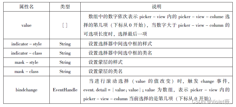
4.4.7 picker-view
picker - view 组件为嵌入页面的滚动选择器。 相对于picker 组件, picker - view 组件的列的个数和列的内容由用户通过< picker - view -column/ > 自定义设置。
示例代码:
<view>当前日期:{{year}}年{{month}}月{{day}}日</view >
<picker-view indicator-style="height:50px;" style ="width:100%; height:300px;"
 value ="{{value}}" bindchange ="bindchange">
 <picker-view-column>
<view wx:for="{{years}}"style="line-height:50px">{{item}}年</view>
</picker-view-column>
<picker-view-column>
<view wx:for="{{months}}" style ="line-height:50px">{{item}}月</view>
</picker-view-column>
<picker-view-column>
<view wx:for="{{days}}" style="line-height:50px">{{item}}日</view>
</picker-view-column>
</picker-view>
const date =new Date()
const years=[]
const months=[]
const days=[]
//定义年份
for(let i=1900;i<=2050;i++){
years.push(i)
}
//定义月份
for(let i=1;i<=12;i++){
months.push(i)
}
//定义日期
for(let i=1;i<=31;i++){
days.push(i)
}
Page({
data:{
years:years,
months:months,
days:days,
year:date.getFullYear(),
month:date.getMonth()+1,day:date.getDate(),value:[118,0,0],
},
//定位到2018年1月1日
bindChange:function(e){
const val =e.detail.value
console.log(val);
this.setData({
year:this.data.years[val[0]],
month:this.data.months[val[1]],
day:this.data.days[val[2]]
})
}
})
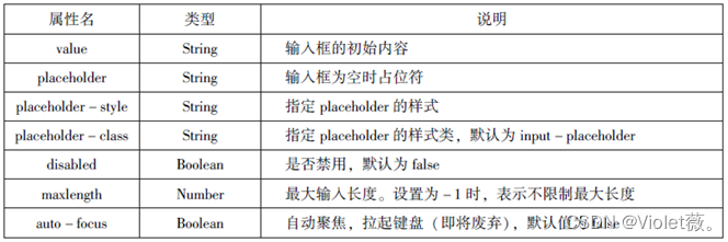
4.4.8 input
input为组件输入框,用户可以输入相应的信息,其属性如下:

 示例代码:
示例代码:
<input placeholder="这是一个可以自动聚焦的 input" auto-focus/>
<input placeholder="这个只有在按钮点击的时候才聚焦" focus ="{{focus}}"/>
<button bindtap="bindButtonTap">使得输入框获取焦点</button>
<input maxlength="10" placeholder="最大输入长度为10"/>
<view class="section_title">你输入的是:{{inputValue}}</view>
<input bindinput="bindKeyInput" placeholder="输入同步到view中"/>
<input bindinput="bindReplaceInput" placeholder="连续的两个1会变成2"/>
<input password type="number"/>
<input password type="text"/>
<input type="digit" placeholder="带小数点的数字键盘"/>
<input type="idcard" placeholder="身份证输入键盘"/>
<input placeholder-style="color:red" placeholder="占位符字体是红色的"/>
Page({
data:{
focus:false,
inputValue:""
},
bindButtonTap:function(){
this.setData({
focus:true
})
},
bindKeyInput:function(e){
this.setData({
inputValue:e.detail.value
})
},
bindReplaceInput:function(e){
var value =e.detail.value
var pos =e.detail.cursor
if(pos!=-1){
//光标在中间
var left =e.detail.value.slice(0,pos)
//计算光标的位置
pos =left.replace(/11/g,'2').length
}
//直接返回对象,可以对输入进行过滤处理,同时可以控制光标的位置
return{
value:value.replace(/11/g,'2'),
Cursor:pos
}
//或者直接返回字符串,光标在最后边
//return value.replace( /11 /g,'2'),
}
}) 
4.4.9 textarea
textarea组件为多行输入框组件,可以实现多行内容的输入,属性如图所示:

示例代码:
<textarea bindblur="bindTextAreaBlur"auto-height placeholder="自动变高"></textarea>
<textarea placeholder="placeholder 颜色是红色的" placeholder-style="color:red;"></textarea>
<input placeholder="这是一个可以自动聚焦的 input" auto-focus/>
<input placeholder="这个只有在按钮点击的时候才聚焦" focus ="{{focus}}"/>
<button bindtap="bindButtonTap">使得输入框获取焦点</button>
<input maxlength="10" placeholder="最大输入长度为10"/>
<view class="section_title">你输入的是:{{inputValue}}</view>
<input bindinput="bindKeyInput" placeholder="输入同步到view中"/>
<input bindinput="bindReplaceInput" placeholder="连续的两个1会变成2"/>
<input password type="number"/>
<input password type="text"/>
<input type="digit" placeholder="带小数点的数字键盘"/>
<input type="idcard" placeholder="身份证输入键盘"/>
<input placeholder-style="color:red" placeholder="占位符字体是红色的"/>
Page({
data:{
height:10,
focus:false
},
bindButtonTap:function(){
this.setData({
focus:true
})
},
bindTextAreaBlur:function(e){
console.log(e.detail.value)
},
bindFormSubmit:function(e){
console.log(e.detail.value.textarea)
}
})
4.4.10 label
label组件为标签组件,用于提升表单组件的可用性。label组件支持使用for属性找到对应的id,或者将控件放在该标签下,当点击label组件时,就会触发对应的控件。for属性的优先级高于内部控件,内部有多个控件的时候默认触发第一个控件。
目前,label组件可以绑定的控件有<button/ >、<checkbox/ >、<radio/>、<switch/ >。
示例代码
<!--单击中国不能选择/取消复选框-->
<view><checkbox></checkbox>中国</view>
<!--单击“中国”可以选择/取消复选框-->
<view><label><checkbox> </checkbox >中国</label></view>
<!--使用for找到对应的 id -->
<checkbox-group bindchange="cityChange">
<label wx:for="{{citys}}">
<checkbox value ="{{item.value}}" checked = '{{item.checked}}'>
{{item.value}}</checkbox>
</label>
</checkbox-group>
<view>您的选择是:{{city}}</view>
Page({
city:"",
data:{
citys:[
{name:'km',value:'昆明'},
{name:'sy',value:'三亚'},
{name:'zh',value:'珠海',checked:'true'},
{name:'dl',value:'大连'}]
},
cityChange:function(e){
console.log(e.detail.value);
var city =e.detail.value;
this.setData({city: city})
}
}) 
4.4.11 from
form 组件为表单组件, 用来实现将组件内的用户输入信息进行提交。 当< form/ > 表单中formType为submit 的< button/ > 组件时, 会将表单组件中的value 值进行提交。

示例代码:
<form bindsubmit ="formSubmit " bindreset ="formReset ">
  <view>姓名:
    <input type="text"name="xm"/>
  </view>
  <view>性别:
    <radio-group name="xb">
      <label><radio value="男" checked/>男</label>
      <label><radio value="女"/>女</label>
    </radio-group>
  </view>
  <view>爱好:
    <checkbox-group name="hobby">
      <label wx:for="{{hobbies}}">
        <checkbox value="{{item.value}}" checked='{{item.checked}}'>{{item.value}}</checkbox>
      </label>
    </checkbox-group>
  </view>
  <button formType='submit'>提交</button>
  <button formrype='reset'>重置</button>
</form>
Page({
hobby :"",
data:{
hobbies :[
{name:'jsj',value:'计算机',checked:'true'},
{name:'music',value:'听音乐'},
{name:'game',value:'玩电竟'},
{name:'swim',value:'游泳',checked:'true'}]
},
formSubmit:function(e){
console.log('form发生了submit事件,携带数据为:'.e.detail.value)
},
formReset:function(){
console.log('form发生了reset事件')
}
})
4.5 多媒体组件
多媒体组件包括image (图像)、audio (音频)、video (视频)、camera (相机) 组件,使用这些组件, 可以让页面更具有吸引力。
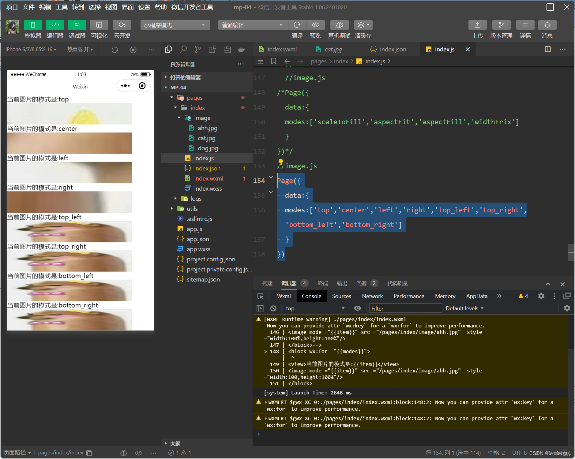
4.5.1 image
image 组件为图像组件, 与HTML 中的< img/ > 类似, 系统默认image 组件的宽度为300 px、高度为2 250 px, image 组件的属性如表所示。

image 组件中的mode 属性有13 种模式, 其中缩放模式有4 种, 裁剪模式有9 种。
1.缩放模式
<block wx:for ="{{modes}}">
<view>当前图片的模式是:{{item}}</view>
<image mode ="{{item}}" src ="/pages/index/image/ahh.jpg"  style ="width:100%,height:100%"/>
</block>
Page({
data:{
modes:['scaleToFill','aspectFit','aspectFill','widthFrix']
}
})
2.裁剪模式
top 不缩放图片, 只显示图片的顶部区域。
bottom 不缩放图片, 只显示图片的底部区域。
center 不缩放图片, 只显示图片的中间区域。
left 不缩放图片, 只显示图片的左边区域。
right 不缩放图片, 只显示图片的右边区域。
top_left 不缩放图片, 只显示图片的左上边区域。
top_right 不缩放图片, 只显示图片的右上边区域。
bottom_left 不缩放图片, 只显示图片的左下边区域。
示例代码:
Page({
  data:{
  modes:['top','center','left','right','top_left','top_right','bottom_left','bottom_right']
  }
})
Page({
data:{
modes:['top','center','left','right','top_left','top_right','bottom_left','bottom_right']
}
})
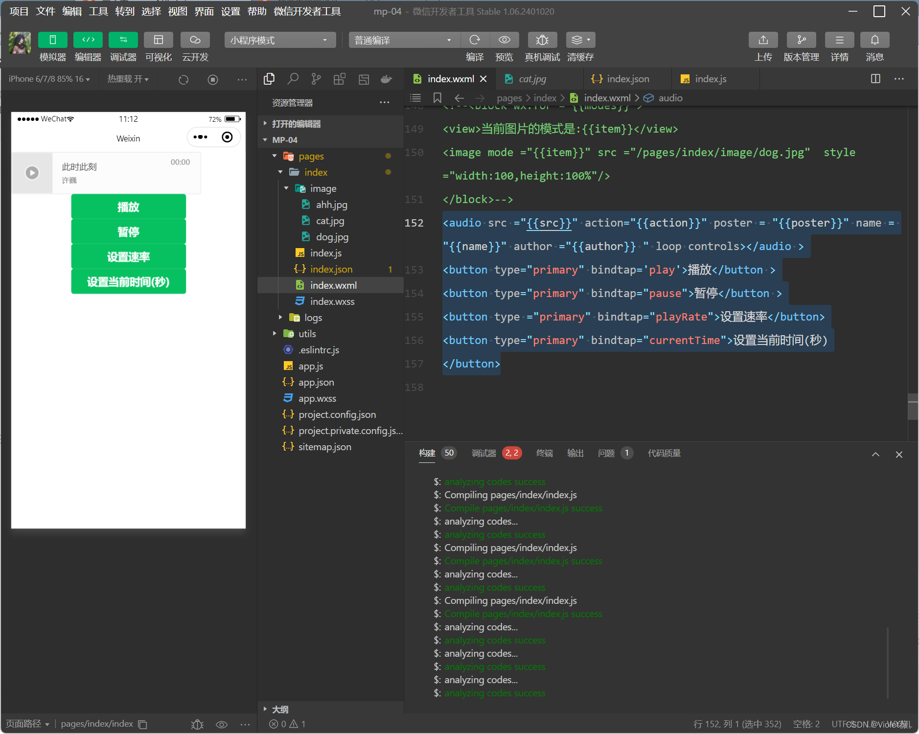
4.5.2 audio
audio 组件用来实现音乐播放,暂停等,其属性如下:
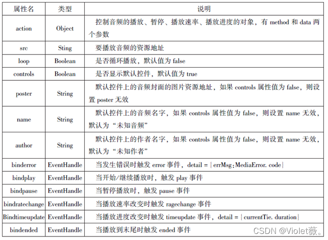
示例代码:
<audio src ="{{src}}" action="{{action}}" poster = "{{poster}}" name = "{{name}}" author ="{{author}} " loop controls></audio >
<button type="primary" bindtap='play'>播放</button >
<button type="primary" bindtap="pause">暂停</button >
<button type ="primary" bindtap="playRate">设置速率</button>
<button type="primary" bindtap="currentTime">设置当前时间(秒)
</button>
Page( {
data:{
poster:'http://.gtimg.cn/usic/hoto new/002R300x300M000003rsKF44Gyask.jpg?max age=2592000',
name:'此时此刻',
author:'许巍',
src:'http://ws.stream.qqmusic.gg.comM500001VfvsJ21xFab.mp3? guidffffffff82def4af4b12b3cd9337d5e7&uin=346897220&vkey=6292F51E1E384E06DCBDC9AB7C49FD713D632D313AC4858BACB8DDD29067D3C601481D36E62053BF8DFEAF74C0A5CCFADD6471160CAF3E6A&fromtag=46',
},
play:function(){
this.setData({
action:{
method: 'play'
}
})
},
pause:function(){
this.setData({
action:{
method: 'pause'
}
})
},
playRate:function(){
this.setData({
action:{
method:'setPlaybackRate',
data:10 //速率
}
})
console.log('当前速率:'+this.data.action.data)
},
currentTime:function(e){
this.setData({
action:{
method:'setCurrentTime',
data:120
}
})
}
})
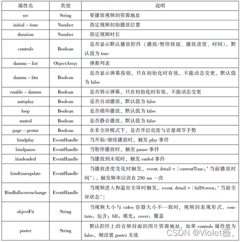
4.5.3 video
用于实现视频的播放与暂停等,视频默认宽度为300px,高为225px。属性如下:
示例代码如下:
Page({
  data:{
  srC:"",
  },
  bindButtonTap:function(){
  var that =this
  wx.chooseVideo()({
  sourceType: [ 'album' ,'camera'],
  maxDuration:60,
  camera:['front','back'],
  success:function(res){
  that.setData({
  src:res.tempFilePath
  })
}
})
}
})
<video src ="{{src}}" controls ></video >
<view class="btn-area">
<button bindtap="bindButtonTap">获取视频</button>
</view>

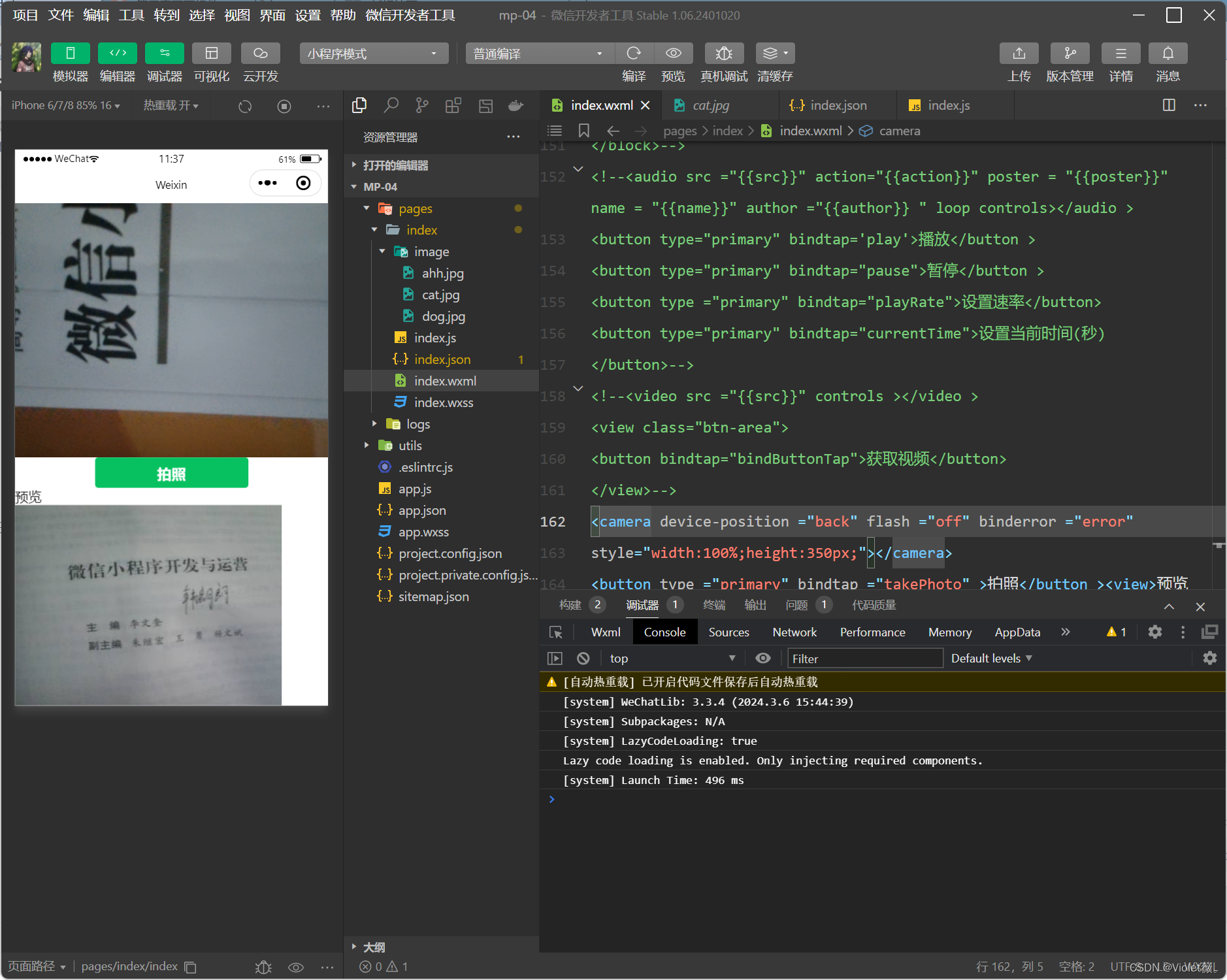
4.5.4 camera
camera 组件为系统相机组件, 可以实现拍照或录像功能。 在一个页面中, 只能有一个camera 组件。 在开发工具中运行时, 使用电脑摄像头实现拍照或录像; 在手机中运行时, 使用手机前后摄像头实现拍照或录像。

<camera device-position ="back" flash ="off" binderror ="error"
style="width:100%;height:350px;"></camera>
<button type ="primary" bindtap ="takePhoto" >拍照</button ><view>预览</view >
<image mode ="widthFix" src ="{{src}}"></image>
Page({
takePhoto(){
const ctx=wx.createCameraContext()//创建并返回 camera上下文对象/拍照,成功则返回图片
ctx.takePhoto({
quality:' high',
success:(res)=>{
this.setData({
src:res.tempImagePath
})
}
})
},
error(e){
console.log(e.detail)
}
})
4.6 其他组件
在小程序中,除了前面介绍的组件以外,map组件和canvas组件1比较常用。
4.6.1 map
map组件用于在页面中显示地图或路径,常用于LBS(基于位置服务)或路径指引,功能相对百度地图、高德地图较简单,目前具备绘制图标、路线、半径等能力,不能在croll-view、swiper、picker-view、movable -view组件中使用。map组件的属性如表所示:

map组件的markers属性用于在地图上显示标记的位置,属性如下:

map组件的palyhine 属性用来指定一系列坐标点,从数组第杉成条路线,可以指定线的颜色、宽度、线型以及是否带箭头等,其关属性如表所示:

<map id="map"
  longitude ="108.9200"
  latitude="34.1550"
  scale ="14"
  controls="{{controls}}"
  bindcontroltap="contro1tap"
  markers="{{markers}}"
  bindmarkertap="markertap"
  polyline="{{polyline}}"
  bindregionchange="regionchange"
  show-location
  style="width:100%;height:300;">
</map>
Page({
data:{
markers:[{
iconPath:"/pages/news/3.gif",
id:0,
longitude:"108.9290",
latitude:"34.1480",
width:50,
height:50
}],
polyline:[{
points:[
{
longitude:"108.9200",
latitude:"34.1400",
},
{
longitude:"108.9200",
latitude:"34.1500",
},
{
longitude:"108.9200",
latitude:"34.1700",
}
],
color:"#00ff00",
width:2,
dottedLine:true
}],
controls:[{
id:1,
iconPath:'/pages/news/3.gif',
position: {
left:0,
top:300,
width:30,
height:30,
},
clickable:true
}]
},
regionchange(e){
console.log(e.type)
},
markertap(e) {
console.log(e.markerId)
},
controltap(e){
console.log(e.controlId)
}
}) 
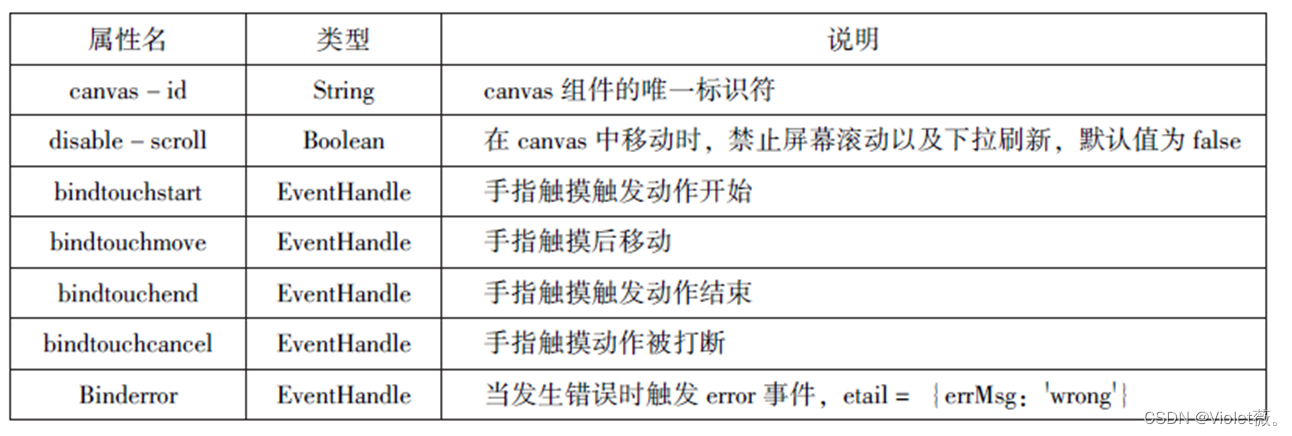
4.6.2 canvas
canvas组件用来绘制图形,相当于一块无色透明的普通图布。canvas组件本身并没有绘图能力、仅仅是图形容器,通过绘图AP1实现绘图功能。在默认情况下,canvas组件的默认宽度为300px,高度为225px,同一页面中的canvas-id不能重复,否则会出错。
实现绘图需要三步:
1.创建一个canvas绘图上下文
var context=wx.createCanvasContext('myCanvas')2.使用canvas绘图上下文进行描述
context.setFillStyle('green')//设置绘图上下文的填充色为绿色
context.fillRect(10,10,200,100)//方法画一个矩形,填充色为设置的绿色
3.画图
context.draw()示例代码:
<canvas canvas-id="maCanvas" style="border: 1px solid red;"></canvas>Page({
onLoad:function(options){
var ctx =wx.createCanvasContext('myCanvas')
ctx.setFillStyle('green')
ctx.fillRect(10,10,200,100)
ctx.draw()
}
}) 
4.7本章小结
本章介绍了小程序中的常用组件,包括容器组件(view、seroll-view、swiper)、基础内容组件(icon、text、progress、rich-text)、表单组件(form、input、button、radio、check-box、label、picker、picker-view、slider、swich、textarea)、多媒体组件( audio、image、video、camera)、其他组件(map、canvas等)。熟练掌握这些组件的属性和方法是开发小程序的必备技能。


 1500
1500


 被折叠的 条评论
为什么被折叠?
被折叠的 条评论
为什么被折叠?
 到【灌水乐园】发言


