


【开发工具界面功能介绍】
1.工具栏
在工具栏中可以实现多种功能。
2.模拟区
在模拟区中选择模拟手机的类型、显示比例、网络类型后,模拟器中会显示小程序的运行效果。
3. 目录文件区
目录文件区用来显示当前项目的目录结构。
4.编辑区
编辑区用来实现对代码的编辑操作。
5.调试区
调试区的功能是帮助开发者进行代码调试及排查有问题的区域。
第一个小程序:

{
  "usingComponents": {
  }
}【小程序的基本目录结构】
【主体文件】:
app.js 小程序逻辑文件,主要用来注册小程序全局实例。
app.json 小程序公共设置文件,配置小程序全局设置。
app.wxss 小程序主样式表文件。

【页面文件】:
.js文件 页面逻辑文件,在该文件中编写JavaScript代码控制页面逻辑。
.wxml文件 页面结构文件,用于设计页面的布局、数据绑定等。
.wxss文件 页面样式表文件,用于定义本页面中用到的各类样式表。
.json文件 页面配置文件。
【配置文件】
【全局配置项】:

【定义当前页面的生命周期函数】
在 Page()函数的参数中,可以定义当前页面的生命周期函数。页面的生命周期函数主要有onLoad、onShow、onReady、onHide、onUnload。
1. onLoad 页面加载函数。当页面加载完成后调用该函数。一个页面只会调用一次。
2. onShow 页面显示函数。当页面显示时调用该函数。每次打开页面都会调用一次。
3. onReady 页面数据绑定函数。当页面初次数据绑定完成时调用该函数。一个页面只会调用一次,代表页面已经准备就绪,可以和视图进行交互。
4. onHide 页面隐藏函数。当页面隐藏时及当 navigateTo 或小程序底部进行 tab 切换时,调用该函数。
5.onUnload 页面卸载函数。当页面卸载、进行 navigateBack 或 redirectTo 操作时,调用该函数。
页面程序


//index.js
Page({
  //页面的初始数据
  data:{
    name:'学生党',
    age:10,
    birthday:[{year:2014},{month:11},{date:11}],
    object:{hobby:'game'},
  students :[
    {nickname:"Tom", height:180, weight:150},
    {nickname:"Anne", height:169, weight:100}]
}
})
//index.wxml
<view>姓名:{{name}}</view>
<view>年龄:{{age}}</view>
<view>出生日期:
{{birthday[0].year}}年
{{birthday[1].month}}月
{{birthday[2].date}}日
</view>
<view>爱好:{{object.hobby}}</view>
<view>算术运算:{{age + num}}</view>
<view>逻辑运算:{{age == 40}}</view>
<view>三元运算:{{1==2 ? 3:4}}</view>
<template name="stu">
<view wx:for="{{students}}">
<text>姓名:{{item.nickname}}</text>
<text>身高:{{item.height}}</text>
<text>体重:{{item.weight}}</text>
</view>
</template>
<template is="stu" data="{{students}}"></template>
盒子模型:
微信小程序的视图层由WXML和WSXX组成。
盒子模型在css中,一个独立的盒子模型由内容(content)、内边距(padding)、边框(border)和外边距(margin)4个部分组成。

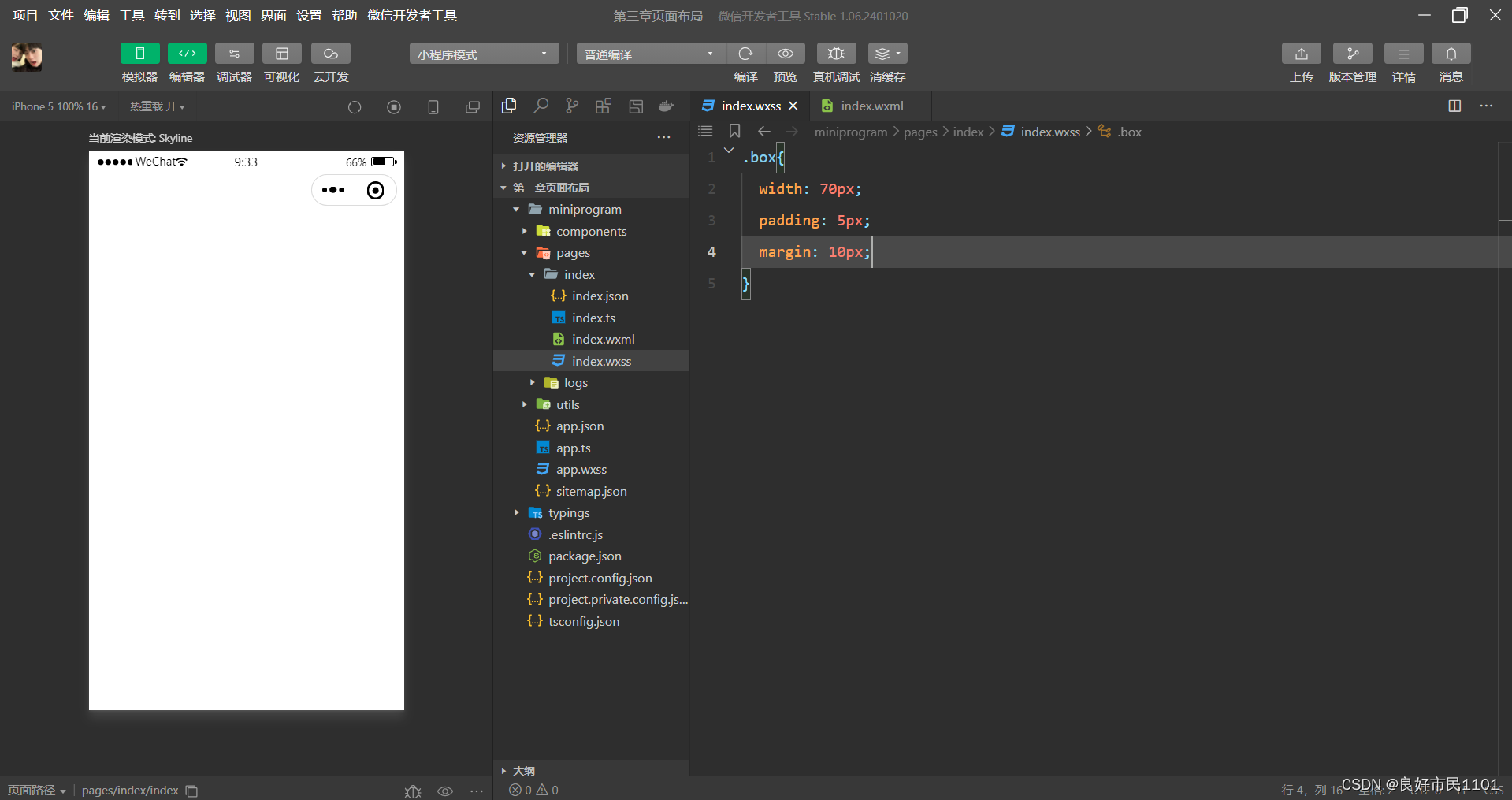
//index.wxss
.box{
  width: 70px;
  padding: 5px;
  margin: 10px;
}
盒子模型结构:

盒子模型元素
width和height 内容的宽度和高度。
padding-top、padding-right、padding-bottom和padding-left 上内边距、右内边距、底内边距和左内边距。
border-top、border-right、border-bottom和border-left 上边框、右边框、底边框和左边框。
margin-top、margin-right、margin-bottom和margin-left 上外边距、右外边距、底外边距和左外边距。
块级元素与行内元素
块级元素
(1)一个块级元素占一行。
(2)块级元素的默认高度是由内容决定,除非自定义高度。
(3)块级元素的默认宽度是父级元素的内容区宽度,除非自定义宽度。
(4)块级元素的宽度、高度、外边距及内边距都可以自定义设置。
(5)块级元素可以容纳块级元素和行内元素。
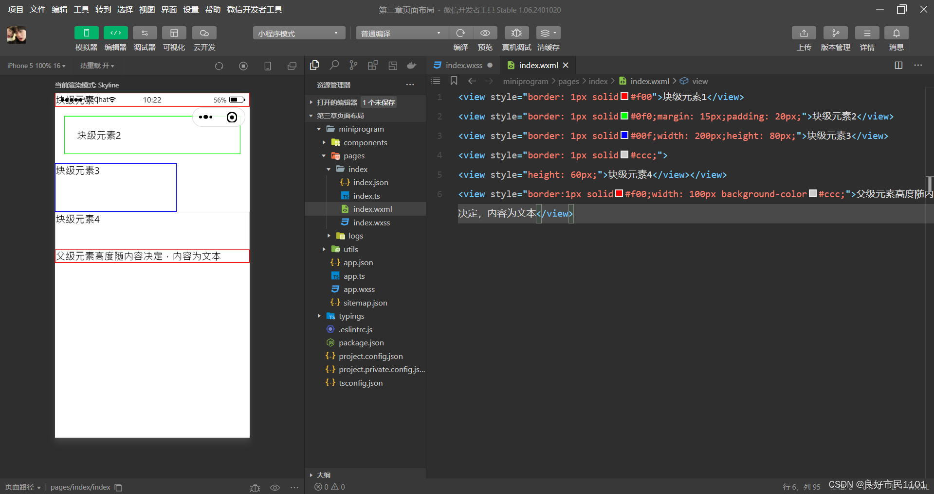
//index.wxml
<view style="border: 1px solid#f00">块级元素1</view>
<view style="border: 1px solid#0f0;margin: 15px;padding: 20px;">块级元素2</view>
<view style="border: 1px solid#00f;width: 200px;height: 80px;">块级元素3</view>
<view style="border: 1px solid#ccc;">
<view style="height: 60px;">块级元素4</view></view>
<view style="border:1px solid#f00;width: 100px background-color#ccc;">父级元素高度随内容决定,内容为文本</view>
行内元素
(1)行内元素不能被设置高度和宽度,其高度和宽度由内容决定。
(2)行内元素内不能放置块级元素,只能容纳文本或其他行内元素。
(3)同一块内,行内元素和其他行内元素显示在同一行

//index.wxml
<view style="padding: 20px;">
  <text style="border: 1px solid#f00">文本一</text>
  <text style="border: 1px solid#0f0;margin: 10px;padding: 5px;">文本2</text>
  <view style="border: 1px solid#0ff;display: inline">块级元素设置为行内元素</view>一行
  显示不全,自动换行显示
</view>
行内块元素

//index.wxml
<view>
元素显示方式的<view style="display:inline-block;border:1px solid#f00;margin: 10px;padding: 10px;width: 200px;">块级元素、行内元素和行内块元素
</view>三种类型。
</view>
浮动与定位
元素浮动
float
none——默认值,表示元素不浮动;
left——元素向左浮动;
right——元素向右浮动。

//index.wxml
<view>box1,box2,box3 没浮动</view>
 <view style="border: 1px solid #f00;padding: 5px">
 <view style="border: 1px solid #0f0">box1</view>
 <view style="border: 1px solid #0f0">box2</view>
 <view style="border: 1px solid #0f0">box3</view>
 </view>
 <view>box1 左浮动</view>
 <view style="border: 1px solid #f00;padding: 5px">
<view style="float: right;border: 1px solid #0f0">box1</view>
<view style="border: 1px solid #0f0">box2</view>
<view style="border: 1px solid #0f0">box3</view>
 </view>
 <view>box1 box2 左浮动</view>
 <view style="border: 1px solid #f00;padding: 5px">
<view style="float: left;border: 1px solid #0f0">box1</view>
<view style="float: left;border: 1px solid #0f0">box2</view>
<view style="border: 1px solid #0f0">box3</view>
 </view>
 <view>box1 box2 box3 左浮动</view>
 <view style="border: 1px solid #f00;padding: 5px">
<view style="float: left;border: 1px solid #0f0">box1</view>
<view style="float: left;border: 1px solid #0f0">box2</view>
<view style="float: left;border: 1px solid #0f0">box3</view>
</view>
清除浮动
clear
left——清除左边浮动的影响,也就是不允许左侧有浮动元素;
right——清除右边浮动的影响,也就是不允许右侧有浮动元素;
both——同时清除左右两侧浮动的影响,
none——不清除浮动。
//index.wxml
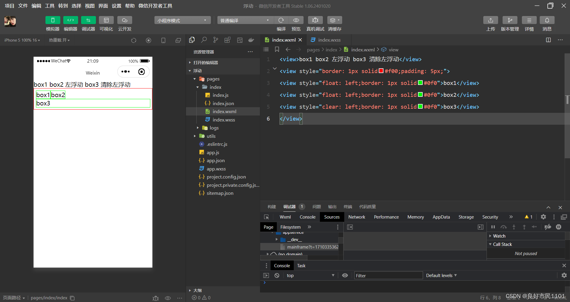
<view>box1 box2 左浮动 box3 清除左浮动</view>
<view style="border: 1px solid#f00;padding: 5px;">
<view style="float: left;border: 1px solid#0f0">box1</view>
<view style="float: left;border: 1px solid#0f0">box2</view>
<view style="clear: left;border: 1px solid#0f0">box3</view>
</view>添加一个空元素
//index.wxml
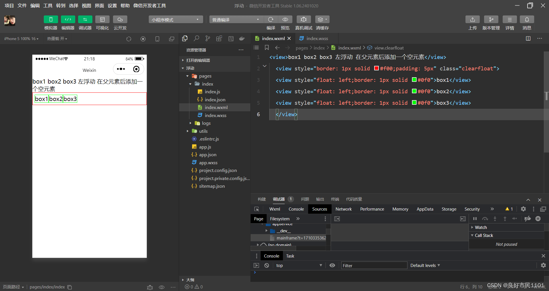
<view>box1 box2 box3 左浮动 在父元素后添加一个空元素</view>
<view style="border: 1px solid #f00;padding: 5px" class="clearfloat">
<view style="float: left;border: 1px solid #0f0">box1</view>
<view style="float: left;border: 1px solid #0f0">box2</view>
<view style="float: left;border: 1px solid #0f0">box3</view>
</view>
元素定位
position
static——默认值,该元素按照标准流进行布局;
relative——相对定位,相对于它在原文档流的位置进行定位,它后面的盒子仍以标准流方式对待它;
absolute——绝对定位,相对于其上一个已经定位的父元素进行定位,绝对定位的盒子从标准流中脱离,它对其后的兄弟盒子的定位没有影响;
fixed——固定定位,相对于浏览器窗口进行定位。
对box1、box2、box3进行元素静态定位

//index.wxml
<view style="border: 1px solid #0f0;width: 100px;height: 100px">box1</view>
<view style="border: 1px solid #0f0;width: 100px;height: 100px">box2</view>
<view style="border: 1px solid #0f0;width: 100px;height: 100px">box3</view>
对box1、box2、box3进行元素相对定位
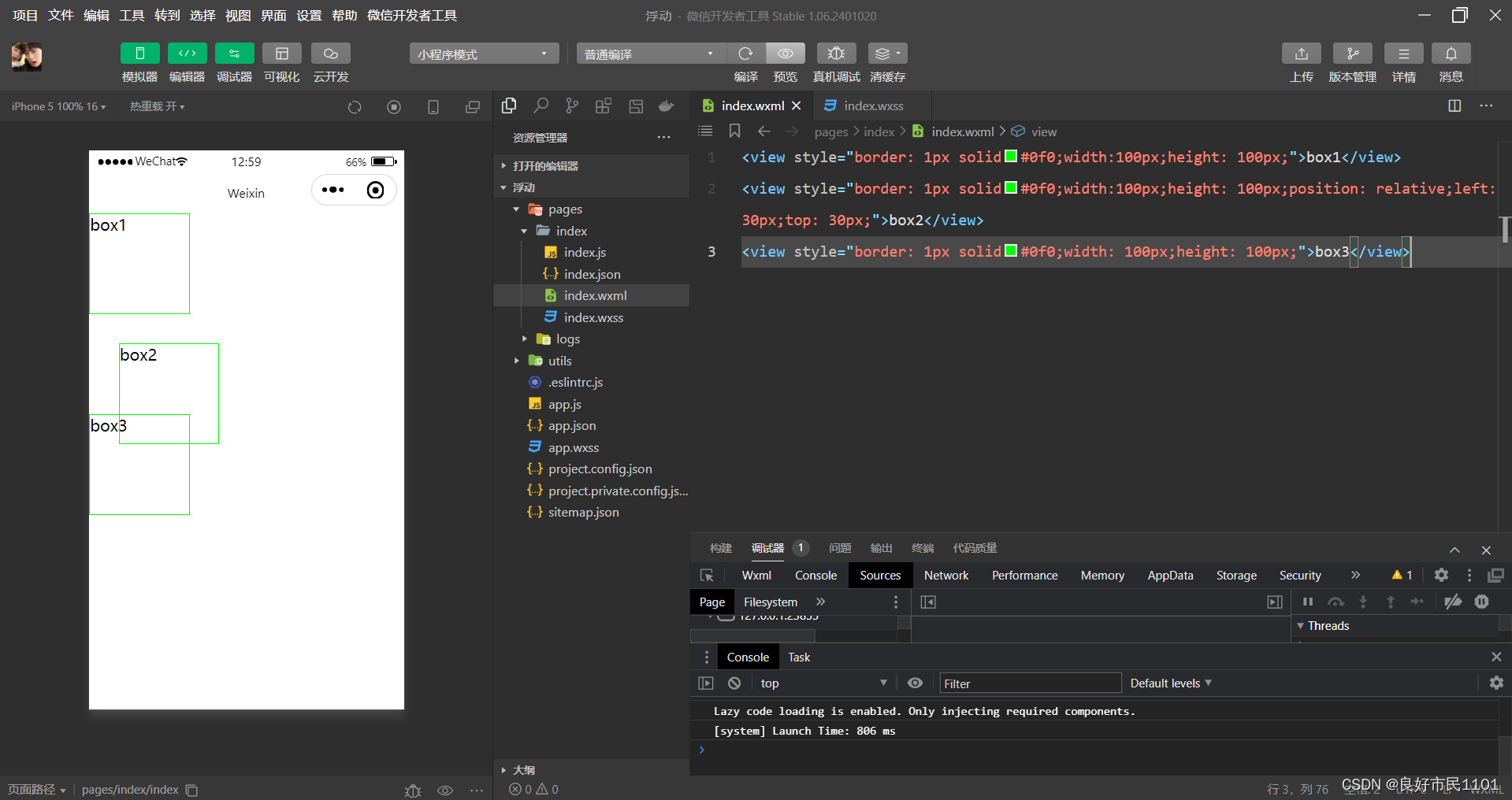
//index.wxml
<view style="border: 1px solid #0f0;width: 100px;height: 100px">box1</view>
<view style="border: 1px solid #0f0;width: 100px;height: 100px;position: relative;left: 30px">box2</view>
<view style="border: 1px solid #0f0;width: 100px;height: 100px">box3</view>
对box1、box2、box3进行元素绝对定位

//index.wxml
<view style="border: 1px solid #0f0;width: 100px;height: 100px">box1</view>
<view style="border: 1px solid #0f0;width: 100px;height: 100px;position: absolute;left: 30px;top: 30px">box2</view>
<view style="border: 1px solid #0f0;width: 100px;height: 100px">box3</view>
对box1、box2、box3进行元素固定定位

//index.wxml
<view style="border: 1px solid #0f0;width: 100px;height: 100px">box1</view>
<view style="border: 1px solid #0f0;width: 100px;height: 100px;position:fixed;left: 30px;top: 30px">box2</view>
<view style="border: 1px solid #0f0;width: 100px;height: 100px">box3</view>
将box1、box2、box3的父元素采用相对定位,将box2采用绝对定位
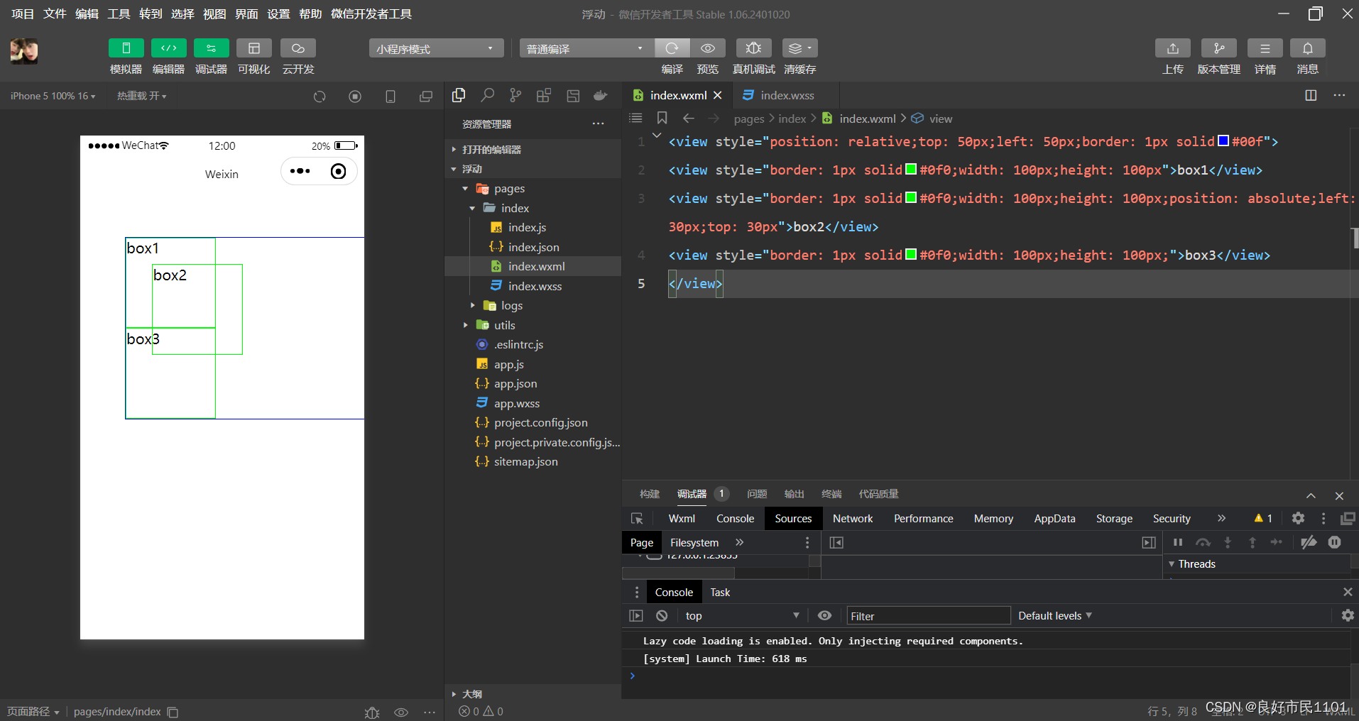
//index.wxml
<view style="position: relative;top: 50px;left: 50px;border: 1px solid#00f">
<view style="border: 1px solid#0f0;width: 100px;height: 100px">box1</view>
<view style="border: 1px solid#0f0;width: 100px;height: 100px;position: absolute;left: 30px;top: 30px">box2</view>
<view style="border: 1px solid#0f0;width: 100px;height: 100px;">box3</view>
</view>
将box1、box2、box3的父元素采用相对定位,将box2采用固定定位

//index.wxml
<view style="position: relative;top: 50px;left: 50px;border: 1px solid#00f">
<view style="border: 1px solid#0f0;width: 100px;height: 100px">box1</view>
<view style="border: 1px solid#0f0;width: 100px;height: 100px;position: fixed;left: 30px;top: 30px">box2</view>
<view style="border: 1px solid#0f0;width: 100px;height: 100px">box3</view>
</view>
flex布局
flex是flexible box的缩写,意为弹性盒子模型,可以简便、完整、响应式地实现各种页面布局。
flex布局主要有容器和项目组成,采用flex布局的元素称为flex容器(flex container),flex布局的所有直接子元素自动成为容器的成员,称为flex项目(flex item)。
容器默认存在两根轴:水平的主轴(main axis)和垂直的交叉轴(cross axis)。主轴的开始位置(与边框的交叉点)叫做main start,结束位置叫做main end;交叉轴的开始位置叫做cross start,结束位置叫做cross end。
项目默认沿主轴排列。单个项目占据的主轴空间叫做main size,占据的交叉轴空间叫做cross size。

设置display属性可以将一个元素指定为flex布局,设置flex-direction属性可以指定主轴方向。主轴既可以是水平方向,也可以是垂直方向。
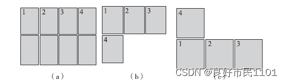
容器属性

row——主轴为水平方向,起点在左端,当元素设置为flex布局时,主轴默认为row;
row-reverse——主轴为水平方向,起点在右端;
column——主轴为垂直方向,起点在顶端;
column-reverse——主轴为垂直方向,起点在底端。
元素在不同主轴方向下的显示效果

(a)row(b)row-reverse(c)column(d)column-reverse
nowrap——不换行,默认值;
wrap——换行,第一行在上方;
wrap-reverse——换行,第一行在下方。
flex-wrap不同值的显示效果
(a)nowrap(b)wrap(c)wrap-reverse
justify-content——与主轴方向有关,默认主轴水平对齐,方向从左到右;
flex-start——左对齐,默认值;
flex-end——右对齐;
center——居中;
space-between——两端对齐,项目之间的间隔都相等;
space-around——每个项目两侧的间隔相等。
justify-content不同值的显示效果。
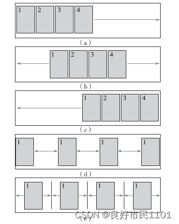
(a)flex-start(b)center(c)flex-end(d)space-between(e)space-around
align-items——与交叉轴方向有关,默认交叉由上到下;
flex-start——交叉轴起点对齐;
flex-end——交叉轴终点对齐;
center——交叉轴中线对齐;
baseline——项目根据它们第一行文字的基线对齐;
stretch——如果项目未设置高度或设置为auto,项目将在交叉轴方向拉伸填充容器,此为默认值。
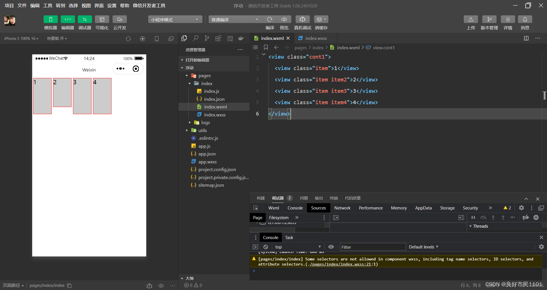
//index.wxml
<view class="cont1">
  <view class="item">1</view>
  <view class="item item2">2</view>
  <view class="item item3">3</view>
  <view class="item item4">4</view>
</view>
//index.wxss
.cont1{
display: flex;
flex-direction: row;
align-items: baseline;
}
.item{
background-color: #ccc;
border: 1px solid#f00;
height: 100px;
width: 50px;
margin: 2px;
}
.item2{
height: 80px;
}
item3{
display: flex;
height: 50px;
align-items: flex-end;
}
item4{
height: 120px;
}

align-content用来定义项目有多根轴线(出现换行后)在交叉轴上的对齐方式,如果只有一根轴线,该属性不起作用。
space-between——与交叉轴两端对齐,轴线之间的间隔平均分布;
space-around——每根轴线两侧的间隔都相等,轴线之间的间隔比轴线与边框间隔大一倍。
其余各属性值的含义与align-item属性含义相同。

(a)flex-start(b)center(c)flex-end
项目属性

1.order
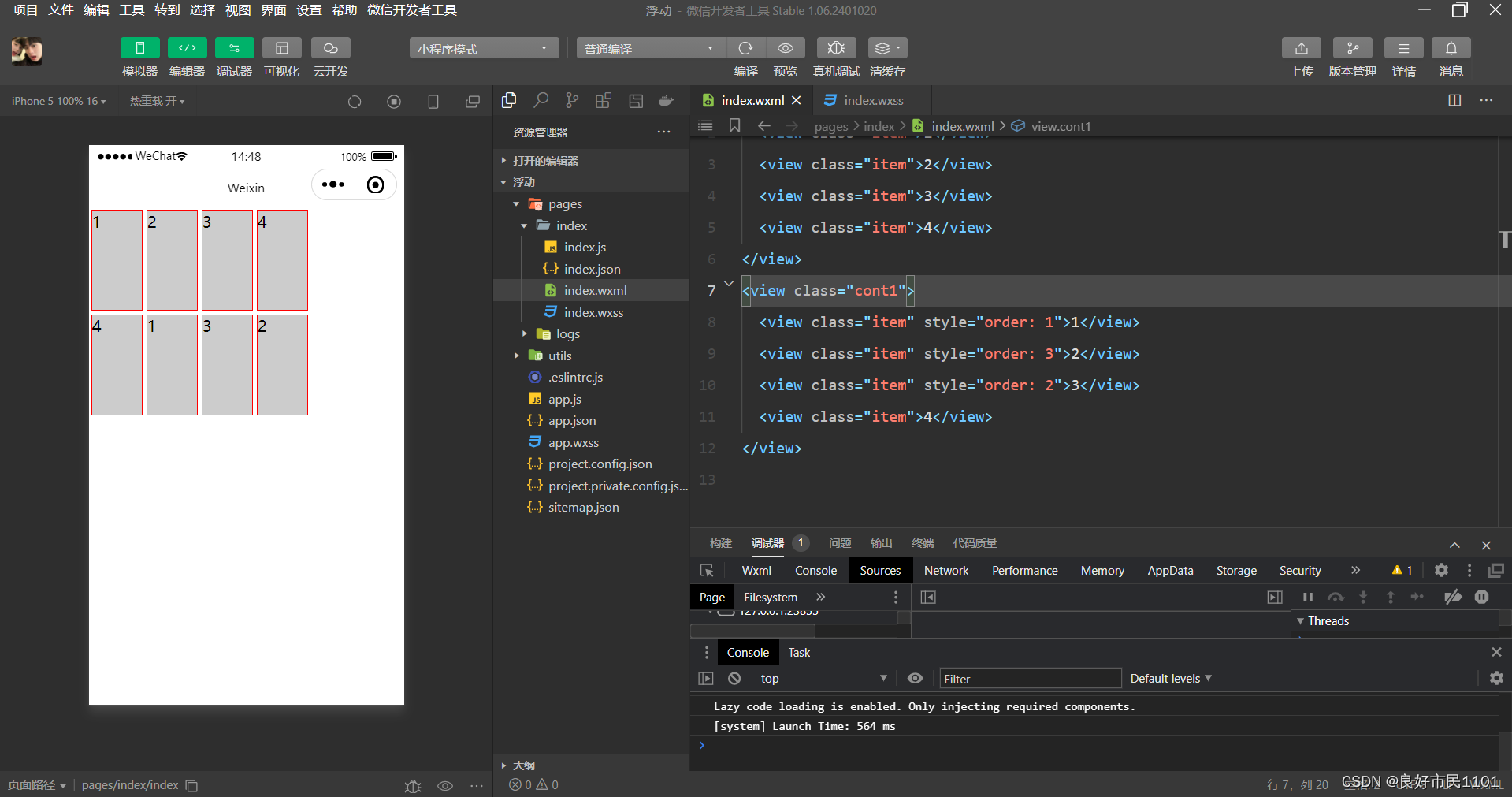
//index.wxml
<view class="cont1">
  <view class="item">1</view>
  <view class="item">2</view>
  <view class="item">3</view>
  <view class="item">4</view>
</view>
<view class="cont1">
  <view class="item" style="order: 1">1</view>
  <view class="item" style="order: 3">2</view>
  <view class="item" style="order: 2">3</view>
  <view class="item">4</view>
</view>
2.flex-grow

//index.wxml
<view class="cont1">
  <view class="item">1</view>
  <view class="item">2</view>
  <view class="item">3</view>
  <view class="item">4</view>
</view>
<view class="cont1">
  <view class="item">1</view>
  <view class="item" style="flex-grow: 1">2</view>
  <view class="item" style="flex-grow: 2">3</view>
  <view class="item">4</view>
</view>
3.flex-shrink

//index.wxml
<view class="cont1">
  <view class="item">1</view>
  <view class="item">2</view>
  <view class="item">3</view>
  <view class="item">4</view>
</view>
<view class="cont1">
  <view class="item">1</view>
  <view class="item" style="flex-shrink: 2">2</view>
  <view class="item" style="flex-shrink: 1">3</view>
  <view class="item" style="flex-shrink: 4">4</view>
</view>
4.flex-basis

//index.wxml
<view class="cont1">
  <view class="item">1</view>
  <view class="item">2</view>
  <view class="item">3</view>
  <view class="item">4</view>
</view>
<view class="cont1">
  <view class="item">1</view>
  <view class="item" style="flex-basis: 100px">2</view>
  <view class="item" style="flex-basis: 200px">3</view>
  <view class="item">4</view>
</view>
组件的定义及属性
组件是页面视图层(WXML)的基本组成单元,组件组合可以构建功能强大的页面结构。
格式如下:
<标签名 属性名="属性值">内容...</标签名>
组件通过属性来进一步细化。不同的组件可以有不同的属性,也可以有一些共用的属性。
id 组件的唯一表示,保持整个页面唯一,不常用。
class 组件的样式类,对应WXSS中定义的样式。
style 组件的内联样式,可以动态设置内联样式。
hidden 组件是否显示,所有组件默认显示。
data-* 自定义属性,组件触发事件时,会发送给事件处理函数。事件处理函数可以通过传入参数对象的 currentTarget.dataset 方式来获取自定义属性的值。
bind*/catch* 组件的事件,绑定逻辑层相关事件处理函数。
容器视图组件
view
view组件是块级组件,没有特殊功能,主要用于布局展示,是布局中最基本的用户界面(User Interface,UI)组件,通过设置view的CSS属性可以实现各种复杂的布局。


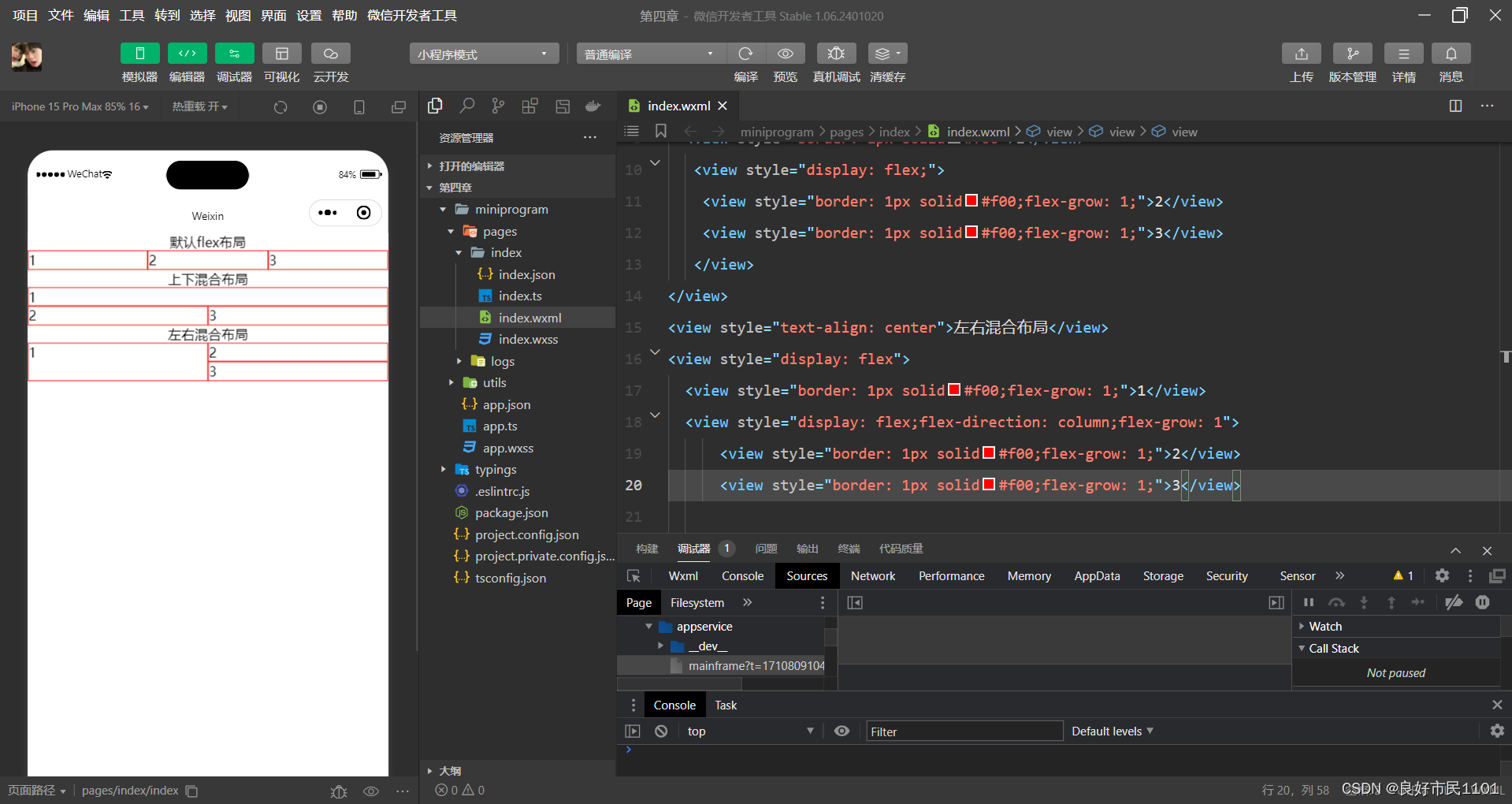
//index.wxml
<view style="text-align: center">默认flex布局</view>
<view style="display: flex">
    <view style="border: 1px solid#f00;flex-grow: 1">1</view>
    <view style="border: 1px solid#f00;flex-grow: 1">2</view>
    <view style="border: 1px solid#f00;flex-grow: 1">3</view>
</view>
<view style="text-align: center">上下混合布局</view>
<view style="display: flex;flex-direction: column">
  <view style="border: 1px solid#f00">1</view>
   <view style="display: flex;">
    <view style="border: 1px solid#f00;flex-grow: 1;">2</view>
    <view style="border: 1px solid#f00;flex-grow: 1;">3</view>
   </view>
</view>
<view style="text-align: center">左右混合布局</view>
<view style="display: flex">
  <view style="border: 1px solid#f00;flex-grow: 1;">1</view>
  <view style="display: flex;flex-direction: column;flex-grow: 1">
      <view style="border: 1px solid#f00;flex-grow: 1;">2</view>
      <view style="border: 1px solid#f00;flex-grow: 1;">3</view>
scroll-view
通过设置scroll-view组件的相关属性可以实现滚动视图的功能。


//index.wxml
<view class="container" style="padding: 0rpx">
<!--垂直滚动,这里必须设置高度-->
  <scroll-view scroll-top="{{scrollTop}}" scroll -y="true"style="height: {{scrollHeight}}px;" class="list" bindscrolltolower="bindDownLoad"
  bindscrolltoupper="topLoad" bindscroll="scroll">
    <view class="item" wx:for="{{list}}">
      <image class="img" src="{{item.pic_url}}"></image>
      <view class="text">
        <text class="title">{{item.name}}</text>
        <text class="description" > {{item.short_description}}</text>
      </view>
    </view>
  </scroll-view>
  <view class="body-view">
    <loading hidden="{{hidden}}" bindchange="loadingChange">
    加载中...
    </loading>
  </view>
</view>
//index.js
var url="http://www.imooc.com/course/ajaxlist";
var page=0;
var page_size=5;
var sort="last";
var is_easy=0;
var lange_id=0;
var pos_id=0;
var unlearn=0;
//请求数据
var loadMore=function(that){
that.setData({
hidden:false
});
wx.request({
url:url,
data:{
page:page,
page_size:page_size,
sort:sort,
is_easy:is_easy,
lange_id:lange_id,
pos_id:pos_id,
unlearn:unlearn
},
success:function(res){
//console.info(that.data.list);
var list=that.data.list;
for(var i=0;i<res.data.list.length;i++){
list.push(res.data.list[i]);
}
that.setData({
list:list
});
page++;
that.setData({
hidden:true
});
}
});
}
page({
data:{
hidden:true,
list:[],
scrollTop:0,
scrollHeight:0
},
onLoad:function(){
var that=this;
wx.getSystemInfo({
success:function(res){
that.setData({
scrollHeight:res.windowHeight
});
}
});
loadMore(that);
},
//页面滑动到底部
bindDownLoad:function(){
var that=this;
loadMore(that);
console.log("lower");
},
scroll:function(event){
this.setData({
scrollTop:event.datail.scrollTop
});
},
topLoad:function(event){
page=0;
this.setData({
list:[],
scrollTop:0
});
loadMore(this);
console.log("lower");
}
})//index.wxss
.userinfo {
display:flex;
flex-direction:column;
align-items:center;
}
.userinfo -avatar {
width:128rpx;
height:128rpx;
margin:20rpx;
border-radius:50%;
}
.userinfo-nickname {
color:#aaa;
}
.usermotto {
margin-top:200px;
}
/**/
scroll -view {
width:100% ;
}
.item{
width:90%;
height:300rpx;
margin:20rpxauto;
background:brown;
overflow:hidden;
}
.item.img {
width:430rpx;
margin-right:20rpx;
float:left;
}
.title{
font-size:30rpx;
display:block;
margin:30rpxauto;
}
.description{
font-size:26rpx;
line-height:15rpx;
}
swiper
swiper组件可以实现轮播图、图片预览、滑动页面等效果。一个完整的 swiper 组件由<swiper/>和<swiper -item/>两个标签组成,它们不能单独使用。<swiper/>中只能放置个或多个<swiper-item/>,若放置其他组件则会被删除;<swiper-item/>内部可以放置任何组件,默认宽高自动设置为 100%。


//index.wxml
<swiper indicator-dots='true' autoplay='true' interval='5000' duration='1000'>
  <swiper-item>
    <image src="/image/tp.jpg" style="width: 100%"></image>
  </swiper-item>
    <swiper-item>
      <image src="/image/tx.jpg" style="width: 100%"></image>
    </swiper-item>
    <swiper-item>
      <image src="/image/zp.jpg" style="width: 100%"></image>
    </swiper-item>
</swiper>
基础内容组件
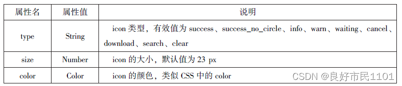
icon
icon组件即图标组件,通常用于表示一种状态。

//index.wxml
<view>icon类型:
  <block wx:for="{{iconType}}">
    <icon type="{{item}}" />{{item}}
  </block>
</view>
<view>icon大小:
  <block wx:for="{{iconSize}}">
    <icon type="success" size="{{item}}" />{{item}}
  </block>
</view>
<view>icon颜色:
  <block wx:for="{{iconColor}}">
    <icon type="success" size="30" color="{{item}}" />{{item}}
  </block>
</view>
//index.js
Page({
data:{
iconType:["success","success_no_circle","info","warn","wating","cancel","download","search","clear"],
iconSize:[10,20,30,40],
iconColor:['#f00','#0f0','#00f']
}
})text
text组件用于展示内容,类似HTML中的<span>,text组件中的内容支持长按选中,支持转义字符“\”,属于行内元素。


//index.wxml
<block wx:for="{{x}}" wx:for-item="x">
<view class="aa">
<block wx:for="{{26-x}}" wx:for-item="x">
<text decode="{{true}}" space="{{true}}"> </text>
</block>
<block wx:for="{{y}}" wx:for-item="y">
<block wx:if="{{y<=2*x-1}}">
<text>*</text>
</block>
</block>
</view>
</block>
<block wx:for="{{x}}" wx:for-item="x">
<view class="aa">
<block wx:for="{{20+x}}" wx:for-item="x">
<text decode="{{true}}"space="{{true}}"> </text>
</block>
<block wx:for="{{y}}" wx:for-item="y">
<block wx:if="{{y<=11-2*x}}">
<text>*</text>
</block>
</block>
</view>
</block>progress
progress组件用于显示进度状态。
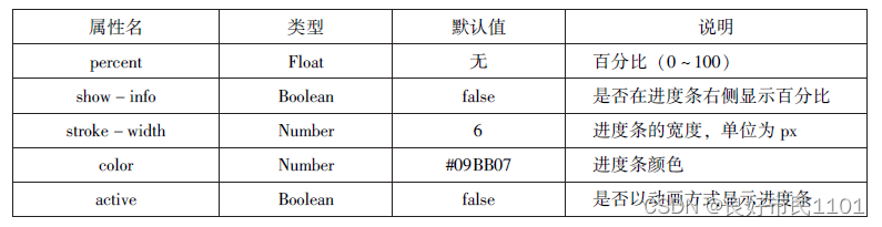

//index.wxml
<view>显示百分比</view>
<progress percent='80' show-info='80'></progress>
<view>改变宽度</view>
<progress percent='50' stroke-width='2'></progress>
<view>自动显示进度条</view>
<progress percent='80' active=""></progress>
表单组件
表单组件的主要功能是收集用户信息,并将这些信息传递给后台服务器,实现小程序与用户之间的沟通。表单组件不仅可以放置在</from>标签中使用,还可以作为单独组件和其他组件混合使用。
button
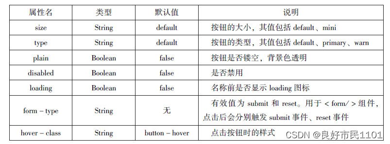

//index.wxml
<button type="default">type:default</button>
<button type="primary">type:primary</button>
<button type="warn">type:warn</button>
<button type="default" bindtap='buttonSize' size="{{size}}">改变size</button>
<button type="default" bindtap='buttonPlain' plain="{{plain}}">改变plain</button>
<button type="default" bindtap='buttonLoading' loading="{{loading}}">改变loading显示</button>
//index.js
Page({
data:{
size:'default',
plain:'false',
loading:'false'
},
buttonSize:function(){
if(this.data.size =="default")
this.setData({size:'mini'})
else
this.setData({size:'default'})
},
buttonPlain:function(){
this.setData({plain:! this.data.plain})
},
buttonLoading:function(){
this.setData({loading:! this.data.loading})
}
})radio
单选框用来从一组选项中选取一个选项。
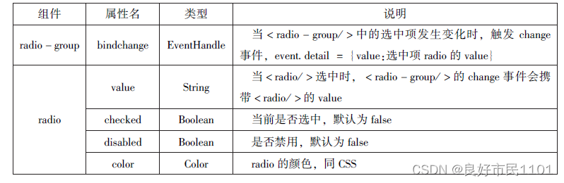

//index.wxml
<viwe>选择您喜爱的城市:</viwe>
<radio-group bindchange="citychange">
  <radio value="西安">西安</radio>
  <radio value="北京">北京</radio>
  <radio value="上海">上海</radio>
  <radio value="广州">广州</radio>
  <radio value="深圳">深圳</radio>
</radio-group>
<view>你的选择:{{city}}</view>
<view>选择您喜爱的计算机语言:</view>
<radio-group class="radio-group" bindchange="radiochange">
  <label class="radio" wx:for="{{radios}}">
    <radio value="{{item.value}}" checked="{{item.checked}}"/>{{item.name}}
  </label>
</radio-group>
<view>你的选择:{{lang}}</view>
checkbox


//index.wxml
<view>选择您想去的城市:</view>
<checkbox-group bindchange="cityChange">
<label wx:for="{{citys}}">
<checkbox value="{{item.value}}" checked='{{item.checked}}'> {{item.value}}
</checkbox>
</label>
</checkbox-group>
<view>您的选择是:{{city}}</view>
//index.js
Page({
city:"",
data:{
citys:[
{name:'km', value:'昆明'},
{name:'sy', value:'三亚'},
{name:'zh', value:'珠海',checked:'true'},
{name:'dl', value:'大连'}]
},
cityChange:function(e){
console.log(e.detail.value);
var city=e.detail.value;
this.setData({city:city})
}
})switch
switch组件的作用类似开关选择器。
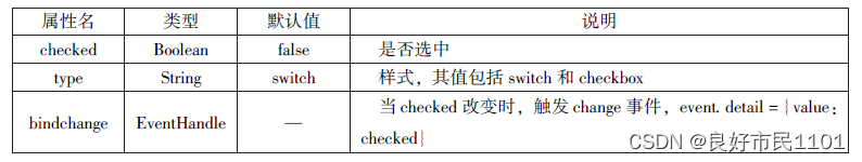
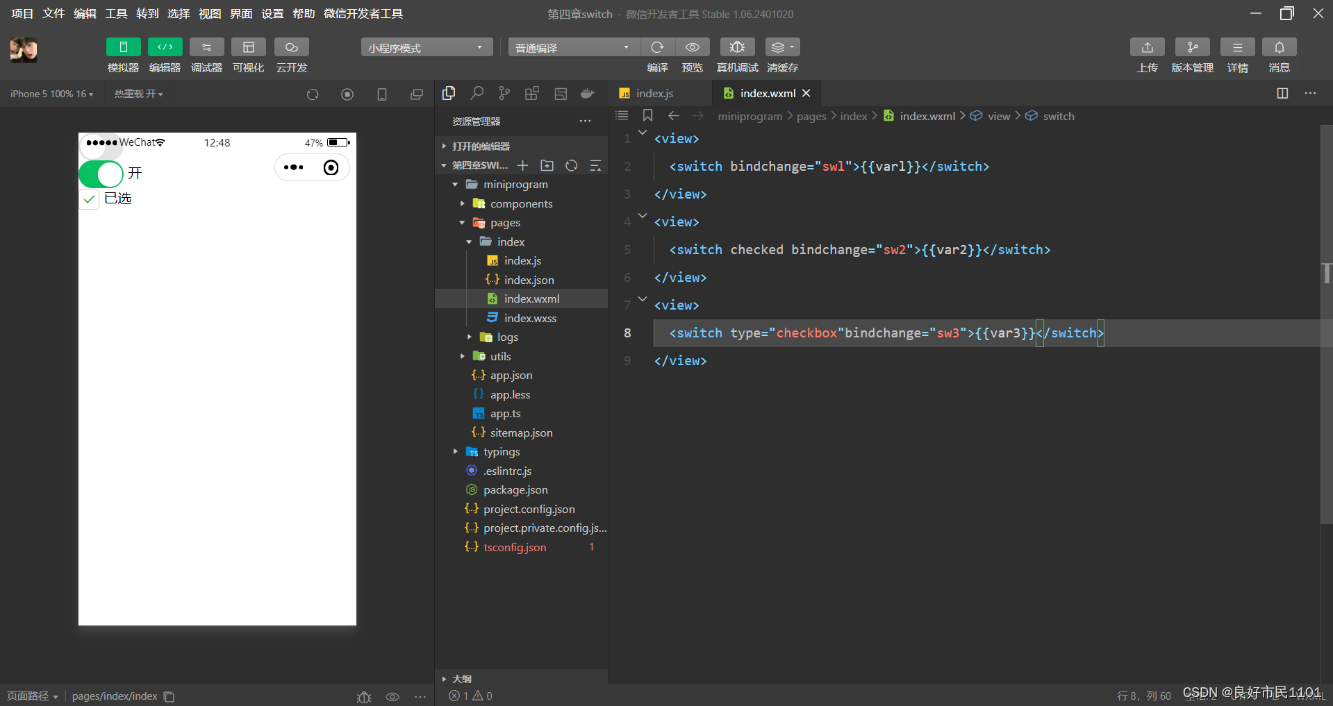
//index.wxml
<view>
  <switch bindchange="swl">{{varl}}</switch>
</view>
<view>
  <switch checked bindchange="sw2">{{var2}}</switch>
</view>
<view>
  <switch type="checkbox"bindchange="sw3">{{var3}}</switch>
</view>
//index.js
Page({
data:{
var1:'关',
var2:'开',
var3:'未选'
},
sw1:function(e){
this.setData({var1:e.detail.value ?'开':'关'})
},
sw2:function(e){
this.setData({var2:e.detail.value ?'开':'关'})
},
sw3:function(e){
this.setData({var3:e.detail.value ?'已选':'未选'})
}
})slider
slider组件为滑动选择器,可以通过滑动来设置相应的值。
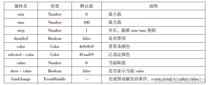

//index.wxml
<view>默认min=0 max=100 step=1</view>
<slider></slider>
<view>显示当前值</view>
<slider show-value></slider>
<view>设置min=20 max=200 step=10</view>
<slider min='0' max='200' step='10' show-value></slider>
<view>背景条红色,已选定颜色绿色</view>
<slider color="#f00" selected-color='#0f0'></slider>
<view>滑动改变icon的大小</view>
<slider show-value bindchange='sliderchange'></slider>
<icon type="success" size='{{size}}'></icon>
//index.js
Page({
data:{
size:'20'
},
sliderchange:function(e){
this.setData({size:e.datail.value})
}
})picker
picker组件为滚动选择器,当用户点击picker组件时,系统从底部弹出选择器供用户选择。分别是:selector(普通选择器)、multiSelector(多列选择器)、time(时间选择器)、data(日期选择器)、region(省市选择器)。
1.普通选择器(mode=selector)


//index.wxml
<view>----range为数组---</view>
  <picker range="{{array}}" value="{{index1}}" bindchange='arrayChange'>
    当前选择:{{array[index1]}}
  </picker>


  <view>---range为数组对象--</view>
  <picker
    bindchange="objArrayChange" value="{{index2}}" range-key="name" range="{{objArray}}">
      当前选择:{{objArray[index2].name}}
    </picker>
//index.js
Page({
data:{
array:['Java','Python','C','C#'],
objArray:[
{id:0,name:'Java'},
{id:1,name:'Python'},
{id:2,name:'C'},
{id:3,name:'C#'}
],
index1:0,
index2:0
},
arrayChange:function(e){
console.log('picker值变为',e.detail.value)
var index=0;
this.setData({
index1:e.detai1.value
})
},
objArrayChange:function(e){
console.log('picker值变为',e.detail.value)
this.setData({
index2:e.detai1.value
})
}
})2.多项选择器(mode=multiSelector)允许用户从不同列中选择不同的选项卡,其选项是二维数组或数组对象。

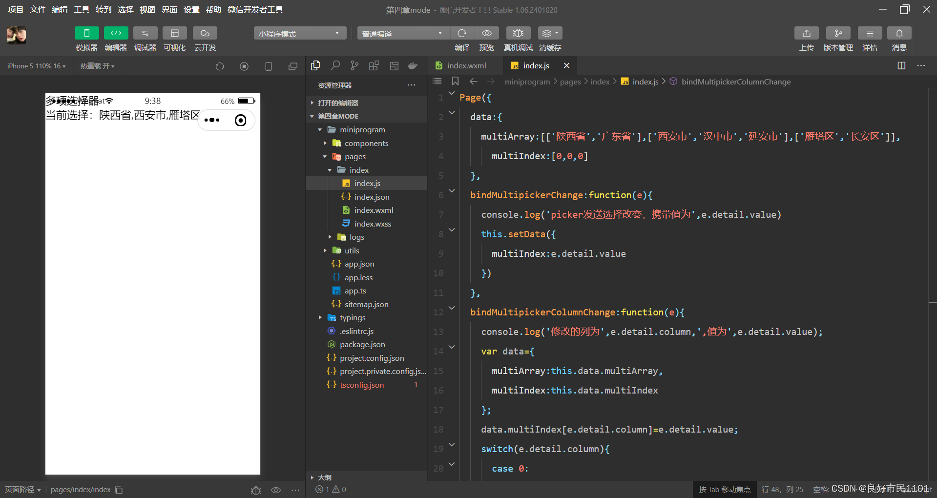
//index.wxml
  <view>多项选择器</view>
  <picker mode="multiseSelector" bindchange="bindMultipickerChange" bindcolumnchange="bindMultipickerColumnChange"
  value="{{multiIndex}}"
  range="{{multiArray}}">
    <view>
    当前选择:{{multiArray[0][multiIndex[0]]}},{{multiArray[1][multiIndex[1]]}},{{multiArray[2][multiIndex[2]]}}
    </view>
  </picker>
//index.js
Page({
data:{
multiArray:[['陕西省','广东省'],['西安市','汉中市','延安市'],['雁塔区','长安区']],
multiIndex:[0,0,0]
},
bindMultipickerChange:function(e){
console.log('picker发送选择改变,携带值为',e.detail.value)
this.setData({
multiIndex:e.detail.value
})
},
bindMultipickerColumnChange:function(e){
console.log('修改的列为',e.detail.column,',值为',e.detail.value);
var data={
multiArray:this.data.multiArray,
multiIndex:this.data.multiIndex
};
data.multiIndex[e.detail.column]=e.detail.value;
switch(e.detail.column){
case 0:
switch(data.multiIndex[0]){
case 0:
data.multiArray[1]=['西安市','汉中市','延安市'];
data.multiArray[2]=['雁塔区','长安区'];
break;
case 1:
data.multiArray[1]=['深圳市','珠海市'];
data.multiArray[2]=['南山区','罗湖区'];
break;
}
data.multiIndex[1]=0;
data.multiIndex[2]=0;
break;
case 1:
switch(data.multiIndex[0]){
case 0:
switch(data.multiIndex[1]){
case 0:
data.multiArray[2]=['雁塔区','长安区'];
break;
case 1:
data.multiArray[2]=['汉台区','南郑区'];
break;
case 2:
data.multiArray[2]=['宝塔区','子长县','延川县'];
break;
}
break;
case 1:
switch(data.multiIndex[1]){
case 0:
data.multiArray[2]=['南山区','罗湖区'];
break;
case 1:
data.multiArray[2]=['香洲区','斗门区'];
break;
}
break;
}
data.multiIndex[2]=0;
console.log(data.multiIndex);
break;
}
this.setData(data);
},
})time

date


//index.wxml
<view>
<picker mode="date"start="{{startdate}}"end="{{enddate}}"value="{{date}}"bindchange="changedate">
选择日期:{{date}}
</picker>
</view>
<view>
<picker mode="time"start="{{starttime}}"end="{{endtime}}"bindchange="changetime">
选择的时间:{{time}}
</picker>
</view>
//index.js
Page({
data:{
startdate:2000,
enddate:2050,
date:'2018',
dtarttime:'00:00',
endtime:'12:59',
time:'8:00'
},
changedate:function(e){
this.setData({date:e.detail.vslue});
console.log(e.detail.value)
},
changetime:function(e){
this.setData({time:e.detail.value})
console.log(e.detail.value)
}
})region


//index.wxml
<picker mode="region"value="{{region}}"custom-item="{{cust-omitem}}"bindchange="changeregion">
      选择省份:{{region[0]}},{{region[1]}},{{region[2]}}
</picker>
//index.js
Page({
data:{
region:['陕西省','西安市','长安区'],
customitem:'全部'
},
changeregion:function(e){
console.log(e.detail.value)
this.setData({
region:e.detail.value
})
}
})picker-view
picker-view组件为嵌入页面的滚动选择器。


/index.wxml
<view>当前日期:{{year}}年{{month}}月{{day}}日</view>
<picker-view indicator-style="height:50px;"style="width:100%;height:300px;"value="{{value}}"bindchange="bindChange">
<picker-view-column>
  <view wx:for="{{years}}" style="line-height: 50px">{{item}}年</view>
</picker-view-column>

<picker-view-column>
  <view wx:for="{{months}}"style="line-height:50px">{{item}}月</view>
</picker-view-column>

<picker-view-column>
  <view wx:for="{{days}}"style="line-height:50px">{{item}}日</view>
</picker-view-column>
</picker-view>
//index.js
const data=new Date()
const years=[]
const months=[]
const days=[]
//定义年份
for(let i =1900;i<=2050;i++){
years.push(i)
}
//定义月份
for(let i =1;i<=12;i++){
months.push(i)
}
//定义日期
for(let i =1;i<=31;i++){
days.push(i)
}
Page({
data:{
years:years,
months:months,
days:days,
year:data.getFullYear(),
month:data.getMonth(),
day:data.getDay(),
value:[118,0,0],//定位到2018年1月1日
},
bindChange:function(e){
const val=e.detail.value
console.log(val);
this.setData({
year:thisdata.years[val[0]],
month:this.data.months[val[1]],
day:this.data.days[val[2]]
})
}
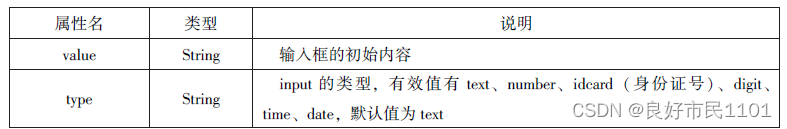
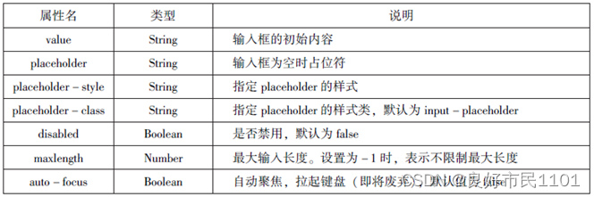
})input
input组件为输入框,用户可以输入相应的信息。


//index.wxml
<input placeholder="这是一个可以自动聚焦的input" auto-focus/>
<input placeholder="这是只有在按钮点击的时候才聚焦" focus="{{focus}}"/>
<button bindtap="bindBottonTap">使得输入框获得焦点</button>
<input maxlength="10" placeholder="最大输入长度为10"/>
<view class="section_title">您输入的是:{{inputValue}}</view>
  <input bindinput="bindKeyInput" placeholder="输入同步到view中"/>
<input bindinput="bindReplaceInput" placeholder="连续的两个1会变成2"/>
<input password type="number"/>
<input password type="text"/>
<input type="digit" placeholder="带小数点的数字键盘"/>
<input type="idcard" placeholder="带身份证输入键盘"/>
<input placeholder-style="color:red" placeholder="占位符字体是红色的"/>
//index.js
Page({
data:{
focus:false,
inputValue:""
},
bindButtonTap:function(){
this.setData({
focus:true
})
},
bindKeyInput:function(e){
this.setData({
inputValue:e.detail.value
})
},
bindReplaceInput:function(e){
var value = e.detail.value
var pos = e.detail.cursor
if(pos !=-1){
var left =e.detail.value.slice(0,pos)
pos =left.replace(/11/g,'2').length
}
return{
value:value.replace(/11/g,'2'),
cursor:pos
}
//return value.replace(/11/g,'2'),
}
})textarea
textarea组件为多行输入框组件,可以实现多行内容的输入。


//index.wxml
<textarea bindblur="bindTextAreaBlur" auto- height placeholder="自动变高"/>
<textarea placeholder="placeholder颜色是红色的" placeholder-style="color:red;"/>
<textarea placeholder="这是一个可以自动聚焦的textarea" auto-focus/>
<textarea placeholder="这个只有在按钮点击的时候才聚焦" focus="{{focus}}"/>
<button bindtap="bindButtonTap">使得输入框获取焦点</button>
<form bindsubmit="bindFormSumbit">
  <textarea placeholder="form中的textarea" name="textarea"/>
<button form-type="submit">提交</button>
</form>
//index.js
Page({
data:{
height:10,
focus:false
},
bindButtonTap:function(){
this.setData({
focus:true
})
},
bindTextAreaBlue:function(e){
console.log(e.detail.value)
},
bindFormSubmit:function(e){
console.log(e.detail.value.textarea)
}
})label
label组件为标签组件,用于提升表单组件的可用性。

//index.wxml
<view><cheakbox> </cheakbox>中国</view>
<view><label><cheakbox> </cheakbox>中国</label></view>
<cheakbox-group bindchange="cityChange">
<label wx:for="{{citys}}">
<checkbox value="{{item.value}}" checked='{{item.checked}}'>{{item.value}}</checkbox>
</label>
</cheakbox-group>
<view>您的选择是:{{city}}</view>
//index.js
Page({
city:"",
data:{
citys:[
{name:'km',value:'昆明'},
{name:'sy',value:'三亚'},
{name:'zh',value:'珠海',checked:'true'},
{name:'dl',value:'大连'}]
},
cityChange:function(e){
console.log(e.detail.value);
var city=e.detail.value;
this.setData({city:city})
}
})form
form组件为表单组件,用来实现将组件内的用户输入信息进行提交。


//index.wxml
<form bindsubmit="formSubmit" bindreset="formReset">
<view>姓名:
  <input type="text" name="xm"/>
  </view>
  <view>性别:
    <radio-group name="xb"/>
      <label>
      <radio value="男" checked/>男</label>
      <label>
      <radio value="女"/>女</label>
  </view>
  <view>爱好:
    <checkbox-group name="hobby">
    <label wx:for="{{hobbies}}">
      <checkbox value="{{item.value}}"
    checked="{{item.checked}}">{{item.value}}</checkbox>
    </label>
    </checkbox-group>
  </view>
  <button formType='submit'>提交</button>
  <button formType='reset'>重置</button>
</form>
//index.js
Page({
hobby:"",
data:{
hobbies:[
{name:'jsj',value:'计算机',checked:'true'},
{name:'music',value:'听音乐'},
{name:'game',value:'玩电竞'},
{name:'swim',value:'游泳',checked:'true'}]
},
formSubmit:function(e){
console.log('from发生了submit事件,携带数据为:',e.detail.value)
},
formReset:function(){
console.log('from发生了reset事件')
}
})多媒体组件
image
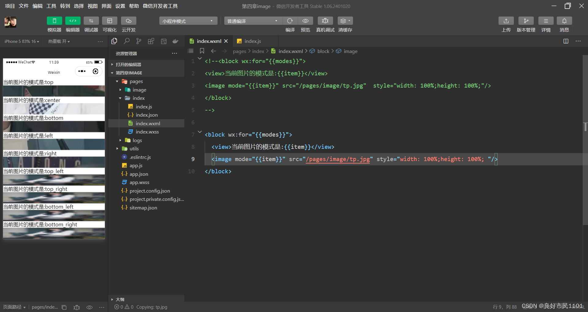
image组件为图像组件,系统默认image组件的宽度为300px、高度为250px。

1.缩放模式:
scaleToFill 不保持纵横比缩放图片,使图片的宽高完全拉伸至填满image元素。
aspectFit 保持纵横比缩放图片,使图片的长边能完全显示出来。可以将图片完整地显示出来。
aspectFill 保持纵横比缩放图片,只保证图片地短边能完全显示出来。图片通常只在水平或垂直方向是完整的,在另一个方向将会发生截取。
widthFix 宽度不变,高度自动变化,保持原图宽高比不变。

//index.wxml
<block wx:for="{{modes}}">
<view>当前图片的模式是:{{item}}</view>
<image mode="{{item}}" src="/pages/image/tp.jpg"  style="width: 100%;height: 100%;"/>
</block>
//index.js
Page({
data:{
modes:['scaleToFill','aspectFit','aspectFill','widthFix']
}
})2.裁剪模式
top 不缩放图片,只显示图片的顶部区域。
bottom 不缩放图片,只显示图片的底部区域。
center 不缩放图片,只显示图片的中间区域。
left 不缩放图片,只显示图片的左边区域。
right 不缩放图片,只显示图片的右边区域。
top_letf 不缩放图片,只显示图片的左上边区域。
top_right 不缩放图片,只显示图片的右上边区域。
bottom_left 不缩放图片,只显示图片的左下边区域。
bottom_right 不缩放图片,只显示图片的右下边区域。
//index.wxml
<block wx:for="{{modes}}">
  <view>当前图片的模式是:{{item}}</view>
  <image mode="{{item}}" src="/pages/image/tp.jpg" style="width: 100%;height: 100%; "/>
</block>
//index.js
Page({
data:{
modes:['top','center','bottom','left','right','top_left','top_right','bottom_left','bottom_right']
}
})audio
audio组件用来实现音乐播放,暂停等。


//index.wxml
<audio src="{{src}}" action="{{action}}" poster="{{poster}}" name="{{name}}" author="{{author}}" loop controls></audio>
<button type="primary" bindtap='play'>播放</button>
<button type="primary" bindtap='pause'>暂停</button>
<button type="primary" bindtap='playRate'>设置速率</button>
<button type="primary" bindtap='currntTime'>设置当前时间(秒)</button>
//index.js
Page({
data:{
poster:'http://y.gtimg.cn/music/photo_new/T002R300x300M000003rsKF44GyaSk.jpg? max_age=2592000',
name:'此时此刻',
author:'许巍',
src:'http://ws.stream.qqmusic.qq.com/M500001VfvsJ21xFqb.mp3?guid=ffffffff82def4af4b12b3cd9337d5e7&uin=346897220&vkey=6292F51E1E384E06DCBDC9AB7C49FD713D632D313AC4858BACB8DDD29067D3C601481D36E62053BF8DFEAF74C0A5CCFADD6471160CAF3E6A&fromtag=46',
},
play:function(){
this.setData({
action:{
method:'play'
}
})
},
pause:function(){
this.setData({
action:{
method:'pause'
}
})
},
playRate:function()
{
this.setData({
action:{
method:'setPlaybackRate',
data:10
}
})
console.log('当前速率:'+this.data.action.data)
},
currentTime:function(e){
this.setData({
action:{
method:'setCurrentTime',
data:120
}
})
}
})video
video组件用来实现视频的播放、暂停等。

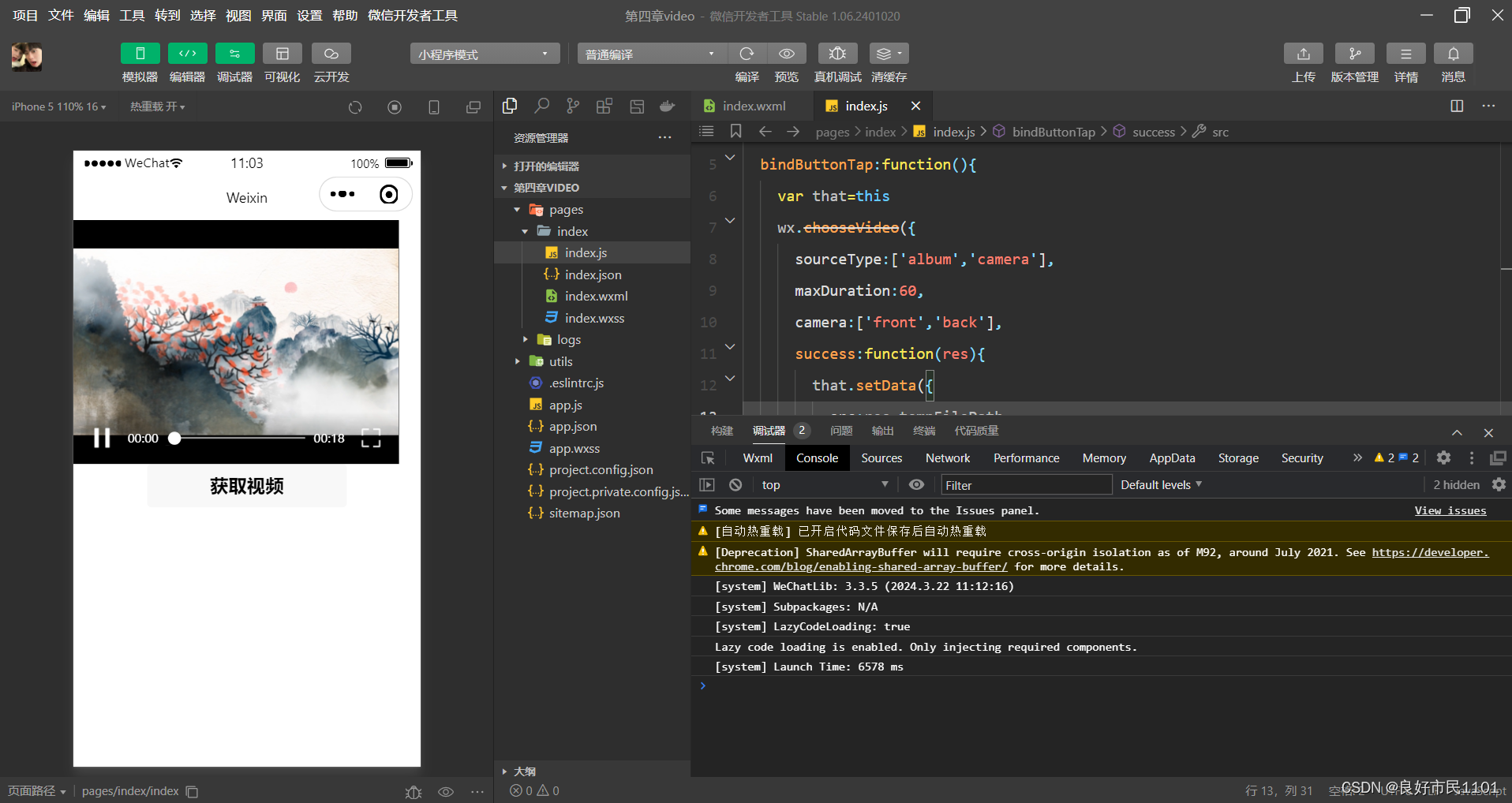
//index.wxml
<video src="{{src}}" controls></video>
<view class="btn-area">
<button bindtap="bindButtonTap">获取视频</button>
</view>
//index.js
Page({
  data:{
    src:"",
  },
  bindButtonTap:function(){
    var that=this
    wx.chooseVideo({
      sourceType:['album','camera'],
      maxDuration:60,
      camera:['front','back'],
      success:function(res){
        that.setData({
          src:res.tempFilePath
        })
      }
    })
  }
})
camera
camera组件为系统相机组件,可以实现拍照或录像功能。在一个页面中只能有一个camera组件。


//index.wxml
<camera device-position="back" flash="off" binderror="error" style="width: 100%;height: 350px;"></camera>
<button type="primary" bindtap="takephoto">拍照</button>
<view>预览</view>
<image mode="widthFix" src="{{src}}"></image>
//index.js
Page({
  takephoto(){
    const ctx=wx.createCameraContext()
    ctx.takePhoto({
      quality:'high',
      success:(res)=>{
        this.setData({
        src:res.tempImagePath
      })
    }
  })
},
error(e){
  console.log(e.detail)
}
})
其他组件
map
map组件用于在页面中显示地图或路径。不能在croll-view、swiper、picker-view、movable-view组件中使用。


map组件的makers属性用于在地图上显示标记的位置。
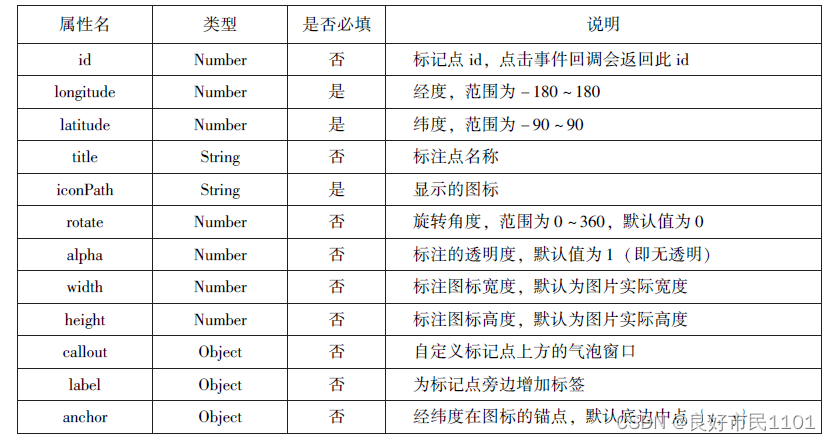
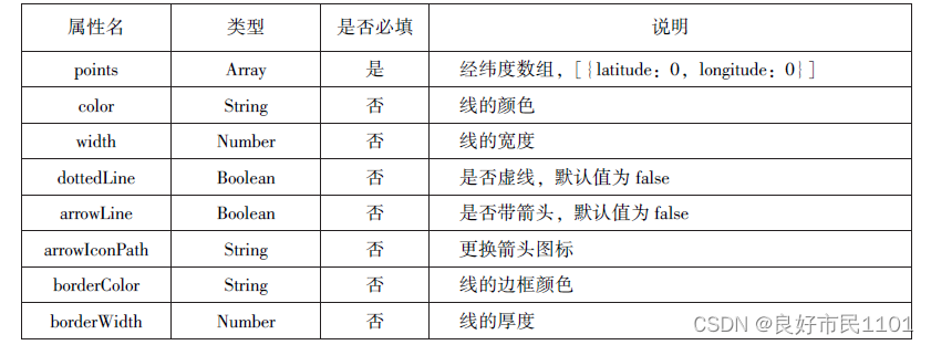
map组件的polyline属性用来指定一系列坐标点,从数组第一项连线到最后一项,形成一条路线,可以指定线的颜色、宽度、线型以及是否带箭头等。

//index.wxml
<map id="map"
  longitude="108.9200"
  latitude="34.1550"
  scale="14"
  controls="{{controls}}"
  bindcontroltap="controltap"
  markers="{{markers}}"
  bindmarkertap="markertap"
  polyline="{{polyline}}"
  bindregionchange="regionchange"
  show-location
  style="width: 100%;height: 300px;">
  </map>
Page({
  data:{
    markers:[{
      iconPath:"/pages/dw.png",
      id:0,
      longitude:"108.9290",
      latitude:"34.1480",
      width:50,
      height:50
    }],
    polyline:[{
      points:[
        {
          longitude:"108.9200",
          latitude:"34.1400",
        },
        {
          longitude:"108.9200",
          latitude:"34.1500"
        },
        {
          longitude:"108.9200",
          latitude:"34.1700"
        }
      ],
      color:"#00ff00",
      width:2,
      dottedLine:true
    }],
    controls:[{
      id:1,
      iconPath:'/pages/dw.png',
      position:{
        left:0,
        top:300,
        width:30,
        height:30
      },
      clickable:true
    }]
  },
  regionchange(e){
    console.log(e.type)
  },
  markertap(e){
    console.log(e.markerId)
  },
  controltap(e){
    console.log(e.controlId)
  }
})
canvas
canvas组件用来绘制图形,相当于一块无色透明的普通画布。


//index.wxml
<canvas canvas-id="myCanvas" style="border: 1px solid red;"/>
//index.js
Page({
  onLoad:function(options){
    var ctx=wx.createCanvasContext('myCanvas')
    ctx.setFillStyle('green')
    ctx.fillRect(10,10,200,100)
    ctx.draw()
  }
})
网络API
网络API可以帮助开发者实现网络URL访问调用、文件的上传和下载、网络套数字的使用等功能处理。微信开发团队提供10个网络API接口。
wx.request(Object)接口 用于发起HTTPS请求。
wx.uploadFile(Object)接口 用于将本地资源上传到后台服务器。
wx.downloadFile(Object)接口 用于下载文件资源到本地。
wx.connectSocket(Object)接口 用于创建一个WebSocket连接。
wx.sendSocketMessage(Object)接口 用于实现通过WebSocket连接发送数据。
wx.closeSocket(Object)接口 用于关闭WebSocket连接。
wx.onSocketOpen(CallBack)接口 用于监听WebSocket连接打开事件。
wx.onSocketError(CallBack))接口 用于监听WebSocket错误。
wx.onSocketMessage(CallBack)接口 用于实现监听WebSocket接收到服务器的消息事件。
wx.onSocketClose(CallBack)接口 用于实现监听WebSocket关闭。
发起网络请求
wx.request(Object)实现向服务器发送请求、获取数据等各种网络交互操作。一个微信小程序同时只能有5个网络请求连接,并且是HTTPS请求。


通过wx.request(Object)获取百度(https://www.baidu.com)首页的数据。

//index.wxml
<button type="primary" bindtap="getbaidutap"></button>
<textarea value="{{html}}" auto-focus="0"></textarea>
//index.js
Page({
  data:{
    html:""
  },
  getbaidutap:function(){
    var that=this;
    wx.request({
      url: 'https:/www.baidu.com',
      data:{},
      header:{'Content-Type':'application/json'},
      success:function(res){
        console.log(res);
        that.setData({
          html:res.data
        })
      }
    })
  }
})
通过wx.request(Object)的GET方法获取邮政编码对应的地址信息。

//index.wxml
<view>邮政编码:</view>
<input type="text" bindinput="input" placeholder="6位邮政编码"/>
<button type="primary" bindtap="find">查询</button>
<blaock wx:for="{{address}}">
  <block wx:for="{{item}}">
    <text>{{item}}</text>
  </block>
</blaock>
//index.js
Page({
  data:{
    postcode:"",
    address:[],
    errMsg:"",
    error_code:-1
  },
  input:function(e){
    this.setData({
      postcode:e.detail.value,
    })
    console.log(e.detail.value)
  },
  find:function(){
    var postcode=this.data.postcode;
    if(postcode!=null&&postcode!=""){
      var self=this;
      wx.showToast({
        title: '正在查询,请稍后....',
        icon:'loading',
        duration:10000
      });
      wx.request({
        url: 'https://v.juhe.cn/postcode/query',
        data:{
          'postcode':postcode,
          'key':'0ff9bfccdf147476e067de994eb5496e'
        },
        header:{
          'Content-Type':'application/json',
        },
        method:'GEt',
      success:function(res){
        wx.hideToast();
        if(res.data.error_code==0){
          console.log(res);
          self.setData({
            errMsg:"",
            error_code:res.data.result.list
          })
        }
        else{
          self.setData({
            errMsg:res.data.reason||res.data.reason,
            error_code:res.data.error_code
          })
        }
      }

      })

    }
  }
})
通过wx.request(Object)的POST方法获取邮政编码对应的地址信息。

//index.wxml
<view>邮政编码:</view>
<input type="text" bindinput="input" placeholder="6位邮政编码"/>
<button type="primary" bindtap="find">查询</button>
<blaock wx:for="{{address}}">
  <block wx:for="{{item}}">
    <text>{{item}}</text>
  </block>
</blaock>
//index.js
Page({
data:{
postcode:"",
address:[],
errMsg:"",
error_code:-1
},
input:function(e){
this.setData({
postcode:e.detail.value,
})
console.log(e.detail.value)
},
find:function(){
var postcode=this.data.postcode;
if(postcode!=null&&postcode!=""){
var self=this;
wx.showToast({
title: '正在查询,请稍后....',
icon:'loading',
duration:10000
});
wx.request({
url: 'https://v.juhe.cn/postcode/query',
data:{
'postcode':postcode,
'key':'0ff9bfccdf147476e067de994eb5496e'
},
header:{
'Content-Type':'application/json',
},
method:'POST',
success:function(res){
wx.hideToast();
if(res.data.error_code==0){
console.log(res);
self.setData({
errMsg:"",
error_code:res.data.result.list
})
}
else{
self.setData({
errMsg:res.data.reason||res.data.reason,
error_code:res.data.error_code
})
}
}
})
}
}
})上传文件
wx.uploadFile(Object)接口用于将本地资源上传到开发者服务器,并在客户端发起一个HTTPS POST请求。


//index.wxml
<button type="primary" bindtap="uploadimage">上传图片</button>
<image src="{{img}}" mode="widthFix"/>
//index.js
Page({
data:{
img:null,
},
uploadimage:function(){
var that=this;
wx.chooseImage({
success:function(res){
var tempFilePaths=res.tempFilePaths
upload(that.tempFilePaths);
}
})
function upload(page,path){
wx.showToast({
icon: 'loading',
title:"正在上传"
}),
wx.uploadFile({
url:"http://localhost/",
filePath: path[0],
name: 'file',
success:function(res){
console.log(res);
if(res.statusCode!=200){
wx.showModal({
title: '提示',
content: '上传失败',
showCancel:false
})
return;
}
var data=res.data
page.setData({
img:path[0]
})
},
fail:function(e){
console.log(e);
wx.showModal({
title: '提示',
content: '上传失败',
showCancel:false
})
},
complete:function(){
wx.hideToast();
}
})
}
}
})
下载文件
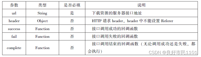
wx.downloadFile(Object)接口用于实现从开发者服务器下载文件资源到本地,在客户端直接发起一个HTTP GET请求,返回文件的本地临时路径。
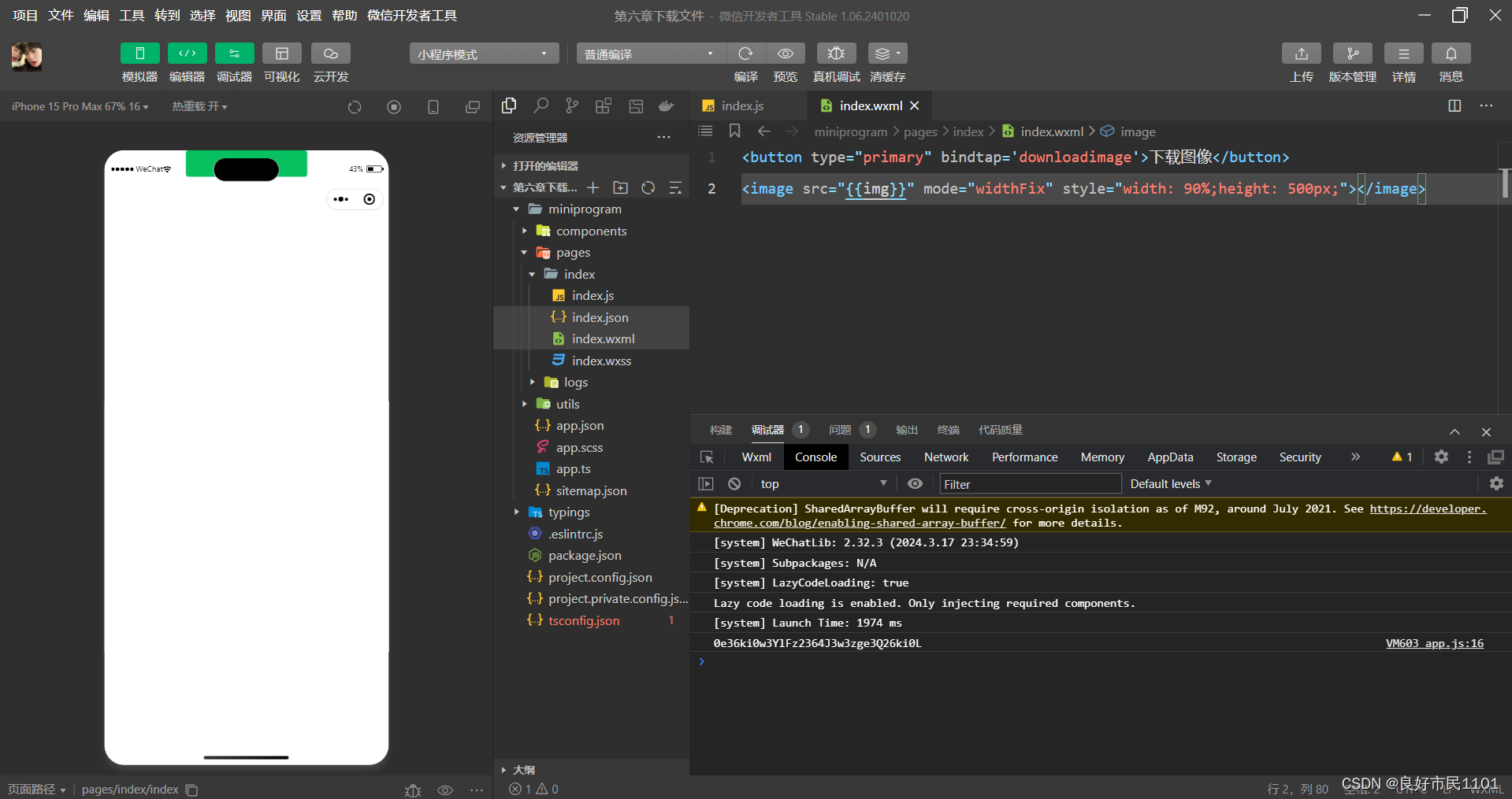
//index.wxml
<button type="primary" bindtap='downloadimage'>下载图像</button>
<image src="{{img}}" mode="widthFix" style="width: 90%;height: 500px;"></image>
//index.js
Page({
data:{
img:null
},
downloadimage:function(){
var that=this;
wx.downloadFile({
url: 'http://localhost/1.jpg',
success:function(res){
console.log(res)
that.setData({
img:res.tempFilePath
})
}
})
}
})多媒体API
图片API
图片API实现对相机拍照图片或本地相册图片进行处理,主要包括一下4个API接口:
wx.chooseImage(Object)接口 用于从本地相册选择图片或使用相机拍照。
wx.previewImage(Object)接口 用于预览图片。
wx.getImageInfo(Object)接口 用于获取图片信息。
wx.savaImageToPhotosAlbum(Object)接口 用于保存图片到系统相册。
1.选择图片或拍照
wx.chooseImage(Object)接口用于从本地相册选择图片或使用相机拍照。拍照时产生的临时路径在小程序本次启动期间可以正常使用,若要持久保存,则需要调用wx.saveFile保存图片到本地。
若调用成功,则返回tempFilePaths和tempFile,tempFilePaths表示图片在本地临时文件路径列表。tempFiles表示图片的本地文件列表,包括path和size。


//index.js
wx.chooseImage({
count:2,
sizeType:['original','compressed'],
sourceType:['album','camera'],
success:function(res){
var temFilePaths=res.tempFilePaths
var temFiles=res.tempFiles;
console.log(temFilePaths)
console.log(temFiles)
}
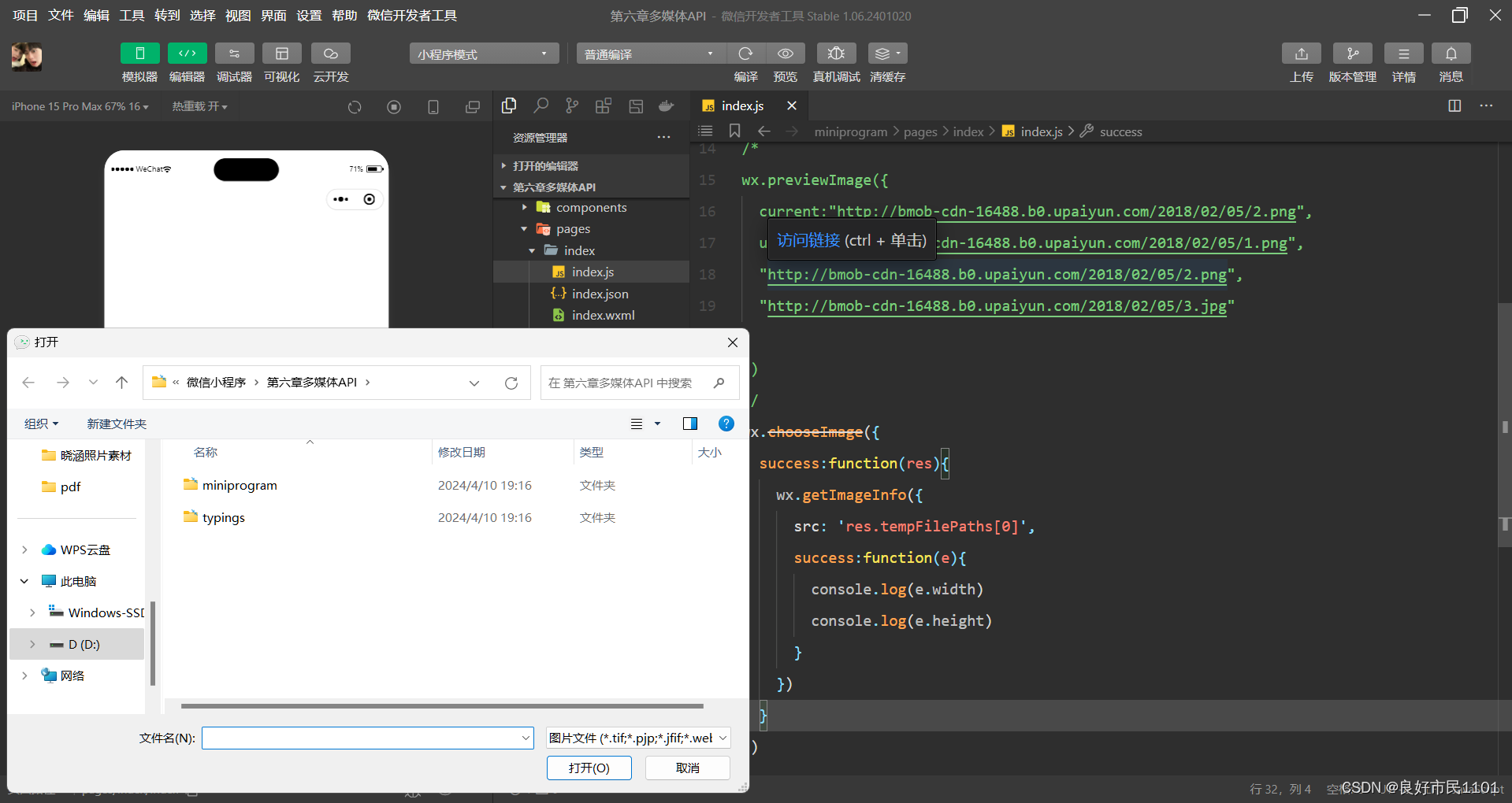
})2.预览图片
wx.previewImage(Object)接口主要用于预览图片。

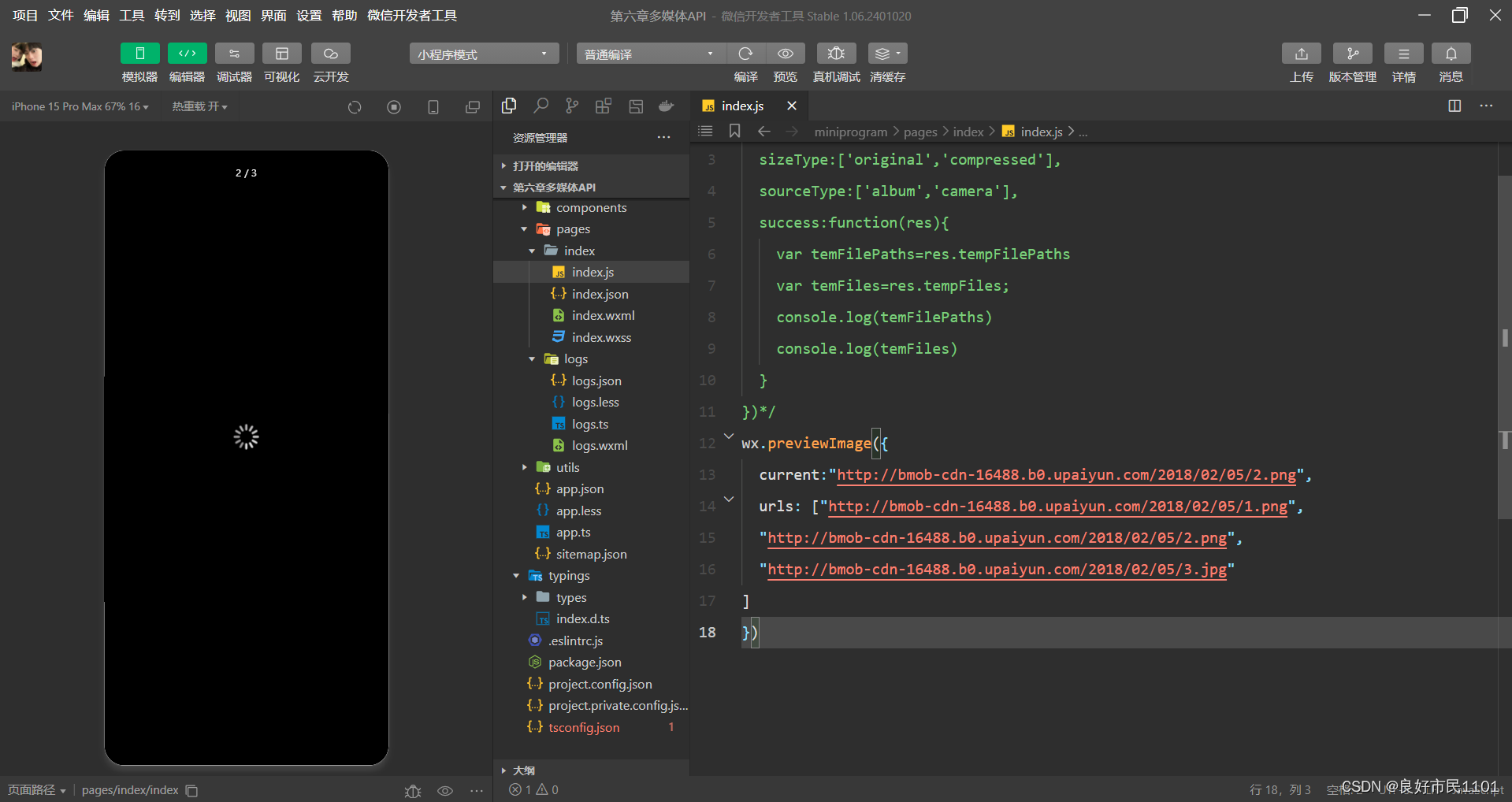
//index.js
wx.previewImage({
  current:"http://bmob-cdn-16488.b0.upaiyun.com/2018/02/05/2.png",
  urls: ["http://bmob-cdn-16488.b0.upaiyun.com/2018/02/05/1.png",
  "http://bmob-cdn-16488.b0.upaiyun.com/2018/02/05/2.png",
  "http://bmob-cdn-16488.b0.upaiyun.com/2018/02/05/3.jpg"
]
})
3.获取图片信息
wx.getImageInfo(Object)接口用于获取图片信息。

//index.js
wx.chooseImage({
  success:function(res){
    wx.getImageInfo({
      src: 'res.tempFilePaths[0]',
      success:function(e){
        console.log(e.width)
        console.log(e.height)
      }
    })
  }
})
4.保存图片到系统相册
wx.saveImageToPhotosAlbum(Object)接口用于保存图片到系统相册,需要得到用户授权scope.writePotosAlbum。


//index.js
wx.chooseImage({
  success:function(res){
    wx.saveImageToPhotosAlbum({
      filePath: res.tempFilePaths[0],
      success:function(e){

      }
    })
  },
})
录音API
录音API提供了语音录制的功能,主要包括以下两个API接口:
wx.startRecord(Object)接口 用于实现开始录音。
wx.stopRecord(Object)接口 用于实现主动调用停止录音。
1.开始录音
wx.startRecord(Object) 接口用于实现开始录音。当主动调用 wx.stopRecord(Object)接口或者录音超过1分钟时,系统自动结束录音,并返回录音文件的临时文件路径。若要持久保存,则需要调用wxsaveFile()接口。
2.停止录音
wx.stopRecord(Object)接口用于实现主动调用停止录音。

//index.js
wx.startRecord()
({
  success:function(res){
    var tempFilePath=res.tempFilePath
  },
  fail:function(res){
  }
})
setTimeout:(function(){
wx.stopRecord()
},10000)
音频播放控制API
音频播放控制 API主要用于对语音媒体文件的控制,包括播放、暂停、停止及 audio 组件的控制,主要包括以下3个 API:
wx.playVoice(Object) 接口 用于实现开始播放语音。
wx.pauseVoice(Object) 接口 用于实现暂停正在播放的语音
wx.stopVoice(Object) 接口 用于结束播放语音。
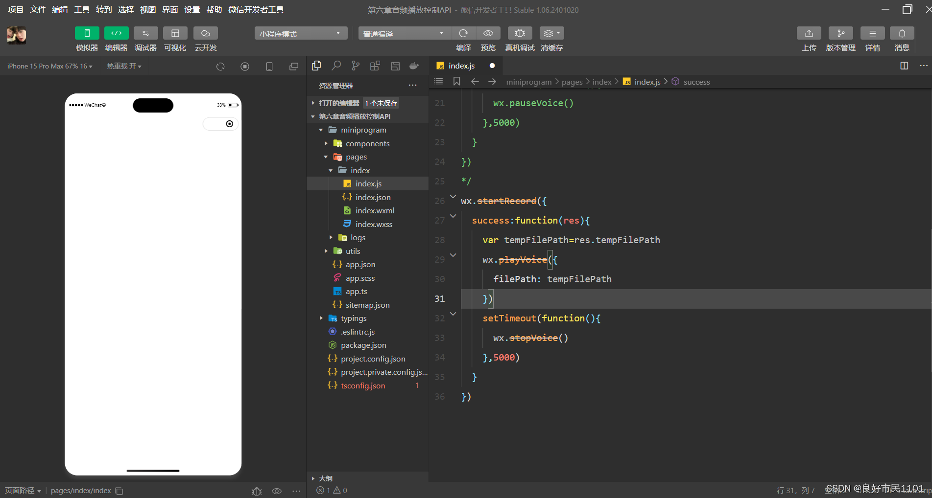
1.播放语音
wx. playVoice(Object)接口用于开始播放语音,同时只允许一个语音文件播放,如果前一个语音文件还未播放完,则中断前一个语音文件的播放。

//index.js
wx.startRecord({
  success:function(res){
    var tempFilePath=res.tempFilePath
    wx.playVoice({
      filePath: tempFilePath,
      complete:function(){
      }
    })
  }
})
2.暂停播放
wx.pauseVoice(Object)用于暂停正在播放的语言。再次调用wx.playVoice(Object)播放同一个文件时,会从暂停处开始播放。如果想从头开始播放,则需要先调用wx.stopVoice(Object)。

//index.js
wx.startRecord({
  success:function(res){
    var tempFilePath=res.tempFilePath
    wx.playVoice({
      filePath: tempFilePath
    })
    setTimeout(function(){
      wx.pauseVoice()
    },5000)
  }
})
3.结束播放
wx.stopVoice(Object)用于结束播放语音。
//index.js
wx.startRecord({
  success:function(res){
    var tempFilePath=res.tempFilePath
    wx.playVoice({
      filePath: tempFilePath
    })
    setTimeout(function(){
      wx.stopVoice()
    },5000)
  }
})
音乐播放控制API
音乐播放控制API主要用于实现对背景音乐的控制,音乐文件只能是网络流媒件,不能是本地音乐文件。音乐播放控制API主要包括以下8个API:
wx.playBackgroundAudio(Object) 接口 用于播放音乐。
wx.getBackgroundAudioPlayerState( Object) 接口 用于获取音乐播放状态。
wx.seekBackgroundAudio(Object) 接口 用于定位音乐播放进度。
wx.pauseBackgroundAudio() 接口 用于实现暂停播放音乐。
wx.stopBackgroundAudio() 接口 用于实现停止播放音乐。
wx.onBackgroundAudioPlay(CallBack) 接口 用于实现监听音乐播放。
wx.onBackgroundAudioPause( CallBack) 接口 用于实现监听音乐暂停。
用于实现监听音乐停止wxonBackgroundAudioStop( CallBack) 接口 用于实现监听音乐停止。
1. 播放音乐
wx.playBackgroundAudio(Object) 用于播放音乐,同一时间只能有一首音乐处于播放状态。
2.获取音乐播放状态
wx.getBackgroundAudioPlayerState( Object) 接口用于获取音乐播放状态。
3.控制音乐播放进度
wx.seekBackgroundAudio(Object) 接口用于控制音乐播放进度。
4.暂停播放音乐
wx.pauseBackgroundAudio() 接口用于暂停播放音乐。
5.停止播放音乐
wx.stopBackgroundAudio() 接口用于停止播放音乐。
6.监听音乐播放
wx.onBackgroundAudioPlay(CallBack)接口用于实现监听音乐播放。通常wx.playBack.groundAudio(Object)方法触发,在 CallBack 中可改变播放图标。
7.监听音乐暂停
wx.onBackgroundAudioPause(CallBack)接口用于实现监听音乐暂停,通常被 wx.pauseBackgroundAudio()方法触发。在 CallBack 中可以改变播放图标。
8.监听音乐停止
wxonBackgroundAudioStop(CallBack) 接口用于实现监听音乐停止,通常被音乐自然播放停止或 wxseekBackgroundAudio(Object)方法导致播放位置等于音乐总时长时触发。在 CallBack 中可以改变播放图标。
文件API
从网络上下载或录音的文件都是临时保存的,若要持久保存,需要用到文件API。文件
API 提供了打开、保存、删除等操作本地文件的能力,主要包括以下5个API接口:
wx.saveFile(Object) 接口 用于保存文件到本地。
wxgetSavedFileList(Object) 接口 用于获取本地已保存的文件列表
wxgetSaveFileInfo(Object) 接口 用于获取本地文件的文件信息。
wxremoveSaveFile(Object) 接口 用于删除本地存储的文件
wxopenDocument(Object) 接口 用于新开页面打开文档,支持格式:doc、xls、ppt、pdf、docx 、xlsx、ppts。
1.保存文件
wx.saveFile(Object)用于保存文件到本地。

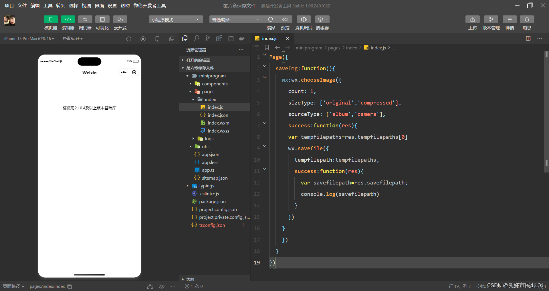
//index.js
Page({
  saveImg:function(){
    wx:wx.chooseImage({
      count: 1,
      sizeType: ['original','compressed'],
      sourceType: ['album','camera'],
      success:function(res){
      var tempfilepaths=res.tempfilepaths[0]
      wx.savefile({
        tempfilepath:tempfilepaths,
        success:function(res){
          var savefilepath=res.savefilepath;
          console.log(savefilepath)
        }
      })
    }
    })
  }
})
2.获取本地文件列表
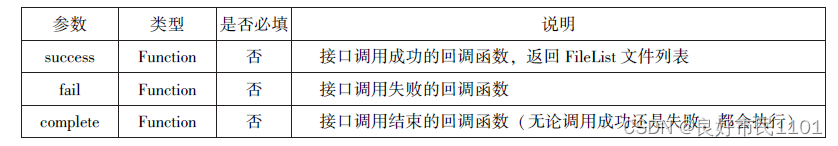
wx.getSavedFileList(Object) 接口用于获取本地已保存的文件列表,如果调用成功,则返回文件的本地路径、文件大小和文件保存时的时间戳(从1970/01/01 08:00:00到当前时间的秒数)文件列表。

//index.js
wx.getSavedFileList({
    success:function(res){
      that.setData({
        fileList:res.fileList
      })
    }
  })
3.获取本地文件的文件信息
wx.getSaveFileInfo(Object)接口用于获取本地文件的文件信息,此接口只能用于获取已保存到本地的文件,若需要获取临时文件信息,则使用 wx getFilelnfo(Object)接口


//index.js
wx.chooseImage({
  count:1,
  sizeType:['original','compressed'],
  sourceType:['album','camera'],
    success:function(res){
      var tempFilePaths=res.tempFilePaths[0]
      wx.saveFile({
        tempFilePath:tempFilePaths,
        success:function(res){
          var saveFilePath=res.savedFilePath;
          wx.getSavedFileInfo({
            filePath:saveFilePath,
            success:function(res){
              console.log(res.size)
            }
          })
        }
      })
    }
  })
4.删除本地文件
wx.removeSaveFile(Object)接口用于删除本地存储的文件。


//index.js
wx.getSavedFileList({
  success:function(res){
    if(res.fileList.length>0){
    wx.removeSaveFile({
     FilePath:res.fileList[0].filePath,
     complete:function(res){
            console.log(res)
          }
        })
      }
    }
    })
5.打开文档
wxopenDocument(Object)接口用于新开页面打开文档,支持格式有 doc、xls、ppt、pdf、docx、xlsx、pptx。


//index.js
wx.downloadFile({
  url: "http://localhost/fm2.pdf",
    success:function(res){
      var tempfilepath=res.tempfilepath;
      wx.openDocument({
        filePath:tempfilepath,
        success:function(res){
          console.log("成功打开")
        }
      })
    }
  })
异步和同步的区别

本地数据及缓存API
小程序提供了以键值对的形式进行本地数据缓存功能,并且是永久存储的,但最大不超过 10 MB,其目的是提高加载速度。数据缓存的接口主要有4个:
wx. setStorage(Object)或 wx. setStorageSyne(key,data)接口用于设置缓存数据。
wx. getStorage (Object)或 wx.getStorageSync(key)接口 用于获取缓存数据。
wx. removeStorage(Object)或 wx. removeStorageSyne(key)接口 用于删除指定缓存
数据。
wx. clearStorage()或 wx. clearStorageSync()接口 用于清除缓存数据。
其中,带 Sync 后缀的为同步接口,不带 Sync 后缀的为异步接口。
保存数据
1.wx.setStorage(Object)
wx.setStorage(Object)接口将数据存储到本地缓存接口指定的key中,接口执行后会覆盖原来的key对应的内容。


//index.js
wx.setStorage({
  key:'name',
  data:'sdy',
  success:function(res){
    console.log(res)
  }
})
2.wx. setStorageSyne(key,data)是同步接口,其参数之有key和data。

//index.js
wx.setStorageSync('age', '25')
获取数据
1.wx. getStorage (Object)
wx. getStorage(Object)接口是从本地缓存中异步获取指定key对应的内容。


//index.js
wx.getStorage({
  key:'name',
  success:function(res){
    console.log(res.data)
  },
})
2.wx.getStorageSync(key)
wx.getStorageSync(key)从本地缓存中同步获取指定key对应的内容。
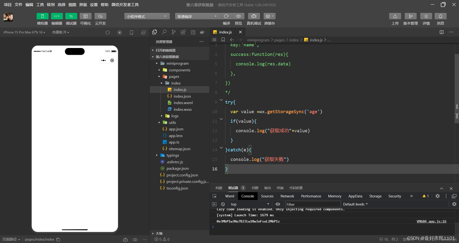
//index.js
try{
  var value =wx.getStorageSync('age')
  if(value){
    console.log("获取成功"+value)
  }
}catch(e){
  console.log("获取失败")
}
删除数据
1.wx.removeStorage(Object)
wx.removeStorage(Object)接口用于从本地缓存中异步移除指定key。


//index.js
wx.removeStorage({
  key: 'name',
  success:function(res){
    console.log("删除成功")
  },
  fail:function(){
    console.log("删除失败")
  }
})
2.wx.removeStorageSync(key)
wx.removeStorageSync(key)接口用于从本地缓存中同步删除指定key对应的内容。

//index.js
try{
  wx.removeStorageSync('name')
}catch(e){

}
清空数据
1.wx.clearStorage()
wx.clearStorage()接口用于异步清理本地数据缓存,没有参数。
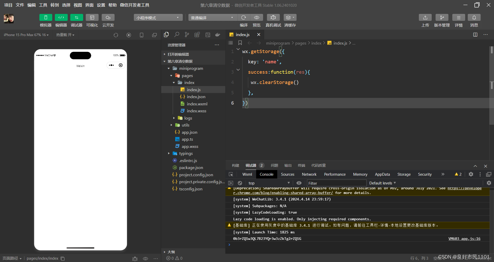
//index.js
wx.getStorage({
  key: 'name',
  success:function(res){
   wx.clearStorage()
  },
})
2.wx.clearStroageSync()
wx.clearStroageSync()接口用于异步清理本地数据缓存。
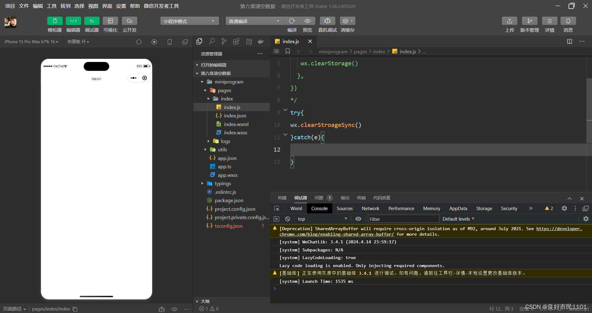
//index.js
try{
wx.clearStroageSync()
}catch(e){

}
位置信息API
小程序可以通过位置信息 API来获取或显示本地位置信息,小程序支持 WCS84和CCi02标准,WGS84 标准为地球坐标系,是国际上通用的坐标系;GCj02 标准是中国国家测绘局制定的地理信息系统的坐标系统,是由 WGS84 坐标系经加密后的坐标系,又称为火星坐标系默认为 WGS84 标准,若要查看位置需要使用 GCi02 标准。主要包括以下3 个 API接口:
wx.getLocation(Object) 接口 用于获取位置信息
wx.chooseLocation(Object) 接口 用于选择位置信息
wx.openLocation(Object) 接口 用于通过地图显示位置
获取位置信息
wx.getLocation(Object)接口用于获取当前用户的地理位置、速度,需要用户开启定位功能,当用户离开小程序后,无法获取当前的地理位置及速度,当用户点击“显示在聊天顶部”时,可以获取到定位信息。

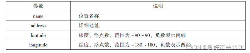
wx.getLocation(Object)调用成功后,返回的参数如表:


//index.js
wx.getLocation({
  type:'wgs84',
    success:function(res){
      console.log("经度"+res.longitude);
      console.log("纬度度"+res.latitude);
      console.log("速度"+res.longitude);
      console.log("位置的精确度"+res.accuracy);
      console.log("水平精确度"+res.horizontalAccuracy);
      console.log("垂直精确度"+res.verticalAccuracy);
    }
})
选择位置信息
wx.chooseLocation(Object)接口用于在打开的地图中选择位置,用户选择位置后返回当前位置的名称、地址、经纬度信息。

wx.chooseLocation(Object)调用成功后,返回的参数如表:

//index.js
wx.chooseLocation({
  success:function(res){
    console.log("位置的名称"+res.longitude)
    console.log("位置的地址"+res.accuracy)
    console.log("位置的纬度"+res.horizontalAccuracy)
    console.log("位置的纬度"+res.verticalAccuracy)
  }
})
显示位置信息
wx.openLocation(Object)接口用在微信内置地图中显示位置信息。

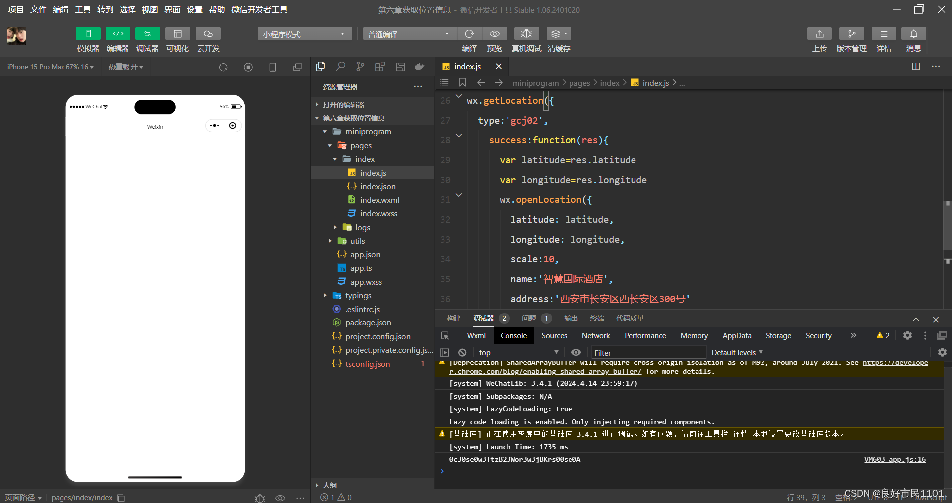
//index.js
wx.getLocation({
  type:'gcj02',
    success:function(res){
      var latitude=res.latitude
      var longitude=res.longitude
      wx.openLocation({
        latitude: latitude,
        longitude: longitude,
        scale:10,
        name:'智慧国际酒店',
        address:'西安市长安区西长安区300号'
      })
    }
})
设备相关API
设备相关的接口用于获取设备相关信息,主要包括系统信息、网络状态、拨打电话及扫码等。主要包括以下5 个接口 API:
wx.getSystemInfo(Object) 接口、wxgetSystemInfoSync() 接口 用于获取系统信息wx.getNetworkType(Object) 接口 用于获取网络类型。
wx.onNetworkStatusChange( CallBack) 接口 用于监测网络状态改变
wx.makePhoneCall(Object) 接口 用于拨打电话
wx.scanCode(Object) 接口 用于扫描二维码
获取系统信息
wx.getSystemInfo(Object) 接口、wxgetSystemInfoSync() 接口分别用于异步和同步获取系统信息。

wx.getSystemInfo()接口或wx.getSystemInfoSyne()接口调用成功后,返回系统相关信息。

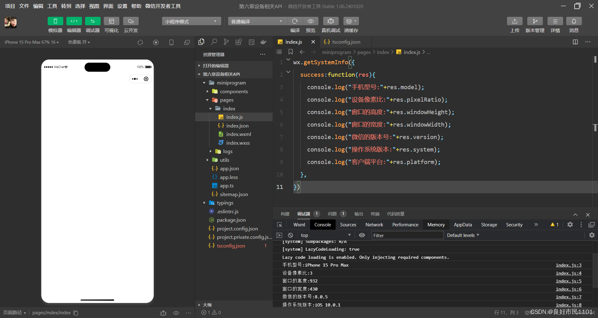
//index.js
wx.getSystemInfo({
    success:function(res){
      console.log("手机型号:"+res.model);
      console.log("设备像素比:"+res.pixelRatio);
      console.log("窗口的高度:"+res.windowHeight);
      console.log("窗口的宽度:"+res.windowWidth);
      console.log("微信的版本号:"+res.version);
      console.log("操作系统版本:"+res.system);
      console.log("客户端平台:"+res.platform);
    },
})
网络状态
1.获取网络状态
wx.getNetworkType(Object)用于获取网络类型。

如果wx.getNetworkType()接口被成功调用,则返回网络类型包,有wifi、2G、3G、4G、unknown(Android下不常见的网络类型)、none(无网络)。

//index.js
wx.getNetworkType({
  success:function(res){
    console.log(res.networkType)
  },
})
2.监听网络状态变化
wx.onNetworkStatusChange(CallBack)接口用于监听网络状态变化,当网络状态变化时,返回当前网络状态类型及是否有网络连接。

//index.js
wx.onNetworkStatusChange({function(res){
  console.log("网络是否链接"+res.isConnected)
  console.log("变化后的网络类型"+res.networkType)
}
})
拨打电话
wx.makePhoneCall(Object)接口用于实现用手机拨打电话。


//index.js
wx.makePhoneCall({
  phoneNumber: '18092585093',
})
扫描二维码
wx.scanCode(Object)接口用于调起客户端扫码界面,扫码成功后返回相应的内容。
扫码成功后,返回的数据如表:


//index.js
wx.scanCode({
  success:(res)=>{
    console.log(res.result)
    console.log(res.scanType)
    console.log(res.charSet)
    console.log(res.path)
  }
})


 4740
4740


 被折叠的 条评论
为什么被折叠?
被折叠的 条评论
为什么被折叠?
 到【灌水乐园】发言


