


Flex布局也叫弹性布局,是浏览器提倡的布局模型,非常适合结构化布局,提供强大的空间分布和对齐能力。Flex模型不会产生浮动布局中脱标现象,布局网页更简单,更灵活。下面是一个体验效果的代码。
    <style>
        .box {
            display: flex;
            justify-content: space-between;
            height: 300px;
            /* 如果是浮动的话 没有高度 那么父级的盒子就无法撑开 */
            border: 1px solid #000;
        }

        .box div {
            /* float: left;
            margin: 50px; */

            width: 200px;
            height: 100px;
            background-color: pink;
        }
    </style>
</head>

<body>
    <div class="box">
        <div>1</div>
        <div>2</div>
        <div>3</div>
    </div>
</body> 
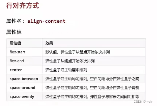
Flex-组成
设置方法:给父级元素设置display:flex,子元素可以自动挤压或拉伸

组成部分:弹性容器 弹性盒子 主轴:默认在水平方向上 侧轴:默认垂直方向上
    <title>Flex</title>
    <style>
        .box {
            /* 舒服df就会有提示 */
            display: flex;
            height: 300px;
            /* 如果是浮动的话 没有高度 那么父级的盒子就无法撑开 */
            border: 1px solid #000;
        }

        .box div {

            width: 200px;
            /* height: 100px; */
            background-color: pink;
        }
    </style>
</head>

<body>
    <div class="box">
        <div>1</div>
        <div>2</div>
        <div>3</div>
        <div>1</div>
        <div>2</div>
        <div>3</div>
        <div>1</div>
        <div>2</div>
        <div>3</div>
    </div>
</body>
Flex布局


            display: flex;
            justify-content: flex-start;
            /* 从起点开始向后排列 写与不写没有区别 */
            justify-content: flex-end;
            /* 从右向左 不常用 */

            justify-content: center;
            /* 居中 */
            justify-content: space-between;
            /* 父级剩余的尺寸分配成间距 弹性盒子之间的间距相等 */
            justify-content: space-around;
            /* 间距出现在弹性盒子两侧 弹性盒子之间的间距是两端间距的2倍 */
            justify-content: space-evenly;
/* 各个间距相等 */ 
    <title>Flex</title>
    <style>
        .box {
            display: flex;
            /* 弹性盒子在侧轴方向没有尺寸才能拉伸 */
            /* align-items: stretch; */
            /* align-items: center; */
            /* align-items: flex-start; */
            /* align-items: flex-end; */


            height: 300px;
            border: 1px solid #000;
        }

        /* 第二个div,侧轴居中对齐 */
        .box div:nth-child(2) {
            align-self: center;
        }

        .box div {

            width: 200px;
            height: 100px;
            background-color: pink;
        }
    </style>
</head>

<body>
    <div class="box">
        <div>1</div>
        <div>2</div>
        <div>3</div>
    </div>
</body>
修改主轴方向
主轴默认在水平方向上,侧轴默认在垂直方向上
属性名:flex-direction
属性值:
| 属性值 | 效果 |
| row | 水平方向,从左到右(默认) |
| column | 垂直方向,从上到下 |
| row-reverse | 水平方向,从左到右 |
| column-reverse | 垂直方向,从下向上 |

 <title>Flex</title>
    <style>
        .box {
            /* 默认情况下,主轴方向尺寸是靠内容撑开,侧轴默认拉伸 */
            display: flex;
            flex-direction: column;
            height: 300px;
            border: 1px solid #000;
        }

        .box div:nth-child(1) {
            width: 200px;
        }

        .box div:nth-child(2) {
            flex: 1;
        }

        .box div:nth-child(3) {
            flex: 2;
            /* 父级剩余部分平均分成三份 */
        }

        .box div {
            /* height: 100px; */
            background-color: pink;
        }
    </style>
</head>

<body>
    <div class="box">
        <div>1</div>
        <div>2</div>
        <div>3</div>
    </div>
</body>
弹性盒子换行
弹性盒子可以自动挤压或拉伸,默认情况下,使用弹性盒子都在一行显示。
属性名:flex-wrap
属性值:
wrap:换行
nowrap:不换行 (默认)
<style>
        .box {
            display: flex;
            flex-wrap: wrap;
            justify-content: space-between;
            height: 300px;
            border: 1px solid #000;
        }

        .box div {
            width: 200px;
            height: 100px;
            background-color: pink;
        }
    </style>
</head>

<body>
    <div class="box">
        <div>1</div>
        <div>2</div>
        <div>3</div>
        <div>1</div>
        <div>2</div>
        <div>3</div>
        <div>1</div>
        <div>2</div>
        <div>3</div>
        <div>1</div>
        <div>2</div>
        <div>3</div>
    </div>
</body> 
当然浏览器的中页面比例不同打开看到的也不一样

    <title>Flex</title>
    <style>
        .box {
            display: flex;
            flex-wrap: wrap;
            justify-content: space-between;
            /* 调整行对齐方式 */

            height: 400px;
            border: 1px solid #000;
        }

        .box div {
            width: 200px;
            height: 100px;
            background-color: pink;
        }
    </style>
</head>

<body>
    <div class="box">
        <div>1</div>
        <div>2</div>
        <div>3</div>
        <div>4</div>
        <div>5</div>
        <div>6</div>
        <div>7</div>
        <div>8</div>
    </div>
</body>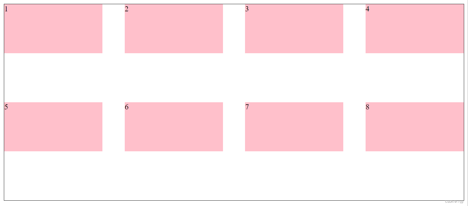
在上面的代码中做一些修改
 图就变成了这样:

注意:对单行弹性盒子不生效。
其余的大家自己自行可以试试。


 11万+
11万+


 被折叠的 条评论
为什么被折叠?
被折叠的 条评论
为什么被折叠?
 到【灌水乐园】发言


