


堆积图源代码
from pyecharts import options as opts
from pyecharts.charts import Bar
from pyecharts.faker import Faker

c = (
    Bar()
    .add_xaxis(Faker.choose())
    .add_yaxis("商家A", Faker.values(), stack="stack1")
    .add_yaxis("商家B", Faker.values(), stack="stack1")
    .set_series_opts(label_opts=opts.LabelOpts(is_show=False))
    .set_global_opts(title_opts=opts.TitleOpts(title="Bar-堆叠数据(全部)"))
    .render("bar_stack0.html")
)
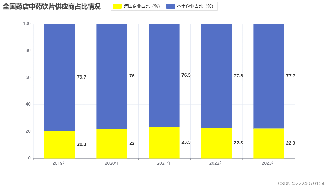
表3. 全国药店中药饮片供应商占比情况
| 年份(年) | 跨国企业占比(%) | 本土企业占比(%) |
| 2019 | 20.3 | 79.7 |
| 2020 | 22.0 | 78.0 |
| 2021 | 23.5 | 76.5 |
| 2022 | 22.5 | 77.5 |
| 2023 | 22.3 | 77.7 |
一、导入基本模块
from pyecharts import options as opts
from pyecharts.charts import Bar
from pyecharts.faker import Faker
from pyecharts.commons.utils import JsCode
二、数据准备
x_years =['2019年', '2020年','2021年', '2022年','2023年']    #横坐标数据
y1 = [20.3, 22.0, 23.5, 22.5, 22.3]                          #纵坐标数据1
y2 = [79.7, 78.0, 76.5, 77.5, 77.7]                          #纵坐标数据2
三、导入实例图
c = (       # 创建图对象
    Bar()
    .add_xaxis(x_years)
    .add_yaxis("跨国企业占比(%)", y1, stack="stack1", color='#FFFF00',bar_width=85)      #纵坐标1 图例名称,值, color='#FFFF00'设置柱状图颜色
    .add_yaxis("本土企业占比(%)", y2, stack="stack1" )      #纵坐标2    stack="stack":数据堆叠,必须两组同时设置才可生效
    .set_series_opts(label_opts=opts.LabelOpts(is_show=True ,           #是否显示数据标签
                                               position="right",         #标签位置
                                               font_size=12,            #文字大小
                                               font_weight = "bold") )#文字字体的粗细
    .set_global_opts(title_opts=opts.TitleOpts(title="全国药店中药饮片供应商占比情况"))    #全局配置项    标题

)
四、渲染图表
c.render_notebook() # 在notebook中渲染图表


 159
159


 被折叠的 条评论
为什么被折叠?
被折叠的 条评论
为什么被折叠?
 到【灌水乐园】发言


