


表1. 2014-2021年中国中医类医疗卫生机构诊疗量
| 年份(年) | 诊疗量(万人次) | 同比增速(%) |
| 2014 | 87430 | 7.40 |
| 2015 | 90912 | 4.00 |
| 2016 | 96225 | 5.83 |
| 2017 | 101885 | 5.81 |
| 2018 | 107147 | 5.16 |
| 2019 | 116390 | 8.63 |
| 2020 | 105764 | -9.13 |
| 2021 | 120215 | 13.66 |
表2. 中药材消费者画像数据
| 年龄 | 占比(%) |
| 20岁以下 | 2.2 |
| 20-30岁 | 27.9 |
| 31-40岁 | 56.2 |
| 41-50岁 | 10.9 |
| 51岁以上 | 2.8 |
表3. 全国药店中药饮片供应商占比情况
| 年份(年) | 跨国企业占比(%) | 本土企业占比(%) |
| 2019 | 20.3 | 79.7 |
| 2020 | 22.0 | 78.0 |
| 2021 | 23.5 | 76.5 |
| 2022 | 22.5 | 77.5 |
| 2023 | 22.3 | 77.7 |
表4. 全国药店药品销售额占比
| 药品类型 | 占比(%) |
| 化学药 | 33 |
| 中成药 | 45 |
| 生物制品 | 3 |
| 医疗器械 | 9 |
| 中药饮片 | 6 |
| 保健品 | 4 |
需求一: 请基于pyecharts,用柱形图和折线图在同一个坐标系展示表1数据,得到图1。
需求二: 请基于pyecharts,用环图展示表2数据,得到图2。
需求三: 请基于pyecharts,用堆积柱形图展示表3数据,得到图3。
需求四: 请基于pyecharts,用雷达图展示表4数据,得到图4。
需求五: 将上述图1到图4,利用“并行多图”的方式排布,得到图5。(参考示意图)
需求六: 将上述图1到图5,利用“轮播多图”的方式排布,得到图6。
from pyecharts import options as opts
from pyecharts.charts import Bar, Grid, Line,Pie,Radar
#折线柱形图
x_data = ['2014', '2015', '2016', '2017', '2018', '2019', '2020', '2021']
# 柱形图设置
bar1 = (
    Bar()
    .add_xaxis(x_data)
    .add_yaxis(
        series_name="诊疗量",
        y_axis=[87430,90912,96225,101885,107147,116390,105764,120215],
        # 这个参数是用来设置 y 轴的索引。在 pyecharts 中,可以通过设置这个参数来改变 y 轴的位置。默认情况下,y 轴的索引是 0,也就是最上面。
        yaxis_index=0,
        # 柱形图组织的所有图形的z值,控制图形的前后顺序,默认值为2,z值小的图形会被z值大的图形覆盖
        z=0,
        #这个参数用来设置柱形图的颜色。在这里,所有的柱形图都被设置为橙色。
        color="orange",
        bar_width=40,   # 设置柱形宽度

    )
    #Bar.extend_axis 是 pyecharts 绘图库中的一个方法,用于扩展坐标轴。它通常用于创建双轴图表,其中一个轴是主轴,另一个轴是扩展轴。
    .extend_axis(
        yaxis=opts.AxisOpts(
            # 设置y轴属性
            type_="value",  #表示y轴是一个数值轴,用于显示连续的数据。
            name="同比增速(%)",    #给y轴设置名称
            name_location="center",  #轴名称位于中间
            name_gap=30,      #轴名称与轴线距离30px
            min_=-20,      #设置y轴的最大值20 最小值-20
            max_=20,
            axislabel_opts=opts.LabelOpts(font_size=15),     #y轴刻度标签字体大小为15
            axisline_opts=opts.AxisLineOpts(
                linestyle_opts=opts.LineStyleOpts(color="black")    #设置线样式
            ),

            splitline_opts=opts.SplitLineOpts(           #显示分割线
                is_show=True, linestyle_opts=opts.LineStyleOpts(opacity=1)   #图形透明度。支持从0到1的数字,为0时不绘图。
            ),
        )
    )
    .set_global_opts(                              #用于设置图表的全局选项
        yaxis_opts=opts.AxisOpts(                  #设置y轴的各种属性
            name="诊疗量(万人次)",                #设置名称
            name_location="center",                 #设置名称位置
            name_gap=60,                           #设置轴名称与轴线之间的距离
            min_=0,                                 #设置y轴最大值和最小值
            max_=130000,
            interval=50000,                         # 显示y轴刻度间隔,默认为1
            axislabel_opts=opts.LabelOpts(font_size=14),
            offset=0,                  #偏移量设置,在此影响y轴的位置
            axisline_opts=opts.AxisLineOpts(                                    # 设置线样式
                linestyle_opts=opts.LineStyleOpts(color="blank")
            ),

        ),
        # 标题设置
        title_opts=opts.TitleOpts(title="2014-2021年中国中医类医疗卫生机构诊疗量",pos_left="center",pos_top="top"),
        # 图例设置
        legend_opts=opts.LegendOpts(pos_left='40%',pos_bottom='89%'),
        # 设置提示框和指示器
        tooltip_opts=opts.TooltipOpts(trigger="axis", axis_pointer_type="cross"),
    )
)
# 折线图设置
line1 = (
    Line()
    .add_xaxis(x_data)
    .add_yaxis(
        series_name="同比增速(%)",
        y_axis=[7.40,4.00,5.83,5.81,5.16,8.63,-9.13,13.66],
        # 设置标记的图形为三角形
        symbol='triangle',
        # 设置标记图形的大小
        symbol_size=15,
        #删了一个Y轴,Y轴索引由2改为1
        yaxis_index=1,
        color="#aa00ff",  #设置紫色
        # 显示标签
        label_opts=opts.LabelOpts(is_show=False, font_size=10,font_weight='bold'),
        linestyle_opts=opts.LineStyleOpts(width=3)  # 使用LineStyleOpts来设置线的粗细

    )
)
#环形图
data = [['20岁以下-2.2%', 2.2],
        ['20-30岁-27.9%', 27.9],
        ['31-40岁-56.2%', 56.2],
        ['41-50岁-10.9%', 10.9],
        ['50岁以上-2.8%',2.8]]#饼图数据

pie = (
    Pie()
    .add("",data,
        is_avoid_label_overlap = False,
        percent_precision = 2,
         radius=["12.5%", "25%"],
        center=["16.5%","60%"]
        )
     .set_global_opts(
        title_opts=opts.TitleOpts(title="中药材消费者画像", pos_top="40%"),
        legend_opts=opts.LegendOpts(pos_top="45%",pos_left='1%',is_show = False),
    )
)
 #叠加柱形图
data2 = ['2019年','2020年','2021年','2022年','2023年']

bar2 = (
    Bar()
    .add_xaxis(xaxis_data=data2)
    .add_yaxis(
        series_name="跨国企业占比",
        y_axis=[20.3,22.0,23.5,22.5,22.3],stack="stack1", category_gap="50%",xaxis_index=1,yaxis_index=2
    )
    .add_yaxis(
        series_name="本土企业占比",
               y_axis=[79.7,78.0,76.5,77.5,77.7],stack="stack1", category_gap="50%",xaxis_index=1,yaxis_index=2)
    .set_global_opts(
    title_opts=opts.TitleOpts(title="全国药店饮片供应商占比",pos_top="40%",pos_left="40%"),
    legend_opts=opts.LegendOpts(is_show=False),
    )
)
#雷达图
v1 = [[33, 45, 3, 9, 6, 4]]

radar = (
    Radar()
    .add_schema(
        schema=[
            opts.RadarIndicatorItem(name="化学药", max_=50),
            opts.RadarIndicatorItem(name="中成药", max_=50),
            opts.RadarIndicatorItem(name="生物制品", max_=50),
            opts.RadarIndicatorItem(name="其他", max_=50),
            opts.RadarIndicatorItem(name="中药饮片", max_=50),
            opts.RadarIndicatorItem(name="保健品", max_=50),
        ]
    )
   .add("全国药店药品销售额占比", v1)


)


overlap_1 = bar1.overlap(line1)
grid = (
    # 1.创建一个Grid图表
    Grid(init_opts=opts.InitOpts(width="1000px", height="800px"))
    # 2.往Grid图表里面填充其他图表(Bar,Line,Scatter)
    # 通过联合调整pos_bottom, pos_top, pos_left, pos_right这四个参数,可以精细布局图表在整张画布中的位置
    .add(overlap_1, grid_opts=opts.GridOpts(pos_bottom='70%',pos_top="10%",
                                     pos_left="10%",pos_right="10%",
                                     ),is_control_axis_index=True)


    .add(bar2, grid_opts=opts.GridOpts(is_show=True,pos_bottom=450, pos_top=600, pos_left="40%", pos_right="40%"),is_control_axis_index=True)


    .add(pie, grid_opts=opts.GridOpts(pos_bottom=40, pos_top=400, pos_left="10%", pos_right="70%"))

   # .add(radar, grid_opts=opts.GridOpts(pos_bottom="1%",pos_top="70%",pos_left="80%",pos_right="1%"))


)

grid.render_notebook()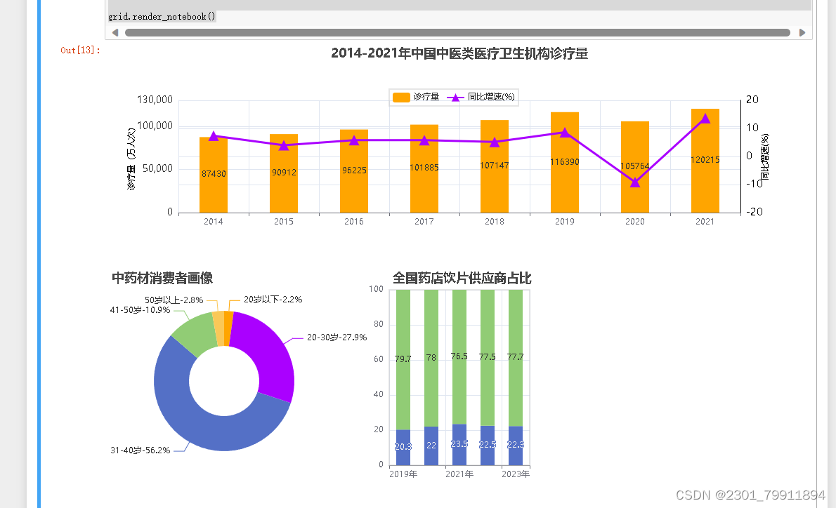


 1127
1127


 被折叠的 条评论
为什么被折叠?
被折叠的 条评论
为什么被折叠?
 到【灌水乐园】发言


