


小程序UI组件
1.小程序UI组件概述
开发文档:https://developers.weixin.qq.com/miniprogram/dev/framework/view/component.html
什么是组件:
-
组件是视图层的基本组成单元。
-
组件自带一些功能与微信风格一致的样式。
-
一个组件通常包括 开始标签 和 结束标签 , 属性 用来修饰这个组件, 内容 在两个标签之内。
-
这里的组件通俗的讲就是标签
  <tagname property="value">
  Content goes here ...
  </tagname>
注意:所有组件与属性都是小写,以连字符 - 连接
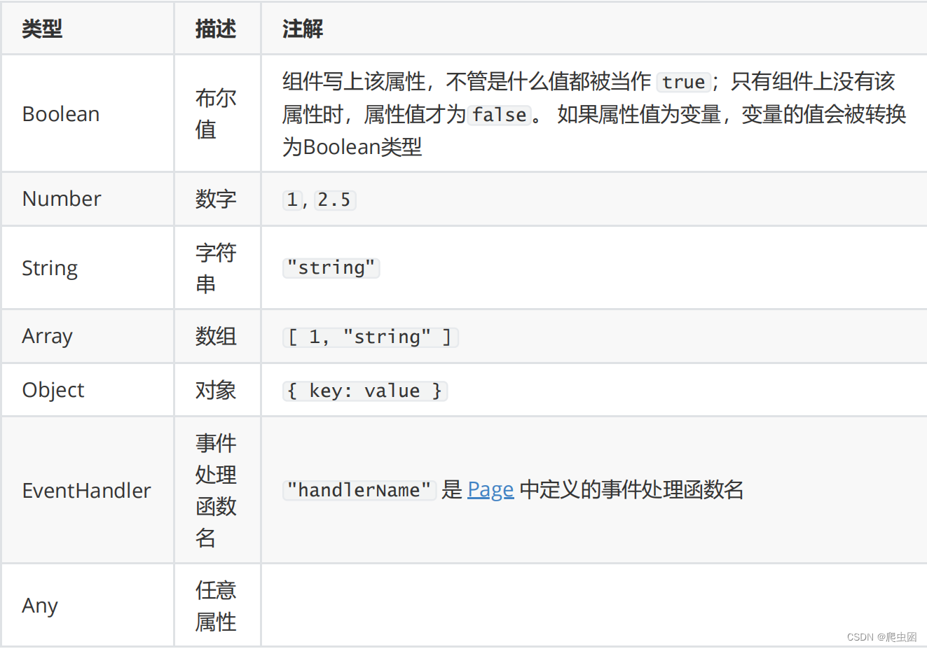
1.1 属性值类型
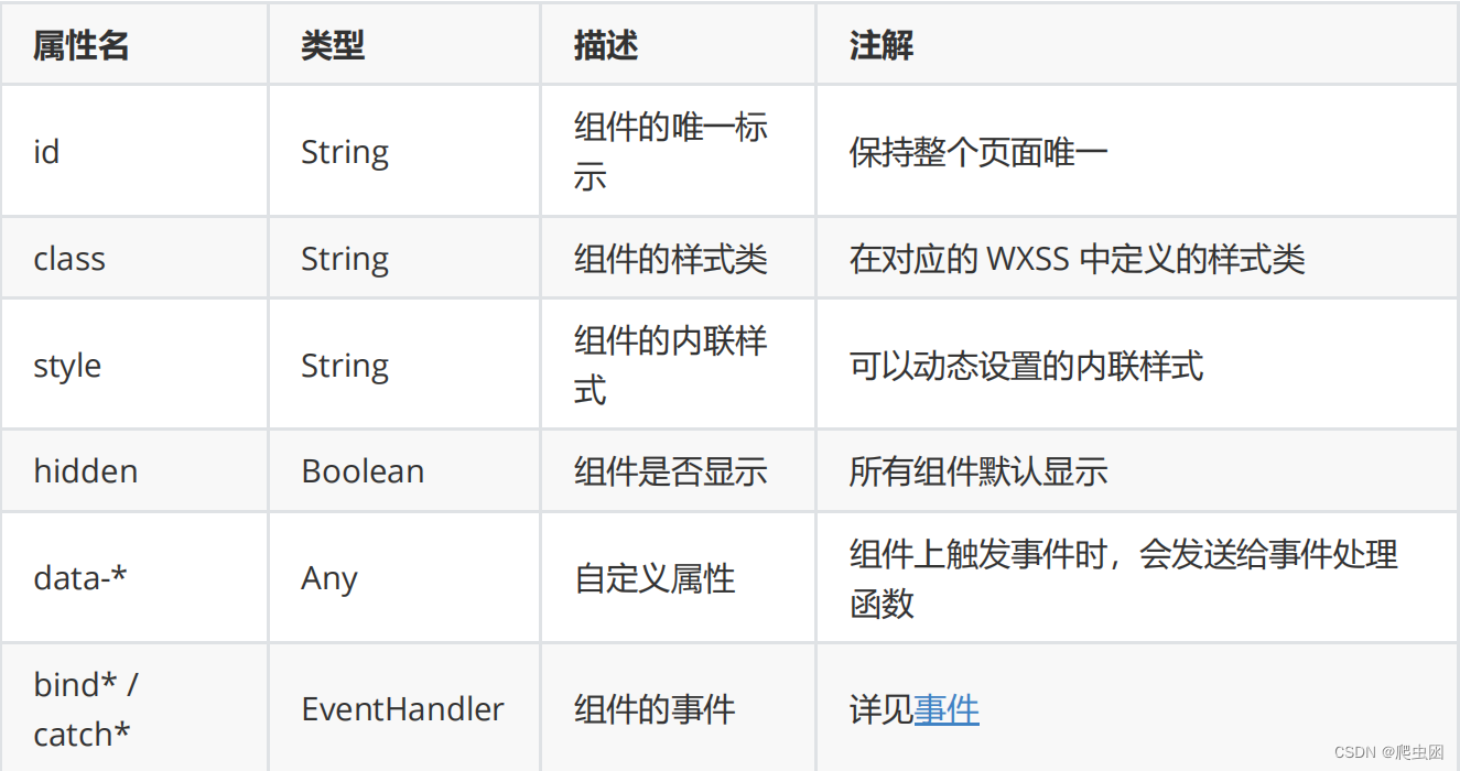
1.2 公共属性
所有组件都有以下属性:
1.3 特殊属性
几乎所有组件都有各自定义的属性,可以对该组件的功能或样式进行修饰,请参考各个组件的定义。
2. 视图容器
2.1 view 组件
view 也被称为视图容器。相当于 html 中的 div 标签。
开发文档:https://developers.weixin.qq.com/miniprogram/dev/component/view.html
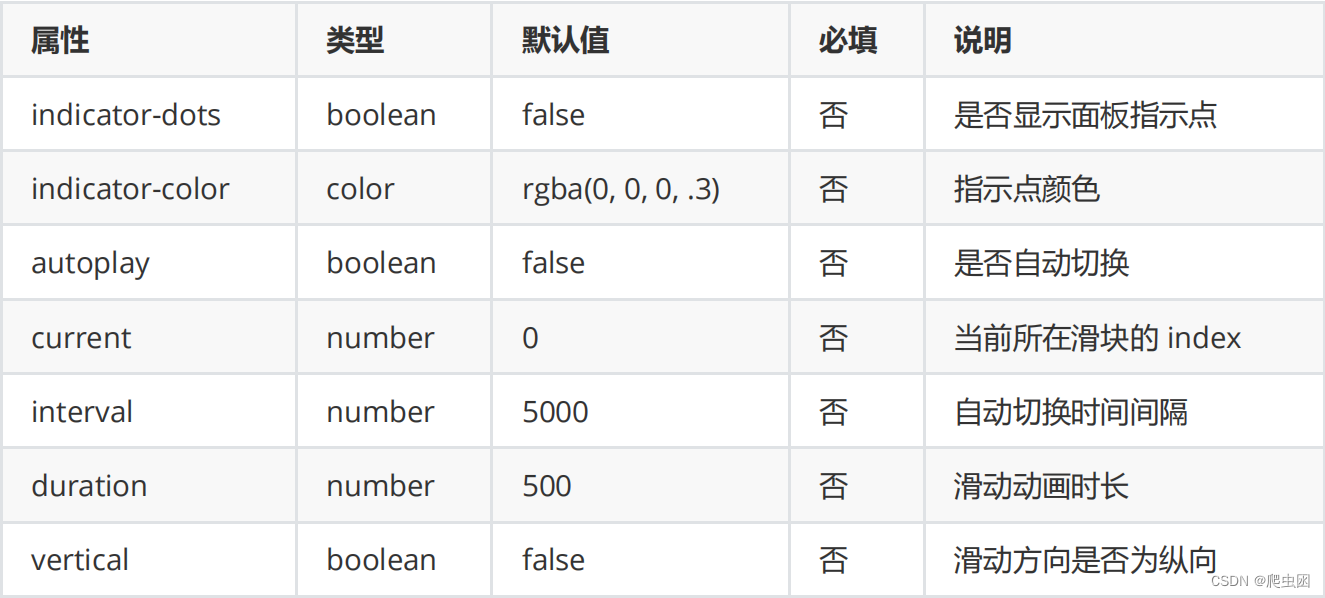
2.2 swiper 与swiper-item
滑块视图容器。其中只可放置swiper-item组件,否则会导致未定义的行为。
案例:使用 swiper 滑块实现轮播图
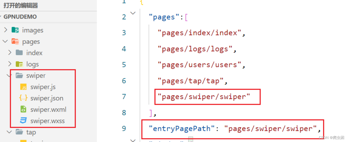
1.配置app.json ,实现新建swiper页面
2.swiper.wxml 设计界面结构
<!--pages/swiper/swiper.wxml-->
<!-- 轮播图开始 -->
<view class="index_swiper">
	<swiper autoplay indicator-dots circular>
		<swiper-item wx:for="{{swiperList}}">
			<image mode="widthFix" src="{{item}}"></image>
		</swiper-item>
	</swiper>
</view>
<!-- 轮播图 结束 -->
3.swiper.wxss 设计样式
/* pages/swiper/swiper.wxss */
.index_swiper swiper {
	width: 750rpx;
	height: 340rpx;
}
.index_swiper swiper image {
	width: 100%;
}
4.swiper.js 文件中构建代码
// pages/swiper/swiper.js
Page({
	data: {
// 轮播图数组
		swiperList: ["/images/img/banner1.png", "/images/img/banner2.png",
			"/images/img/banner3.png"],
	},
})
5.效果如下图所示

2.3 scroll-view
可滚动视图区域。使用竖向滚动时,需要给scroll-view一个固定高度,通过 WXSS 设置 height
3.基础内容组件
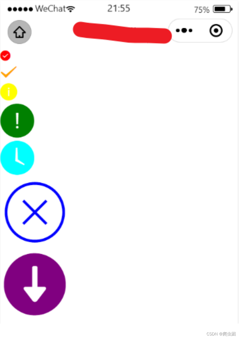
3.1 图标icon
图标。组件属性的长度单位默认为px,2.4.0起支持传入单位(rpx/px)。
开发文档:https://developers.weixin.qq.com/miniprogram/dev/component/icon.html
案例:
1.创建bcontent 基础组件页面
2.bcontent.wxml
<Label>-------------图标icon----------</Label>
<view wx:for="{{iconInfos}}">
	<icon color="{{item.color}}" type="{{item.iconType}}" size="
	{{item.iconSize}}"></icon>
</view>
3.bcontent.js
Page({
	data: {
		iconInfos: [{
			"iconSize": 14,
			"color": "red",
			iconType: "success"
		}, {
			"iconSize": 23,
			"color": "orange",
			iconType: "success_no_circle"
		}, {
			"iconSize": 23,
			"color": "yellow",
			iconType: "info"
		}, {
			"iconSize": 46,
			"color": "green",
			iconType: "warn"
		}, {
			"iconSize": 46,
			"color": "rgb(0,255,255)",
			iconType: "waiting"
		}, {
			"iconSize": 93,
			"color": "blue",
			iconType: "cancel"
		}, {
			"iconSize": 93,
			"color": "purple",
			iconType: "download"
		}]
	}
})
4.效果如小图所示
3.2 文本text
文本
开发文档:https://developers.weixin.qq.com/miniprogram/dev/component/text.html
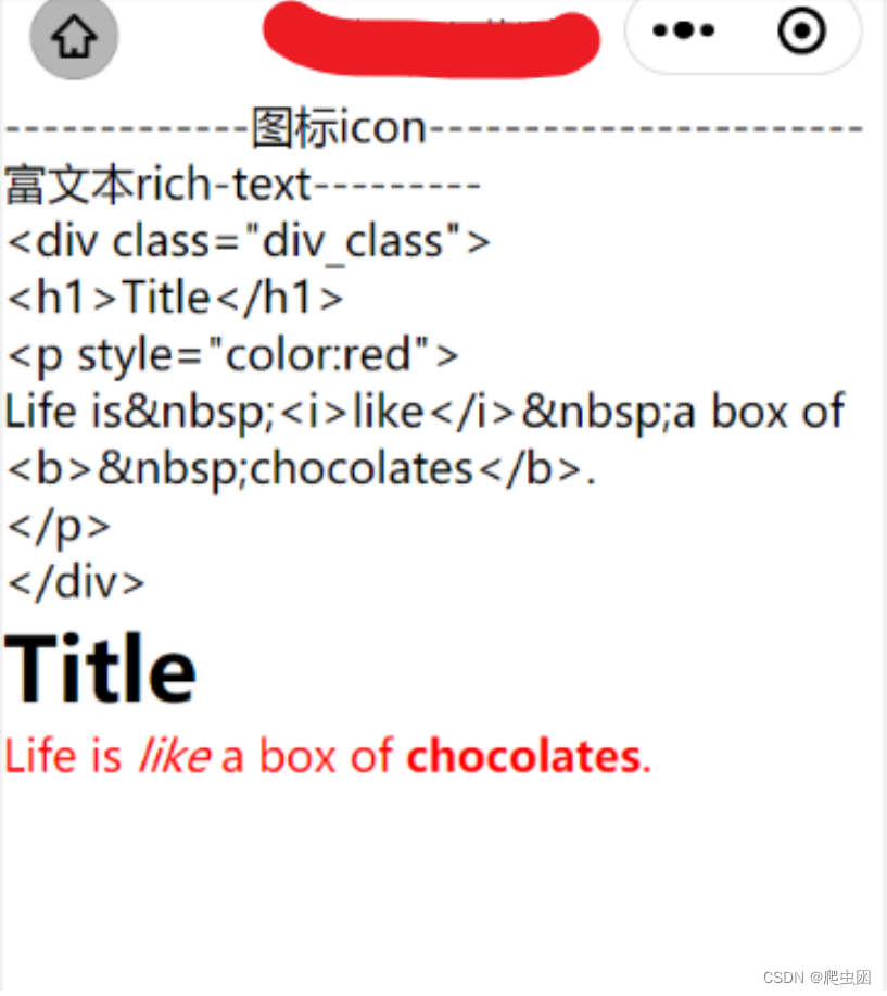
3.3 富文本rich-text
富文本
开发文档:https://developers.weixin.qq.com/miniprogram/dev/component/rich-text.html

space 的合法值

案例:
1.wxml 文件
<Label>-------------富文本rich-text---------</Label>
<view><text>{{htmlSnip}}</text></view>
<view>
	<rich-text nodes="{{htmlSnip}}"></rich-text>
</view>
2.wxjs文件
const htmlSnip =
<div class="div_class">
<h1>Title</h1>
<p style="color:red">
Life is <i>like</i> a box of
<b> chocolates</b>.
</p>
</div>`
Page({
data: {
htmlSnip
}
})
3.效果
4.表单组件
4.1 form 表单组件
表单
当点击 form 表单中 form-type 为 submit 的 button 组件时,会将表单组件中的 value 值进行提交,
需要在表单组件中加上 name 来作为 key。
开发文档:https://developers.weixin.qq.com/miniprogram/dev/component/form.html
4.2 button按钮
按钮
开发文档:https://developers.weixin.qq.com/miniprogram/dev/component/button.html
4.3 input输入框组件
输入框
开发文档:https://developers.weixin.qq.com/miniprogram/dev/component/input.html
4.4 checkbox
复选框
开发文档:https://developers.weixin.qq.com/miniprogram/dev/component/checkbox.html
4.5 radio
单选按钮
开发文档:https://developers.weixin.qq.com/miniprogram/dev/component/radio.html
4.6 slider
滑动选择器
开发文档: https://developers.weixin.qq.com/miniprogram/dev/component/slider.html
4.7 switch
开关选择器
开发文档:https://developers.weixin.qq.com/miniprogram/dev/component/switch.html
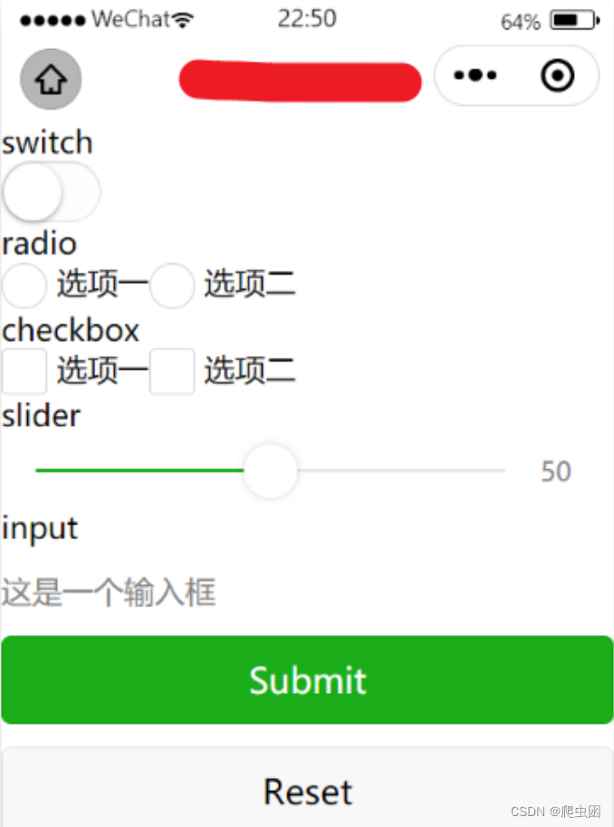
表单案例:
1.添加form页面
2.wxml文件
<view>
	<form catchsubmit="formSubmit" catchreset="formReset">
		<view>
			<view>switch</view>
			<switch name="switch" />
		</view>
		<view>
			<view>radio</view>
			<radio-group name="radio">
			<label>
				<radio value="radio1" />选项一
			</label>
			<label>
				<radio value="radio2" />选项二
			</label>
		</radio-group>
	</view>
	<view>
		<view>checkbox</view>
			<checkbox-group name="checkbox">
			<label>
				<checkbox value="checkbox1" />选项一
			</label>
			<label>
				<checkbox value="checkbox2" />选项二
			</label>
		</checkbox-group>
	</view>
		<view>
			<view>slider</view>
			<slider value="50" name="slider" show-value></slider>
		</view>
	<view>
		<view>input</view>
			<view style="margin: 30rpx 0">
				<input name="input" placeholder="这是一个输入框" />
			</view>
		</view>
	<view>
		<button style="margin: 30rpx 0" type="primary"formType="submit">Submit</button>
		<button style="margin: 30rpx 0" formType="reset">Reset</button>
	</view>
	</form>
</view>
3.wxjs文件
formSubmit(e){
console.log('form发生了submit事件,携带数据为:', e.detail.value)
},
4.效果如下图所示
5.导航
5.1 navigator
导航,跳转
开发文档:https://developers.weixin.qq.com/miniprogram/dev/component/navigator.html

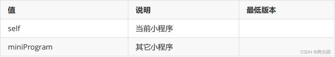
target 的合法值
open-type 的合法值
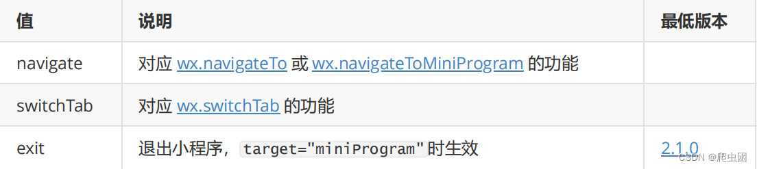
提示:
- open-type的值如果设置为navigate则可以拥有回退按钮;如果设置为redirect则没有回退按钮
- navigate、redirect这两值和switchTab这个值的区别在于前面两个不能跳转到带tabBar的页面;
而switchTab可以
案例:
1.创建nav导航页面
2.nav.wxml
<!--pages/nav/nav.wxml-->
<!-- 假如跳转到tabbar关联的页面,则需open-type="switchTab" -->
<navigator url="/pages/index/index" open-type="switchTab">跳转到tab首页</navigator>

<!-- open-type="navigate" 拥有回退按钮 -->
<navigator url="/pages/tap/tap" open-type="navigate">跳转到tap首页</navigator>
<navigator url="/pages/bcontent/bcontent" open-type="redirect">跳转到基本bcontent页</navigator>
<view bind:tap="tapEnterForm">通过事件代码进入视图容器页</view>
3.nav.js
Page({
	data: {
	},
	 onLoad: function (options) {
	},
	tapEnterForm:function() {
		wx.navigateTo({
			url: '/pages/container/container',
		})
	}
})
6.媒体组件
6.1 image
图片。支持 JPG、PNG、SVG、WEBP、GIF 等格式,2.3.0 起支持云文件ID
开发文档:https://developers.weixin.qq.com/miniprogram/dev/component/image.html
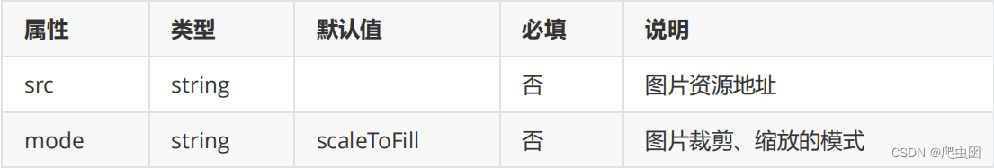
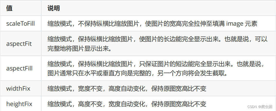
mode 的合法值 : 图片的填充方式
提示:
- image组件默认宽度320px、高度240px
- image组件中二维码/小程序码图片不支持长按识别。仅在wx.previewImage中支持长按识别
6.2 camera
系统相机, 扫码二维码功能
开发文档:https://developers.weixin.qq.com/miniprogram/dev/component/camera.html

mode 的合法值

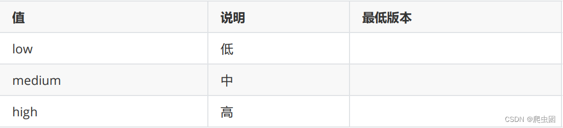
resolution 的合法值
提示:
同一页面只能插入一个 camera 组件
案例
1.添加media页面
2.media.wxml
<!-- camera.wxml -->
<camera style="width: 100%; height: 300px;" mode="normal"></camera>
<button type="primary" bindtap="takePhoto">拍照</button>
<view>预览</view>
<image mode="widthFix" src="{{src}}"></image>
3.media.js
Page({
	data: {
		},
	onLoad: function (options) {
	},
	takePhoto() {
		const ctx = wx.createCameraContext()
		ctx.takePhoto({
			quality: 'high',
			success: (res) => {
				this.setData({
					src: res.tempImagePath
				})
			}
		})
	},
})
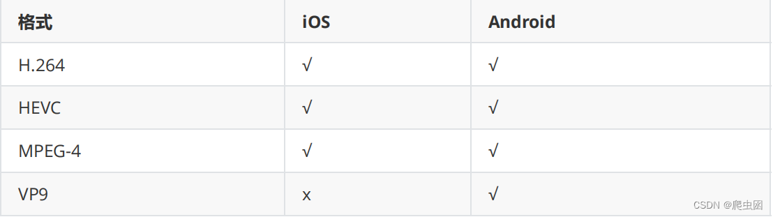
6.3 video
视频
开发文档:https://developers.weixin.qq.com/miniprogram/dev/component/video.html

支持的格式:兼容性才更好 , 版权 转成这种格式

支持的编码格式
media.wxml
<video autoplay loop controls="{{false}}"
src="http://wxsnsdy.tc.qq.com/105/20210/snsdyvideodownload?
filekey=30280201010421301f0201690402534804102ca905ce620b1241b726bc41dcff44e00204
012882540400&bizid=1023&hy=SH&fileparam=302c020101042530230204136ffd93020457e3c4
ff02024ef202031e8d7f02030f42400204045a320a0201000400"
></video>


 2965
2965


 被折叠的 条评论
为什么被折叠?
被折叠的 条评论
为什么被折叠?
 到【灌水乐园】发言


