


1、元素的显示和隐藏
display:none隐藏之后不再显示 不保留位置
visibility: hidden; 隐藏之后不保留位置
案例
要求:本来son元素是隐藏的,当鼠标放到father元素上时,使son元素显示
<!DOCTYPE html>
<html lang="en">

<head>
    <meta charset="UTF-8">
    <meta name="viewport" content="width=device-width, initial-scale=1.0">
    <title>Document</title>
    <style>
        .father {
            width: 300px;
            height: 300px;
            margin: 0 auto;
            border: 1px solid red;
        }
        /* 本来son元素是隐藏的,当鼠标放到father元素上时,使son元素显示 */

        .son {
            width: 100px;
            height: 100px;
            background-color: red;
            display: none;
        }

        .father:hover .son {
            display: block;
        }
    </style>
</head>

<body>
    <div class="father">
        <div class="son">son1</div>
    </div>
</body>

</html>
2、结构伪类选择器
-
:nth-child(n) 对指定序号的子元素设置样式(从前往后数)。参数可以使数字(1、2、3)、关键字(odd、even)、公式(2n、2n+3 :使用公式时,n从0开始),参数的索引起始值时1,而不是0。
-
:nth-last-child(n) 对指定序号的子元素设置样式(从后往前数)。参数同上。
-
:nth-of-type(n) 匹配指定序号的同一种类型的子元素(从前往后数)。参数同上。
-
:nth-last-of-type(n) 匹配 指定序号的同一种类型的子元素(从后往前数)。参数同上。
<!DOCTYPE html>
<html lang="en">

<head>
    <meta charset="UTF-8">
    <meta name="viewport" content="width=device-width, initial-scale=1.0">
    <title>Document</title>
    <style>
        /* nth-child(n) 对指定序号的子元素设置样式*/

        .nav li:nth-child(3) {
            color: red;
        }
        /* 2.odd奇数 even偶数 */

        .nav li:nth-child(odd) {
            color: red;
        }

        .nav li:nth-child(even) {
            color: blue
        }
        /* 3、2n+1 2n 4n 4n+1 n:从零开始 */

        .nav li:nth-child(2n+1) {
            color: green;
        }
        /* nth-of-type(n) 匹配指定序号的同一种类型的子元素(从前往后数) */

        .main p:nth-of-type(3) {
            color: pink;
        }
    </style>
</head>

<body>
    <ul class="nav">
        <li>li元素1</li>
        <li>li元素2</li>
        <li>li元素3</li>
        <li>li元素4</li>
        <li>li元素5</li>
        <li>li元素6</li>
        <li>li元素7</li>
        <li>li元素8</li>
    </ul>
    <div class="main">
        <span>你好</span>
        <p>p1</p>
        <p>p2</p>
        <!-- 目标元素 -->
        <p>p3</p>
        <p>p4</p>
        <p>p5</p>
    </div>
</body>

</html>
3、过渡(CSS3) transition
transition: 要过渡的属性 花费时间 运动曲线 何时开始;
如果有多组属性变化,还是用逗号隔开。
<!DOCTYPE html>
<html lang="en">
<head>
<meta charset="UTF-8">
<meta name="viewport" content="width=device-width, initial-scale=1.0">
<title>Document</title>
<style>
.box {
width: 200px;
height: 100px;
background-color: pink;
/* 过渡 transition: 要过度属性 过渡时间 运动曲线(ease 缓慢动画) 何时开始; */
/* transition: width 1s linear, height 1s; */
transition: all 1s;
}
.box:hover {
width: 1000px;
height: 400px;
background-color: red;
}
</style>
</head>
<body>
<div class="box">box</div>
</body>
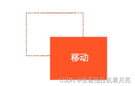
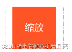
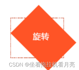
</html>2D变形(CSS3) transform
属性值:translate( 移动平移 ) scale(缩放)rotate(旋转)
transform:translate(50px,50px);
transform:scale(1.1);
transform:rotate(45deg);
动画(CSS3) animation
定义动画
@keyframes 动画名称 {
from{ 开始位置 }
to{ 结束 }
}
@keyframes 动画名称 {
0%
55%
....
100%
}
/* 关于几个值,除了名字,动画时间,延时有严格顺序要求其它随意*/
调用动画
animation:动画名称 动画时间 运动曲线 何时开始 播放次数 是否反方向;
<!DOCTYPE html>
<html lang="en">

<head>
    <meta charset="UTF-8">
    <meta name="viewport" content="width=device-width, initial-scale=1.0">
    <title>Document</title>
    <style>
        /* 元素移动 */
        /* 1、transform:translateX()
        2、margin-left
        3、定位 */

        @keyframes mover {
            from {
                /* transform: translate(0); */
                /* left: 100px; */
            }
            to {
                /* transform: translate(660px); */
                left: 600px;
            }
        }

        .car {
            /* 调用动画 */
            /* animation: 动画名称 动画时间 运动曲线 何时开始 播放次数(infinite无限次) 是否反方向; */
            animation: mover 2s linear;
            /* 动画完成后停留在最后位置 */
            animation-fill-mode: forwards;
            position: absolute;
            left: 0;
            top: 0;
        }
    </style>
</head>

<body>
    <div class="car"><img src="../img/car.jpg " alt="" width="100px"></div>
</body>

</html>
动画案例
<!DOCTYPE html>
<html lang="en">

<head>
    <meta charset="UTF-8">
    <meta name="viewport" content="width=device-width, initial-scale=1.0">
    <title>Document</title>
    <style>
        /* 元素移动 */
        /* 1、transform:translateX()
        2、margin-left
        3、定位 */

        @keyframes mover {
            0% {
                /* transform: translate(0); */
            }
            49% {
                transform: translateX(1000px);
            }
            50% {
                transform: translateX(1000px) rotateY(180deg);
            }
            99% {
                transform: translateX(0px) rotateY(180deg);
            }
            100% {
                transform: rotateY(0deg);
            }
        }

        .car {
            /* 调用动画 */
            /* animation: 动画名称 动画时间 运动曲线 何时开始 播放次数(infinite无限次) 是否反方向; */
            animation: mover 2s linear;
            /* 动画完成后停留在最后位置 */
            animation-fill-mode: forwards;
            position: absolute;
            left: 0;
            top: 0;
        }
    </style>
</head>

<body>
    <div class="car"><img src="../img/car.jpg " alt="" width="100px"></div>
</body>

</html>
弹性布局
flex布局
Flex 是 Flexible Box 的缩写,意为"弹性布局",用来为盒状模型提供最大的灵活性。
任何一个容器都可以指定为 Flex 布局。(芸芸众生皆平等)
.box {
display: flex;
}
采用 Flex 布局的元素,称为 Flex 容器(flex container),简称"容器"。它的所有子元素自动成为容器成员,称为 Flex 项目(flex item),简称"项目"。
.box {
flex-direction: row | row-reverse | column | column-reverse;
}
-
父盒子是:flex container
-
子元素是:flex item
-
总结原理:就是给父盒子添加flex属性,来控制子盒子的位置和排列方式
<!DOCTYPE html>
<html lang="en">

<head>
    <meta charset="UTF-8">
    <meta name="viewport" content="width=device-width, initial-scale=1.0">
    <title>Document</title>
    <style>
        .wrap {
            width: 600px;
            height: 200px;
            border: 1px solid red;
            margin: 100px auto;
            /* 使wrap元素成为弹性盒子 */
            display: flex;
            /* 如果子元素宽度不够可以自动进行缩放 */
            /* 如果父元素宽度剩余,会按照原来的大小显示 */
        }

        .wrap span {
            width: 100px;
            height: 150px;
            background-color: pink;
            margin-left: 10px;
        }
    </style>
</head>

<body>
    <div class="wrap">
        <!-- <div class="item1">item1</div>
        <div class="item2">item2</div>
        <div class="item3">item3</div>
        <div class="item4">item4</div>
        <div class="item5">item5</div>
        <div class="item6">item6</div>
        <div class="item6">item6</div>
        <div class="item6">item6</div>
        <div class="item6">item6</div> -->

        <!-- 对于子元素来说,什么样的标签元素都是一样的 -->
        <span class="item1">item1</span>
        <span class="item2">item2</span>
        <span class="item3">item3</span>
        <span class="item4">item4</span>
        <span class="item5">item5</span>
        <span class="item6">item6</span>
        <span class="item7">item7</span>
        <span class="item8">item8</span>
    </div>
</body>

</html>
弹性盒子的方向
-
flex-direction属性(主轴的方向)
-
它可能取有4个值:
-
row(默认值):主轴为水平方向,起点在左端。
-
row-reverse:主轴为水平方向,起点在右端。
-
column:主轴为垂直方向,起点在上沿。
-
column-reverse:主轴为垂直方向,起点在下沿。
<!DOCTYPE html>
<html lang="en">

<head>
    <meta charset="UTF-8">
    <meta name="viewport" content="width=device-width, initial-scale=1.0">
    <title>Document</title>
    <style>
        .wrap {
            width: 700px;
            height: 500px;
            border: 1px solid red;
            margin: 100px auto;
            /* 设置父元素为弹性盒子 */
            display: flex;
            /* 主轴的方向 */
            /* row主轴水平 从左向右 */
            /* column主轴垂直 从上向下 */
            flex-direction: row;
        }

        .wrap span {
            width: 200px;
            height: 150px;
            background-color: pink;
            margin-left: 10px;
        }
    </style>
</head>

<body>
    <div class="wrap">
        <span class="item1">item1</span>
        <span class="item2">item2</span>
        <span class="item3">item3</span>
        <span class="item4">item4</span>
        <span class="item5">item5</span>
        <span class="item6">item6</span>
    </div>
</body>

</html>
弹性盒子换行
.box{
flex-wrap: nowrap(默认) | wrap | wrap-reverse;
}
<!DOCTYPE html>
<html lang="en">

<head>
    <meta charset="UTF-8">
    <meta name="viewport" content="width=device-width, initial-scale=1.0">
    <title>Document</title>
    <style>
        .wrap {
            width: 700px;
            height: 500px;
            border: 1px solid red;
            margin: 100px auto;
            /* 设置父元素为弹性盒子 */
            display: flex;
            /* wrap换行 */
            /* nowrap 不换行 */
            flex-wrap: wrap;
        }

        .wrap span {
            width: 200px;
            height: 150px;
            background-color: pink;
            margin-left: 10px;
        }
    </style>
</head>

<body>
    <div class="wrap">
        <span class="item1">item1</span>
        <span class="item2">item2</span>
        <span class="item3">item3</span>
        <span class="item4">item4</span>
        <span class="item5">item5</span>
        <span class="item6">item6</span>
    </div>
</body>

</html>
弹性盒子主轴上的对齐方式
.box {
justify-content: flex-start(默认值) | flex-end | center | space-between | space-around;
}
-
flex-start(默认值):左对齐
-
flex-end:右对齐
-
center: 居中
-
space-between:两端对齐,项目之间的间隔都相等。
-
space-around:每个项目两侧的间隔相等。所以,项目之间的间隔比项目与边框的间隔大一倍。
<!DOCTYPE html>
<html lang="en">

<head>
    <meta charset="UTF-8">
    <meta name="viewport" content="width=device-width, initial-scale=1.0">
    <title>Document</title>
    <style>
        .wrap {
            width: 800px;
            height: 200px;
            border: 1px solid red;
            margin: 100px auto;
            /* 设置父元素为弹性盒子 */
            display: flex;
            /* 主轴上的对齐方式 */
            /* 默认左对齐 */
            justify-content: flex-start;
            /* 右对齐 */
            justify-content: flex-end;
            /* 居中 */
            justify-content: center;
            /* 两端对齐 */
            justify-content: space-between;
            /* 两侧相等 */
            justify-content: space-around;
        }

        .wrap div {
            width: 180px;
            height: 200px;
            background-color: pink;
        }
    </style>
</head>

<body>
    <div class="wrap">
        <div class="item1">item1</div>
        <div class="item2">item2</div>
        <div class="item3">item3</div>
        <div class="item4">item4</div>
    </div>
</body>

</html>
弹性盒子交叉轴的对齐方式
.box {
align-items: flex-start | flex-end | center | baseline | stretch;
}
<!DOCTYPE html>
<html lang="en">

<head>
    <meta charset="UTF-8">
    <meta name="viewport" content="width=device-width, initial-scale=1.0">
    <title>Document</title>
    <style>
        .wrap {
            width: 800px;
            height: 300px;
            border: 1px solid red;
            margin: 100px auto;
            /* 设置父元素为弹性盒子 */
            display: flex;
            justify-content: space-between;
            /* 交叉轴的对齐方式 */
            /* 居中 */
            align-items: center;
        }

        .wrap div {
            width: 180px;
            height: 200px;
            background-color: pink;
        }
    </style>
</head>

<body>
    <div class="wrap">
        <div class="item1">item1</div>
        <div class="item2">item2</div>
        <div class="item3">item3</div>
        <div class="item4">item4</div>
    </div>
</body>

</html>
嵌套的元素水平垂直居中
<!DOCTYPE html>
<html lang="en">

<head>
    <meta charset="UTF-8">
    <meta name="viewport" content="width=device-width, initial-scale=1.0">
    <title>Document</title>
    <style>
        .wrap {
            width: 800px;
            height: 300px;
            border: 1px solid red;
            margin: 100px auto;
            /* 设置父元素为弹性盒子 */
            display: flex;
            /* 水平居中 */
            justify-content: center;
            /* 交叉轴的对齐方式 */
            /* 垂直居中居中 */
            align-items: center;
        }

        .wrap div {
            width: 180px;
            height: 200px;
            background-color: pink;
        }
    </style>
</head>

<body>
    <div class="wrap">
        <div class="item1">item1</div>
        <div class="item2">item2</div>
        <div class="item3">item3</div>
        <div class="item4">item4</div>
    </div>
</body>

</html>


 563
563

 被折叠的 条评论
为什么被折叠?
被折叠的 条评论
为什么被折叠?
 到【灌水乐园】发言


