


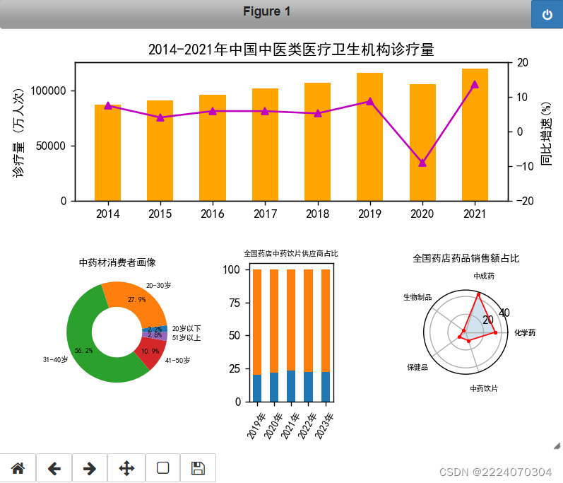
表1. 2014-2021年中国中医类医疗卫生机构诊疗量
| 年份(年) | 诊疗量(万人次) | 同比增速(%) |
| 2014 | 87430 | 7.40 |
| 2015 | 90912 | 4.00 |
| 2016 | 96225 | 5.83 |
| 2017 | 101885 | 5.81 |
| 2018 | 107147 | 5.16 |
| 2019 | 116390 | 8.63 |
| 2020 | 105764 | -9.13 |
| 2021 | 120215 | 13.66 |
表2. 中药材消费者画像数据
| 年龄 | 占比(%) |
| 20岁以下 | 2.2 |
| 20-30岁 | 27.9 |
| 31-40岁 | 56.2 |
| 41-50岁 | 10.9 |
| 51岁以上 | 2.8 |
表3. 全国药店中药饮片供应商占比情况
| 年份(年) | 跨国企业占比(%) | 本土企业占比(%) |
| 2019 | 20.3 | 79.7 |
| 2020 | 22.0 | 78.0 |
| 2021 | 23.5 | 76.5 |
| 2022 | 22.5 | 77.5 |
| 2023 | 22.3 | 77.7 |
表4. 全国药店药品销售额占比
| 药品类型 | 占比(%) |
| 化学药 | 33 |
| 中成药 | 45 |
| 生物制品 | 3 |
| 医疗器械 | 9 |
| 中药饮片 | 6 |
| 保健品 | 4 |
要求将数据可视化之后,排布到一张画布中,如下图所示:
完整实例代码
import matplotlib
import numpy as np
import matplotlib.pyplot as plt
import matplotlib.gridspec as gridspec
matplotlib.rcParams['font.sans-serif'] = ['SimHei']
fig2 = plt.figure()
spec2 = gridspec.GridSpec(nrows=2, ncols=3,figure=fig2, wspace=1,hspace=0.3)
ax1 = fig2.add_subplot(spec2[0,:])
ax1.set_title("2014-2021年中国中医类医疗卫生机构诊疗量")
ax2 = fig2.add_subplot(spec2[1,0])
ax2.set_title("中药材消费者画像")
ax3 = fig2.add_subplot(spec2[1,1])
ax3.set_title("全国药店中药饮片供应商占比")
ax4 = fig2.add_subplot(spec2[1,2], projection='polar')
ax4.set_title("全国药店药品销售占比")
#1,柱形和折线的融合图
x = [2014,2015,2016,2017,2018,2019,2020, 2021]
y = [7.40, 4.00, 5.83, 5.81, 5.16, 8.63, -9.13, 13.66]
z = [87430, 90912, 96225, 101885, 107147, 116390, 105764, 120215]
# 绘柱状图
ax1.bar(x=x, height=z, label='诊疗量(万人次)', color='Coral', alpha=0.8)
# 在左侧显示图例
ax1.legend(loc="upper left")
# 设置标题
#ax1.set_title("2014-2021年中国中医类医疗卫生机构诊疗量")
# 为坐标轴设置名称
ax1.set_ylabel("诊疗量(万人次)")
# 画折线图
ax02 = ax1.twinx()
ax02.set_ylabel("同比增速(%)")
# 设置坐标轴范围
ax02.set_ylim([-20, 20]);
plt.plot(x, y, marker='^',color='#9400d3', ms=10, linewidth='1', label="同比增速(%)")
# 在右侧显示图例
plt.legend(loc="upper right")
plt.savefig("同比增速(%)")
#2,饼图
ratios = [2.2, 27.9, 56.2, 10.9, 2.8] #各年龄段用户比例
labels = ['20岁以下', '20-30岁', '31-40岁', '41-50岁', '51岁以上']
ax2.pie(ratios, labels = labels,
textprops={'fontsize':6},
wedgeprops={'width': 0.5},
pctdistance=0.75,
autopct='%3.1f%%',
startangle=1)
#3,堆积柱形图
x_labels = ['2019年','2020年','2021年','2022年','2023年']
year_x2 = np.arange(2019,2024,1)
data1 = np.array([20.3,22.0,23.5,22.5,22.3])
data2 = np.array([79.7,78.0,76.5,77.5,77.7])
ax3.bar(year_x2,data1)
ax3.bar(year_x2, data2, bottom=data1)
ax3.set_xticks(year_x2)
ax3.set_xticklabels(x_labels, rotation=60)
#4,雷达图
dim_num = 6
radians = np.linspace(0, 2* np.pi, dim_num, endpoint=False)
radians = np.concatenate((radians, [radians[0]]))
score = np.array([33,45,3,9,6,4])
score = np.concatenate((score, [score[0]]))
radar_labels = ['化学药','中成药','生物制品','医疗器械','中药饮片','保健品']
radar_labels = np.concatenate((radar_labels, [radar_labels[0]]))
ax4.plot(radians,score, marker='o', markersize=2, color='r')
ax4.fill(radians,score,color='b',alpha=0.1)
angles = radians *180/np.pi #弧度转角度
ax4.set_thetagrids(angles, labels=radar_labels)
#5 展示图表
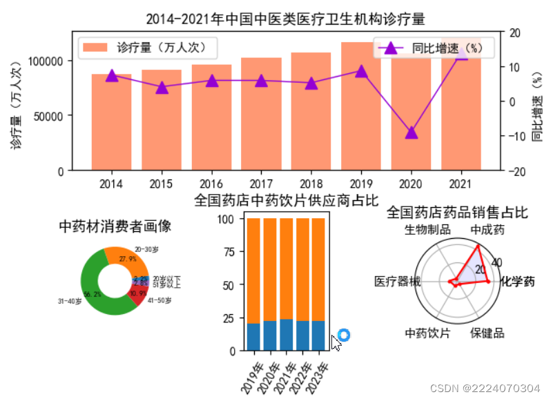
plt.show()运行结果如下


 464
464


 被折叠的 条评论
为什么被折叠?
被折叠的 条评论
为什么被折叠?
 到【灌水乐园】发言


