


目录
2、使用簇状柱状-折线图对2019年9月的售货机销售金额和销售金额环比增长率进行展示
1、使用南丁格尔玫瑰图对各区域无人售货机的销售金额、订单量、客单价等指标进行可视化展示。
4、使用簇状柱状-折线图对商品的滞销金额、库存数量和存货周转率进行展示
了解无人机售货机数据情况
在无人售货机信息表数据的预处理与建模完成后,从无人售货机销售的整体情况、销售情况、库存情况和用户情况4个方向对预处理和建模后的数据进行可视化展现与分析。


一、总数据模块分析
通过写echarts.total.js文件来实现最终大屏中总数据模块的效果。
源码及效果图如下
// 销售金额 & 订单量 & 毛利润 & 售货机数量 & 购买用户数
$.get("data/无人售货机各特征数据.json").done(function (data) {
    //data = JSON.parse(data);
    saleT('saleM', '销售金额', 0, data.销售金额[0], data.销售金额[1], data.销售金额[2], '','#1779d9','rgba(23,121,217,0.6)');
    saleT('orderQ', '订单量', 0, data.订单量[0], data.订单量[1], data.订单量[2], '','#30b761','rgba(48,183,97,0.5)');
    saleT('grossM', '毛利润', 0, data.毛利润[0], data.毛利润[1], data.毛利润[2], '','#d04a4b','rgba(208,74,75,0.5)');
    saleT('discount', '折扣额', 0, data.折扣额[0], data.折扣额[1], data.折扣额[2], '千','#ca841e','rgba(202,132,30,0.5)');
    saleT('unitP', '客单价', 0, data.客单价[0], data.客单价[1], data.客单价[2], '','#00a7c2','rgba(0,167,194,0.5)');
});
/*
 *id: chart容器id;
 *title: 仪表盘名称
 *min: 最小值
 *max: 最大值
 *val: 当前实际值
 *tag: 目标值
 *unit: 单位符号
 *color1: 主轴颜色
 */

var saleM = echarts.init(document.getElementById("saleM"));
var orderQ = echarts.init(document.getElementById("orderQ"));
var grossM = echarts.init(document.getElementById("grossM"));
var discount = echarts.init(document.getElementById("discount"));
var unitP = echarts.init(document.getElementById("unitP"));

function saleT(id, title, min, max, val, tag, unit, color1,  color2) {

    var myChart = echarts.init(document.getElementById(id));

    option = {
        tooltip: {
            confine:true,
            trigger: 'item',
            formatter:function(data){
                hbl = (data.value/tag).toFixed(2);
                return title + ":" + data.value + '<br/>' + name + ":" + hbl
            }
        },
        series: [{
            startAngle: 180,
            endAngle: 0,
            splitNumber: 1,
            name: title,
            type: 'gauge',
            radius: '100%',
            axisLine: {
                lineStyle: {
                    color: [
                        [0.25, '#1779da'],
                        [0.5, '#1779da'],
                        [1, '#ddd']
                    ],
                    width: 20
                }
            },
            axisTick: { show: false },
            axisLabel: {
                distance:0,
                width:30,
                height:24,
                lineHeight:24,
                padding:[25,-30,0],
                color:'rgba(255,255,255,0.5)',
                formatter: function (value) {
                    if(unit=='千'){
                        return (value/1000).toFixed(1) + ' ' + unit;
                    }else if(unit=='万'){
                        return (value/10000).toFixed(1) + ' ' + unit;
                    }else{
                        return value;
                    }
                }
            },
            splitLine: { show: false },
            pointer: { show:false, width: 3 },
            title: {
                offsetCenter: [0, '92%'],
                color:'rgba(255,255,255,0.7)'
            },
            detail: {
                offsetCenter: [0, '-10%'],
                formatter: function(value){
                    value1 = value / tag;
                    return '{a|' + value.toFixed(1) + '}';
                },
                rich: {
                    a: {
                        fontSize:'16',
                        fontWeight:'bold'
                    }
                }
            },
            data: [{}]
        }]
    };
    option.series[0].min = min;
    option.series[0].max = max;
    option.series[0].data[0].value = val;
    option.series[0].axisLine.lineStyle.color[0][0] = (tag - min) / (max - min);
    option.series[0].axisLine.lineStyle.color[0][1] = color2;
    option.series[0].axisLine.lineStyle.color[1][0] = (val - min) / (max - min);
    option.series[0].axisLine.lineStyle.color[1][1] = color1;

    myChart.setOption(option);

}


//销售金额变化趋势
//初始化图表
var saleRate = echarts.init(document.getElementById('saleRate'));
//设置图表option值
$.get("data/售货机销售金额及其环比增长率.json").done(function (data) {
    //data = JSON.parse(data);
	saleRate.setOption({
    tooltip: {
        trigger: 'axis',
        axisPointer: {
            type: 'cross'
        }
    },
    grid: {
        //用网格定位图表四边留空及顶部避开标题位置
        x: 10,
        y: 50,
        x2: 10,
        y2: 10,
        //使坐标轴数据能完整显示
        containLabel: true
    },
    //设置legend位置及数据,位于图表右上方
    legend: {
        data:['销售金额','销售金额环比增长率'],
        top: 10
    },
    barCategoryGap:'40%',
    xAxis: [
        {
            type: 'category',
            //日期数据
            data: data.日期,
            axisPointer: {
                type: 'shadow'
            },
            //运用eCharts内置方法格式化日期,使x轴日期数据更简洁,同时不影响原数据在鼠标交互时的完整展现
            axisLabel: {
                formatter: function(value){
                    return echarts.format.formatTime('dd', value);
                }
            }
        }
    ],
    yAxis: [
        {
            type: 'value',
            name: '销售金额(元)',
            //设置Y坐标轴最小值
            min: 0,
            //设置Y坐标轴最大值
            max: 15000,
            //设置Y坐标轴值间隔值
            interval: 5000
        },
        //定义Y轴右侧坐标轴
        {
            type: 'value',
            name: '环比增长率(%)',
            min: -0.5,
            max: 1,
            interval: 0.5
        }
    ],
    series: [
        {
            name:'销售金额',
            type:'bar',
            //设置显示坐标点数值
            label:{
                show:'true'
            },
            //销售金额数据
            data:data.销售金额
        },
        {
            name:'销售金额环比增长率',
            type:'line',
            //设置“销售金额环比增长率”数值样式,圆角矩形黑底白字,位于数据点上方
            label:{
                //设置显示坐标点数值
                show:'true',
                color:'#fff',
                backgroundColor:'rgba(0,0,0,0.7)',
                verticalAlign:'middle',
                padding:4,
                borderRadius:4,
                position:'top'
            },
            //设置“销售金额环比增长率”在坐标轴右侧显示
            yAxisIndex: 1,
            //销售金额环比增长率数据
            data:data.销售金额环比增长率
        }
    ]
		})
});


//商品销售金额Top5
var saleMtop5 = echarts.init(document.getElementById('saleMtop5'));
$.get("data/商品销售金额前5名.json").done(function (data) {
    //data = JSON.parse(data);
	saleMtop5.setOption({
    tooltip: {
        trigger: 'axis',
        axisPointer: {
            type: 'shadow'
        }
    },
    grid: {
        x: 10,
        y: 20,
        x2: 10,
        y2: 10,
        containLabel: true
    },
    barCategoryGap:'40%',
    xAxis: {
        type: 'value',
        boundaryGap: [0, 0.01],
        axisLine:{lineStyle:{width:0}},
    },
    yAxis: {
        type: 'category',
        splitLine:{lineStyle:{width:0}},
        data: data.商品名称
    },
    series: [
        {
            name: '售出总数量',
            type: 'bar',
            label:{
                position:'right',
                verticalAlign:'middle',
            },
            data: data.销售金额
        }
    ]
		})
});


//售货机销售情况
var saleOrder = echarts.init(document.getElementById('saleOrder'));
$.get("data/不同地点售货机销售数据.json").done(function (data) {
    //data = JSON.parse(data);
	saleOrder.setOption({
    tooltip: {
        trigger: 'axis',
        axisPointer: {
            type: 'cross',
            crossStyle: {
                color: '#999'
            }
        }
    },
    grid: {
        x: 10,
        y: 50,
        x2: 10,
        y2: 10,
        containLabel: true
    },
    toolbox: {
        show:false,
        feature: {
            dataView: {show: true, readOnly: false},
            magicType: {show: true, type: ['line', 'bar']},
            restore: {show: true},
            saveAsImage: {show: true}
        }
    },
    legend: {
        top:10
    },
    barGap:'10%',
    barCategoryGap:'35%',
    xAxis: [
        {
            type: 'category',
            data: data.地点,
            axisPointer: {
                type: 'shadow'
            },
            splitLine:{lineStyle:{width:0}},
        }
    ],
    yAxis: [
        {
            type: 'value',
            name: '',
            min: 0,
            axisLabel: {
                formatter: '{value}'
            },
            axisLine:{lineStyle:{width:0}},
        }
    ],
    series: [
        {
            name:'销售金额',
            type:'bar',
            data:data.销售金额
        },
        {
            name:'订单量',
            type:'bar',
            data:data.订单量
        },
        {
            name:'毛利润',
            type:'bar',
            data:data.毛利润
        }
    ]
		})
});


//支付方式占比
var payWay = echarts.init(document.getElementById('payWay'));
$.get("data/不同支付方式用户人数.json").done(function (data) {
    //data = JSON.parse(data);
	payWay.setOption({
    tooltip : {
        trigger: 'item',
        formatter: "{a} <br/>{b} : {c} ({d}%)"
    },
    legend: {
        data: data.支付方式,
        orient:'vertical',
        left:0,
        top:"25%"
    },
    grid: {
        left: '0%',
        right: '0%',
        bottom: '0%',
        containLabel: true
    },
    series : [
        {
            name: '支付方式占比',
            type: 'pie',
            radius : '62%',
            center: ['65%', '50%'],
            label:{
                formatter:"{b}\n{a|{d}%}",
                rich: {
                    a: {
                        padding:6,
                        align:'left',
                        color:'#999',
                    }
                }
            },
            data:data.data,
            itemStyle: {
                emphasis: {
                    shadowBlur: 10,
                    shadowOffsetX: 0,
                    shadowColor: 'rgba(0, 0, 0, 0.5)'
                }
            }
        }
    ]
		})
});


window.onresize = function() {
    saleM.resize();
    orderQ.resize();
    grossM.resize();
    discount.resize();
    unitP.resize();
    saleRate.resize();
    saleMtop5.resize();
    saleOrder.resize();
    payWay.resize();
};
1、使用仪表盘对数据进行展示
首先要对销售金额及其环比增长率进行展示,对订单量及其环比增长率进行展示,对毛利润及其环比增长率进行展示,对售货机数量及其环比增长率进行展示,对购买用户数及其环比增长率进行展示,那么我们可以考虑使用仪表盘对数据进行展示。
ECharts 仪表盘可以同时显示多个数据指标,让用户一目了然地了解数据情况。
用户可以根据自己的需求自定义仪表盘的样式,包括颜色、字体、大小等。
ECharts 仪表盘可以动态更新数据,让用户及时了解最新的数据情况。

// 销售金额 & 订单量 & 毛利润 & 售货机数量 & 购买用户数
$.get("data/无人售货机各特征数据.json").done(function (data) {
    //data = JSON.parse(data);
    saleT('saleM', '销售金额', 0, data.销售金额[0], data.销售金额[1], data.销售金额[2], '','#1779d9','rgba(23,121,217,0.6)');
    saleT('orderQ', '订单量', 0, data.订单量[0], data.订单量[1], data.订单量[2], '','#30b761','rgba(48,183,97,0.5)');
    saleT('grossM', '毛利润', 0, data.毛利润[0], data.毛利润[1], data.毛利润[2], '','#d04a4b','rgba(208,74,75,0.5)');
    saleT('discount', '折扣额', 0, data.折扣额[0], data.折扣额[1], data.折扣额[2], '千','#ca841e','rgba(202,132,30,0.5)');
    saleT('unitP', '客单价', 0, data.客单价[0], data.客单价[1], data.客单价[2], '','#00a7c2','rgba(0,167,194,0.5)');
});
/*
 *id: chart容器id;
 *title: 仪表盘名称
 *min: 最小值
 *max: 最大值
 *val: 当前实际值
 *tag: 目标值
 *unit: 单位符号
 *color1: 主轴颜色
 */

var saleM = echarts.init(document.getElementById("saleM"));
var orderQ = echarts.init(document.getElementById("orderQ"));
var grossM = echarts.init(document.getElementById("grossM"));
var discount = echarts.init(document.getElementById("discount"));
var unitP = echarts.init(document.getElementById("unitP"));

function saleT(id, title, min, max, val, tag, unit, color1,  color2) {

    var myChart = echarts.init(document.getElementById(id));

    option = {
        tooltip: {
            confine:true,
            trigger: 'item',
            formatter:function(data){
                hbl = (data.value/tag).toFixed(2);
                return title + ":" + data.value + '<br/>' + name + ":" + hbl
            }
        },
        series: [{
            startAngle: 180,
            endAngle: 0,
            splitNumber: 1,
            name: title,
            type: 'gauge',
            radius: '100%',
            axisLine: {
                lineStyle: {
                    color: [
                        [0.25, '#1779da'],
                        [0.5, '#1779da'],
                        [1, '#ddd']
                    ],
                    width: 20
                }
            },
            axisTick: { show: false },
            axisLabel: {
                distance:0,
                width:30,
                height:24,
                lineHeight:24,
                padding:[25,-30,0],
                color:'rgba(255,255,255,0.5)',
                formatter: function (value) {
                    if(unit=='千'){
                        return (value/1000).toFixed(1) + ' ' + unit;
                    }else if(unit=='万'){
                        return (value/10000).toFixed(1) + ' ' + unit;
                    }else{
                        return value;
                    }
                }
            },
            splitLine: { show: false },
            pointer: { show:false, width: 3 },
            title: {
                offsetCenter: [0, '92%'],
                color:'rgba(255,255,255,0.7)'
            },
            detail: {
                offsetCenter: [0, '-10%'],
                formatter: function(value){
                    value1 = value / tag;
                    return '{a|' + value.toFixed(1) + '}';
                },
                rich: {
                    a: {
                        fontSize:'16',
                        fontWeight:'bold'
                    }
                }
            },
            data: [{}]
        }]
    };
    option.series[0].min = min;
    option.series[0].max = max;
    option.series[0].data[0].value = val;
    option.series[0].axisLine.lineStyle.color[0][0] = (tag - min) / (max - min);
    option.series[0].axisLine.lineStyle.color[0][1] = color2;
    option.series[0].axisLine.lineStyle.color[1][0] = (val - min) / (max - min);
    option.series[0].axisLine.lineStyle.color[1][1] = color1;

    myChart.setOption(option);

}2、使用簇状柱状-折线图对2019年9月的售货机销售金额和销售金额环比增长率进行展示
Echarts簇状柱状-折线图可以同时展示柱状图和折线图,同时将这两种图形进行组合展示,方便用户同时查看两种数据的变化情况。
可视化效果好:Echarts簇状柱状-折线图采用了鲜艳的色彩和自适应的布局方式,使得数据更加直观易懂,能够更好地吸引用户的注意力,提高用户的数据分析效率。
交互性强:该图表支持鼠标悬停、拖拽、缩放等交互方式,能够更好地帮助用户进行数据分析和决策。
数据呈现灵活:Echarts簇状柱状-折线图支持多种数据格式输入,能够适应不同类型的数据呈现需求,同时也支持自定义图例、标签等,让用户可以更加灵活地呈现自己需要的数据信息。

//销售金额变化趋势
//初始化图表
var saleRate = echarts.init(document.getElementById('saleRate'));
//设置图表option值
$.get("data/售货机销售金额及其环比增长率.json").done(function (data) {
    //data = JSON.parse(data);
	saleRate.setOption({
    tooltip: {
        trigger: 'axis',
        axisPointer: {
            type: 'cross'
        }
    },
    grid: {
        //用网格定位图表四边留空及顶部避开标题位置
        x: 10,
        y: 50,
        x2: 10,
        y2: 10,
        //使坐标轴数据能完整显示
        containLabel: true
    },
    //设置legend位置及数据,位于图表右上方
    legend: {
        data:['销售金额','销售金额环比增长率'],
        top: 10
    },
    barCategoryGap:'40%',
    xAxis: [
        {
            type: 'category',
            //日期数据
            data: data.日期,
            axisPointer: {
                type: 'shadow'
            },
            //运用eCharts内置方法格式化日期,使x轴日期数据更简洁,同时不影响原数据在鼠标交互时的完整展现
            axisLabel: {
                formatter: function(value){
                    return echarts.format.formatTime('dd', value);
                }
            }
        }
    ],
    yAxis: [
        {
            type: 'value',
            name: '销售金额(元)',
            //设置Y坐标轴最小值
            min: 0,
            //设置Y坐标轴最大值
            max: 15000,
            //设置Y坐标轴值间隔值
            interval: 5000
        },
        //定义Y轴右侧坐标轴
        {
            type: 'value',
            name: '环比增长率(%)',
            min: -0.5,
            max: 1,
            interval: 0.5
        }
    ],
    series: [
        {
            name:'销售金额',
            type:'bar',
            //设置显示坐标点数值
            label:{
                show:'true'
            },
            //销售金额数据
            data:data.销售金额
        },
        {
            name:'销售金额环比增长率',
            type:'line',
            //设置“销售金额环比增长率”数值样式,圆角矩形黑底白字,位于数据点上方
            label:{
                //设置显示坐标点数值
                show:'true',
                color:'#fff',
                backgroundColor:'rgba(0,0,0,0.7)',
                verticalAlign:'middle',
                padding:4,
                borderRadius:4,
                position:'top'
            },
            //设置“销售金额环比增长率”在坐标轴右侧显示
            yAxisIndex: 1,
            //销售金额环比增长率数据
            data:data.销售金额环比增长率
        }
    ]
		})
});3、使用条形图对销售金额排名前5名的商品进行展示
易于使用:Echarts 条形图提供了丰富的配置选项,使得用户可以很方便地进行图表的定制和配置,同时 Echarts 还提供了丰富的示例和文档,使得用户可以快速上手。
数据可视化效果好:Echarts 条形图采用了直观的条形表示方式,使得数据可以被清晰地呈现出来,同时还提供了各种动画效果和交互方式,使得用户可以更好地理解数据。
高度可定制性:Echarts 条形图提供了多种配置选项,用户可以根据自己的需求进行图表的定制和配置,包括样式、颜色、字体、坐标轴等多个方面。
兼容性好:Echarts 条形图支持多种浏览器,并且还支持响应式布局,可以适应不同大小的屏幕。

//商品销售金额Top5
var saleMtop5 = echarts.init(document.getElementById('saleMtop5'));
$.get("data/商品销售金额前5名.json").done(function (data) {
    //data = JSON.parse(data);
	saleMtop5.setOption({
    tooltip: {
        trigger: 'axis',
        axisPointer: {
            type: 'shadow'
        }
    },
    grid: {
        x: 10,
        y: 20,
        x2: 10,
        y2: 10,
        containLabel: true
    },
    barCategoryGap:'40%',
    xAxis: {
        type: 'value',
        boundaryGap: [0, 0.01],
        axisLine:{lineStyle:{width:0}},
    },
    yAxis: {
        type: 'category',
        splitLine:{lineStyle:{width:0}},
        data: data.商品名称
    },
    series: [
        {
            name: '售出总数量',
            type: 'bar',
            label:{
                position:'right',
                verticalAlign:'middle',
            },
            data: data.销售金额
        }
    ]
		})
});4、使用簇状柱状图对统计结果进行展示
Echarts的簇状柱状图是一种特殊的柱状图,它可以用来表示时间序列数据或分布数据,并且可以清晰地显示出数据的分布情况。它的主要优点包括:
易于理解:它可以清晰地显示数据的分布情况,使得数据更易于理解和解释。
美观:它通常比普通的柱状图更美观,有时甚至可以用来作为报告或者报告的一部分,增强可视化的效果。
动态效果:Echarts的动态效果可以让复杂的数据更加生动,更加容易理解。

//售货机销售情况
var saleOrder = echarts.init(document.getElementById('saleOrder'));
$.get("data/不同地点售货机销售数据.json").done(function (data) {
    //data = JSON.parse(data);
	saleOrder.setOption({
    tooltip: {
        trigger: 'axis',
        axisPointer: {
            type: 'cross',
            crossStyle: {
                color: '#999'
            }
        }
    },
    grid: {
        x: 10,
        y: 50,
        x2: 10,
        y2: 10,
        containLabel: true
    },
    toolbox: {
        show:false,
        feature: {
            dataView: {show: true, readOnly: false},
            magicType: {show: true, type: ['line', 'bar']},
            restore: {show: true},
            saveAsImage: {show: true}
        }
    },
    legend: {
        top:10
    },
    barGap:'10%',
    barCategoryGap:'35%',
    xAxis: [
        {
            type: 'category',
            data: data.地点,
            axisPointer: {
                type: 'shadow'
            },
            splitLine:{lineStyle:{width:0}},
        }
    ],
    yAxis: [
        {
            type: 'value',
            name: '',
            min: 0,
            axisLabel: {
                formatter: '{value}'
            },
            axisLine:{lineStyle:{width:0}},
        }
    ],
    series: [
        {
            name:'销售金额',
            type:'bar',
            data:data.销售金额
        },
        {
            name:'订单量',
            type:'bar',
            data:data.订单量
        },
        {
            name:'毛利润',
            type:'bar',
            data:data.毛利润
        }
    ]
		})
});5、使用饼图对不同的支付方式占比进行展示
显示各项的大小与各项总和的所占比例,适用简单的占比比例图,在不要求数据精细的情况下适用。
明确显示数据的比例情况

//支付方式占比
var payWay = echarts.init(document.getElementById('payWay'));
$.get("data/不同支付方式用户人数.json").done(function (data) {
    //data = JSON.parse(data);
	payWay.setOption({
    tooltip : {
        trigger: 'item',
        formatter: "{a} <br/>{b} : {c} ({d}%)"
    },
    legend: {
        data: data.支付方式,
        orient:'vertical',
        left:0,
        top:"25%"
    },
    grid: {
        left: '0%',
        right: '0%',
        bottom: '0%',
        containLabel: true
    },
    series : [
        {
            name: '支付方式占比',
            type: 'pie',
            radius : '62%',
            center: ['65%', '50%'],
            label:{
                formatter:"{b}\n{a|{d}%}",
                rich: {
                    a: {
                        padding:6,
                        align:'left',
                        color:'#999',
                    }
                }
            },
            data:data.data,
            itemStyle: {
                emphasis: {
                    shadowBlur: 10,
                    shadowOffsetX: 0,
                    shadowColor: 'rgba(0, 0, 0, 0.5)'
                }
            }
        }
    ]
		})
});


window.onresize = function() {
    saleM.resize();
    orderQ.resize();
    grossM.resize();
    discount.resize();
    unitP.resize();
    saleRate.resize();
    saleMtop5.resize();
    saleOrder.resize();
    payWay.resize();
};
二、销售分析模块分析
通过写echarts.sale.js文件来实现最终大屏中总数据模块的效果。
源码及效果图如下
// 销售金额
var saleM_Site = echarts.init(document.getElementById('saleM_Site'));
$.get("data/不同区域的各指标数据.json").done(function (data) {
    //data = JSON.parse(data),
	saleM_Site.setOption({
    tooltip : {
        trigger: 'item',
        formatter: "{b}:<br/>{c} 元<br/>({d}%)"
    },
    legend: {
        type:'scroll',
        data:data.where
    },
    toolbox: {
        show : false,
        feature : {
            mark : {show: true},
            dataView : {show: true, readOnly: false},
            magicType : {
                show: true,
                type: ['pie', 'funnel']
            },
            restore : {show: true},
            saveAsImage : {show: true}
        }
    },
    calculable : true,
    series : [
        {
            name:'地点',
            type:'pie',
            radius : ["25%", '60%'],
            center : ['50%', '57%'],
            roseType : 'area',
            label:{
                show:true,
                formatter:'{c}'
            },
            data:data.sale
        },
        {
            type:'pie',radius:'25%',center:['50%','57%'],
            label: {normal:{position:'center',color:'#fff'}},
            labelLine:{normal:{show:false}},itemStyle:{color:'transparent'},
            data:[{value:1,name:'地点',tooltip:{formatter:' ',backgroundColor:'none'}}]
        },
    ]
		})
});


// 订单量
var orderQ_Site = echarts.init(document.getElementById('orderQ_Site'));
$.get("data/不同区域的各指标数据.json").done(function (data) {
    //data = JSON.parse(data),
	orderQ_Site.setOption({
    tooltip : {
        trigger: 'item',
        formatter:  "{b}:<br/>{c} 个<br/>({d}%)"
    },
    legend: {
        type:'scroll',
        data:data.where
    },
    toolbox: {
        show : false,
        feature : {
            mark : {show: true},
            dataView : {show: true, readOnly: false},
            magicType : {
                show: true,
                type: ['pie', 'funnel']
            },
            restore : {show: true},
            saveAsImage : {show: true}
        }
    },
    calculable : true,
    series : [
        {
            name:'地点',
            type:'pie',
            radius : ["25%", '60%'],
            center : ['50%', '57%'],
            roseType : 'area',
            label:{
                show:true,
                formatter:'{c}'
            },
            data:data.order
        },
        {
            type:'pie',radius:'25%',center:['50%','57%'],
            label: {normal:{position:'center',color:'#fff'}},
            labelLine:{normal:{show:false}},itemStyle:{color:'transparent'},
            data:[{value:1,name:'地点',tooltip:{formatter:' ',backgroundColor:'none'}}]
        },
    ]
		})
});


// 毛利润
var grossM_Site = echarts.init(document.getElementById('grossM_Site'));
$.get("data/不同区域的各指标数据.json").done(function (data) {
    //data = JSON.parse(data),
	grossM_Site.setOption({
    tooltip : {
        trigger: 'item',
        formatter:  "{b}:<br/>{c} 元<br/>({d}%)"
    },
    legend: {
        type:'scroll',
        data:data.where
    },
    toolbox: {
        show : false,
        feature : {
            mark : {show: true},
            dataView : {show: true, readOnly: false},
            magicType : {
                show: true,
                type: ['pie', 'funnel']
            },
            restore : {show: true},
            saveAsImage : {show: true}
        }
    },
    calculable : true,
    series : [
        {
            name:'地点',
            type:'pie',
            radius : ["25%", '60%'],
            center : ['50%', '57%'],
            roseType : 'area',
            label:{
                show:true,
                formatter:'{c}'
            },
            data:data.gross
        },
        {
            type:'pie',radius:'25%',center:['50%','57%'],
            label: {normal:{position:'center',color:'#fff'}},
            labelLine:{normal:{show:false}},itemStyle:{color:'transparent'},
            data:[{value:1,name:'地点',tooltip:{formatter:' ',backgroundColor:'none'}}]
        },
    ]
		})
});


// 客单价平均值
var unitP_Site = echarts.init(document.getElementById('unitP_Site'));
$.get("data/不同区域的各指标数据.json").done(function (data) {
    //data = JSON.parse(data),
	unitP_Site.setOption({
    tooltip : {
        trigger: 'item',
        formatter:  "{b}:<br/>{c} 元<br/>({d}%)"
    },
    legend: {
        type:'scroll',
        data:data.where
    },
    toolbox: {
        show : false,
        feature : {
            mark : {show: true},
            dataView : {show: true, readOnly: false},
            magicType : {
                show: true,
                type: ['pie', 'funnel']
            },
            restore : {show: true},
            saveAsImage : {show: true}
        }
    },
    calculable : true,
    series : [
        {
            name:'地点',
            type:'pie',
            radius : ["25%", '60%'],
            center : ['50%', '57%'],
            roseType : 'area',
            label:{
                show:true,
                formatter:'{c}'
            },
            data:data.unit
        },
        {
            type:'pie',radius:'25%',center:['50%','57%'],
            label: {normal:{position:'center',color:'#fff'}},
            labelLine:{normal:{show:false}},itemStyle:{color:'transparent'},
            data:[{value:1,name:'地点',tooltip:{formatter:' ',backgroundColor:'none'}}]
        },
    ]
		})
});


// 商品销售数量Top10
var saleMtop10 = echarts.init(document.getElementById('saleMtop10'));
$.get("data/商品销售数量前10.json").done(function (data) {
    //data = JSON.parse(data),
	saleMtop10.setOption({
    tooltip: {
        trigger: 'axis',
        axisPointer: {
            type: 'shadow'
        }
    },
    grid: {
        left: '0%',
        top:'20',
        right:'2%',
        bottom: '10',
        containLabel: true
    },
    barCategoryGap:'40%',
    xAxis: {
        type: 'value',
        min: 0,
        interval: 5,
        boundaryGap: [0, 0.01],
        axisLine:{lineStyle:{width:0}},
    },
    yAxis: {
        type: 'category',
        splitLine:{lineStyle:{width:0}},
        data: data.商品名称
    },
    series: [
        {
            name: '售出总数量',
            type: 'bar',
            label:{
                position:'right',
                verticalAlign:'middle',
            },
            data: data.销售数量
        }
    ]
		})
});


// 商品价格区间
var priceRange = echarts.init(document.getElementById('priceRange'));
$.get("data/商品销量数量和价格数据.json").done(function (data) {
    //data = JSON.parse(data),
	priceRange.setOption({
    grid: {
        left: '3%',
        right: '10',
        bottom: '10',
        containLabel: true
    },
    tooltip : {
        showDelay : 0,
        formatter : function (params) {
                return params.seriesName + '<br/>'
                + '单价:' + params.value[0] + '<br/>'
                + '销量:' + params.value[1];
        },
        axisPointer:{
            show: true,
            type : 'cross',
            lineStyle: {
                type : 'dashed',
                width : 1
            }
        }
    },

    legend: {
        type:'scroll',
    },
    xAxis :{ scale:true},
    yAxis :{ scale:true},
	})
});
$.get("data/商品销量数量和价格数据.json").done(function (data) {
    //data = JSON.parse(data);
    var series=[];
    for(var i = 0;i < data.data.length;i++){
        series.push({
            name: data.data[i].name,
            type: 'scatter',
            data: [data.data[i].value],
            symbolSize:data.data[i].value[1]*2
        });
    }
    priceRange.setOption({
        series:series
    });
});


// 销售金额预测值与实际值
var saleAll = echarts.init(document.getElementById('saleAll'));
$.get("data/销售金额实际值与预测值.json").done(function (data) {
    //data = JSON.parse(data),
	saleAll.setOption({
    tooltip: {
        trigger: 'axis'
    },
    legend: {
        type:'scroll'
    },
    grid: {
        left: '10',
        right: '20',
        bottom: '10',
        containLabel: true
    },
    xAxis:  {
        type: 'category',
        boundaryGap: false,
        data: ['1日','2日','3日','4日','5日','6日','7日','8日','9日','10日',
		'11日','12日','13日','14日','15日','16日','17日','18日','19日','20日','21日','22日']
    },
    yAxis: {
        type: 'value',
        name: '金额(万元)',
        axisLabel: {
            formatter: '{value}'
        }
    },
    series: [
        {
            name:'销售金额实际值',
            type:'line',
            data:data.T,
            areaStyle: {
                normal: {
                    color: new echarts.graphic.LinearGradient(0, 0, 0, 1, [{
                        offset: 0,
                        color: 'rgba(194, 53, 49,.8)'
                    }, {
                        offset: 1,
                        color: 'transparent'
                    }])
                }
            },
        },
        {
            type:'line',
            name:'销售金额预测值',
            data:data.Y,
            areaStyle:{
                normal: {
                    color: new echarts.graphic.LinearGradient(0, 0, 0, 1, [{
                        offset: 0,
                        color: 'rgba(47, 69, 84,.4)'
                    }, {
                        offset: 1,
                        color: 'transparent'
                    }])
                }
            }
        },
    ]
		})
});


window.onresize = function() {
    saleM_Site.resize();
    orderQ_Site.resize();
    grossM_Site.resize();
    unitP_Site.resize();
    saleMtop10.resize();
    priceRange.resize();
    saleAll.resize();
}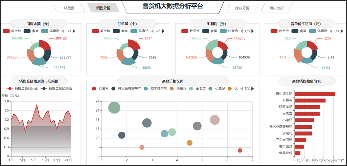
1、使用南丁格尔玫瑰图对各区域无人售货机的销售金额、订单量、客单价等指标进行可视化展示。
南丁格尔玫瑰图是将柱状图 转化为更美观的饼图形式,是极坐标化的柱状图 。不同于饼图用角度表现数值或占比,南丁格尔玫瑰图使用扇形的半径表示数据的大小。为了方便对比分析不同区域无人售货机的销售情况,可以使用南丁格尔玫瑰图对各区域无人售货机的销售金额、订单量、客单价等指标进行可视化展示。

几个图表大体相同,只需修改几个小地方
// 销售金额
var saleM_Site = echarts.init(document.getElementById('saleM_Site'));
$.get("data/不同区域的各指标数据.json").done(function (data) {
    //data = JSON.parse(data),
	saleM_Site.setOption({
    tooltip : {
        trigger: 'item',
        formatter: "{b}:<br/>{c} 元<br/>({d}%)"
    },
    legend: {
        type:'scroll',
        data:data.where
    },
    toolbox: {
        show : false,
        feature : {
            mark : {show: true},
            dataView : {show: true, readOnly: false},
            magicType : {
                show: true,
                type: ['pie', 'funnel']
            },
            restore : {show: true},
            saveAsImage : {show: true}
        }
    },
    calculable : true,
    series : [
        {
            name:'地点',
            type:'pie',
            radius : ["25%", '60%'],
            center : ['50%', '57%'],
            roseType : 'area',
            label:{
                show:true,
                formatter:'{c}'
            },
            data:data.sale
        },
        {
            type:'pie',radius:'25%',center:['50%','57%'],
            label: {normal:{position:'center',color:'#fff'}},
            labelLine:{normal:{show:false}},itemStyle:{color:'transparent'},
            data:[{value:1,name:'地点',tooltip:{formatter:' ',backgroundColor:'none'}}]
        },
    ]
		})
});


// 订单量
var orderQ_Site = echarts.init(document.getElementById('orderQ_Site'));
$.get("data/不同区域的各指标数据.json").done(function (data) {
    //data = JSON.parse(data),
	orderQ_Site.setOption({
    tooltip : {
        trigger: 'item',
        formatter:  "{b}:<br/>{c} 个<br/>({d}%)"
    },
    legend: {
        type:'scroll',
        data:data.where
    },
    toolbox: {
        show : false,
        feature : {
            mark : {show: true},
            dataView : {show: true, readOnly: false},
            magicType : {
                show: true,
                type: ['pie', 'funnel']
            },
            restore : {show: true},
            saveAsImage : {show: true}
        }
    },
    calculable : true,
    series : [
        {
            name:'地点',
            type:'pie',
            radius : ["25%", '60%'],
            center : ['50%', '57%'],
            roseType : 'area',
            label:{
                show:true,
                formatter:'{c}'
            },
            data:data.order
        },
        {
            type:'pie',radius:'25%',center:['50%','57%'],
            label: {normal:{position:'center',color:'#fff'}},
            labelLine:{normal:{show:false}},itemStyle:{color:'transparent'},
            data:[{value:1,name:'地点',tooltip:{formatter:' ',backgroundColor:'none'}}]
        },
    ]
		})
});


// 毛利润
var grossM_Site = echarts.init(document.getElementById('grossM_Site'));
$.get("data/不同区域的各指标数据.json").done(function (data) {
    //data = JSON.parse(data),
	grossM_Site.setOption({
    tooltip : {
        trigger: 'item',
        formatter:  "{b}:<br/>{c} 元<br/>({d}%)"
    },
    legend: {
        type:'scroll',
        data:data.where
    },
    toolbox: {
        show : false,
        feature : {
            mark : {show: true},
            dataView : {show: true, readOnly: false},
            magicType : {
                show: true,
                type: ['pie', 'funnel']
            },
            restore : {show: true},
            saveAsImage : {show: true}
        }
    },
    calculable : true,
    series : [
        {
            name:'地点',
            type:'pie',
            radius : ["25%", '60%'],
            center : ['50%', '57%'],
            roseType : 'area',
            label:{
                show:true,
                formatter:'{c}'
            },
            data:data.gross
        },
        {
            type:'pie',radius:'25%',center:['50%','57%'],
            label: {normal:{position:'center',color:'#fff'}},
            labelLine:{normal:{show:false}},itemStyle:{color:'transparent'},
            data:[{value:1,name:'地点',tooltip:{formatter:' ',backgroundColor:'none'}}]
        },
    ]
		})
});


// 客单价平均值
var unitP_Site = echarts.init(document.getElementById('unitP_Site'));
$.get("data/不同区域的各指标数据.json").done(function (data) {
    //data = JSON.parse(data),
	unitP_Site.setOption({
    tooltip : {
        trigger: 'item',
        formatter:  "{b}:<br/>{c} 元<br/>({d}%)"
    },
    legend: {
        type:'scroll',
        data:data.where
    },
    toolbox: {
        show : false,
        feature : {
            mark : {show: true},
            dataView : {show: true, readOnly: false},
            magicType : {
                show: true,
                type: ['pie', 'funnel']
            },
            restore : {show: true},
            saveAsImage : {show: true}
        }
    },
    calculable : true,
    series : [
        {
            name:'地点',
            type:'pie',
            radius : ["25%", '60%'],
            center : ['50%', '57%'],
            roseType : 'area',
            label:{
                show:true,
                formatter:'{c}'
            },
            data:data.unit
        },
        {
            type:'pie',radius:'25%',center:['50%','57%'],
            label: {normal:{position:'center',color:'#fff'}},
            labelLine:{normal:{show:false}},itemStyle:{color:'transparent'},
            data:[{value:1,name:'地点',tooltip:{formatter:' ',backgroundColor:'none'}}]
        },
    ]
		})
});2、使用条形图对销售数量前10名的商品进行展示
易于使用:Echarts 条形图提供了丰富的配置选项,使得用户可以很方便地进行图表的定制和配置,同时 Echarts 还提供了丰富的示例和文档,使得用户可以快速上手。
数据可视化效果好:Echarts 条形图采用了直观的条形表示方式,使得数据可以被清晰地呈现出来,同时还提供了各种动画效果和交互方式,使得用户可以更好地理解数据。
高度可定制性:Echarts 条形图提供了多种配置选项,用户可以根据自己的需求进行图表的定制和配置,包括样式、颜色、字体、坐标轴等多个方面。
兼容性好:Echarts 条形图支持多种浏览器,并且还支持响应式布局,可以适应不同大小的屏幕。

// 商品销售数量Top10
var saleMtop10 = echarts.init(document.getElementById('saleMtop10'));
$.get("data/商品销售数量前10.json").done(function (data) {
    //data = JSON.parse(data),
	saleMtop10.setOption({
    tooltip: {
        trigger: 'axis',
        axisPointer: {
            type: 'shadow'
        }
    },
    grid: {
        left: '0%',
        top:'20',
        right:'2%',
        bottom: '10',
        containLabel: true
    },
    barCategoryGap:'40%',
    xAxis: {
        type: 'value',
        min: 0,
        interval: 5,
        boundaryGap: [0, 0.01],
        axisLine:{lineStyle:{width:0}},
    },
    yAxis: {
        type: 'category',
        splitLine:{lineStyle:{width:0}},
        data: data.商品名称
    },
    series: [
        {
            name: '售出总数量',
            type: 'bar',
            label:{
                position:'right',
                verticalAlign:'middle',
            },
            data: data.销售数量
        }
    ]
		})
});
3、使用气泡图对商品销售数量和商品价格进行展示。
显示若干数据系列中各数值之间的关系,类似 XY 轴,判断两变量之间是否存在某种关联;
散点图适用于三维数据集,但是其中只有两维数据是需要比较的,另外,散点图还可以看出极值的分布情况。
优势:
对于处理值的分布和数据点的分簇区域(通过设置横纵项的辅助线)。
散点图都很理想,如果数据集中包含非常多的点,那么散点图便是最佳图表类型。

// 商品价格区间
var priceRange = echarts.init(document.getElementById('priceRange'));
$.get("data/商品销量数量和价格数据.json").done(function (data) {
    //data = JSON.parse(data),
	priceRange.setOption({
    grid: {
        left: '3%',
        right: '10',
        bottom: '10',
        containLabel: true
    },
    tooltip : {
        showDelay : 0,
        formatter : function (params) {
                return params.seriesName + '<br/>'
                + '单价:' + params.value[0] + '<br/>'
                + '销量:' + params.value[1];
        },
        axisPointer:{
            show: true,
            type : 'cross',
            lineStyle: {
                type : 'dashed',
                width : 1
            }
        }
    },

    legend: {
        type:'scroll',
    },
    xAxis :{ scale:true},
    yAxis :{ scale:true},
	})
});
$.get("data/商品销量数量和价格数据.json").done(function (data) {
    //data = JSON.parse(data);
    var series=[];
    for(var i = 0;i < data.data.length;i++){
        series.push({
            name: data.data[i].name,
            type: 'scatter',
            data: [data.data[i].value],
            symbolSize:data.data[i].value[1]*2
        });
    }
    priceRange.setOption({
        series:series
    });
});4、使用折线图进行展示预测之后的商品销售情况
折线图适合二维的大数据集,还适合多个二维数据集的比较,一般用来表示趋势的变化,横轴一般为日期字段。
容易反应出数据变化的趋势。

// 销售金额预测值与实际值
var saleAll = echarts.init(document.getElementById('saleAll'));
$.get("data/销售金额实际值与预测值.json").done(function (data) {
    //data = JSON.parse(data),
	saleAll.setOption({
    tooltip: {
        trigger: 'axis'
    },
    legend: {
        type:'scroll'
    },
    grid: {
        left: '10',
        right: '20',
        bottom: '10',
        containLabel: true
    },
    xAxis:  {
        type: 'category',
        boundaryGap: false,
        data: ['1日','2日','3日','4日','5日','6日','7日','8日','9日','10日',
		'11日','12日','13日','14日','15日','16日','17日','18日','19日','20日','21日','22日']
    },
    yAxis: {
        type: 'value',
        name: '金额(万元)',
        axisLabel: {
            formatter: '{value}'
        }
    },
    series: [
        {
            name:'销售金额实际值',
            type:'line',
            data:data.T,
            areaStyle: {
                normal: {
                    color: new echarts.graphic.LinearGradient(0, 0, 0, 1, [{
                        offset: 0,
                        color: 'rgba(194, 53, 49,.8)'
                    }, {
                        offset: 1,
                        color: 'transparent'
                    }])
                }
            },
        },
        {
            type:'line',
            name:'销售金额预测值',
            data:data.Y,
            areaStyle:{
                normal: {
                    color: new echarts.graphic.LinearGradient(0, 0, 0, 1, [{
                        offset: 0,
                        color: 'rgba(47, 69, 84,.4)'
                    }, {
                        offset: 1,
                        color: 'transparent'
                    }])
                }
            }
        },
    ]
		})
});


window.onresize = function() {
    saleM_Site.resize();
    orderQ_Site.resize();
    grossM_Site.resize();
    unitP_Site.resize();
    saleMtop10.resize();
    priceRange.resize();
    saleAll.resize();
}
三、库存分析模块分析
通过写echarts.int.js文件来实现最终大屏中总数据模块的效果。
源码及效果图如下
// 商品存货周转天数
var formatUtil = echarts.format;
var turnaround = echarts.init(document.getElementById('turnaround'));
$.get("data/各类商品存货周转天数.json").done(function (data) {
    //data = JSON.parse(data),
    turnaround.setOption({
        tooltip:{
        formatter: '{b}:{c}'
    },
    series: [{
        type: 'treemap',
        label:{
            show:true,
            position:'insideTopLeft',
            distance:0,
            padding:10,
            formatter:"{b}\n{a|{c}}",
            rich: {
                a: {
                    padding:6,
                    align:'right',
                    verticalAlign:'bottom',
                    color:'#fff',
                }
            }
        },
        roam:false,
        nodeClick:false,
        breadcrumb:{show:false},
        itemStyle:{
            gapWidth:5,
            borderColor:'transparent'
        },
        data: data.data
    }]
        })
});
// 存销量
var stockSales = echarts.init(document.getElementById('stockSales'));
$.get("data/商品库存数量和销售数量.json").done(function (data) {
    //data = JSON.parse(data),
	stockSales.setOption({
	tooltip: {
		trigger: 'axis',
		axisPointer: {
			type: 'shadow'
		}
	},
	grid: {
		left: '0%',
		top:'60',
		right:'5%',
		bottom: '10',
		containLabel: true
	},
	barWidth:'45%',
	legend: {
		data:data.数量类型,
		top:'22'
	},
	xAxis: {
		type: 'value',
		min: 0,
		boundaryGap: [0, 0.01],
		axisLine:{lineStyle:{width:0}},
	},
	yAxis: {
		type: 'category',
		splitLine:{lineStyle:{width:0}},
		data: data.商品名称
	},
	series: [
		{
			name: '销售数量',
			type: 'bar',
			stack: '数量',
			label:{
				position:'insideRight',
				padding:[0,5,0,0],
			},
			data: data.销售数量
		},
		{
			name: '库存数量',
			type: 'bar',
			stack: '数量',
			label:{
				position:'insideRight',
				padding:[0,5,0,0],
			},
			data: data.库存数量
		}
	]
		})
});


// 滞销商品
var unsalable = echarts.init(document.getElementById('unsalable'));
$.get("data/商品滞销数据.json").done(function (data) {
	//data = JSON.parse(data),
	unsalable.setOption({
    tooltip: {
        trigger: 'axis',
        axisPointer: {
            type: 'cross',
            crossStyle: {
                color: '#999'
            }
        }
    },
    grid: {
        left: '10',
        right: '10',
        bottom: '10',
        containLabel: true
    },
    toolbox: {
        show:false,
        feature: {
            dataView: {show: true, readOnly: false},
            magicType: {show: true, type: ['line', 'bar']},
            restore: {show: true},
            saveAsImage: {show: true}
        }
    },
    legend: {
        data:data.name
    },
    barGap:'10%',
    barCategoryGap:'25%',
    xAxis: [
        {
            type: 'category',
            data: data.商品名称,
            axisPointer:{type:'shadow'},
            splitLine:{lineStyle:{width:0}},
            axisLabel:{rotate:30}
        }
    ],
    yAxis: [
        {
            type: 'value',
            name: '',
            min: 0,
            max: 500,
            interval: 100,
            axisLabel: {
                formatter: '{value}'
            },
            axisLine:{lineStyle:{width:0}},
        },
        {
            type: 'value',
            name: '',
            min: 0,
            max: 1,
            interval: 0.2,
            axisLabel: {
                formatter: '{value} '
            },
            axisLine:{lineStyle:{width:0}},

        }
    ],
    series: [
        {
            name:'滞销金额',
            type:'bar',
            data:data.滞销金额
        },
        {
            name:'存货周转率',
            type:'line',
            yAxisIndex: 1,
            label:{
                show:'true',
                color:'#fff',
                backgroundColor:'rgba(235,48,48,0.8)',
                verticalAlign:'middle',
                padding:[2,4,0,4],
                borderRadius:4,
                position:'inside'
            },
            data:data.存货周转率
        },
        {
            name:'库存数量',
            type:'bar',
            data:data.库存数量
        }
    ]
		})
});


//品类库存占比
var categoryStock = echarts.init(document.getElementById('categoryStock'));
$.get("data/不同类型的商品库存数量.json").done(function (data) {
	//data = JSON.parse(data),
	categoryStock.setOption({
    tooltip: {
        trigger: 'item',
        formatter: "{a} <br/>{b}: {c} ({d}%)"
    },
    legend: {
        orient: 'vertical',
        data:data.类型,
        left: 10,
        top: 20,
    },
    series: [
        {
            name:'品类',
            type:'pie',
            radius: [0, '40%'],
            center : ['55%', '53%'],
            label: {
                normal: {
                    position: 'inner'
                }
            },
            labelLine: {
                normal: {
                    show: false
                }
            },
            data:data.一级商品
        },
        {
            name:'品类',
            type:'pie',
            color:['LimeGreen', 'DarkGreen', 'red', 'blue', 'Purple',
                'DarkOrchid', 'Navy', '#061e42', 'black', '#4f8fa8'],
            radius: ['40%', '66%'],
            center : ['55%', '53%'],
            selectedMode: 'multiple',
            itemStyle:{
                borderWidth:'2',
                borderColor:'none'
            },
            label: {
            },
            data:data.二级商品
        }
    ]
		})
});


// 设备容量
var mVolume = echarts.init(document.getElementById('mVolume'));
$.get("data/不同地点售货机库存数量和缺货数量.json").done(function (data) {
	//data = JSON.parse(data),
	mVolume.setOption({
    tooltip: {
        trigger: 'axis'
    },
    legend: {
        data:data.类型,
        type:'scroll',
    },
    barWidth:'35%',
    barCategoryGap:'40%',
    grid: {
        left: '10',
        right: '20',
        bottom: '10',
        containLabel: true
    },
    xAxis:  {
        type: 'category',
        data: data.地点
    },
    yAxis: {
        type: 'value',
    },
    series: [
        {
            name:'库存总量',
            type:'bar',
            stack: '总量',
            label:{
                position:'insideTop',
                padding:[5,0,0,0]
            },
            data:data.库存数量,
        },
        {
            type:'line',
            name:'预警线',
            connectNulls: 'true',
            data:[150,150,150,150,150],
        },
        {
            name:'缺货总量',
            type:'bar',
            stack: '总量',
            label:{
                position:'insideTop',
                padding:[5,0,0,0]
            },
            itemStyle:{
                color:'#ca841e'
            },
            data:data.缺货数量,
        }
    ]
		})
});


window.onresize = function() {
    turnaround.resize();
    stockSales.resize();
    unsalable.resize();
    categoryStock.resize();
    mVolume.resize();
}
1、使用簇状柱状图对不同地点的售货机的设备容量情况进行展示
Echarts的簇状柱状图是一种特殊的柱状图,它可以用来表示时间序列数据或分布数据,并且可以清晰地显示出数据的分布情况。它的主要优点包括:
易于理解:它可以清晰地显示数据的分布情况,使得数据更易于理解和解释。
美观:它通常比普通的柱状图更美观,有时甚至可以用来作为报告或者报告的一部分,增强可视化的效果。
动态效果:Echarts的动态效果可以让复杂的数据更加生动,更加容易理解。

// 设备容量
var mVolume = echarts.init(document.getElementById('mVolume'));
$.get("data/不同地点售货机库存数量和缺货数量.json").done(function (data) {
	//data = JSON.parse(data),
	mVolume.setOption({
    tooltip: {
        trigger: 'axis'
    },
    legend: {
        data:data.类型,
        type:'scroll',
    },
    barWidth:'35%',
    barCategoryGap:'40%',
    grid: {
        left: '10',
        right: '20',
        bottom: '10',
        containLabel: true
    },
    xAxis:  {
        type: 'category',
        data: data.地点
    },
    yAxis: {
        type: 'value',
    },
    series: [
        {
            name:'库存总量',
            type:'bar',
            stack: '总量',
            label:{
                position:'insideTop',
                padding:[5,0,0,0]
            },
            data:data.库存数量,
        },
        {
            type:'line',
            name:'预警线',
            connectNulls: 'true',
            data:[150,150,150,150,150],
        },
        {
            name:'缺货总量',
            type:'bar',
            stack: '总量',
            label:{
                position:'insideTop',
                padding:[5,0,0,0]
            },
            itemStyle:{
                color:'#ca841e'
            },
            data:data.缺货数量,
        }
    ]
		})
});


window.onresize = function() {
    turnaround.resize();
    stockSales.resize();
    unsalable.resize();
    categoryStock.resize();
    mVolume.resize();
}2、使用环形图对不同类型的商品库存数量进行展示
ECharts 环形图(Pie Chart)是一种常用的图表类型,适用于显示分割的数据,如各部分的比例。
易于理解:环形图的设计直观地表示了部分与整体的关系,使得数据易于解读。
色彩用法:通过不同的颜色,可以清晰地表示不同的数据系列,有助于快速识别重要的部分。
分层数据:可以显示多层次的数据,每层可以代表不同的类别或时间段。
动态更新:可以通过ECharts的API动态更新数据,实现数据的实时监控。

//品类库存占比
var categoryStock = echarts.init(document.getElementById('categoryStock'));
$.get("data/不同类型的商品库存数量.json").done(function (data) {
	//data = JSON.parse(data),
	categoryStock.setOption({
    tooltip: {
        trigger: 'item',
        formatter: "{a} <br/>{b}: {c} ({d}%)"
    },
    legend: {
        orient: 'vertical',
        data:data.类型,
        left: 10,
        top: 20,
    },
    series: [
        {
            name:'品类',
            type:'pie',
            radius: [0, '40%'],
            center : ['55%', '53%'],
            label: {
                normal: {
                    position: 'inner'
                }
            },
            labelLine: {
                normal: {
                    show: false
                }
            },
            data:data.一级商品
        },
        {
            name:'品类',
            type:'pie',
            color:['LimeGreen', 'DarkGreen', 'red', 'blue', 'Purple',
                'DarkOrchid', 'Navy', '#061e42', 'black', '#4f8fa8'],
            radius: ['40%', '66%'],
            center : ['55%', '53%'],
            selectedMode: 'multiple',
            itemStyle:{
                borderWidth:'2',
                borderColor:'none'
            },
            label: {
            },
            data:data.二级商品
        }
    ]
		})
});3、使用堆积条形图对商品库存数量和销售数量进行展示
堆积条形图是ECharts图表类型的一种,它主要用于显示分层数据的详细信息,其中一个分层的数据可以叠加到另一个分层的数据之上。堆积条形图的优点如下:
清晰的数据层次结构:堆积条形图能够清晰地表示数据的层级关系,使得用户能够一眼看出不同类别之间的数据高低对比。
数据可视化:通过图形化方式展示数据,可以更直观地向用户展示数据的变化趋势和数据间的关系。
分析能力:堆积条形图能够帮助用户在图表中发现数据的模式和趋势,进行更深入的数据分析。
易于理解:堆积条形图的设计使得数据易于理解和记忆,不需要用户做复杂的计算或者记忆复杂的数据计算公式。

// 存销量
var stockSales = echarts.init(document.getElementById('stockSales'));
$.get("data/商品库存数量和销售数量.json").done(function (data) {
    //data = JSON.parse(data),
	stockSales.setOption({
	tooltip: {
		trigger: 'axis',
		axisPointer: {
			type: 'shadow'
		}
	},
	grid: {
		left: '0%',
		top:'60',
		right:'5%',
		bottom: '10',
		containLabel: true
	},
	barWidth:'45%',
	legend: {
		data:data.数量类型,
		top:'22'
	},
	xAxis: {
		type: 'value',
		min: 0,
		boundaryGap: [0, 0.01],
		axisLine:{lineStyle:{width:0}},
	},
	yAxis: {
		type: 'category',
		splitLine:{lineStyle:{width:0}},
		data: data.商品名称
	},
	series: [
		{
			name: '销售数量',
			type: 'bar',
			stack: '数量',
			label:{
				position:'insideRight',
				padding:[0,5,0,0],
			},
			data: data.销售数量
		},
		{
			name: '库存数量',
			type: 'bar',
			stack: '数量',
			label:{
				position:'insideRight',
				padding:[0,5,0,0],
			},
			data: data.库存数量
		}
	]
		})
});4、使用簇状柱状-折线图对商品的滞销金额、库存数量和存货周转率进行展示
ECharts 的簇状柱状-折线图组合是一个很好的选择,它可以清晰地表示出数据的趋势和分布。这种图表的优点包括:
可读性强:图表直观地展示了数据的集群和趋势,非常容易理解和接受。
信息丰富:在一个图表上同时展示了柱状图(用于显示集群的数据)和折线图(用于表示数据的变化趋势),能够传达更多信息。
响应式设计:ECharts支持响应式设计,图表会自动适应不同大小的屏幕。
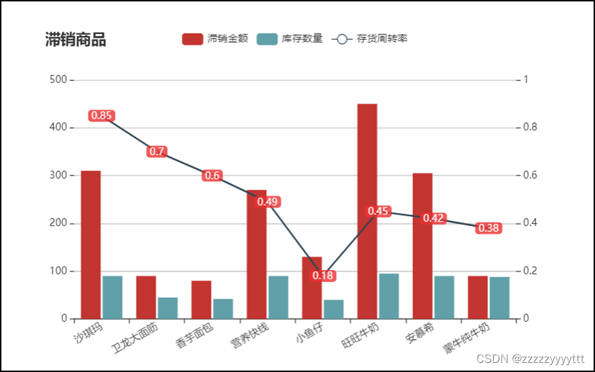
// 滞销商品
var unsalable = echarts.init(document.getElementById('unsalable'));
$.get("data/商品滞销数据.json").done(function (data) {
	//data = JSON.parse(data),
	unsalable.setOption({
    tooltip: {
        trigger: 'axis',
        axisPointer: {
            type: 'cross',
            crossStyle: {
                color: '#999'
            }
        }
    },
    grid: {
        left: '10',
        right: '10',
        bottom: '10',
        containLabel: true
    },
    toolbox: {
        show:false,
        feature: {
            dataView: {show: true, readOnly: false},
            magicType: {show: true, type: ['line', 'bar']},
            restore: {show: true},
            saveAsImage: {show: true}
        }
    },
    legend: {
        data:data.name
    },
    barGap:'10%',
    barCategoryGap:'25%',
    xAxis: [
        {
            type: 'category',
            data: data.商品名称,
            axisPointer:{type:'shadow'},
            splitLine:{lineStyle:{width:0}},
            axisLabel:{rotate:30}
        }
    ],
    yAxis: [
        {
            type: 'value',
            name: '',
            min: 0,
            max: 500,
            interval: 100,
            axisLabel: {
                formatter: '{value}'
            },
            axisLine:{lineStyle:{width:0}},
        },
        {
            type: 'value',
            name: '',
            min: 0,
            max: 1,
            interval: 0.2,
            axisLabel: {
                formatter: '{value} '
            },
            axisLine:{lineStyle:{width:0}},

        }
    ],
    series: [
        {
            name:'滞销金额',
            type:'bar',
            data:data.滞销金额
        },
        {
            name:'存货周转率',
            type:'line',
            yAxisIndex: 1,
            label:{
                show:'true',
                color:'#fff',
                backgroundColor:'rgba(235,48,48,0.8)',
                verticalAlign:'middle',
                padding:[2,4,0,4],
                borderRadius:4,
                position:'inside'
            },
            data:data.存货周转率
        },
        {
            name:'库存数量',
            type:'bar',
            data:data.库存数量
        }
    ]
		})
});5、使用矩形树图对各类商品的存货周转天数进行展示
ECharts 矩形树图(Tree Map)是一种展示层级数据的可视化图表,它通过树状结构显示分层数据,每个节点表示为矩形,其尺寸与值成比例。
清晰的层级结构:它清晰地表示了数据的层级关系,使得数据更容易理解和分析。
值的比例表示:矩形的大小直接反映了其值的比例,使得数据的比较变得简单和直观。
自定义样式:可以自定义每个节点的颜色、边框等样式,以适应不同的需求。
交互功能:用户可以通过鼠标悬停、点击等交互操作来进一步查看和分析数据。

// 商品存货周转天数
var formatUtil = echarts.format;
var turnaround = echarts.init(document.getElementById('turnaround'));
$.get("data/各类商品存货周转天数.json").done(function (data) {
    //data = JSON.parse(data),
    turnaround.setOption({
        tooltip:{
        formatter: '{b}:{c}'
    },
    series: [{
        type: 'treemap',
        label:{
            show:true,
            position:'insideTopLeft',
            distance:0,
            padding:10,
            formatter:"{b}\n{a|{c}}",
            rich: {
                a: {
                    padding:6,
                    align:'right',
                    verticalAlign:'bottom',
                    color:'#fff',
                }
            }
        },
        roam:false,
        nodeClick:false,
        breadcrumb:{show:false},
        itemStyle:{
            gapWidth:5,
            borderColor:'transparent'
        },
        data: data.data
    }]
        })
});
四、用户分析模块分析
通过写echarts.user.js文件来实现最终大屏中总数据模块的效果。
源码及效果图如下
// 近5日用户人数新增和流失趋势
var lossGrowth = echarts.init(document.getElementById('lossGrowth'));
$.get("data/近5日新增和流失用户数据.json").done(function (data) {
    //data = JSON.parse(data);
	lossGrowth.setOption({
        tooltip: {
            trigger: 'axis'
        },
        legend: {
            type:'scroll'
        },
        grid: {
            left: '10',
            right: '30',
            bottom: '10',
            containLabel: true
        },
        xAxis: {
            type: 'category',
            boundaryGap: false,
            data: data.日期
        },
        yAxis: {
            type: 'value'
        },
        series: [
            {
                name:'新增人数',
                type:'line',
                data:data.新增人数,
                symbol:'circle',
                areaStyle: {
                    normal: {
                        color: new echarts.graphic.LinearGradient(0, 0, 0, 1, [{
                            offset: 0,
                            color: 'rgba(194, 53, 49,.8)'
                        }, {
                            offset: 1,
                            color: 'transparent'
                        }])
                    }
                }
            },
            {
                name:'流失人数',
                type:'line',
                symbol:'circle',
                data:data.流失人数,
                areaStyle: {
                    normal: {
                        color: new echarts.graphic.LinearGradient(0, 0, 0, 1, [{
                            offset: 0,
                            color: 'rgba(47, 69, 84,.8)'
                        }, {
                            offset: 1,
                            color: 'transparent'
                        }])
                    }
                }
            }
        ]
	});
});


//用户类型人数
var cSorNum = echarts.init(document.getElementById('cSorNum'));
$.get("data/不同类型用户的人数.json").done(function (data) {
    //data = JSON.parse(data);
	cSorNum.setOption({
    tooltip : {
        trigger: 'item',
        formatter: "{a} <br/>{b} : {c} ({d}%)"
    },
    legend: {
        show:false
    },
    grid: {
        left: '0%',
        right: '0%',
        bottom: '0%',
        containLabel: true
    },
    series : [
        {
            name: '用户类型人数',
            type: 'pie',
            radius: ['40%', '70%'],
            center: ['50%', '50%'],
            label:{
                formatter:"{b}\n{a|{d}%}",
                rich: {
                    a: {
                        padding:6,
                        align:'left',
                        color:'#fff'
                    }
                }
            },
            data:data.data,
            itemStyle: {
                emphasis: {
                    shadowBlur: 10,
                    shadowOffsetX: 0,
                    shadowColor: 'rgba(0, 0, 0, 0.5)'
                }
            }
        }
    ]
		})
});


// 用户分群
var userGroup = echarts.init(document.getElementById('userGroup'));
$.get("data/用户分群数据.json").done(function (data) {
    //data = JSON.parse(data);
	userGroup.setOption({
    tooltip: {},
    legend: {
    },
    radar: {
        name: {
            textStyle: {
                color: '#fff',
                borderRadius: 3,
                padding: [3, 5]
           }
        },
        center: ['50%', '58%'],
        splitArea: {
            areaStyle: {
                color:'transparent'
            }
        },
        axisLine: { lineStyle: {color: '#061e42' }},
        splitLine: { lineStyle: {color: '#061e42' }},
        indicator: [
           { name: '消费金额', max: 80,color:'black'},
           { name: '购买数量', max: 80,color:'black'},
           { name: '购买频率', max: 80,color:'black'},
           { name: '交易次数', max: 80,color:'black'},
           { name: '客单价', max: 80,color:'black' }
        ]
    },
    series: [{
        name: '用户分群',
        type: 'radar',

        areaStyle:{
            show:true,
            opacity:0.3
        },
        data : data.data
    }]
		})
});


// 用户消费时段
var expTime = echarts.init(document.getElementById('expTime'));
$.get("data/用户消费时段数据.json").done(function (data) {
    //data = JSON.parse(data);
	expTime.setOption({
    tooltip: {
        trigger: 'axis',
        axisPointer: {
            type: 'shadow'
        }
    },
    grid: {
        left: '10',
        top:'30',
        right:'10',
        bottom: '10',
        containLabel: true
    },
    barCategoryGap:'50%',
    xAxis: {
        type: 'value',
        min: 0,
        boundaryGap: [0, 0.01],
        axisLine:{lineStyle:{width:0}}
    },
    yAxis: {
        type: 'category',
        splitLine:{lineStyle:{width:0}},
        data: data.消费时段
    },
    series: [
        {
            name: '售出总数量',
            type: 'bar',
            label:{
                position:'right',
                verticalAlign:'middle'
            },
            data: data.用户人数
        }
    ]
		})
});


// 用户消费地点
var expLoc = echarts.init(document.getElementById('expLoc'));
$.get("data/用户消费地点数据.json").done(function (data) {
    //data = JSON.parse(data),
	expLoc.setOption({
    tooltip: {
        trigger: 'axis',
    },
    grid: {
        left: '10',
        right: '10',
        bottom: '0',
        top:'30',
        containLabel: true
    },
    barCategoryGap:'60%',
    xAxis: [
        {
            type: 'category',
            data: data.消费地点,
            axisPointer: {
                type: 'shadow'
            },
            splitLine:{lineStyle:{width:0}}
        }
    ],
    yAxis: [
        {
            type: 'value',
            name: '',
            min: 0,
        }
    ],
    series: [
        {
            type:'bar',
            data:data.用户人数,
        }
    ]
		})
});


// 商品价格区间
var pInterval = echarts.init(document.getElementById('pInterval'));
pInterval.setOption({
    grid: {
        left: '3%',
        right: '10',
        bottom: '10',
        containLabel: true
    },
    tooltip : {
        showDelay : 0,
        formatter : function (params) {
                return params.seriesName + '<br/>' + '单价:' + params.value[0] + '<br/>' + '销量:' + params.value[1];
        },
        axisPointer:{
            show: true,
            type : 'cross',
            lineStyle: {
                type : 'dashed',
                width : 1
            }
        }
    },

    legend: {
        type:'scroll',
    },
    xAxis :{ scale:true},
    yAxis :{ scale:true},
});

$.get("data/商品销量数量和价格数据.json").done(function (data) {
    //data = JSON.parse(data);
    var series=[];
    for(var i = 0;i < data.data.length;i++){
        series.push({
            name: data.data[i].name,
            type: 'scatter',
            data: [data.data[i].value],
            symbolSize:data.data[i].value[1]*2
        });
    }
    pInterval.setOption({
        series:series
    });
});


// 用户画像
var chart = echarts.init(document.getElementById('userHot'));
$.get("data/用户购买的商品名称和商品数量数据.json").done(function (data) {
    //data = JSON.parse(data);
    var option = {
        tooltip : {
            trigger: 'item',
            formatter:function(item){
                return item.name + ":" + item.value.toFixed(2);
            }
        },
        series: [ {
            type: 'wordCloud',
            sizeRange: [10,30],
            rotationRange: [0, 0],
            rotationStep: 180,
            gridSize: 0,
            autoSize: {enable:true, minSize:5},
            shape: 'roundRect',
            left: 'center',
            top: 'center',
            width: '100%',
            height: '100%',
            right: null,
            bottom: null,
            textStyle: {
                normal: {
                    color: function () {
                        return 'rgb(' + [
                            Math.round(Math.random() * 160),
                            Math.round(Math.random() * 160),
                            Math.round(Math.random() * 160)
                        ].join(',') + ')';
                    }
                },
                emphasis: {
                    shadowBlur: 26,
                    color:'#333',
                    shadowColor: '#ccc',
                    fontSize:20
                }
            },
            data: data.data.sort(function (a, b) {
                return b.value  - a.value;
            })
        } ]
    };
    chart.setOption(option);
});


window.onresize = function() {
    cSorNum.resize();
    lossGrowth.resize();
    expTime.resize();
    expLoc.resize();
    pInterval.resize();
    userGroup.resize();
    chart.resize();
};
1、使用簇状柱状图对用户消费地点和时间段情况进行展示
Echarts的簇状柱状图是一种特殊的柱状图,它可以用来表示时间序列数据或分布数据,并且可以清晰地显示出数据的分布情况。它的主要优点包括:
易于理解:它可以清晰地显示数据的分布情况,使得数据更易于理解和解释。
美观:它通常比普通的柱状图更美观,有时甚至可以用来作为报告或者报告的一部分,增强可视化的效果。
动态效果:Echarts的动态效果可以让复杂的数据更加生动,更加容易理解。


// 用户消费时段
var expTime = echarts.init(document.getElementById('expTime'));
$.get("data/用户消费时段数据.json").done(function (data) {
    //data = JSON.parse(data);
	expTime.setOption({
    tooltip: {
        trigger: 'axis',
        axisPointer: {
            type: 'shadow'
        }
    },
    grid: {
        left: '10',
        top:'30',
        right:'10',
        bottom: '10',
        containLabel: true
    },
    barCategoryGap:'50%',
    xAxis: {
        type: 'value',
        min: 0,
        boundaryGap: [0, 0.01],
        axisLine:{lineStyle:{width:0}}
    },
    yAxis: {
        type: 'category',
        splitLine:{lineStyle:{width:0}},
        data: data.消费时段
    },
    series: [
        {
            name: '售出总数量',
            type: 'bar',
            label:{
                position:'right',
                verticalAlign:'middle'
            },
            data: data.用户人数
        }
    ]
		})
});


// 用户消费地点
var expLoc = echarts.init(document.getElementById('expLoc'));
$.get("data/用户消费地点数据.json").done(function (data) {
    //data = JSON.parse(data),
	expLoc.setOption({
    tooltip: {
        trigger: 'axis',
    },
    grid: {
        left: '10',
        right: '10',
        bottom: '0',
        top:'30',
        containLabel: true
    },
    barCategoryGap:'60%',
    xAxis: [
        {
            type: 'category',
            data: data.消费地点,
            axisPointer: {
                type: 'shadow'
            },
            splitLine:{lineStyle:{width:0}}
        }
    ],
    yAxis: [
        {
            type: 'value',
            name: '',
            min: 0,
        }
    ],
    series: [
        {
            type:'bar',
            data:data.用户人数,
        }
    ]
		})
});2、使用折线图对近5天用户人数新增和流失趋势进行展示
折线图适合二维的大数据集,还适合多个二维数据集的比较,一般用来表示趋势的变化,横轴一般为日期字段。
容易反应出数据变化的趋势。

// 近5日用户人数新增和流失趋势
var lossGrowth = echarts.init(document.getElementById('lossGrowth'));
$.get("data/近5日新增和流失用户数据.json").done(function (data) {
    //data = JSON.parse(data);
	lossGrowth.setOption({
        tooltip: {
            trigger: 'axis'
        },
        legend: {
            type:'scroll'
        },
        grid: {
            left: '10',
            right: '30',
            bottom: '10',
            containLabel: true
        },
        xAxis: {
            type: 'category',
            boundaryGap: false,
            data: data.日期
        },
        yAxis: {
            type: 'value'
        },
        series: [
            {
                name:'新增人数',
                type:'line',
                data:data.新增人数,
                symbol:'circle',
                areaStyle: {
                    normal: {
                        color: new echarts.graphic.LinearGradient(0, 0, 0, 1, [{
                            offset: 0,
                            color: 'rgba(194, 53, 49,.8)'
                        }, {
                            offset: 1,
                            color: 'transparent'
                        }])
                    }
                }
            },
            {
                name:'流失人数',
                type:'line',
                symbol:'circle',
                data:data.流失人数,
                areaStyle: {
                    normal: {
                        color: new echarts.graphic.LinearGradient(0, 0, 0, 1, [{
                            offset: 0,
                            color: 'rgba(47, 69, 84,.8)'
                        }, {
                            offset: 1,
                            color: 'transparent'
                        }])
                    }
                }
            }
        ]
	});
});3、使用雷达图对用户分群进行展示
雷达图(Radar Chart)是一种可视化多变量数据的方法,它将多个变量表示为从中心点向外散射的线,通常用于显示同一对象在不同维度上的数据。ECharts 中的雷达图可以用来展示数据的分布情况,并可以直观地比较不同数据点之间的差异。
能够显示多变量数据:雷达图可以同时显示多个变量的数据,有助于观察数据之间的关系。
反映数据的分布情况:雷达图可以清晰地显示数据在各个维度上的分布,有利于识别数据的集群。
易于比较不同的数据集:不同的数据点可以用不同的颜色或样式显示,便于进行比较。
可以强调重要的变量:雷达图中的一个变量可以用较大的区域或更加突出的样式表示,突出重要的数据信息。
易于解释:用户可以直观地看到每个维度的数据表现,并可以通过视觉比较来进行深入分析。

// 用户分群
var userGroup = echarts.init(document.getElementById('userGroup'));
$.get("data/用户分群数据.json").done(function (data) {
    //data = JSON.parse(data);
	userGroup.setOption({
    tooltip: {},
    legend: {
    },
    radar: {
        name: {
            textStyle: {
                color: '#fff',
                borderRadius: 3,
                padding: [3, 5]
           }
        },
        center: ['50%', '58%'],
        splitArea: {
            areaStyle: {
                color:'transparent'
            }
        },
        axisLine: { lineStyle: {color: '#061e42' }},
        splitLine: { lineStyle: {color: '#061e42' }},
        indicator: [
           { name: '消费金额', max: 80,color:'black'},
           { name: '购买数量', max: 80,color:'black'},
           { name: '购买频率', max: 80,color:'black'},
           { name: '交易次数', max: 80,color:'black'},
           { name: '客单价', max: 80,color:'black' }
        ]
    },
    series: [{
        name: '用户分群',
        type: 'radar',

        areaStyle:{
            show:true,
            opacity:0.3
        },
        data : data.data
    }]
		})
});4、使用环形图对不同用户类型人数进行展示
ECharts 环形图(Pie Chart)是一种常用的图表类型,适用于显示分割的数据,如各部分的比例。
易于理解:环形图的设计直观地表示了部分与整体的关系,使得数据易于解读。
色彩用法:通过不同的颜色,可以清晰地表示不同的数据系列,有助于快速识别重要的部分。
分层数据:可以显示多层次的数据,每层可以代表不同的类别或时间段。
动态更新:可以通过ECharts的API动态更新数据,实现数据的实时监控。

//用户类型人数
var cSorNum = echarts.init(document.getElementById('cSorNum'));
$.get("data/不同类型用户的人数.json").done(function (data) {
    //data = JSON.parse(data);
	cSorNum.setOption({
    tooltip : {
        trigger: 'item',
        formatter: "{a} <br/>{b} : {c} ({d}%)"
    },
    legend: {
        show:false
    },
    grid: {
        left: '0%',
        right: '0%',
        bottom: '0%',
        containLabel: true
    },
    series : [
        {
            name: '用户类型人数',
            type: 'pie',
            radius: ['40%', '70%'],
            center: ['50%', '50%'],
            label:{
                formatter:"{b}\n{a|{d}%}",
                rich: {
                    a: {
                        padding:6,
                        align:'left',
                        color:'#fff'
                    }
                }
            },
            data:data.data,
            itemStyle: {
                emphasis: {
                    shadowBlur: 10,
                    shadowOffsetX: 0,
                    shadowColor: 'rgba(0, 0, 0, 0.5)'
                }
            }
        }
    ]
		})
});5、使用气泡图对商品价格区间进行展示
显示若干数据系列中各数值之间的关系,类似 XY 轴,判断两变量之间是否存在某种关联;
散点图适用于三维数据集,但是其中只有两维数据是需要比较的,另外,散点图还可以看出极值的分布情况。
优势:
对于处理值的分布和数据点的分簇区域(通过设置横纵项的辅助线)。
散点图都很理想,如果数据集中包含非常多的点,那么散点图便是最佳图表类型。

// 商品价格区间
var pInterval = echarts.init(document.getElementById('pInterval'));
pInterval.setOption({
    grid: {
        left: '3%',
        right: '10',
        bottom: '10',
        containLabel: true
    },
    tooltip : {
        showDelay : 0,
        formatter : function (params) {
                return params.seriesName + '<br/>' + '单价:' + params.value[0] + '<br/>' + '销量:' + params.value[1];
        },
        axisPointer:{
            show: true,
            type : 'cross',
            lineStyle: {
                type : 'dashed',
                width : 1
            }
        }
    },

    legend: {
        type:'scroll',
    },
    xAxis :{ scale:true},
    yAxis :{ scale:true},
});

$.get("data/商品销量数量和价格数据.json").done(function (data) {
    //data = JSON.parse(data);
    var series=[];
    for(var i = 0;i < data.data.length;i++){
        series.push({
            name: data.data[i].name,
            type: 'scatter',
            data: [data.data[i].value],
            symbolSize:data.data[i].value[1]*2
        });
    }
    pInterval.setOption({
        series:series
    });
});6、使用词云图对用户特征进行展示
ECharts 词云图是一种基于ECharts的可视化图表类型,常用于表达词频的直观展示。以下是ECharts词云图的一些主要优点:
灵活性和灵感来源:ECharts 词云图可以接受各种形式的数据输入,包括数组、JSON等,并允许用户自定义词云的形状、大小、颜色等。
动态更新:ECharts 提供了一个API,可以用来动态更新和刷新词云图,使其适应实时数据的变化。
多样化的配置选项:ECharts 词云图提供了多种配置选项,如字体、颜色、形状、字体加粗、字体大小等,以满足不同用户的需求。
响应式设计:ECharts 词云图能够自适应不同大小的屏幕和容器,提供了良好的响应式体验。
丰富的交互功能:ECharts 词云图支持鼠标的悬停(hover)、点击、拖拽等交互操作,方便用户深入探索数据背后的信息。

// 用户画像
var chart = echarts.init(document.getElementById('userHot'));
$.get("data/用户购买的商品名称和商品数量数据.json").done(function (data) {
    //data = JSON.parse(data);
    var option = {
        tooltip : {
            trigger: 'item',
            formatter:function(item){
                return item.name + ":" + item.value.toFixed(2);
            }
        },
        series: [ {
            type: 'wordCloud',
            sizeRange: [10,30],
            rotationRange: [0, 0],
            rotationStep: 180,
            gridSize: 0,
            autoSize: {enable:true, minSize:5},
            shape: 'roundRect',
            left: 'center',
            top: 'center',
            width: '100%',
            height: '100%',
            right: null,
            bottom: null,
            textStyle: {
                normal: {
                    color: function () {
                        return 'rgb(' + [
                            Math.round(Math.random() * 160),
                            Math.round(Math.random() * 160),
                            Math.round(Math.random() * 160)
                        ].join(',') + ')';
                    }
                },
                emphasis: {
                    shadowBlur: 26,
                    color:'#333',
                    shadowColor: '#ccc',
                    fontSize:20
                }
            },
            data: data.data.sort(function (a, b) {
                return b.value  - a.value;
            })
        } ]
    };
    chart.setOption(option);
});


window.onresize = function() {
    cSorNum.resize();
    lossGrowth.resize();
    expTime.resize();
    expLoc.resize();
    pInterval.resize();
    userGroup.resize();
    chart.resize();
};


 1560
1560

 被折叠的 条评论
为什么被折叠?
被折叠的 条评论
为什么被折叠?
 到【灌水乐园】发言


