


1.京东顶部导航条
<!DOCTYPE html>
<html lang="en">

<head>
    <meta charset="UTF-8">
    <meta name="viewport" content="width=device-width, initial-scale=1.0">
    <title>京东顶部导航条</title>
    <link rel="stylesheet" href="./fa/css/all.css">
    <style>
        * {
            margin: 0;
            padding: 0;
            list-style: none;
        }
        .top-bar-wrapper{
            width:100%;
            background-color: #E3E4E5;
            height:30px;
            line-height:30px;
            border-bottom:1px #ddd solid;
        }
        .top-bar{
            width:1190px;
            margin:0 auto;
            position:relative;
        }
        .location{
            float:left;
        }
        .shortcut{
            float:right;
        }
        .shortcut li{
            float:left;
        }
        .clearfix::before,
        .clearfix::after{
            content:'';
            display: table;
            clear:both;
        }
        body{
            font:12px/1.5 Microsoft YaHei-Heti SC;
        }
        .top-bar a,
        .top-bar span,
        .top-bar i{
            color:#999;
            text-decoration: none;
        }
        .location .fas{
            font-size:14px;
            color:#f10215;
        }
        .location .city-list{
            display:none;
            width:320px;
            height:436px;
            background-color: white;
            border:1px solid rgb(204,204,204);
            /*设置绝对定位,使其脱离文档流*/
            position:absolute;
            top:31px;
            box-shadow: 0 2px 2px rgba(0,0,0,.2);
        }

.location:hover .city-list{
    display: block;
}
.current-city{
    padding:0 10px;
    border:1px solid transparent;
    border-bottom: none;
    position: relative;
    z-index:1;
}
.location:hover .current-city{
    background-color: white;
    border:1px solid rgb(204,204,204);
    border-bottom:none;
}
        .top-bar a:hover,
        .top-bar a.highlight{
            color:#f10215;
        }
        .shortcut .line{
            width: 1px;
            height:10px;
            background-color: #999;
            margin:10px 12px;
        }
    </style>
</head>

<body>
    <div class="top-bar-wrapper">
        <div class="top-bar clearfix">
            <div class="location">
                <div class="current-city">
                    <i class="fas fa-map-marker-alt"></i>
                    <a href="javascript:;">北京</a>
                </div>
                <div class="city-list">

                </div>
            </div>
            <ul class="shortcut">
                <li>
                    <a href="javascript:;">你好,请登录</a>
                    <a class="highlight" href="javascript:;">免费注册</a>
                </li>
                <li class="line"></li>
                <li>
                    <a href="javascript:;">我的订单</a>
                </li>
                <li class="line"></li>
                <li>
                    <a href="javascript:;">我的京东</a>
                    <i class="fas fa-angle-down"></i>
                </li>
                <li class="line"></li>
                <li>
                    <a href="javascript:;">京东会员</a>
                </li>
                <li class="line"></li>
                <li>
                    <a class="highlight" href="javascript:;">企业采购</a>
                    <i class="fas fa-angle-down"></i>
                </li>
                <li class="line"></li>
                <li>
                    <span>客户服务</span>
                    <i class="fas fa-angle-down"></i>
                </li>
                <li class="line"></li>
                <li>
                    <span>网站导航</span>
                    <i class="fas fa-angle-down"></i>
                </li>
                <li class="line"></li>
                <li>
                    <span>手机京东</span>
                    <i class="fas fa-angle-down"></i>
                </li>
            </ul>
        </div>
    </div>
</body>

</html>
2.背景(一)
background-image 设置背景图片
1)可以同时设置背景图片和背景颜色,这样背景颜色将会成为图片的背景色
2)如果背景的图片小于元素,则背景图片会自动在元素中平铺将元素铺满
3)如果背景的图片大于元素,将会一个部分背景无法完全显示
4)如果背景图片和元素一样大,则会直接正常显示
background-repeat 用来设置背景的重复方式
可选值:
1)repeat 默认值,背景会沿着x轴 y轴双方向重复
2)repeat-x 沿着x轴方向重复
3)repeat-y 沿着y轴方向重复
4)no-repeat 背景图片不重复
background-position 用来设置背景图片的位置
设置方式:
通过 top left right bottom center 几个表示方位的词来设置背景图片的位置
使用方位词时必须要同时指定两个值,如果只写一个则第二个默认就是center
通过偏移量来指定背景图片的位置
水平方向的偏移量 垂直方向的偏移量
3.背景(二)
background-clip 设置背景的范围
可选值:
1)border-box 默认值,背景会出现在边框的下边
2)padding-box 背景不会出现在边框,指挥出现在在内容区和内边距
3)content-box 背景只会出现在内容区
background-origin 背景图片的偏移量计算的原点
1)padding-box 默认值,background-position从内边距开始计算
2)content-box 背景图片的偏移量从内容区开始计算
3)border-box 背景图片的偏移量从边框处开始计算
background-size 设置背景图片的大小
第一个值表示宽度
第二个值表示高度
如果只写一个,则第二个值默认是auto
cover:图片的比例不变,将元素铺满
contain:图片比例不变,将图片在元素中完整显示
background-attachment 背景图片是否跟随元素移动
可选值:
1)scoll:默认值 背景图片会跟随元素移动
2)fixed:背景会固定在页面中,不会随元素移动
background 背景相关的简写属性,所有背景相关的样式都可以通过该样式来设置
该样式没有顺序要求,也没有哪个属性必须写的
注意
background-size必须写在background-position的后边,并且使用/隔开
background-position/background-size
background-origin background-clip 两个样式,origin要在clip的前边
4.背景练习
图片属于网页中的外部资源,外部资源都需要浏览器单独发送请求加载
浏览器加载外部资源时是按需加载的,用则加载,不用则不加载
a:link{
}
a:hover{
}
a:active{
}
link会首先加载,而hover和active会在指定状态触发时才会加载
1)解决图片闪烁问题:
可以将多个小图片同意保存到一个大图片中,然后通过调整background-position来显示的图片
这样图片会同时加载到网页中,就可以有效避免出现闪烁的问题
这个技术在网页中应用十分广泛,被称为CSS-Sprite ,这种图称为雪碧图
2)雪碧图的使用步骤
1.先确定要使用的图标
2.测量图标的大小
3.根据测量结果创建一个元素
4.将雪碧图设置为元素的背景图片
5.设置一个偏移量以显示正确的图片
6.雪碧图的特点:一次性将多个图片加载进页面,降低请求的次数,加快访问速度,提升用户的体验
5.线性渐变
通过渐变可以设置一些复杂的背景颜色,可以实现从一个颜色到另一个颜色过度的效果
渐变是图片,需要通过background-image来设置
线性渐变,颜色沿着一条直线发生变化
linear-gradient()
linear-gradient(red,yellow) 红色在开头,黄色在结尾,中间是过渡区域
线性渐变的开头,我们可以指定一个渐变的方向
to left
to right
to bottom
to top
deg deg表示度数
turn 表示圈
渐变可以同时指定多个颜色,多个颜色默认情况下平均分布
也可以手动指定渐变的分布情况
<style>
    .box1{
        width:200px;
        height:200px;
        background-image: linear-gradient(red 50px,yellow,#bfa,orange);
    }
</style>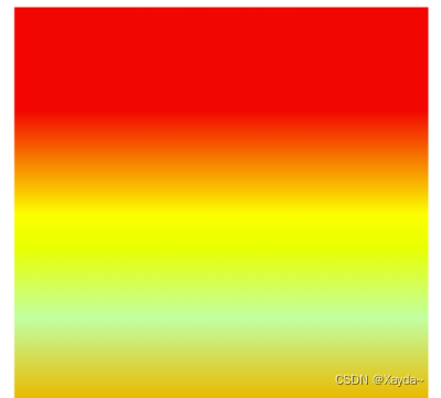
repeating-linear-gradient( )可以平铺的线性渐变
background-image: repeating-linear-gradient(red 50px,yellow 100px); 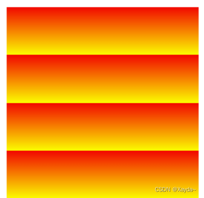
6.径向渐变
radial-gradient( ) 径向渐变(放射性的效果)
默认情况下径向渐变的形状是根据元素的形状来计算的
正方形-->圆形
长方形-->椭圆形
也可以手动指定径向渐变的大小
circle-->圆形
ellipse-->椭圆形
也可以指定渐变的位置
语法:
radial-gradient (大小 at 位置, 颜色 位置 , 颜色 位置 , 颜色 位置)
大小:
circle 圆形
ellipse 椭圆
closest-side 近边
closest-corner 近角
farthest-side 远边
farthest-corner 远角
位置
top right left center bottom
<style>
    .box1{
        width:300px;
        height:300px;
        background-image: radial-gradient(farthest-corner at 100px 100px,red,yellow);
    }
</style>


 1231
1231


 被折叠的 条评论
为什么被折叠?
被折叠的 条评论
为什么被折叠?
 到【灌水乐园】发言


