


看完前面很多人可能还不是很明白0%-100%那到底是怎么回事,到底该怎么用,这里我们做一个普遍的练习——心跳动画
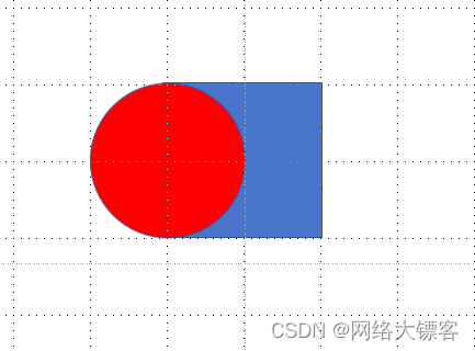
想让心❤跳起来,我们先分析一波,这个心怎么写,我们先写一个正方形,再令一个圆形前移:
再来一个圆向上移一下
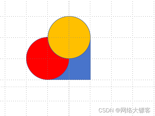
最后再整体转一下,换成统一颜色就OK了

废话不多说,直接来看代码:
<title>心跳动画</title>
<style>
*{
margin: 0;
padding: 0;
}
.box{
width: 200px;
height: 200px;
background-color:red;
margin: 0 auto;
margin-top: 200px;
position: relative;
transform: rotate(45deg);
animation: name 2s infinite alternate;
}
/* 因为before元素与after元素是行内元素不能设置宽高要进行脱标 */
/* 用圆角制作两个圆,再移动到正方形的两边 */
.box::before{
content: '';
width: 200px;
height: 200px;
background-color: red;
position:absolute;
border-radius: 50%;
transform: translate(-100px,0px);
}
.box::after{
content: '';
width: 200px;
height: 200px;
background-color: red;
position:absolute;
border-radius: 50%;
transform: translate(0px,-100px);
}
@keyframes name{
from{}
10%{transform: rotate(30deg) scale(1.5);}
20%{transform: rotate(60deg) scale(2);}
30%{transform: rotate(30deg) scale(.8);}
40%{transform: rotate(-30deg) scale(1.5);}
50%{transform: rotate(-60deg) scale(2);}
60%{transform: rotate(-90deg) scale(2.5);}
70%{transform: rotate(-30deg) scale(1.5);}
80%{transform: rotate(30deg) scale(.8);}
90%{transform: rotate(60deg) scale(1.5);}
to{transform: rotate(90deg) scale(2.5);}
}
</style>
</head>
<body>
<div class="box"></div>
</body>
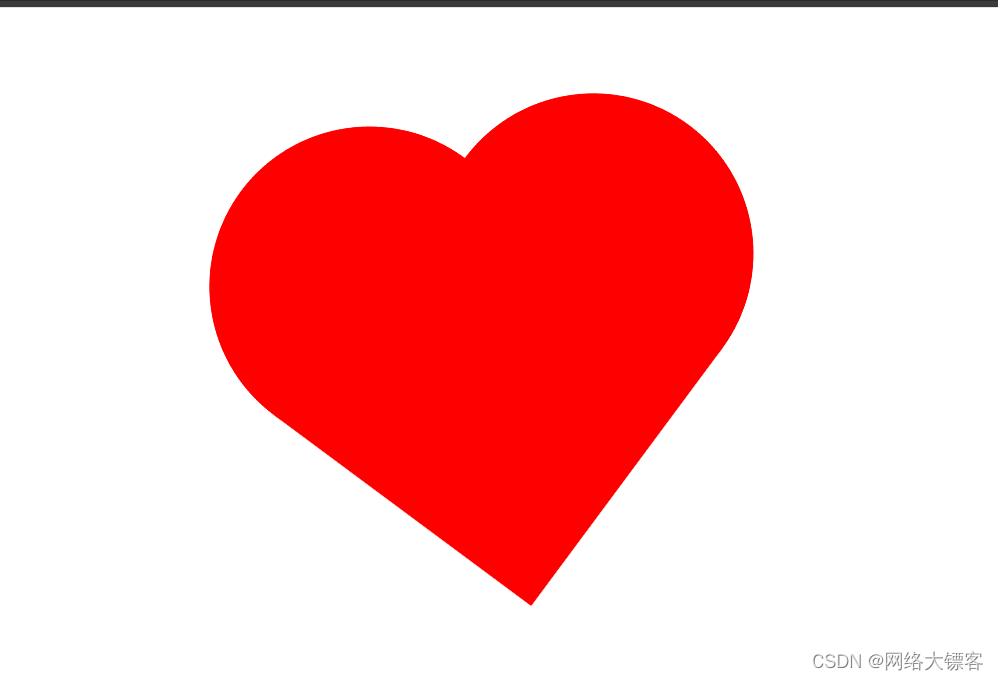
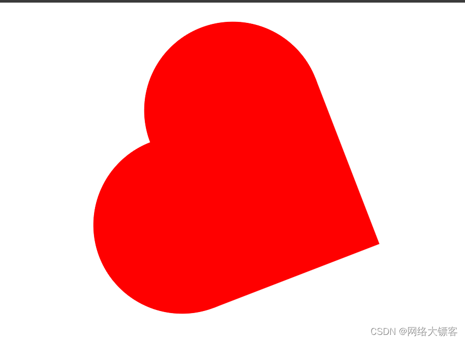
然后我们就可以看到这个心❤跳起来了
如果想让它跳的更激动,这里缩放旋转我都是随便写的,我们可以让0%-100%间设置更多,旋转缩放设置更夸张些,动画完成的时间设置再短一些
这个动画基础也快结束了,后面可以直接来上手写一些网页带大家看一下。


 1339
1339


 被折叠的 条评论
为什么被折叠?
被折叠的 条评论
为什么被折叠?
 到【灌水乐园】发言


