


目录
4.8 css多列
1.引入规则
1.1行内样式
在标签中通过style属性设置
缺点:作用域只在当前标签中,没法和css和html分离,没法和多个标签设置同一个样式
例如:
<!-- <div style="属性1; 属性2; 属性3;..."></div> -->
<div style="border: 1px solid red; background-color: green; width: 200px; height: 200px;">我是行内样式</div>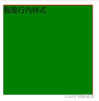
1.2内联样式
通过style标签结合选择器引入---一般写在head中,因为先渲染
 <style>
        div{
            border: 1px solid blue;
            background-color: pink;
            width: 200px;
            height: 200px;
        }
</style>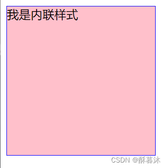
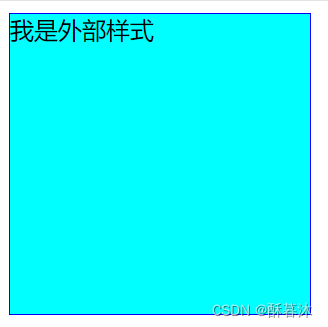
1.3外部样式
--使用link或@import引入外部的css文件(推荐使用link) <link rel="stylesheet" href="">
--分离了html和css文件,协同开发
外部css文件:
div{
    border: 1px solid blue;
    width: 200px;
    height: 200px;
    background-color: aqua;
}
使用link引入外部的css文件
<link rel="stylesheet" href="./2.1.4外部样式.css" type="text/css">使用@import引入外部css文件
<style>@import url("2.1.4外部样式.css");</style> 效果展示:
2.css选择器
2.1基本选择器
和标签绑定,对标签进行样式渲染。格式:选择器{}
(1)标签选择器:直接书写标签的名称
(2)类选择器: .class属性值{}
!!!框架的核心就是类选择器,会为需要修饰的标签或者样式添加class属性,因此class属性主要是用来渲染样式的
class属性可以有多个,值之间为空格分割 如:class="test1 test2 test3"
(3)id选择器: #id属性值{}
!!!id值是唯一的
(4)通用选择器: *{} (很少用,因为范围太大了)
主要使用形式: *{margin:0px}
<!DOCTYPE html>
<html lang="en">
<head>
    <meta charset="UTF-8">
    <meta name="viewport" content="width=device-width, initial-scale=1.0">
    <title>基本选择器--要求必须掌握,使用频率高</title>

     <style type="text/css">
        /* 1.标签选择器 */
        div{
            width: 100px;
            height: 100px;
            background-color: aquamarine;
        }
        p{
            background-color: blueviolet;
        }
        /* 2.类选择器 */
        .test2{
            background-color: bisque;
        }
        /* 或者.container 或.test1 */

        /* 3.id选择器 */
        #test-span{
            font-size: 50px;
        }
        /* 4.通配符 */
        *{
            border: 1px solid red;
            margin: 0px;
        }
     </style>
</head>
<body>
    <div class="container test1 test2">A</div>
    <div>B</div>
    <P>C</P>
    <span id="test-span">这是一个span </span>
</body>
</html>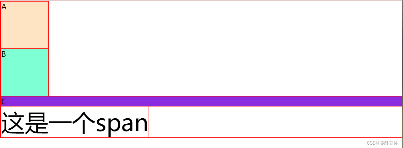
2.2关系选择器
(1)父子选择器
父>子 ----渲染子 且相邻两代
(2)祖先和后代
祖先 后代 ----渲染所有后代 可以隔代
(3)相邻兄弟
兄+弟 ----向下渲染弟 必须为相邻元素,如果相邻元素不为弟标签则不渲染
(4)兄弟关系
兄~弟 ----向下渲染弟 所有的弟标签
<!DOCTYPE html>
<html lang="en">
<head>
    <meta charset="UTF-8">
    <meta name="viewport" content="width=device-width, initial-scale=1.0">
    <title>关系选择器</title>
     <Style>
        /*1. 父子选择器 */
        .A>span{
            background-color: aqua;
        }
        /*   2.祖先和后代选择器 */
        .A span{
            background-color: blue;
        }
        /*  3.相邻兄弟选择器  */
        .B+li {
            background-color: blueviolet;
        }
        /* 4.兄弟关系选择器 */
        /* .B~li{
            background-color: brown;
        } */
     </Style>
</head>
<body>
    <h1>测试父子及祖先后代关系</h1>
    <!-- 测试父子选择器 -->
    <div class="A">A
        <div>B
            <span>c1</span>
            <span>c2</span>
        </div>
        <span>c3</span>
        <span>c4</span>
    </div>
    <h1>测试相邻兄弟关系</h1>
    <!-- 测试相邻兄弟关系 -->
    <li>A</li>
    <li class="B">B</li>
    <li>C</li>
    <li>D</li>
    <li>E</li>
</body>
</html>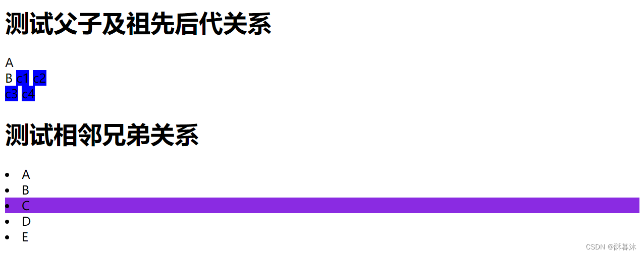
2.3属性选择器
格式:[xx]
--[属性]--找出具备该属性的元素
--[属性="值"]--找出属性=值元素
--[属性^="值"]--以值开头的属性元素
--[属性$="值"]--以值结尾的属性元素
--[属性*="值"]--包含值的属性元素
<!DOCTYPE html>
<html lang="en">
<head>
    <meta charset="UTF-8">
    <meta name="viewport" content="width=device-width, initial-scale=1.0">
    <title>属性选择器</title>
     <style>
        /* 1.直接使用属性--所有拥有class属性的标签 */
        [class]{
            font-size: 80px;
        }
        /* 2.属性=值 */
        [title ="a"]{
            background-color: antiquewhite;

        }
        /* 3.以xx开头 */
        [title ^="a"]{
            color: brown;
        }
        /* 4.以xx结尾 */
        [title $="bc"]{
            color: aqua;
        }
        /* 5.包含xx */
        [title *="c"]{
            background-color: rgb(195, 157, 19);
        }
     </style>

</head>
<body>
    <p title="a">静夜思</p>
    <p title="ab">李白</p>
    <p title="abcd">窗前明月光</p>
    <span title="abc" class="s">疑是地上霜</span>
</body>
</html>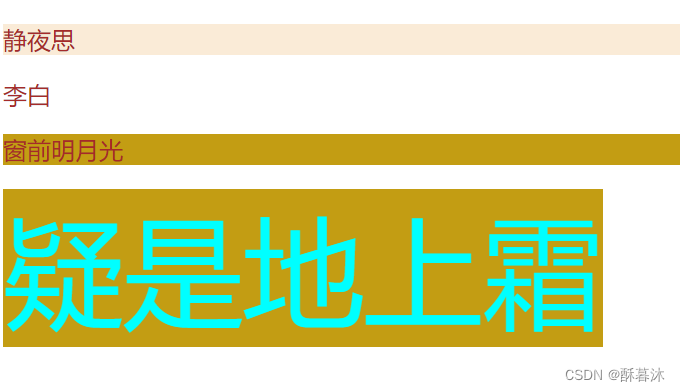
2.4复合选择器
(1)交集选择器
格式:选择器1选择器2选择器n----满足所有选择器的一个元素渲染
(2)并集选择器
格式:选择器1,选择器2,选择器n ----渲染所有满足该条件的选择器标签
  <style>
        .p#container{
            width: 200px;
            height: 200px;
            background-color: aqua;
        }
        #container,.p2{
            background-color: blueviolet;
        }
     </style>
2.5伪类选择器
2.5.1超链接伪类
伪类选择器 --- 渲染某一行为(点击、移入、移出、失去焦点、聚焦等等)
格式: 使用 :冒号表示伪类
 <!-- 注意顺序 -->
     <style>
        /* 未访问的 */
        a:link{
            color: black;
        }
        /* 访问后的颜色 */
        a:visited{
            color: aquamarine;
        }
        /* 悬停在a标签之上触发 */
        a:hover{
            color: brown;
        }
        /* 按压不放时的颜色 */
        a:active{
            color: blue;
        }
     </style>
<a href="https://www.baidu.com?liua=liua">测试--注意看颜色样式变化</a>2.5.2表单伪类
<style>
        /*1.获取焦点时 */
        [name="username"]:focus{
            width:600px;
        }
        /*2.除了not中书写的选择器外的其他元素 */
        button:not(.signin){
            background-color:aquamarine;
        }
        /*3.必填项时渲染 */
        [name*="ss"]:required{
        width: 400px;
        }
        /*4.选中时渲染 */
        [type="checkbox"]:checked{
            width: 200px;
        }
        </style>
<form action="https://www.baidu.com">
<p>username: <input type="text" name="username"></p>
<p>password1: <input type="password" name="password" required></p>
<p>password2: <input type="password" name="password"></p>
<p>
<input type="checkbox" name="bobby">ball1
<input type="checkbox" name="bobby" checked>ball2
<input type="checkbox" name="bobby">ball3
<input type="checkbox" name="bobby">ball4
</p>
<button type="submit" class="signin">sign in</button>
<button type="button">sign up</button>
</form>2.5.3结构伪类
first-child : 找li元素的父元素的第一个子元素,如果是li则渲染,不是则不渲染
first-of-type :找li元素的父元素的第一个li子元素,找到则渲染
<style>
        li:hover{
            color: blueviolet;

        }
        /* li列表中第一个子元素--技巧是找子元素为li标签的第一个元素 */
        li:first-child{
            color: blue;
        }

        /* 找与li元素相同类型的子元素 */
        li:first-of-type{
            color: brown;
        }

        /* 找最后一个子元素 */
        li :last-child{
            color: chocolate;
        }

        /* 找li子元素列表中索引为3 的元素渲染 */
        li:nth-child(3){
            background-color: aqua;
        }

         /* 奇数项 */
         li:nth-child(odd){
            background-color: rgb(204, 33, 82);
        }
        /* 偶数项 */
         li:nth-child(even){
            background-color: chartreuse;
        }

        /* 链式写法(伪类独有 伪元素不能用)-鼠标悬停在文字7上字体变大 */
        /* li:nth-child(8):hover{
            font-size: 150px;
        } */
     </style>
2.6伪元素选择器
伪元素操作不存在的元素
-格式: 使用 ::双冒号
::first-letter表示第一个字母,例如:第一个字母变红色
<style> p::first-letter{ color: red; } </style>::first-line表示第一行(第一行的内容根据屏幕的大小决定显示多少字),例如:
<style> p:hover::first-line{ color: pink; } </style>::selection 选中的内容,例如:
<style> p::selection{ color: green;background-color: antiquewhite; }</style>::before.在之前添加伪元素, ::after在最后添加伪元素。都必须结合content属性来使用
<style>
  li::before{
            content: "!!!";
        }
  li:hover::after{
            content:" zhangsan";
            color: red;
        }
</style>
<body>
<ul>
<li>username</li>
<li>username</li>
<li class="test3">username</li>
<li>username</li>
</ul>
<p>
生产者、消费者共享一个初始为空、大小为n的缓冲区。<br>
只有缓冲区没满时,生产者才能把产品放入缓冲区,否则必须等待。<br>
只有缓冲区不空时,消费者才能从中取出产品,否则必须等待。<br>
缓冲区是临界资源,各进程必须互斥地访问。
</p>
</body>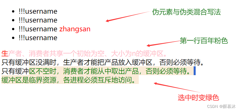
3.css样式
!!!每种样式至少记住几种
3.1背景样式
属性:(background)
背景颜色 : background-color: aquamarine;
背景图片 : background-image:url( ) ;
图片的平铺方式 默认为repeat(平铺): background-repeat: no-repeat;
图片的滑动方式 scroll跟随滑动、fiexd默认值不跟随鼠标滑动而滑动 : background-attachment: scroll;
图片的位置 像素值/百分比/属性单词(center、left、right、top、button) background-position: center;
图片的尺寸 : background-size: 600px 400px;
复合写法 将基本属性综合到一起,多个属性之间使用空格分割,无顺序要求
background: url("") center scroll no-repeat;
3.2字体样式
字体颜色 color: ;
字体大小 font-size:;
字体斜体(italic/oblique) font-style:nomal;(正常)
字体粗细 font-weight:lighter; (100~900 lighter:100 bold:900 normal:400)
字体的格式 font-family:"楷体";
行高 像素150px、倍数1.5、百分比150% line-height:150px;
文字装饰 underline下划线 overline上划线 line-through删除线 text-decoration:underline;
首行缩进 像素、百分比、字符2em text-indent:2em;
对齐方式 center、left、 right、top、buttom text-align:center;
大小写转换 lowercase小写 uppercase大写 text-transform:uppercase;
字体阴影 x偏移量 y偏移量 z偏移量 text-shadow:10px 10px 10px grey;
3.3列表样式
list-style-type :none; 列表序号样式(消除列表的序号)
list-style-image:url(""); 自定义列表图标
list-style-position:inside; 当前列表的位置(inside在内部显示,outside在外部显示)
<!DOCTYPE html>
<html lang="en">
<head>
    <meta charset="UTF-8">
    <meta name="viewport" content="width=device-width, initial-scale=1.0">
    <title>列表样式</title>
    <style>
        li{
            font-size: 50px;
            list-style-type: none;
            list-style-image: url("./图标.png");
            list-style-position: inside;
        }
    </style>
</head>
<body>
    <ol>
        <li>测试内容</li>
        <li>测试内容</li>
        <li>测试内容</li>
        <li>测试内容</li>
    </ol>

</body>
</html>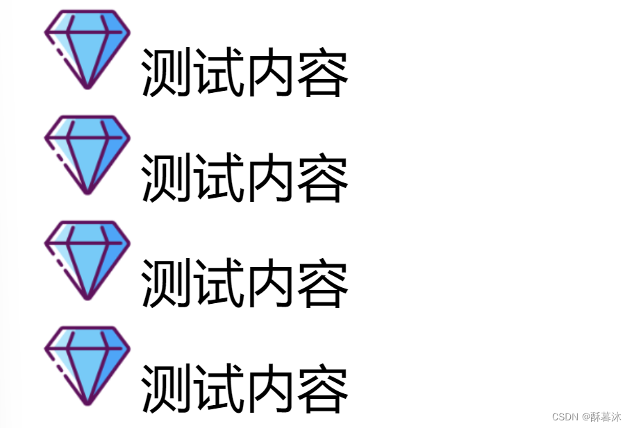
3.4内外边距
3.5边框样式
盒子模型(content【内容】、padding【内边距】、border【边框】、margin【外边距】)
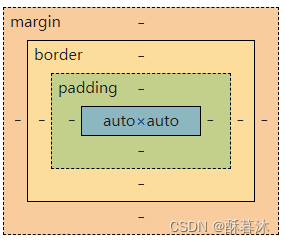
内容:
content:通过weight和height设置宽和高
内边距:
单边设置:padding-right/left/top/bottom:值;
格式--padding:值;(上下左右)
padding:值1(上下),值2(左右);
padding:值1(上),值2(左右),值3(下);
padding:值1(上),值2(右),值3(下),值4(左);
边框:
border:1px solid(double双实线) red(颜色);
border-radius:5%;(圆角效果)
box-shadow:10px 10px 10px ;(边框阴影效果)
外边距:
margin:值;(其他和内边距格式差不多)
margin:auto;(自动居中)
怪异盒子
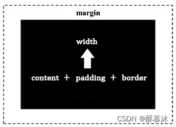
width/height(元素的内容宽或高):内容区(content)、内边距(padding)以及边框(border)的总和。
注意:外边框不受影响,和原来盒子模型一样
我们通过box-sizing:border-box;将普通盒子变成怪异盒子
运用场景:
比如说现在有一个大盒子里面有三个小盒子,让他们都浮动起来,向上图这样排列,刚好能放下三个,但是当我们给三个盒子增加内边距和边框时他们的盒子整体都会变大,然后就可能第三个盒子放不下了,就被挤到下面去了,如果这时候我们将三个盒子都设置成怪异盒模型,那么提前设置好他们每个盒子的大小,在设置内边距和边框就只从他们里面去挤压设置了,整体的盒子大小不变,那么第三个盒子也就不会被挤下去了。
3.6元素属性变化
块级元素<==>行内元素
行内==>块级 : display:block;行内元素改变了属性后可以使用块级元素的特征
块级==>行内 : display: inline;(若不改变块级元素的样式,则 display: inline-block;)
<!DOCTYPE html>
<html lang="en">
<head>
    <meta charset="UTF-8">
    <meta name="viewport" content="width=device-width, initial-scale=1.0">
    <title>元素属性变换</title>
     <style>
        div,span{
            width: 200px;
            height: 200px;
            border: 1px solid red;
            text-align: center;
        }

        span {
            display: block;
        }

        div{
            /* display: inline; */
            display: inline-block;

        }

        li{
            width: 300px;
            height: 600px;
            border: 1px solid grey;
            list-style-type: none;
            text-align: center;
            margin: 20px;
            display: inline-block;
        }
     </style>
</head>
<body>
    <div>块级</div>
    <div>块级</div>
    <hr>
    <span>行内元素span1</span>
    <span>行内元素span2</span>
</body>
</html>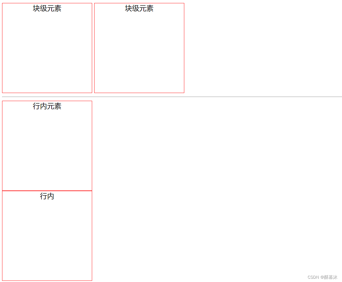
3.7浮动
(1)文档流:编写代码的先后顺序和显示元素顺序是一致的
(2)float: 元素脱离文档流,开始时主要做文本环绕
!!!布局 一般情况下使用 float+div 进行布局
<!DOCTYPE html>
<html lang="en">
<head>
    <meta charset="UTF-8">
    <meta name="viewport" content="width=device-width, initial-scale=1.0">
    <title>浮动 -- 主要用来布局</title>
     <style>
        div{
            width: 100px;
            height: 100px;
            border: 1px solid red;
            float: left;
            margin: 10px;
        }
     </style>
</head>
<body>
  层叠样式表(英文全称:cascading style sheets)是一种用来表现HTML(标准通用标记语言的一个应用)或XML(标准通用标记语言的一
css 能够对网页中元素位置的排版进行像素级精确控制,支持几乎所有的字体字号样式,拥有对网页对象和模型样式编辑的能力。层叠样式表(英文全称:cascading style sheets)是一种用来表现HTML(标准通用标记语言的一个应用)或XML(标准通用标记语言的一个子集能够对网页中元素位置的排版进行像素级精确控制,支持几乎所有的字体字号样式,拥有对网页对象和模型样式编辑的能力。 [2]
    <div>div测试内容</div>
    层叠样式表(英文全称:cascading style sheets)是一种用来表现HTML(标准通用标记语言的一个应用)或XML(标准通用标记语言的一
css 能够对网页中元素位置的排版进行像素级精确控制,支持几乎所有的字体字号样式,拥有对网页对象和模型样式编辑的能力。层叠样式表(英文全称:cascading style sheets)是一种用来表现HTML(标准通用标记语言的一个应用)或XML(标准通用标记语言的一个子集能够对网页中元素位置的排版进行像素级精确控制,支持几乎所有的字体字号样式,拥有对网页对象和模型样式编辑的能力。 [2] -->
    <div class="a">a</div>
    <div class="b">b</div>
    <div class="b">b</div>
    <div class="b">b</div>
    <div class="b">b</div>
    <div class="b">b</div>
    <div class="b">b</div>
    <div class="b">b</div>
    <div class="b">b</div>
</body>
</html>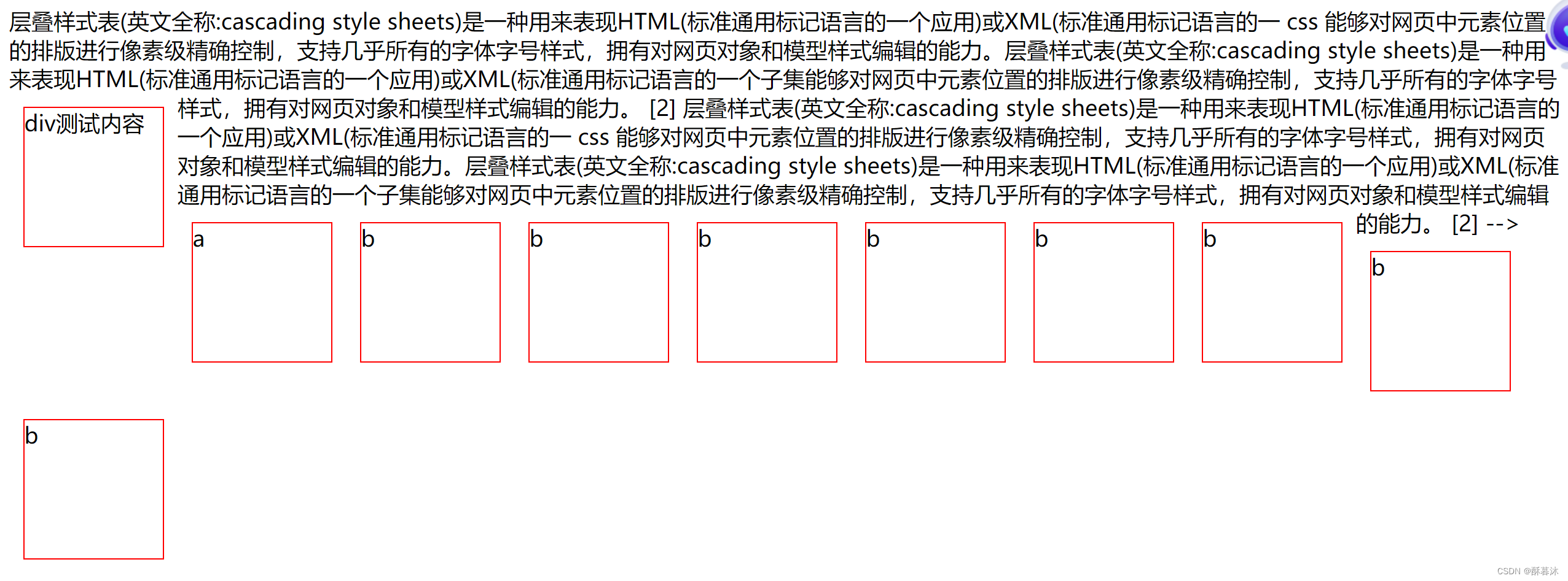
3.8定位
(1)静态定位:static默认的不定位
(2)相对定位:relative相对于原位置定位
(3)绝对定位(难):absolute 根据父级元素定位 1.如果父级未定位则脱离文档流根据body定位,2.如果父级元素有定位,则根据父级定位
(4)固定定位:fixed 固定位置
<body>
    <div class="box">box
        <div class="item">item绝对定位</div>
    </div>

    <div class="abs">abs固定定位</div>
</body>
固定定位:
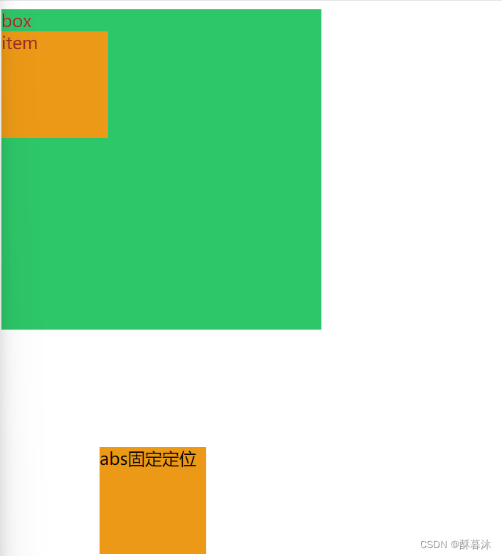
绝对定位:
<style> .item{ position: absolute; top: 0px;left: 0px; } </style>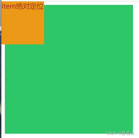
4. css其他样式
4.1 media查询
根据不同设备显示不同的样式
screen 屏幕 print 打印机 all 所有设备
针对屏幕的格式:@media screen{}
<style>
        @media screen
        {
          .box{
            font-size: 100px;
            color: blueviolet;
          }
        }
</style>打印机:@media print {}
<style>

        @media print{
            .box{
                font-size: 10px;
                color: aquamarine;
            }
        }
</style>
所有: @media all{ .box { }} (多个设备之间则用逗号隔开)
4.2 media屏幕尺寸
根据屏幕尺寸大小显示不一样的结果
(1)@media only screen and ( min -width :900px){ 里面利用选择器进行标签渲染 }
最小屏幕大小 就是最小都为900px,所以屏幕是>=900px
(2)@media only screen and (min-width:400px) and (max-width:900px) { }
900px >= 屏幕大小 >= 400px
(3) @media only screen and (max-width:400px) { }
最大屏幕大小 屏幕<= 400px
4.3 自定义字体
https://font.chinaz.com/ 下载字体的网站
首先网站下载字体,然后定义自定义字体文字 @font-face{ font-family:起个名字; src:url("文件路径引用字体文件"); } ,最后引用自定义文字
 <style>

        /* https://font.chinaz.com/ 下载字体的网站  */
        /* 定义自定义文字 */
        @font-face {
            /* 给自定义字体给个名字 */
            font-family:huangkaihualushishouxieti ;
            /* 引入字体文件 */
            src: url("huangkaihualushishouxieti.ttf");
        }

        p{
            color: chartreuse;
            font-family:huangkaihualushishouxieti ;
            font-size: 40px;
        }
  </style>


<body>
    <p>
        分区分配算法至少实现首次适应算法、最佳适应算法和最坏适应算法中的至少一种。熟悉并掌握各种算法的空闲区组织方式。
分区的初始化——可以由用户输入初始分区的大小。(初始化后只有一个空闲分区,起始地址为0,大小是用户输入的大小)
分区的动态分配过程:由用户输入作业号和作业的大小,实现分区过程。
分区的回收:用户输入作业号,实现分区回收,同时,分区的合并要体现出来。(注意:不存在的作业号要给出错误提示!)
分区的显示:任何时刻,可以查看当前内存的情况(起始地址是什么,大小多大的分区时空闲的,或者占用的,能够显示出来)
    </p>
</body>
4,4 css过渡
过渡三要素:触发条件 过渡时间 过渡的内容(作用的属性)
这里采用一个案例来讲解:鼠标悬停在div上,宽高变为原来的两倍
首先给标签设置一些基础样式 从一开始宽高200px背景颜色为青色的div变为宽高为400px背景颜色为紫色的div
<style>
div{ width: 200px; height: 200px; background-color: aqua; }
div:hover{width: 400px; height: 400px; background-color: blueviolet; }
</style>
鼠标悬停div变换的过程可以利用transition过渡,过渡的属性分别如下:
(1)transition-property:定义哪些属性需要过渡。
none:不过渡任何属性
all:支持过渡的所有属性(默认值)
指定具体属性名(值为数字或可以转换为数字的属性才支持过渡)
(3) transition-duration:1s;设置过渡的持续时间为1s,单位为秒(s)或毫秒(ms)。
(3)transition-delay :1s ; 设置过渡的延迟时间为is,单位可以为秒(s)或毫秒(ms)。
(4) transition-timing-function:
linear;以匀速进行过渡
ease;以慢速开始,然后变快,然后慢速进行过渡
ease-in;以慢速开始进行过渡
ease-out;以慢速结束进行过渡
ease-in-out;以慢速开始和结束进行过渡
综合:
transition:width 1s,height 1s;或 transition: all 1s ;(所有属性都已一秒时间过渡)
transition: all 1s linear 1s;或 transition: all 1s linear ;(以时间曲线过渡)
注意:过渡属性全写在还未变化的div属性中
4.5 css变换
css变换效果包括:平移 旋转 缩放 倾斜
(1)translate();平移
将元素水平移动移动移动(根据为 X 轴和 Y 轴指定的参数右正左负,下正上负 按照先x轴再y轴移动)
transform: translate(100px, 100px);(先向右移动100px,再向下移动100px)
另外还有 translateX(x); translateY(y)。 translateX 沿x轴平移
(2)rotate();旋转
根据给定的角度顺时针或逆时针旋转元素(负为逆时针,正为顺时针)
transform: rotate(20deg);(顺时针旋转20度)
另外还有 rotateX(角度),表示沿X轴进行旋转给定的角度,rotateY(角度)同理
(3) scale();缩放
改变元素大小(前一个为宽的倍数,后一个为高的倍数)
transform: scale(2, 2);(宽*2倍,高*2倍 )可以为小数倍
也可以写成
transform: scale(2);另外还有scaleX()和 scaleY()
scaleX()增加或减少元素的宽度
transform: scaleX(2);(宽增加为原来的两倍)
scaleY()增加或减少元素的高度
transform: scaleY(0.5);(高变为原来的一半)
(4)skew(); 倾斜
使元素沿 X 和 Y 轴倾斜给定角度(前面为skewX,后面为skewY)
transform: skew(20deg, 10deg);元素沿xy轴倾斜相同角度可以写为:
transform: skew(70deg); skewX()使元素沿 X 轴倾斜给定角度(实际为y轴倾斜,与x轴平行的不变)
transform: skewX(30deg);
skewY()使元素沿 Y 轴倾斜给定角度(实际为x轴倾斜,与y轴平行的不变)
transform: skewY(30deg);
复合写法:
matrix() 方法可接受六个参数,其中包括数学函数,这些参数使您可以旋转、缩放、移动(平移) 和倾斜元素。 参数如下:matrix(scaleX(),skewY(),skewX(),scaleY(),translateX(),translateY())
transform:matrix(0.866,1,0.5,0.866,0,0);
4.6 css动画
首先先定义动画(keyframes的英文意思是关键帧)
用keyframes定义动画(类似于定义选择器)
@keyframes 动画名称{
        0%{
          width: 100px;
        }
        100%{
          width: 200px;
        }
}0%表示开始,100%表示结束;也可以用from和to表示开始和结束
然后元素使用动画
选择器{

/* 调用动画 */
animation-name: 动画名称;

/* 持续时间 */
animation-duration: 持续时间 1s、2s.....;

 /* 3.时间线 */
 animation-timing-function: linear;

  /* 4.播放次数 */
 animation-iteration-count: 5;


 /* 5.反转 */
 /* alternate */
 animation-direction:alternate-reverse ;
}
4.7 css渐变
background-image:linear-gradient(反向to right...,颜色1,颜色2,颜色n)
(1)线性渐变 从上至下的渐变(默认)
<style>
    div{
            height: 300px;
            border:1px solid red;
            background-image: linear-gradient(red,rgb(21, 205, 34),white);
        }
</style>
(2)具备方向的线性渐变
<style>
    div{
            height: 300px;
            border:1px solid red;
            background-image: linear-gradient(to right, red,white);
            background-image: linear-gradient(to top,red,white);
           background-image: linear-gradient (to right bottom ,  red,white);
</style>
to right (从左到右的渐变)
to top (从下到上的渐变)
to right bottom(从左上到右下的渐变,即对角线渐变)
(3)带有角度的线性渐变
取代预定义的方向(向下、向上、向右、向左、向右下等等)。值 0deg 等于向上(to top)。值 90deg 等于向右(to right)。值 180deg 等于向下(to bottom)。
background-image: linear-gradient(90 deg,red,white);
(4) 带有透明度的线性渐变
使用rgba()函数定义色标,其中括号中前三个参数为rgb三原色的整数数值,范围:(0~255),最后一个参数为透明值,范围:(0~1)
background-image: linear-gradient(to right,rgba(255,0,0,1),rgba(255,0,0,0.2));

(5) 重复的线性渐变
用repeating-linear-gradient()属性
background-image: repeating-linear-gradient(to right,red,rgb(84, 26, 209) 10%,green 20%);
(6)径向线性渐变(由内向外)
background-image: radial-gradient(shape size at position, start-color, ..., last-color);
默认地,shape 为椭圆形,size 为最远角,position 为中心。
background-image: radial-gradient(red,white,green); 
4.8 css多列
将文章划分为多个板块
| column-count:n ; | n列 |
| column-width:100px ; | 每列宽度100px |
| column-gap:20px ; | 列之间的间距为20px |
| column-rule:width style color; (复合写法column-rule:1px solid red) | 列之间的边框样式为1px的红色实线 |
| column-span:取值;all是所有,none是无 | 跨列(实现多列布局的跨列效果) |

5.css布局(重要)
案例:
5.1 div布局
div+css样式用的比较多
<!DOCTYPE html>
<html lang="en">
<head>
    <meta charset="UTF-8">
    <meta name="viewport" content="width=device-width, initial-scale=1.0">
    <title>div布局--工字</title>
    <style>
        .a,.c{
            height:100px;
            background-color: pink;
        }
        .b{
            height: 300px;
        }
        .b>div{
            height: 290px;
            float: left;
            margin-top: 5px;

        }
        .b1,.b3{
            width: 18%;
        }
        .b2{
            width: 58%;
            background-color: aquamarine;
        }

    </style>
</head>
<body>
    <div class="a"></div>
    <div class="b">
        <div class="b1"></div>
        <div class="b2"></div>
        <div class="b3"></div>
    </div>
    <div class="c"></div>
</body>
</html>
5.2 table布局
(不推荐使用,比较复杂)
table----标识当前为表格
tr:行标签 td:列标签 th:表格头(字体会加粗)
跨行:rowspan="跨行行数"
跨列:colspan="跨行列数"
!!!当进行跨行和跨列是需要将移除的元素删掉
<!DOCTYPE html>
<html lang="en">
<head>
    <meta charset="UTF-8">
    <meta name="viewport" content="width=device-width, initial-scale=1.0">
    <title>table 布局</title>
</head>
<body>
    <table border="1px " bgcolor="pink" width="600px" height="300px" align="center">
        <tr>
            <th>username</th>
            <th>passward</th>
            <th>gender</th>
        </tr>
        <tr bgcolor="gray">
            <td>zhangsan</td>
            <td>123</td>
            <td>男</td>
        </tr>
        <tr bgcolor="gray">
            <td>xiaoxiao</td>
            <td>456</td>
            <td>女</td>
        </tr>
        <tr bgcolor="gray">
            <td>lisi</td>
            <td>890</td>
            <td>男</td>
        </tr>
    </table>

</body>
</html>
5.3 flex布局
<!DOCTYPE html>
<html lang="en">
<head>
    <meta charset="UTF-8">
    <meta name="viewport" content="width=device-width, initial-scale=1.0">
    <title>flex布局</title>
    <!--
        1.弹性盒子--主要用来做对齐方式的,且一般情况下处理的是水平或垂直方向的一行或一列--2D
            弹性盒子: flex-container
            弹性元素: flex-items
        2.弹性盒子的轴
            主轴:flex-flow设置主轴
            交叉轴:  未设置的主轴

     -->

     <style>
        /* 1.使用基础样式 */
        .flex-container{
            max-width: 1000px;
            height: 650px;
            background-color: antiquewhite;
            border: 1px solid red;
            margin: auto;

            /* 2.使用flex弹性布局 */
            display: flex;

            /* 3.设置弹性盒子的主轴及是否换行 默认水平row 垂直colum */
            /* flex-direction: row; */
            /* flex-wrap: wrap; */
            /*复合  */
            flex-flow: row wrap;


            /*
            4.主轴上的对齐方式
                start:主轴的开始位置,如果是x则为最左边,如果为y则为最上边
                end:主轴的结束位置,如果是x则为最右边,如果为y则为最下边
                center:在主轴上居中
                space-around:平均分布在主轴上,并且两端留白
                space-between:平均分布在主轴上,并且两端不留白

            */
            justify-content: center;


            /*
            5.交叉轴的对齐方式
                。。。其他的和主轴道理一样
                baseline:按照基线对齐,如果有文本,则按照文本的地步对齐,如果没有文本,则按照盒子的底部对齐
                stretch:元素拉伸至自适应整个容器,默认的---测试时需要去除子项的固定宽高
             */
            align-items: center;


            /* 多行交叉轴对齐方式 */
            align-content: center;

        }
        .flex-items{
            /* width: 100px; */
            height: 100px;
            border: 1px solid red;
            background-color: aquamarine;
        }

        .flex-items:nth-child(1){
            /* flex-grow: 1;
            flex-shrink: 1; */
            flex-basis:200px;

        }
        .flex-items:nth-child(2){
            /* flex-grow: 1;
            flex-shrink: 1; */
            flex-basis:200px;

        }
        .i3{
            font-size: 10px;

            /* 1.弹性子项目放大比率 */
            /* flex-grow: 3; */

            /* 2.子项目缩小比率 */
            /* flex-shrink: 10; */

            /* 3.子项目基础尺寸 */
            /* flex-basis: 200px; */

            /* 4.复合写法 基础尺寸、放大和收缩比率 */
            flex:200px 3 10;

            /* 5.子项目在交叉轴对齐方式---当前单个子项目 */
            align-self: self-start;

        }

     </style>
</head>
<body>
    <div class="flex-container">
        <div class="flex-items">flex-items1</div>
        <div class="flex-items">flex-items2</div>
        <div class="flex-items i3">flex-items3</div>
        <div class="flex-items">flex-items4</div>
        <div class="flex-items">flex-items5</div>
        <div class="flex-items">flex-items6</div>
        <div class="flex-items">flex-items7</div>
        <div class="flex-items">flex-items8</div>
        <div class="flex-items">flex-items9</div>
        <div class="flex-items">flex-items10</div>
        <div class="flex-items">flex-items11</div>
    </div>
</body>
</html>
5.4 栅格布局
采用栅格布局--display:grid;
设置列数
通过像素设置,有几个值就代表几列
grid-template-columns: 200px 200px 200px 200px 200px;
通过百分比设置,有几个值就代表几列,如果超出,则放大屏幕比例
grid-template-columns: 20% 20% 20% 20% 20%;
通过等分函数--推荐
width :多少px;
grid-template-columns: repeat(分成几个比例,1fr);
使用的列数索引,前包含后不包含,复合写法: grid-column: 3/5;
综合复合写法 行起始/列起始/行结束/列结束:grid-area: 2/3/4/5;
<!DOCTYPE html>
<html lang="en">
<head>
    <meta charset="UTF-8">
    <meta name="viewport" content="width=device-width, initial-scale=1.0">
    <title>工字布局</title>
    <style>
        .box{
            /*1. 使用栅格布局 */
            display: grid;

            /* 2.行列数  考虑跨行和跨列所占比例 */
            grid-template-columns: repeat(5,1fr);
            height: 650px;
            grid-template-rows: repeat(5,1fr);
            /* border: 1px solid red; */
        }

        .box>div:nth-child(1), .box>div:nth-child(3){
            grid-column: 1/6;
            background-color: antiquewhite;
        }

        .box>div:nth-child(2){
            grid-area: 2/2/5/5;
            background-color: chartreuse;
        }
    </style>
</head>
<body>
    <div class="box">
        <div>box1</div>
        <div>box2</div>
        <div>box3</div>
    </div>
</body>
</html>


 900
900


 被折叠的 条评论
为什么被折叠?
被折叠的 条评论
为什么被折叠?
 到【灌水乐园】发言


