


}
void setStrokeColor(int color){
setStrokeData(mStrokeWidth, color);
}
static RoundButtonDrawable fromAttrSet(Context context, AttributeSet attrs, int defStyleAttr) {
TypedArray typedArray = context.obtainStyledAttributes(attrs, R.styleable.RoundButton, defStyleAttr, 0);
int bgColor = typedArray.getColor(R.styleable.RoundButton_bgColor, ContextCompat.getColor(context,R.color.white));
int mRadius = typedArray.getDimensionPixelSize(R.styleable.RoundButton_radius, 0);
int mTopLeftRadius = typedArray.getDimensionPixelSize(R.styleable.RoundButton_topLeftRadius, 0);
int mTopRightRadius = typedArray.getDimensionPixelSize(R.styleable.RoundButton_topRightRadius, 0);
int mBottomLeftRadius = typedArray.getDimensionPixelSize(R.styleable.RoundButton_bottomLeftRadius, 0);
int mBottomRightRadius = typedArray.getDimensionPixelSize(R.styleable.RoundButton_bottomRightRadius, 0);
int strokeColor = typedArray.getColor(R.styleable.RoundButton_strokeColor,ContextCompat.getColor(context,R.color.white));
int strokeWidth = typedArray.getDimensionPixelSize(R.styleable.RoundButton_strokeWidth, 0);
typedArray.recycle();
RoundButtonDrawable roundButtonDrawable = new RoundButtonDrawable();
//设置背景颜色
roundButtonDrawable.setColor(bgColor);
//优先设置指定的圆角
if (mTopLeftRadius > 0 || mTopRightRadius > 0 || mBottomLeftRadius > 0 || mBottomRightRadius > 0) {
float[] radii = new float[]{
mTopLeftRadius, mTopLeftRadius,
mTopRightRadius, mTopRightRadius,
mBottomRightRadius, mBottomRightRadius,
mBottomLeftRadius, mBottomLeftRadius
};
roundButtonDrawable.setCornerRadii(radii);
} else {
roundButtonDrawable.setCornerRadius(mRadius);
}
//设置描边的宽度和颜色
roundButtonDrawable.setStrokeData(strokeWidth, strokeColor);
return roundButtonDrawable;
}
}
attr代码如下:
<?xml version="1.0" encoding="utf-8"?>2、自定义Button,设置GradientDrawable为背景
因为GradientDrawable是shape标签的具体代码实现,所以,如果我们想通过GradientDrawable来实现圆角等功能需求的话,需要把上一步骤中我们自定义的GradientDrawable来作为button的background,具体代码如下:
/**
-
@author xiaoman
-
可以设置背景色、指定圆角、描边的宽度和颜色
*/
public class RoundButton extends AppCompatTextView {
private RoundButtonDrawable roundButtonDrawable;
public RoundButton(Context context) {
super(context);
init(context, null, 0);
}
public RoundButton(Context context, AttributeSet attrs) {
super(context, attrs, R.attr.RoundButtonStyle);
init(context, attrs, R.attr.RoundButtonStyle);
}
public RoundButton(Context context, AttributeSet attrs, int defStyleAttr) {
super(context, attrs, defStyleAttr);
init(context, attrs, defStyleAttr);
}
private void init(Context context, AttributeSet attrs, int defStyleAttr) {
roundButtonDrawable = RoundButtonDrawable.fromAttrSet(context, attrs, defStyleAttr);
ViewHelperUtils.setBackgroundKeepingPadding(this, roundButtonDrawable);
}
/**
-
设置背景颜色
-
@param color
*/
@Override
public void setBackgroundColor(int color) {
roundButtonDrawable. setColor(color);
}
/**
-
设置描边的宽度和颜色
-
@param width
-
@param color
*/
public void setStrokeData(int width, int color) {
roundButtonDrawable.setStrokeData(width, color);
}
/**
-
设置描边颜色
-
@param color
*/
public void setStrokeColors(int color) {
roundButtonDrawable.setStrokeColor(color);
}
/**
-
设置四个角的半径
-
@param radius
*/
public void setRadius(int radius){
roundButtonDrawable.setCornerRadius(radius);
}
/**
-
设置 每一个角的半径
-
@param topLeftRadius 左上角半径
-
@param topRightRadius 右上角半径
-
@param bottomLeftRadius 右下角半径
-
@param bottomRightRadius 左下角半径
*/
public void setEachCornerRadius(int topLeftRadius,int topRightRadius,int bottomLeftRadius,int bottomRightRadius){
float[] radius = new float[]{
topLeftRadius, topLeftRadius,
topRightRadius, topRightRadius,
bottomRightRadius, bottomRightRadius,
bottomLeftRadius, bottomLeftRadius
};
roundButtonDrawable. setCornerRadii(radius);
}
/**
-
设置渐变
-
@param gradientType 渐变类型
-
@param orientation 渐变方向
-
@param colors 渐变颜色
*/
public void setGradient(int gradientType, GradientDrawable.Orientation orientation, int[] colors){
roundButtonDrawable.setGradientType(gradientType);
roundButtonDrawable.setOrientation(orientation);
roundButtonDrawable.setColors(colors);
}
public static void setBackgroundKeepingPadding(View view, Drawable drawable) {
int[] padding = new int[]{view.getPaddingLeft(), view.getPaddingTop(), view.getPaddingRight(), view.getPaddingBottom()};
view.setBackground(drawable);
view.setPadding(padding[0], padding[1], padding[2], padding[3]);
}
}
3、在xml布局文件中直接引用自定义的button
<?xml version="1.0" encoding="utf-8"?><androidx.constraintlayout.widget.ConstraintLayout xmlns:android=“http://schemas.android.com/apk/res/android”
xmlns:app=“http://schemas.android.com/apk/res-auto”
xmlns:tools=“http://schemas.android.com/tools”
android:layout_width=“match_parent”
android:layout_height=“match_parent”
tools:context=“.MainActivity”>
<com.ztk.demo.uitool.widget.RoundButton
android:id=“@+id/bt”
android:layout_width=“300dp”
android:layout_height=“wrap_content”
android:text=“Hello World!”
android:padding=“10dp”
app:radius=“30dp”
app:bgColor=“@color/colorAccent”
android:textColor=“#ffffff”
android:gravity=“center_horizontal”
android:layout_marginTop=“60dp”
app:layout_constraintLeft_toLeftOf=“parent”
app:layout_constraintRight_toRightOf=“parent”
app:layout_constraintTop_toTopOf=“parent” />
<com.ztk.demo.uitool.widget.RoundButton
android:id=“@+id/bt2”
android:layout_width=“300dp”
android:layout_height=“wrap_content”
android:text=“”
android:padding=“10dp”
app:topLeftRadius=“10dp”
app:bgColor=“@color/colorPrimary”
android:textColor=“#ffffff”
android:gravity=“center_horizontal”
android:layout_marginTop=“30dp”
app:layout_constraintTop_toBottomOf=“@+id/bt”
app:layout_constraintLeft_toLeftOf=“parent”
app:layout_constraintRight_toRightOf=“parent” />
<com.ztk.demo.uitool.widget.RoundButton
android:id=“@+id/bt3”
自我介绍一下,小编13年上海交大毕业,曾经在小公司待过,也去过华为、OPPO等大厂,18年进入阿里一直到现在。
深知大多数初中级Android工程师,想要提升技能,往往是自己摸索成长或者是报班学习,但对于培训机构动则近万的学费,着实压力不小。自己不成体系的自学效果低效又漫长,而且极易碰到天花板技术停滞不前!
因此收集整理了一份《2024年Android移动开发全套学习资料》,初衷也很简单,就是希望能够帮助到想自学提升又不知道该从何学起的朋友,同时减轻大家的负担。


既有适合小白学习的零基础资料,也有适合3年以上经验的小伙伴深入学习提升的进阶课程,基本涵盖了95%以上Android开发知识点,真正体系化!
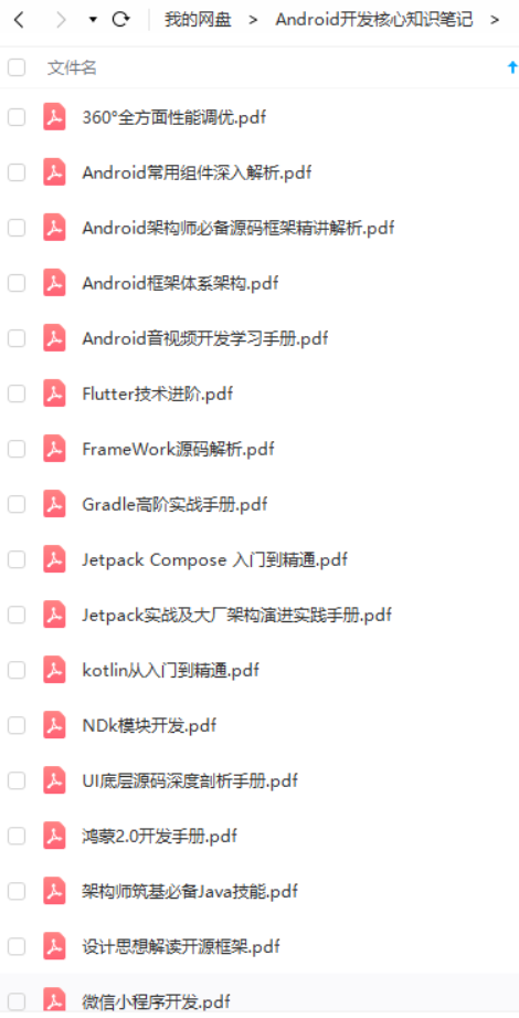
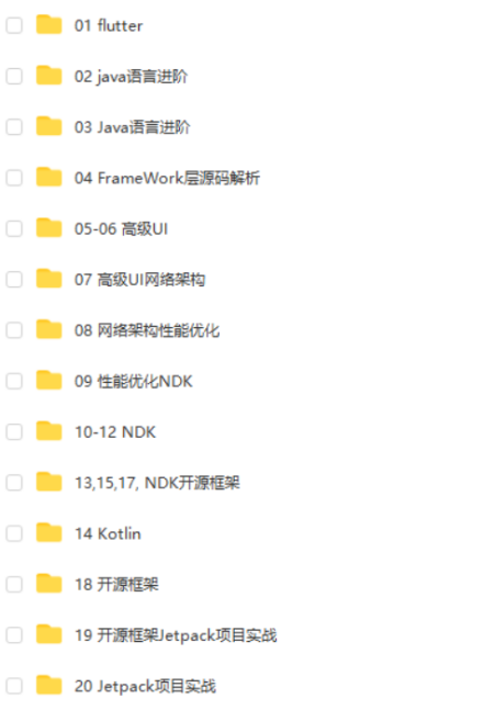
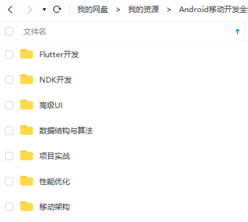
由于文件比较大,这里只是将部分目录截图出来,每个节点里面都包含大厂面经、学习笔记、源码讲义、实战项目、讲解视频,并且会持续更新!
如果你觉得这些内容对你有帮助,可以扫码获取!!(备注:Android)

最后
这里附上上述的技术体系图相关的几十套腾讯、头条、阿里、美团等公司2021年的面试题,把技术点整理成了视频和PDF(实际上比预期多花了不少精力),包含知识脉络 + 诸多细节,由于篇幅有限,这里以图片的形式给大家展示一部分。
相信它会给大家带来很多收获:

当程序员容易,当一个优秀的程序员是需要不断学习的,从初级程序员到高级程序员,从初级架构师到资深架构师,或者走向管理,从技术经理到技术总监,每个阶段都需要掌握不同的能力。早早确定自己的职业方向,才能在工作和能力提升中甩开同龄人。
- 无论你现在水平怎么样一定要 持续学习 没有鸡汤,别人看起来的毫不费力,其实费了很大力,这四个字就是我的建议!!!
- 我希望每一个努力生活的IT工程师,都会得到自己想要的,因为我们很辛苦,我们应得的。
当我们在抱怨环境,抱怨怀才不遇的时候,没有别的原因,一定是你做的还不够好!
《互联网大厂面试真题解析、进阶开发核心学习笔记、全套讲解视频、实战项目源码讲义》点击传送门即可获取!
的形式给大家展示一部分。
相信它会给大家带来很多收获:
[外链图片转存中…(img-VHUhn61a-1713794122024)]
当程序员容易,当一个优秀的程序员是需要不断学习的,从初级程序员到高级程序员,从初级架构师到资深架构师,或者走向管理,从技术经理到技术总监,每个阶段都需要掌握不同的能力。早早确定自己的职业方向,才能在工作和能力提升中甩开同龄人。
- 无论你现在水平怎么样一定要 持续学习 没有鸡汤,别人看起来的毫不费力,其实费了很大力,这四个字就是我的建议!!!
- 我希望每一个努力生活的IT工程师,都会得到自己想要的,因为我们很辛苦,我们应得的。
当我们在抱怨环境,抱怨怀才不遇的时候,没有别的原因,一定是你做的还不够好!
《互联网大厂面试真题解析、进阶开发核心学习笔记、全套讲解视频、实战项目源码讲义》点击传送门即可获取!


 4330
4330


 被折叠的 条评论
为什么被折叠?
被折叠的 条评论
为什么被折叠?
 到【灌水乐园】发言


