


        transform-style: preserve-3d;


    }

    .minbox li{

        position: absolute;

        width: 200px;

        height: 200px;

        background-color: pink;

    }

    .minbox li:nth-child(1){

        background: url(images/images1.jpeg) no-repeat 0 0;

        background-size: 200px 200px;

        transform: translateZ(100px);

    }

    .minbox li:nth-child(2){

        background: url(images/images2.jpeg) no-repeat 0 0;

        background-size: 200px 200px;

        transform:rotateX(180deg) rotate(180deg) translateZ(100px);

    }

    .minbox li:nth-child(3){

        background: url(images/images3.jpeg) no-repeat 0 0;

        background-size: 200px 200px;

        transform:rotateX(90deg) translateZ(100px);

    }

    .minbox li:nth-child(4){

        background: url(images/images4.jpeg) no-repeat 0 0;

        background-size: 200px 200px;

        transform:rotateX(-90deg) translateZ(100px);

    }

    .minbox li:nth-child(5){

        background: url(images/images5.jpeg) no-repeat 0 0;

        background-size: 200px 200px;

        transform:rotateY(90deg) translateZ(100px);

    }

    .minbox li:nth-child(6){

        background: url(images/images6.jpeg) no-repeat 0 0;

        background-size: 200px 200px;

        transform:rotateY(-90deg) translateZ(100px);

    }

    .maxbox{

        width: 400px;

        height: 400px;

        position: absolute;

        left:0;

        top: 0;

        transform-style: preserve-3d;


    }

    .maxbox li{

        width: 400px;

        height: 400px;

        position: absolute;

    }


    .maxbox li:nth-child(1){

        background: url(images/images1.jpeg) no-repeat 0 0;

        background-size: 400px 400px;

        transform: translateZ(200px);

        opacity: 0.2;

    }

    .maxbox li:nth-child(2){

        background: url(images/images2.jpeg) no-repeat 0 0;

        background-size: 400px 400px;

        transform: rotateX(180deg) rotate(180deg) translateZ(200px);

        opacity: 0.2;

    }

    .maxbox li:nth-child(3){

        background: url(images/images3.jpeg) no-repeat 0 0;

        background-size: 400px 400px;

        transform: rotateX(90deg) translateZ(200px);

        opacity: 0.2;

    }

    .maxbox li:nth-child(4){

        background: url(images/images4.jpeg) no-repeat 0 0;

        background-size: 400px 400px;

        transform: rotateX(-90deg) translateZ(200px);

        opacity: 0.2;

    }

    .maxbox li:nth-child(5){

        background: url(images/images5.jpeg) no-repeat 0 0;

        background-size: 400px 400px;

        transform: rotateY(90deg) translateZ(200px);

        opacity: 0.2;

    }

    .maxbox li:nth-child(6){

        background: url(images/images6.jpeg) no-repeat 0 0;

        background-size: 400px 400px;

        transform: rotateY(-90deg) translateZ(200px);

        opacity: 0.2;

    }

    .maxbox:hover li:nth-child(1){

        transform: translateZ(400px) scale(1.5);

        opacity: 0.8;


    }

    div:hover .minbox li:nth-child(1){

        transform:translateZ(150px) scale(1.5);

    }

    .maxbox:hover li:nth-child(2){

        transform:rotateX(180deg) rotate(180deg) translateZ(400px) scale(1.5);

        opacity: 0.8;


    }

    div:hover .minbox li:nth-child(2){

        transform:rotateX(180deg) rotate(180deg) translateZ(150px) scale(1.5);

    }

    .maxbox:hover li:nth-child(3){

        transform:rotateX(90deg) translateZ(400px) scale(1.5);

        opacity: 0.8;


    }

    div:hover .minbox li:nth-child(3){

        transform:rotateX(90deg) translateZ(150px) scale(1.5);

    }

    .maxbox:hover li:nth-child(4){

        transform:rotateX(-90deg) translateZ(400px) scale(1.5);

        opacity: 0.8;


    }

    div:hover .minbox li:nth-child(4){

        transform:rotateX(-90deg) translateZ(150px) scale(1.5);

    }

    .maxbox:hover li:nth-child(5){

        transform:rotateY(90deg) translateZ(400px) scale(1.5);

        opacity: 0.8;


    }

    div:hover .minbox li:nth-child(5){

        transform:rotateY(90deg) translateZ(150px) scale(1.5);

    }

    .maxbox:hover li:nth-child(6){

        transform:rotateY(-90deg) translateZ(400px) scale(1.5);

        opacity: 0.8;


    }

    div:hover .minbox li:nth-child(6){

        transform:rotateY(-90deg) translateZ(150px) scale(1.5);

    }


</style>
<div>

    <ul class="minbox">

        <li></li>

        <li></li>

        <li></li>

        <li></li>

        <li></li>

        <li></li>

    </ul>
最后
自我介绍一下,小编13年上海交大毕业,曾经在小公司待过,也去过华为、OPPO等大厂,18年进入阿里一直到现在。
深知大多数初中级Android工程师,想要提升技能,往往是自己摸索成长,自己不成体系的自学效果低效漫长且无助。
因此收集整理了一份《2024年Web前端开发全套学习资料》,初衷也很简单,就是希望能够帮助到想自学提升又不知道该从何学起的朋友,同时减轻大家的负担。

既有适合小白学习的零基础资料,也有适合3年以上经验的小伙伴深入学习提升的进阶课程,基本涵盖了95%以上Android开发知识点!不论你是刚入门Android开发的新手,还是希望在技术上不断提升的资深开发者,这些资料都将为你打开新的学习之门!
如果你觉得这些内容对你有帮助,需要这份全套学习资料的朋友可以戳我获取!!
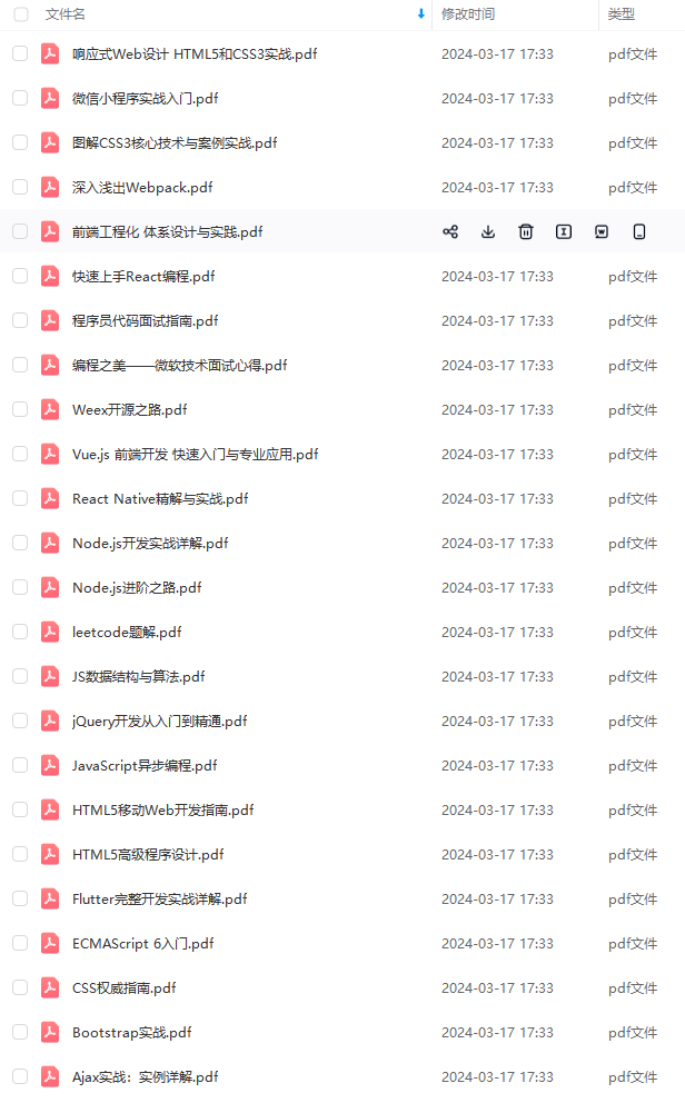
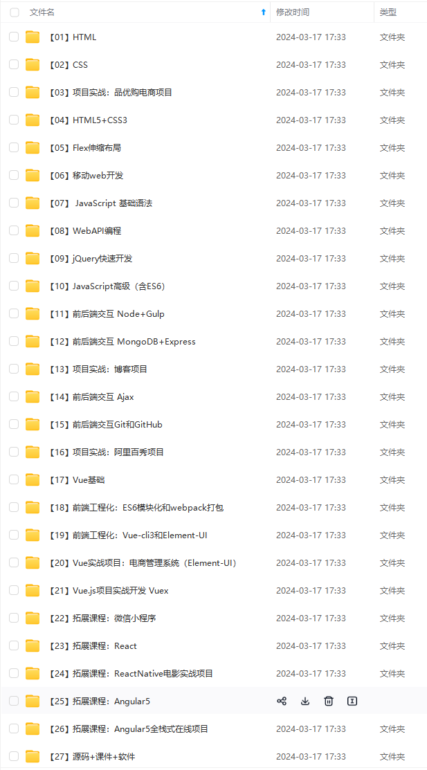
由于文件比较大,这里只是将部分目录截图出来,每个节点里面都包含大厂面经、学习笔记、源码讲义、实战项目、讲解视频,并且会持续更新!
片转存中…(img-602CnNkL-1715288057011)]
既有适合小白学习的零基础资料,也有适合3年以上经验的小伙伴深入学习提升的进阶课程,基本涵盖了95%以上Android开发知识点!不论你是刚入门Android开发的新手,还是希望在技术上不断提升的资深开发者,这些资料都将为你打开新的学习之门!
如果你觉得这些内容对你有帮助,需要这份全套学习资料的朋友可以戳我获取!!
由于文件比较大,这里只是将部分目录截图出来,每个节点里面都包含大厂面经、学习笔记、源码讲义、实战项目、讲解视频,并且会持续更新!


 191
191

 被折叠的 条评论
为什么被折叠?
被折叠的 条评论
为什么被折叠?
 到【灌水乐园】发言


