


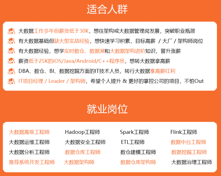

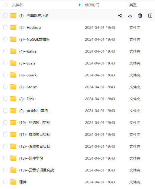
既有适合小白学习的零基础资料,也有适合3年以上经验的小伙伴深入学习提升的进阶课程,涵盖了95%以上大数据知识点,真正体系化!
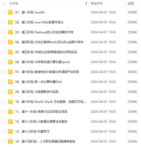
由于文件比较多,这里只是将部分目录截图出来,全套包含大厂面经、学习笔记、源码讲义、实战项目、大纲路线、讲解视频,并且后续会持续更新
复制如下源码粘贴到<style></style>标签之间
@import url("https://fonts.googleapis.com/css2?family=Poppins:wght@200;300;400;500;600;700;800&display=swap");

\*,
\*::before,
\*::after {
  padding: 0;
  margin: 0;
  box-sizing: border-box;
}

body,
input {
  font-family: "Poppins", sans-serif;
}


.box {
  position: relative;
  width: 100%;
  max-width: 1020px;
  height: 640px;
  background-color: #fff;
  border-radius: 3.3rem;
  box-shadow: 0 60px 40px -30px rgba(0, 0, 0, 0.27);
}

.inner-box {
  position: absolute;
  width: calc(100% - 4.1rem);
  height: calc(100% - 4.1rem);
  top: 50%;
  left: 50%;
  transform: translate(-50%, -50%);
}

.forms-wrap {
  position: absolute;
  height: 100%;
  width: 45%;
  top: 0;
  left: 0;
  display: grid;
  grid-template-columns: 1fr;
  grid-template-rows: 1fr;
  transition: 0.8s ease-in-out;
}

form {
  max-width: 260px;
  width: 100%;
  margin: 0 auto;
  height: 100%;
  display: flex;
  flex-direction: column;
  justify-content: space-evenly;
  grid-column: 1 / 2;
  grid-row: 1 / 2;
  transition: opacity 0.02s 0.4s;
}

form.sign-up-form {
  opacity: 0;
  pointer-events: none;
}

.logo {
  display: flex;
  align-items: center;
}

.logo img {
  width: 27px;
  margin-right: 0.3rem;
}

.logo h4 {
  font-size: 1.1rem;
  margin-top: -9px;
  letter-spacing: -0.5px;
  color: #151111;
}

.heading h2 {
  font-size: 2.1rem;
  font-weight: 600;
  color: #151111;
}

.heading h6 {
  color: #bababa;
  font-weight: 400;
  font-size: 0.75rem;
  display: inline;
}

.toggle {
  color: #151111;
  text-decoration: none;
  font-size: 0.75rem;
  font-weight: 500;
  transition: 0.3s;
}

.toggle:hover {
  color: #8371fd;
}

.input-wrap {
  position: relative;
  height: 37px;
  margin-bottom: 2rem;
}

.input-field {
  position: absolute;
  width: 100%;
  height: 100%;
  background: none;
  border: none;
  outline: none;
  border-bottom: 1px solid #bbb;
  padding: 0;
  font-size: 0.95rem;
  color: #151111;
  transition: 0.4s;
}

label {
  position: absolute;
  left: 0;
  top: 50%;
  transform: translateY(-50%);
  font-size: 0.95rem;
  color: #bbb;
  pointer-events: none;
  transition: 0.4s;
}

.input-field.active {
  border-bottom-color: #151111;
}

.input-field.active + label {
  font-size: 0.75rem;
  top: -2px;
}

.sign-btn {
  display: inline-block;
  width: 100%;
  height: 43px;
  background-color: #151111;
  color: #fff;
  border: none;
  cursor: pointer;
  border-radius: 0.8rem;
  font-size: 0.8rem;
  margin-bottom: 2rem;
  transition: 0.3s;
}

.sign-btn:hover {
  background-color: #8371fd;
}

.text {
  color: #bbb;
  font-size: 0.7rem;
}

.text a {
  color: #bbb;
  transition: 0.3s;
}

.text a:hover {
  color: #8371fd;
}

main.sign-up-mode form.sign-in-form {
  opacity: 0;
  pointer-events: none;
}

main.sign-up-mode form.sign-up-form {
  opacity: 1;
  pointer-events: all;
}

main.sign-up-mode .forms-wrap {
  left: 55%;
}

main.sign-up-mode .carousel {
  left: 0%;
}

.carousel {
  position: absolute;
  height: 100%;
  width: 55%;
  left: 45%;
  top: 0;
  background-color: #ffe0d2;
  border-radius: 2rem;
  display: grid;
  grid-template-rows: auto 1fr;
  padding-bottom: 2rem;
  overflow: hidden;
  transition: 0.8s ease-in-out;
}

.images-wrapper {
  display: grid;
  grid-template-columns: 1fr;
  grid-template-rows: 1fr;
}

.image {
  width: 100%;
  grid-column: 1/2;
  grid-row: 1/2;
  opacity: 0;
  transition: opacity 0.3s, transform 0.5s;
}

.img-1 {
  transform: translate(0, -50px);
}

.img-2 {
  transform: scale(0.4, 0.5);
}

.img-3 {
  transform: scale(0.3) rotate(-20deg);
}

.image.show {
  opacity: 1;
  transform: none;
}

.text-slider {
  display: flex;
  align-items: center;
  justify-content: center;
  flex-direction: column;
}

.text-wrap {
  max-height: 2.2rem;
  overflow: hidden;
  margin-bottom: 2.5rem;
}

.text-group {
  display: flex;
  flex-direction: column;
  text-align: center;
  transform: translateY(0);
  transition: 0.5s;
}

.text-group h2 {
  line-height: 2.2rem;
  font-weight: 600;
  font-size: 1.6rem;
}

.bullets {
  display: flex;
  align-items: center;
  justify-content: center;
}

.bullets span {
  display: block;
  width: 0.5rem;
  height: 0.5rem;
  background-color: #aaa;
  margin: 0 0.25rem;
  border-radius: 50%;
  cursor: pointer;
  transition: 0.3s;
}

.bullets span.active {
  width: 1.1rem;
  background-color: #151111;
  border-radius: 1rem;
}
【登录】|【注册】表单切换设计
使用JAVASCRIPT嵌入到<script></script>标签之中,可以实现【登录】|【注册】表单切换设计和图片【文字】的轮换设计,加入JAVASCRIPT代码后登陆注册表单便可以动起来了!
JAVASCRIPT源码
复制如下源码粘贴到<script></script>标签之间
const inputs = document.querySelectorAll(".input-field");
const toggle_btn = document.querySelectorAll(".toggle");
const main = document.querySelector("main");
const bullets = document.querySelectorAll(".bullets span");
const images = document.querySelectorAll(".image");

inputs.forEach((inp) => {
  inp.addEventListener("focus", () => {
    inp.classList.add("active");
  });
  inp.addEventListener("blur", () => {
    if (inp.value != "") return;
    inp.classList.remove("active");
  });
});

toggle_btn.forEach((btn) => {
  btn.addEventListener("click", () => {
    main.classList.toggle("sign-up-mode");
  });
});

function moveSlider() {
  let index = this.dataset.value;

  let currentImage = document.querySelector(`.img-${index}`);
  images.forEach((img) => img.classList.remove("show"));
  currentImage.classList.add("show");

  const textSlider = document.querySelector(".text-group");
  textSlider.style.transform = `translateY(${-(index - 1) \* 2.2}rem)`;

  bullets.forEach((bull) => bull.classList.remove("active"));
  this.classList.add("active");
}

bullets.forEach((bullet) => {
  bullet.addEventListener("click", moveSlider);
});
响应式布局设计

通过不同的媒介类型和条件定义样式表规则。媒介查询让CSS可以更精确作用于不同的媒介类型和同一媒介的不同条件。媒介查询的大部分媒介特性都接受min和max用于表达”大于或等于”和”小于或等于”。如:width会有min-width和max-width媒介查询可以被用在CSS中的@media和@import规则上,也可以被用在HTML和XML中。通过这个标签属性,我们可以很方便的在不同的设备下实现丰富的界面,特别是移动设备,将会运用更加的广泛。
CSS源码
复制如下源码粘贴到<style></style>标签之间,便可实现多分辨率下的完美显示!
@media (max-width: 850px) {
  .box {
    height: auto;
    max-width: 550px;
    overflow: hidden;
  }

  .inner-box {
    position: static;
    transform: none;
    width: revert;
    height: revert;
    padding: 2rem;
  }

  .forms-wrap {
    position: revert;
    width: 100%;
    height: auto;
  }

  form {
    max-width: revert;
    padding: 1.5rem 2.5rem 2rem;
    transition: transform 0.8s ease-in-out, opacity 0.45s linear;
  }

  .heading {
    margin: 2rem 0;
  }

  form.sign-up-form {
    transform: translateX(100%);
  }

  main.sign-up-mode form.sign-in-form {
    transform: translateX(-100%);
  }

  main.sign-up-mode form.sign-up-form {
    transform: translateX(0%);
  }

  .carousel {
    position: revert;
    height: auto;
    width: 100%;
    padding: 3rem 2rem;
    display: flex;
  }

  .images-wrapper {
    display: none;
  }

  .text-slider {
    width: 100%;
  }
}

@media (max-width: 530px) {
  main {
    padding: 1rem;
  }

  .box {
    border-radius: 2rem;
  }

  .inner-box {
    padding: 1rem;
  }

  .carousel {
    padding: 1.5rem 1rem;
    border-radius: 1.6rem;
  }

  .text-wrap {
    margin-bottom: 1rem;
  }

  .text-group h2 {
    font-size: 1.2rem;
  }

  form {
    padding: 1rem 2rem 1.5rem;
  }
}
完整源码

扫码关注 文章底部公众号或者微信公众号搜索ThundersArk,发送关键字精美响应式登录注册表单 即可完整获取打包源码。
写在最后的话
本文花费大量时间介绍了如何创建一个响应式布局的精美注册表单代码,希望能帮助到各位小伙伴,码文不易,还望各位大佬们多多支持哦,你们的支持是我最大的动力!

✨
原创不易,还希望各位大佬支持一下
\textcolor{blue}{原创不易,还希望各位大佬支持一下}
原创不易,还希望各位大佬支持一下
👍
点赞,你的认可是我创作的动力!
\textcolor{9c81c1}{点赞,你的认可是我创作的动力!}
点赞,你的认可是我创作的动力!
⭐️
收藏,你的青睐是我努力的方向!
\textcolor{ed7976}{收藏,你的青睐是我努力的方向!}
收藏,你的青睐是我努力的方向!
✏️
网上学习资料一大堆,但如果学到的知识不成体系,遇到问题时只是浅尝辄止,不再深入研究,那么很难做到真正的技术提升。
一个人可以走的很快,但一群人才能走的更远!不论你是正从事IT行业的老鸟或是对IT行业感兴趣的新人,都欢迎加入我们的的圈子(技术交流、学习资源、职场吐槽、大厂内推、面试辅导),让我们一起学习成长!
\textcolor{9c81c1}{点赞,你的认可是我创作的动力!}
点赞,你的认可是我创作的动力!
⭐️
收藏,你的青睐是我努力的方向!
\textcolor{ed7976}{收藏,你的青睐是我努力的方向!}
收藏,你的青睐是我努力的方向!
✏️
[外链图片转存中…(img-qQ8a8xus-1715698899476)]
[外链图片转存中…(img-8gDjyp4T-1715698899476)]
网上学习资料一大堆,但如果学到的知识不成体系,遇到问题时只是浅尝辄止,不再深入研究,那么很难做到真正的技术提升。
一个人可以走的很快,但一群人才能走的更远!不论你是正从事IT行业的老鸟或是对IT行业感兴趣的新人,都欢迎加入我们的的圈子(技术交流、学习资源、职场吐槽、大厂内推、面试辅导),让我们一起学习成长!


 2243
2243


 被折叠的 条评论
为什么被折叠?
被折叠的 条评论
为什么被折叠?
 到【灌水乐园】发言


