


文末
技术是没有终点的,也是学不完的,最重要的是活着、不秃。
零基础入门的时候看书还是看视频,我觉得成年人,何必做选择题呢,两个都要。喜欢看书就看书,喜欢看视频就看视频。
最重要的是在自学的过程中,一定不要眼高手低,要实战,把学到的技术投入到项目当中,解决问题,之后进一步锤炼自己的技术。
自学最怕的就是缺乏自驱力,一定要自律,杜绝“三天打鱼两天晒网”,到最后白忙活一场。
高度自律的同时,要保持耐心,不抛弃不放弃,切勿自怨自艾,每天给自己一点点鼓励,学习的劲头就会很足,不容易犯困。
技术学到手后,找工作的时候一定要好好准备一份简历,不要无头苍蝇一样去海投简历,容易“竹篮打水一场空”。好好的准备一下简历,毕竟是找工作的敲门砖。
拿到面试邀请后,在面试的过程中一定要大大方方,尽力把自己学到的知识舒适地表达出来,不要因为是自学就不够自信,给面试官一个好的印象,面试成功的几率就会大很多,加油吧,骚年!
开源分享:【大厂前端面试题解析+核心总结学习笔记+真实项目实战+最新讲解视频】
content:none;
}
a {
margin:0;
padding:0;
border:0;
font-size:100%;
vertical-align:baseline;
background:transparent;
}
ins {
background-color:#ff9;
color:#000;
text-decoration:none;
}
mark {
background-color:#ff9;
color:#000;
font-style:italic;
font-weight:bold;
}
del {
text-decoration: line-through;
}
abbr[title], dfn[title] {
border-bottom:1px dotted #000;
cursor:help;
}
table {
border-collapse:collapse;
border-spacing:0;
}
hr {
display:block;
height:1px;
border:0;
border-top:1px solid #cccccc;
margin:1em 0;
padding:0;
}
input, select {
vertical-align:middle;
}
1px边框像素问题: 手机像素都比较高 如果是2倍 3倍屏 虽然设置border:1px 实际上有 2px 3px
border.css 解决方案 使用css3 的 scale属性
main.js中导入border.css
import “./assets/styles/border.css”
border.css如下:
@charset “utf-8”;
.border,
.border-top,
.border-right,
.border-bottom,
.border-left,
.border-topbottom,
.border-rightleft,
.border-topleft,
.border-rightbottom,
.border-topright,
.border-bottomleft {
position: relative;
}
.border::before,
.border-top::before,
.border-right::before,
.border-bottom::before,
.border-left::before,
.border-topbottom::before,
.border-topbottom::after,
.border-rightleft::before,
.border-rightleft::after,
.border-topleft::before,
.border-topleft::after,
.border-rightbottom::before,
.border-rightbottom::after,
.border-topright::before,
.border-topright::after,
.border-bottomleft::before,
.border-bottomleft::after {
content: “\0020”;
overflow: hidden;
position: absolute;
}
/* border
-
因,边框是由伪元素区域遮盖在父级
-
故,子级若有交互,需要对子级设置
-
定位 及 z轴
*/
.border::before {
box-sizing: border-box;
top: 0;
left: 0;
height: 100%;
width: 100%;
border: 1px solid #eaeaea;
transform-origin: 0 0;
}
.border-top::before,
.border-bottom::before,
.border-topbottom::before,
.border-topbottom::after,
.border-topleft::before,
.border-rightbottom::after,
.border-topright::before,
.border-bottomleft::before {
left: 0;
width: 100%;
height: 1px;
}
.border-right::before,
.border-left::before,
.border-rightleft::before,
.border-rightleft::after,
.border-topleft::after,
.border-rightbottom::before,
.border-topright::after,
.border-bottomleft::after {
top: 0;
width: 1px;
height: 100%;
}
.border-top::before,
.border-topbottom::before,
.border-topleft::before,
.border-topright::before {
border-top: 1px solid #eaeaea;
transform-origin: 0 0;
}
.border-right::before,
.border-rightbottom::before,
.border-rightleft::before,
.border-topright::after {
border-right: 1px solid #eaeaea;
transform-origin: 100% 0;
}
.border-bottom::before,
.border-topbottom::after,
.border-rightbottom::after,
.border-bottomleft::before {
border-bottom: 1px solid #eaeaea;
transform-origin: 0 100%;
}
.border-left::before,
.border-topleft::after,
.border-rightleft::after,
.border-bottomleft::after {
border-left: 1px solid #eaeaea;
transform-origin: 0 0;
}
.border-top::before,
.border-topbottom::before,
.border-topleft::before,
.border-topright::before {
top: 0;
}
.border-right::before,
.border-rightleft::after,
.border-rightbottom::before,
.border-topright::after {
right: 0;
}
.border-bottom::before,
.border-topbottom::after,
.border-rightbottom::after,
.border-bottomleft::after {
bottom: 0;
}
.border-left::before,
.border-rightleft::before,
.border-topleft::after,
.border-bottomleft::before {
left: 0;
}
@media (max–moz-device-pixel-ratio: 1.49), (-webkit-max-device-pixel-ratio: 1.49), (max-device-pixel-ratio: 1.49), (max-resolution: 143dpi), (max-resolution: 1.49dppx) {
/* 默认值,无需重置 */
}
@media (min–moz-device-pixel-ratio: 1.5) and (max–moz-device-pixel-ratio: 2.49), (-webkit-min-device-pixel-ratio: 1.5) and (-webkit-max-device-pixel-ratio: 2.49), (min-device-pixel-ratio: 1.5) and (max-device-pixel-ratio: 2.49), (min-resolution: 144dpi) and (max-resolution: 239dpi), (min-resolution: 1.5dppx) and (max-resolution: 2.49dppx) {
.border::before {
width: 200%;
height: 200%;
transform: scale(.5);
}
.border-top::before,
.border-bottom::before,
.border-topbottom::before,
.border-topbottom::after,
.border-topleft::before,
.border-rightbottom::after,
.border-topright::before,
.border-bottomleft::before {
transform: scaleY(.5);
}
.border-right::before,
.border-left::before,
.border-rightleft::before,
.border-rightleft::after,
.border-topleft::after,
.border-rightbottom::before,
.border-topright::after,
.border-bottomleft::after {
transform: scaleX(.5);
}
}
@media (min–moz-device-pixel-ratio: 2.5), (-webkit-min-device-pixel-ratio: 2.5), (min-device-pixel-ratio: 2.5), (min-resolution: 240dpi), (min-resolution: 2.5dppx) {
.border::before {
width: 300%;
height: 300%;
transform: scale(.33333);
}
.border-top::before,
.border-bottom::before,
.border-topbottom::before,
.border-topbottom::after,
.border-topleft::before,
.border-rightbottom::after,
.border-topright::before,
.border-bottomleft::before {
transform: scaleY(.33333);
}
.border-right::before,
.border-left::before,
.border-rightleft::before,
.border-rightleft::after,
.border-topleft::after,
.border-rightbottom::before,
.border-topright::after,
.border-bottomleft::after {
transform: scaleX(.33333);
}
}
rem配置:1rem=100px;方便计算
main.js引入:
import rem from ‘./assets/js/rem’
rem();
export default function() {
// var devicePixelRatio = 1;
// var scale = 1 / devicePixelRatio;
// document.querySelector(‘meta[name=“viewport”]’).setAttribute(‘content’,‘initial-scale=’ + scale + ‘, maximum-scale=’ + scale + ‘, minimum-scale=’ + scale + ‘, user-scalable=no’);
// 7.5根据设计稿的横向分辨率/100得来
function setRemUnit(){
//获取屏幕宽度
var deviceWidth = document.documentElement.clientWidth;
// 屏幕宽度 / 7.5 ? 方便计算。
// 1. ui给的设计图宽度一般:750px
// 2. 把屏幕宽度进行切割750份,每一份可以容纳设计稿1px的宽度。
//3. 浏览器最小能识别的font-size为12px, 所以*100
//4.html font-size =100px 1rem100px;
// 5.在计算的时候, 200px 就用2rem表示。
// if(deviceWidth > 750) {
// deviceWidth = 750;
// deviceWidth = 7.5 * 50;
// }
document.documentElement.style.fontSize = deviceWidth / 750 * 100+ ‘px’;
}
setRemUnit();
// reset rem unit on page resize
window.addEventListener(‘resize’, setRemUnit)
window.addEventListener(‘pageshow’, function (e) {
if (e.persisted) {
setRemUnit()
}
})
// 禁止双击放大
document.documentElement.addEventListener(‘touchstart’, function (event) {
if (event.touches.length > 1) {
event.preventDefault();
}
}, false);
var lastTouchEnd = 0;
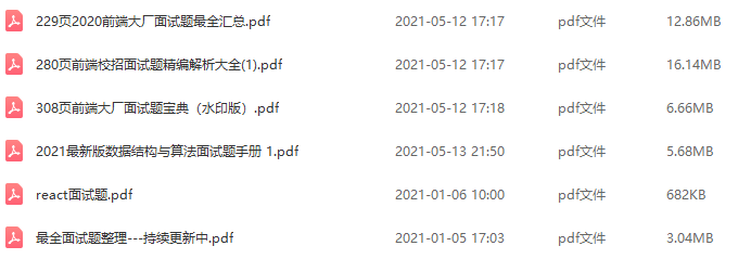
前端面试题汇总
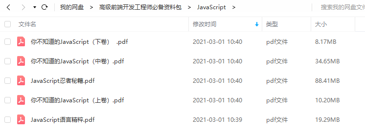
JavaScript
开源分享:【大厂前端面试题解析+核心总结学习笔记+真实项目实战+最新讲解视频】
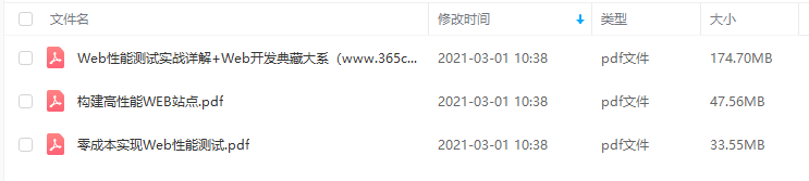
性能
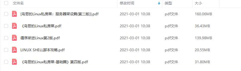
linux
前端资料汇总


 被折叠的 条评论
为什么被折叠?
被折叠的 条评论
为什么被折叠?
 到【灌水乐园】发言


