


元素全屏指令 v-screenfull
全屏指令,点击元素进行全屏/退出全屏的操作。支持元素后面是否插入 element-ui 的全屏图标 el-icon-full-screen。
指令的代码如下:
import screenfull from ‘screenfull’
export default {
bind (el, binding) {
if (binding.modifiers.icon) {
if (el.hasIcon) return
// 创建全屏图标
const iconElement = document.createElement(‘i’)
iconElement.setAttribute(‘class’, ‘el-icon-full-screen’)
iconElement.setAttribute(‘style’, ‘margin-left:5px’)
el.appendChild(iconElement)
el.hasIcon = true
}
el.style.cursor = el.style.cursor || ‘pointer’
// 监听点击全屏事件
el.addEventListener(‘click’, () => handleClick())
}
}
function handleClick () {
if (!screenfull.isEnabled) {
alert(‘浏览器不支持全屏’)
return
}
screenfull.toggle()
}
参数 Attributes:
| 参数 | 说明 | 默认值 | 类型 | 可选 |
| — | — | — | — | — |
| icon | 是否添加 icon | / | String | 可选 |
然后你可以在模板中任何元素上使用新的 v-screenfull property,如下:
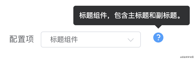
元素说明指令 v-tooltip
为元素添加说明,如同 element-ui 的 el-tooltip(问号 icon 在鼠标覆盖后,展示说明文字)。
 指令的代码如下:
import Vue from ‘vue’
export default function (el, binding) {
if (el.hasIcon) return
const iconElement = structureIcon(binding.arg, binding.value)
el.appendChild(iconElement)
el.hasIcon = true
}
function structureIcon (content, attrs) {
// 拼接绑定属性
let attrStr = ‘’
for (let key in attrs) {
attrStr += ${key}=${attrs[key]}
}
const a = <el-tooltip content=${content} ${attrStr}><i class="el-icon-question" style="margin:0 10px"></i></el-tooltip>
// 创建构造器
const tooltip = Vue.extend({
template: a
})
// 创建一个 tooltip 实例并返回 dom 节点
const component = new tooltip().$mount()
return component.$el
}
参数 Attributes:
| 参数 | 说明 | 默认值 | 类型 | 可选 |
| — | — | — | — | — |
| content | 传给指令的参数。例如 v-tooltip:content 中,参数为 “content” ,tooltip中展示的内容为:“content” | / | String | 可选 |
| tootipParams | element-ui 支持的 tooltip 属性 | / | Object | 可选 |
然后你可以在模板中任何元素上使用新的 v-tooltip property,如下:
举例:
为指令传入 element-ui 支持的参数:
data() {
return {
tootipParams: {
placement: ‘top’,
effect: ‘light’,
}
}
}
文字超出省略指令 v-ellipsis
使用该指令当文字内容超出宽度(默认 100 px)时自动变为省略形式。等同于使用 css:
width: 100px;
whiteSpace: nowrap
overflow: hidden;
textOverflow: ellipsis;
使用指令效果:
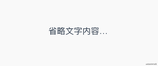
image.png
指令的代码如下:
export default function (el, binding) {
el.style.width = binding.arg || 100 + ‘px’
el.style.whiteSpace = ‘nowrap’
el.style.overflow = ‘hidden’;
el.style.textOverflow = ‘ellipsis’;
}
参数 Attributes:
| 参数 | 说明 | 默认值 | 类型 | 可选 |
| — | — | — | — | — |
| width | 元素宽度 | 100 | Number | 必填 |
然后你可以在模板中任何元素上使用新的 v-ellipsis property,如下:
回到顶部指令 v-backtop
使用该指令可以让页面或指定元素回到顶部。
可选指定元素,如果不指定则全局页面回到顶部。可选在元素偏移多少 px 后显示 backtop 元素,例如在滚动 400px 后显示回到顶部按钮。
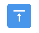
image.png
指令的代码如下:
export default {
bind (el, binding, vnode) {
// 响应点击后滚动到元素顶部
el.addEventListener(‘click’, () => {
const target = binding.arg ? document.getElementById(binding.arg) : window
target.scrollTo({
top: 0,
behavior: ‘smooth’
})
})
},
update (el, binding, vnode) {
// 滚动到达参数值才出现绑定指令的元素
const target = binding.arg ? document.getElementById(binding.arg) : window
if (binding.value) {
target.addEventListener(‘scroll’, (e) => {
if (e.srcElement.scrollTop > binding.value) {
el.style.visibility = ‘unset’
} else {
el.style.visibility = ‘hidden’
}
})
}
// 判断初始化状态
if (target.scrollTop < binding.value) {
el.style.visibility = ‘hidden’
}
},
unbind (el) {
const target = binding.arg ? document.getElementById(binding.arg) : window
target.removeEventListener(‘scroll’)
el.removeEventListener(‘click’)
}
}
参数 Attributes:
| 参数 | 说明 | 默认值 | 类型 | 可选 |
| — | — | — | — | — |
| id | 给需要回到顶部的元素添加的id | / | String | 可选 |
| offset | 偏移距离为 height 时显示指令绑定的元素 | / | Number | 可选 |
然后你可以在模板中任何元素上使用新的 v-backtop property,如下表示在 id 为 app 的元素滚动 400px 后显示绑定指令的元素:
也可以这样使用,表示为一直显示绑定指令的元素,并且是全局页面回到顶部:
空状态指令 v-empty
使用该指令可以显示缺省的空状态。可以传入默认图片(可选,默认无图片)、默认文字内容(可选,默认为暂无数据)、以及标示是否显示空状态(必选)。
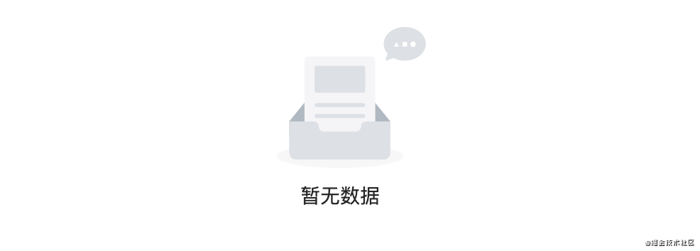
image.png
指令的代码如下:
import Vue from “vue”;
export default {
update (el, binding, vnode) {
el.style.position = el.style.position || ‘relative’
const { offsetHeight, offsetWidth } = el
const { visible, content, img } = binding.value
const image = img ? <img src="${img}" height="30%" width="30%"></img> : ‘’
const defaultStyle = “position:absolute;top:0;left:0;z-index:9999;background:#fff;display:flex;justify-content: center;align-items: center;”
const empty = Vue.extend({
template: `
})
const component = new empty(). m o u n t ( ) . mount(). mount().el
if (visible) {
el.appendChild(component)
} else {
el.removeChild(el.lastChild)
}
},
}
参数 Attributes:
| 参数 | 说明 | 默认值 | 类型 | 可选 |
| — | — | — | — | — |
| emptyValue | 包含文字内容 content、图片 img、是否显示 visible,仅 visible 必传 | / | Object | 必须 |
然后你可以在模板中任何元素上使用新的 v-empty property,如下传入对象 emptyValue:
需要传入一个参数对象,例如显示文字为:暂无列表,图片路径为 ../../assets/images/blue_big.png,控制标示 visible:
emptyValue = {
content: ‘暂无列表’,
img: require(‘…/…/assets/images/blue_big.png’),
visible: true,
},
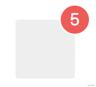
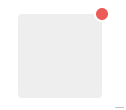
徽标指令 v-badge
使用该指令在元素右上角显示徽标。
支持配置徽标的背景颜色、徽标形状;支持传入徽标上显示的数字。
指令的代码如下:
import Vue from ‘vue’
const SUCCESS = ‘#72c140’
const ERROR = ‘#ed5b56’
const WARNING = ‘#f0af41’
const INFO = ‘#4091f7’
const HEIGHT = 20
let flag = false
export default {
update (el, binding, vnode) {
const { modifiers, value } = binding
const modifiersKey = Object.keys(modifiers)
let isDot = modifiersKey.includes(‘dot’)
let backgroundColor = ‘’
if (modifiersKey.includes(‘success’)) {
backgroundColor = SUCCESS
} else if (modifiersKey.includes(‘warning’)) {
backgroundColor = WARNING
} else if (modifiersKey.includes(‘info’)) {
backgroundColor = INFO
} else {
backgroundColor = ERROR
}
const targetTemplate = isDot
? <div style="position:absolute;top:-5px;right:-5px;height:10px;width:10px;border-radius:50%;background:${backgroundColor}"></div>
: <div style="background:${backgroundColor};position:absolute;top:-${HEIGHT / 2}px;right:-${HEIGHT / 2}px;height:${HEIGHT}px;min-width:${HEIGHT}px;border-radius:${HEIGHT / 2}px;text-align:center;line-height:${HEIGHT}px;color:#fff;padding:0 5px;">${value}</div>
el.style.position = el.style.position || ‘relative’
const badge = Vue.extend({
template: targetTemplate
})
const component = new badge(). m o u n t ( ) . mount(). mount().el
if (flag) {
el.removeChild(el.lastChild)
}
el.appendChild(component)
flag = true
}
}
参数 Attributes:
| 参数 | 说明 | 默认值 | 类型 | 可选 |
| — | — | — | — | — |
| normal、dot | 徽标形状normal为正常徽标;dot 仅为一个点 | normal | String | 可选 |
| success、error、info、warning | 徽标颜色 | error | String | 可选 |
| number | 徽标上显示的数字 | / | Number | 可选 |
然后你可以在模板中任何元素上使用新的 v-badge property,如下:
拖拽指令 v-drag
使用该指令可以对元素进行拖拽。
指令的代码如下:
export default {
let _el = el
document.onselectstart = function() {
return false //禁止选择网页上的文字
}
_el.onmousedown = e => {
let disX = e.clientX - _el.offsetLeft //鼠标按下,计算当前元素距离可视区的距离
let disY = e.clientY - _el.offsetTop
document.onmousemove = function(e){
let l = e.clientX - disX
let t = e.clientY - disY;
_el.style.left = l + “px”
_el.style.top = t + “px”
}
document.onmouseup = e => {
document.onmousemove = document.onmouseup = null
}
return false
}
}
然后你可以在模板中任何元素上使用新的 v-drag property,如下:
响应缩放指令 v-resize
使用该指令可以响应元素宽高改变时执行的方法。
指令的代码如下:
export default {
bind(el, binding) {
let width = ‘’, height = ‘’;
function isReize() {
const style = document.defaultView.getComputedStyle(el);
if (width !== style.width || height !== style.height) {
binding.value(); // 执行传入的方法
}
width = style.width;
height = style.height;
最后:
总结来说,面试成功=基础知识+项目经验+表达技巧+运气。我们无法控制运气,但是我们可以在别的地方花更多时间,每个环节都提前做好准备。
面试一方面是为了找到工作,升职加薪,另一方面也是对于自我能力的考察。能够面试成功不仅仅是来自面试前的临时抱佛脚,更重要的是在平时学习和工作中不断积累和坚持,把每个知识点、每一次项目开发、每次遇到的难点知识,做好积累,实践和总结。
开源分享:【大厂前端面试题解析+核心总结学习笔记+真实项目实战+最新讲解视频】


 6112
6112


 被折叠的 条评论
为什么被折叠?
被折叠的 条评论
为什么被折叠?
 到【灌水乐园】发言


