


最后
其实前端开发的知识点就那么多,面试问来问去还是那么点东西。所以面试没有其他的诀窍,只看你对这些知识点准备的充分程度。so,出去面试时先看看自己复习到了哪个阶段就好。
这里再分享一个复习的路线:(以下体系的复习资料是我从各路大佬收集整理好的)
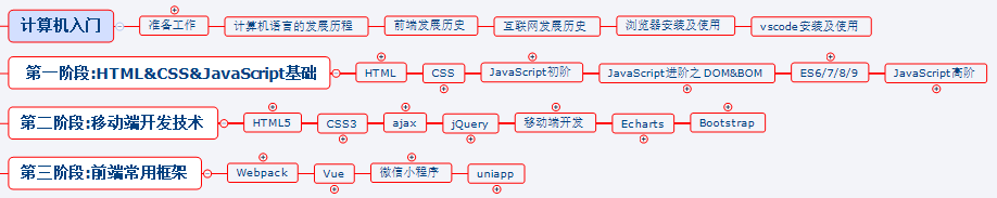
《前端开发四大模块核心知识笔记》
最后,说个题外话,我在一线互联网企业工作十余年里,指导过不少同行后辈。帮助很多人得到了学习和成长。
开源分享:【大厂前端面试题解析+核心总结学习笔记+真实项目实战+最新讲解视频】
我意识到有很多经验和知识值得分享给大家,也可以通过我们的能力和经验解答大家在IT学习中的很多困惑,所以在工作繁忙的情况下还是坚持各种整理和分享。
-
关键字 and not only
-
media feature 媒体特性 必须有小括号包含
2.2.1 mediatype 查询类型
将不同的终端设备划分成不同的类型,称为媒体类型
| 值 | 解释说明 |
| — | — |
| all | 用于所有设备 |
| print | 用于打印机和打印预览 |
| scree | 用于电脑屏幕、平板电脑、智能手机等 |
2.2.2 关键字
关键字将媒体类型或多个媒体特性连接到一起做为媒体查询的条件。
-
and:可以将多个媒体特性连接到一起,相当于“且”的意思。
-
not:排除某个媒体类型,相当于“非”的意思,可以省略。
-
only:指定某个特定的媒体类型,可以省略。
2.2.3 媒体特性
每种媒体类型都具有各自不同的特性,根据不同媒体类型的媒体特性设置不同的展示风格。我们暂且了解三个。注意他们要加小括号包含。
| 值 | 解释说明 |
| — | — |
| width | 定义输出设备中页面可见区域的宽度 |
| min-width | 定义输出设备中页面最小可见区域宽度 |
| max-width | 定义输出设备中页面最大可见区域宽度 |
【案例】
根据页面宽度改变背景颜色。
实现思路:
-
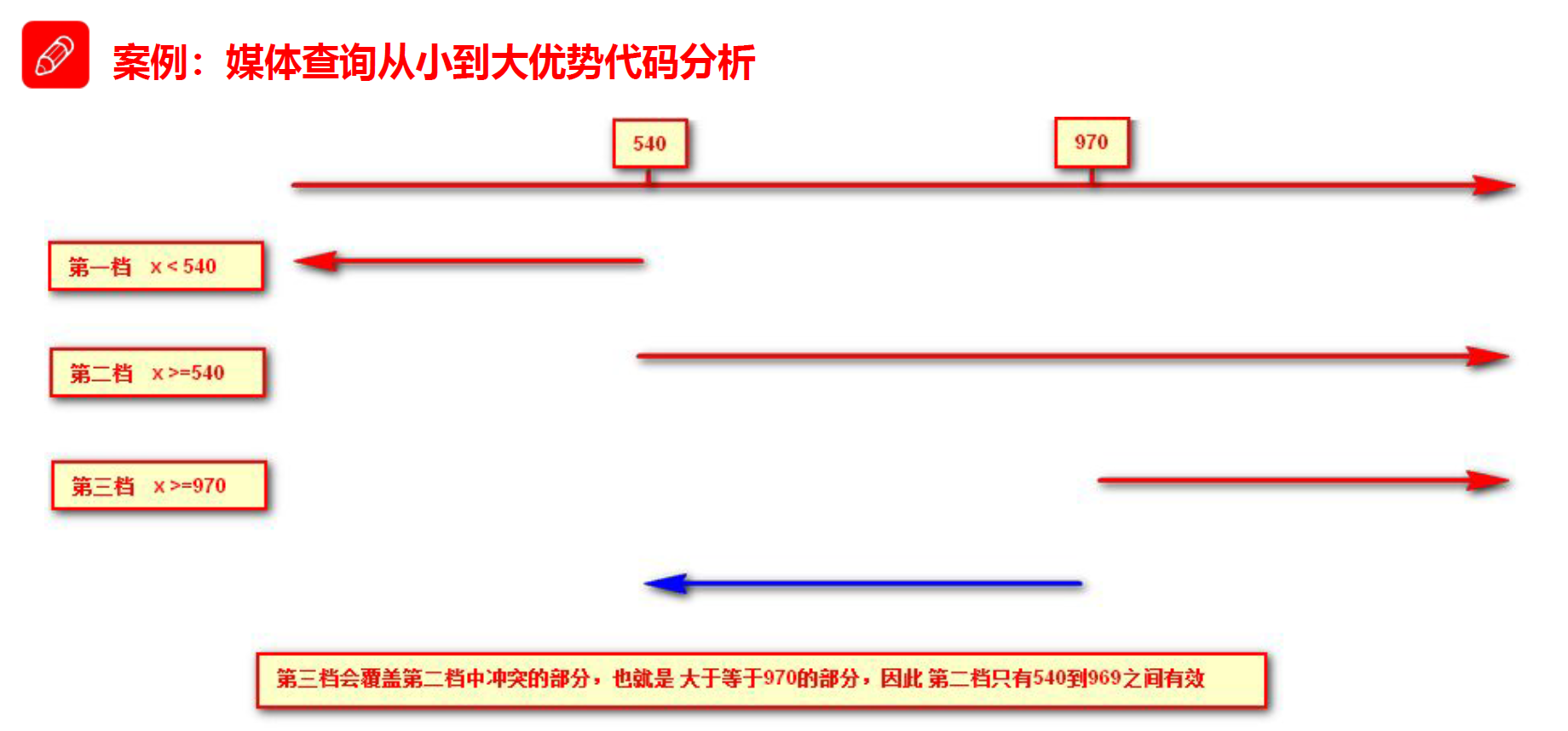
按照 从大到小 的或者 从小到大 的思路
-
注意我们有最大值
max-width和最小值min-width都是包含等于的 -
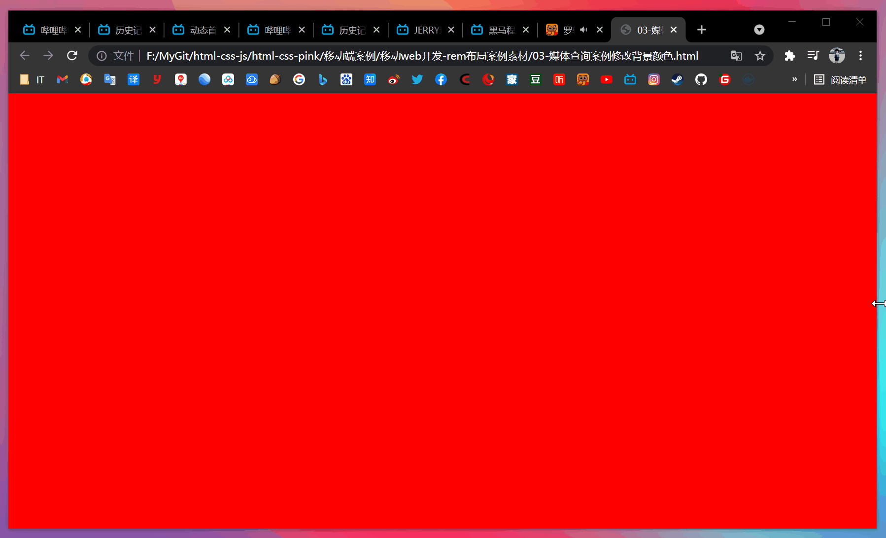
当屏幕小于 540 像素,背景颜色变为蓝色(x <= 539)
-
当屏幕大于等于 540 像素并且小于等于 969 像素的时候背景颜色为绿色(540 <= x <= 969)
-
当屏幕大于等于 970 像素的时候,背景颜色为红色(x >= 970)
注意:为了防止混乱,媒体查询我们要按照从小到大或者从大到小的顺序来写,但是我们最喜欢的还是从小到大来写,这样代码更简洁。
举例:
效果图:
媒体查询从小到大优势代码分析:
rem 单位是跟着 html 来走的,有了 rem 页面元素可以设置不同大小尺寸。
媒体查询可以根据不同设备宽度来修改样式。
媒体查询 + rem 就可以实现不同设备宽度,实现页面元素大小的动态变化。
【案例】
当样式比较繁多的时候,我们可以针对不同的媒体使用不同 stylesheet(样式表)。
比如:从 PC 端样式变移动端样式时,最好分开写样式表
原理,就是直接在 link 中判断设备的设备的尺寸,然后引用不同的 CSS 文件。
(1)语法规范
(2)实例
【案例】
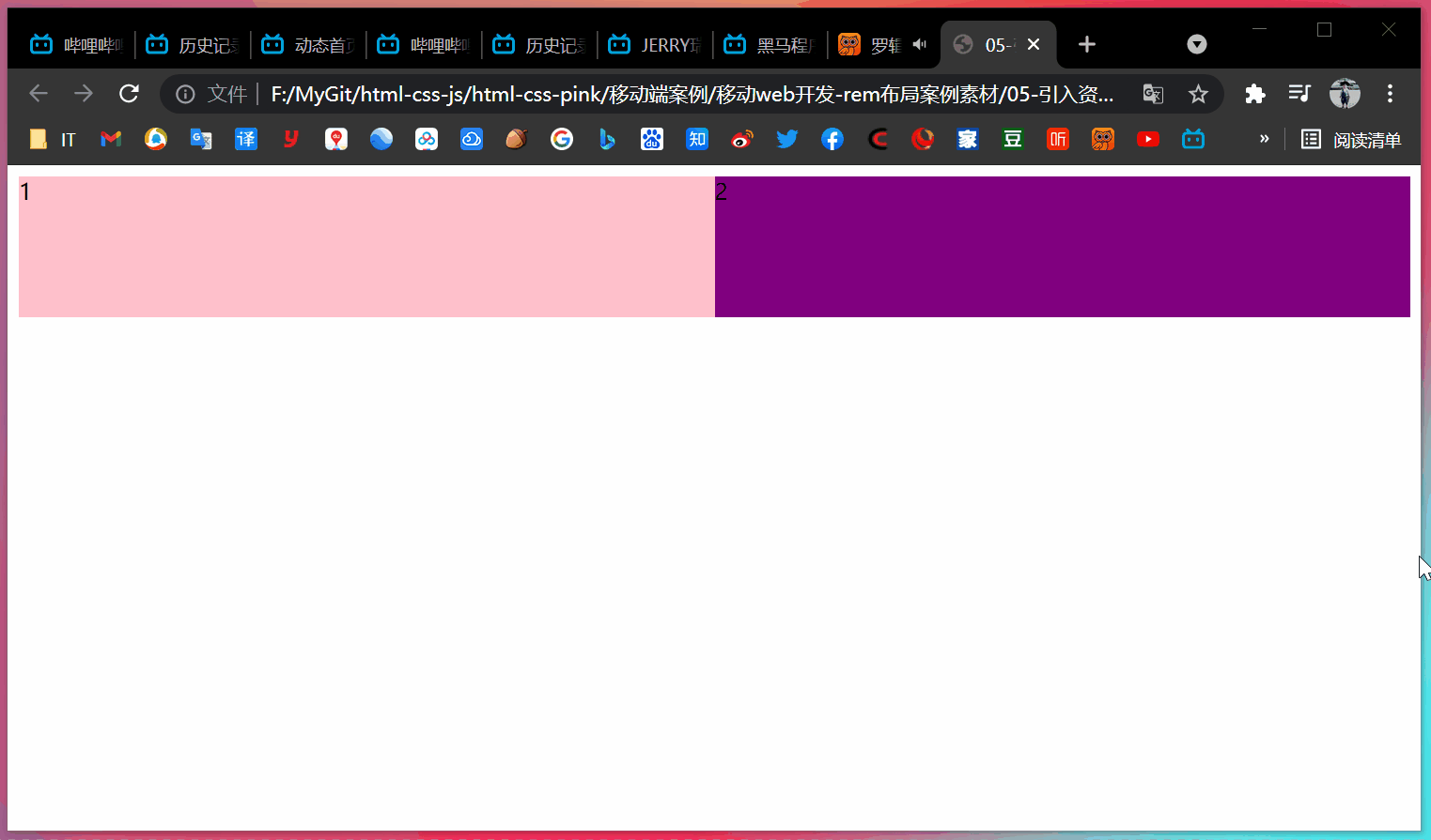
- html
- style320.css
div {
width: 100%;
height: 100px;
}
div:nth-child(1) {
background-color: pink;
}
div:nth-child(2) {
background-color: purple;
}
- style640.css
div {
float: left;
width: 50%;
height: 100px;
}
div:nth-child(1) {
background-color: pink;
}
div:nth-child(2) {
background-color: purple;
}
- 效果
===========================================================================
CSS 是一门非程序式语言,没有变量、函数、SCOPE(作用域)等概念。
-
CSS 需要书写大量看似没有逻辑的代码,CSS 冗余度是比较高的
-
不方便维护及扩展,不利于复用
-
CSS 没有很好的计算能力
-
非前端开发工程师来讲,往往会因为缺少 CSS 编写经验而很难写出组织良好且易于维护的 CSS 代码项目
Less(Leaner Style Sheets 的缩写)是一门 CSS 扩展语言,也称为 CSS 预处理器。
做为 CSS 的一种形式的扩展,它并没有减少 CSS 的功能,而是在现有的 CSS 语法上,为 CSS 加入程序式语言的特性。
它在 CSS 的语法基础上,引入了变量,Mixin(混入),运算以及函数等功能,大大简化了 CSS 的编写,并且降低了 CSS 的维护成本,就像它的名称所说的那样,Less 可以让我们用更少的代码做更多的事情。
Less 中文网址:http://lesscss.cn/
常见的 CSS 预处理器:Sass、Less、Stylus
一句话:Less 是一门 CSS 预处理语言,它扩展了 CSS 的动态特性。
3.3 Less安装(注意如果使用VSCode无需安装Less)
-
安装 node.js,可选择版本(8.0),网址:http://nodejs.cn/download/
-
检查是否安装成功,使用 cmd 命令输入
node -v查看版本即可 -
基于 node.js 在线安装 Less,使用 cmd 命令输入
npm install -g less即可 -
检查是否安装成功,使用 cmd 命令
lessc -v查看版本即可
【Less 使用】
我们首先新建一个后缀为 less 的文件,在这个文件里面书写 less 语句
-
Less 变量
-
Less 编译
-
Less 嵌套
-
Less 运算
变量是指没有固定值,可以改变的。因为我们 CSS 中的一些颜色和数值等经常使用。
@变量名: 值;
3.4.1 变量命名规范
-
必须有
@为前缀 -
不能包含特殊字符
-
不能以数字开头
-
大小写敏感
@color: pink;
3.4.2 变量使用规范
// 直接使用
body {
color: @color;
}
a:hover {
color: @color;
}
本质上,Less 包含一套自定义的语法及一个解析器,用户根据这些语法定义自己的样式规则,这些规则最终会通过解析器,编译生成对应的 CSS 文件。
所以,我们需要把我们的 Less 文件,编译生成为 CSS 文件,这样我们的 HTML 页面才能使用。
【VSCode Less 插件】
Easy LESS 插件用来把 less 文件编译为 css 文件。
安装完毕插件,重新加载下 VSCode。只要保存一下 less 文件,会自动生成 CSS 文件。
【我们经常用到选择器的嵌套】
#header .logo {
width: 300px;
}
【less 嵌套写法】
#header {
.logo {
width: 300px;
}
}
如果遇见(交集|伪类|伪元素选择器)
-
内层选择器的前面没有
&符号,则它被解析为父选择器的后代 -
如果有
&符号,它就被解析为父元素自身或父元素的伪类
a:hover {
color: red;
}
【less 嵌套写法】
a {
&:hover {
color: red;
}
}
任何数字、颜色或者变量都可以参与运算。就是 Less 提供了加(+)、减(-)、乘(*)、除(/)算术运算。
/* Less 里面写 */
@width: 10px + 5;
div {
border: @width solid red;
}
/* Less 甚至还可以这样 */
width: (@width + 5) * 2;
【生成的 css】
div {
border: 15px solid red;
}
注意:
-
乘号(*)和除号(/)的写法要牢记
-
运算符中间左右必须有个空格隔开
1px + 5 -
在新版本的 Less 中,除法有变动,应将
100px / 10改为(100px / 10),否则没有效果 -
对于两个不同的单位的值之间的运算,运算结果的值取第一个值的单位
-
如果两个值之间只有一个值有单位,则运算结果就取该单位
【案例】
- my.less
// 定义一个粉色的变量
@color: pink;
// 错误的变量名 @1color @color~@#
// 变量名区分大小写 @color 和 @Color 是两个不同的变量
// 定义了一个字体为 14 像素的变量
@font14: 14px;
body {
background-color: @color;
}
div {
color: @color;
font-size: @font14;
}
a {
font-size: @font14;
}
- 编译后得到的 my.css
body {
background-color: pink;
}
div {
color: pink;
font-size: 14px;
}
a {
font-size: 14px;
}
- nest.less
.header {
width: 200px;
height: 200px;
background-color: pink;
// 1. less嵌套 子元素的样式直接写到父元素里面就好了
a {
color: red;
// 2. 如果有伪类、交集选择器、伪元素选择器 我们内层选择器的前面需要加 &
&:hover {
color: blue;
}
}
}
.nav {
.logo {
color: green;
}
&::before {
content: “”;
}
}
- 编译得到的 nest.css
.header {
width: 200px;
height: 200px;
background-color: pink;
}
.header a {
color: red;
}
.header a:hover {
color: blue;
}
.nav .logo {
color: green;
}
.nav::before {
content: “”;
}
- count.less
@baseFont: 50px;
html {
font-size: @baseFont;
}
@border: 5px + 5;
div {
width: 200px - 50;
height: (200px + 50px) * 2;
border: @border solid red;
background-color: #666 - #222;
}
img {
width: 82rem / @baseFont;
height: 82rem / @baseFont;
}
// 1. 我们运算符的左右两侧必须敲一个空格隔开
// 2. 两个数参与运算,如果只有一个数有单位,则最后的结果就以这个单位为准
// 3. 两个数参与运算,如果两个数都有单位,而且不一样的单位,最后的结果以第一个单位为准
- 编译后得到的 count.css
html {
font-size: 50px;
}
div {
width: 150px;
height: 500px;
border: 10px solid red;
background-color: #444444;
}
img {
width: 82rem / 50px;
height: 82rem / 50px;
}
============================================================================
【思考】
-
我们适配的目标是什么?
-
怎么去达到这个目标的?
-
在实际的开发如何实现?
【答案】
-
让一些不能等比自适应的元素,达到当设备尺寸发生改变的时候,等比例适配当前设备。
-
使用媒体查询根据不同的设备按比例设置 html 的字体大小,然后页面元素使用 rem 做尺寸单位,当 html 做尺寸单位,当 html 字体大小变化元素尺寸也会发生变化,从而达到等比缩放的适配。
(1)按照设计稿与设备宽度的比例,动态计算并设置 html 根标签的 font-size 大小(媒体查询)。
(2)CSS 中,设计稿元素的宽、高、相对位置等取值,按照同等比例换算为 rem 为单位的值。

(1)技术方案1
-
less
-
媒体查询
-
rem
(2)技术方案2
-
flexible.js
-
rem
总结:
-
两种方案的底层原理都是一样的
-
两种方案目前都在使用
-
方案2 更简单,现阶段大家无需了解里面的 js 代码
rem + 媒体查询 + less
(1)设计稿常见尺寸宽度
| 设备 | 常见宽度 |
| — | — |
| iphone 4 5 | 640px |
| iphone 6 7 8 | 750px |
| iphone x 11 12 | 1170px |
| Android | 常见 320px、360px、375px、384px、400px、414px、500px、720px、1080px |
一般情况下,我们以一套或两套效果图适应大部分的屏幕,放弃极端屏或对其优雅降级,牺牲一些效果,现在基本以 750px 为准。(目前应该是 1080px 2021年)
(2)动态设置 html 标签 font-size 大小
-
假设设计稿是 750px
-
假设我们把整个屏幕划分为 15 等份(划分标准不一,可以是 20 份,也可以是 10 等份)
-
每一份作为 html 字体大小,这里就是 750/15 = 50px
-
那么在 320px 设备的时候,字体大小为 320/15 = 21.33px
-
用我们页面元素的大小除以不同的 html 字体大小会发现他们比例还是相同的
-
比如我们以 750px 设计稿
-
此时便实现了不同屏幕下页面元素盒子等比例缩放的效果
(3)元素大小取值方法
-
最后的公式:
页面元素的 rem 值 = 页面元素值(px) / (屏幕跨度 / 划分份数) -
屏幕宽度 / 划分份数 = html font-size 的大小 -
或者:
页面元素的 rem 值 = 页面元素值(px) / html font-size 字体大小
【案例】

==============================================================================
【案例:苏宁网移动端首页】
访问地址:https://m.suning.com/
【技术选型】
方案:我们采取单独制作移动页面方案
技术:布局采取 rem 适配布局(less + rem + 媒体查询)
设计图:本设计图采用 750px 设计尺寸
【搭建相关文件夹结构】

【设置视口标签以及引入初始化样式】
<meta name=“viewport” content="width=device-width, user-scalable=no,
initial-scale=1.0, maximum-scale=1.0, minimum-scale=1.0">
【设置公共 common.less 文件】
-
新建 common.less 设置好最常见的屏幕尺寸,利用媒体查询设置不同的 html 字体大小,因为除了首页其他页面也需要
-
我们关心的尺寸有 320px、360px、375px、384px、400px、414px、424px、480px、540px、720px、750px、1080px
-
划分的份数我们定位 15 等份
-
因为我们 PC 端也可以打开我们苏宁移动端首页,我们默认 html 字体大小为 50px(注意这句话写到最上面)
【新建 index.less 文件】
-
新建 index.less,这里面写首页的样式
-
将刚才设置好的 common.less 引入到 index.less 里面,语法如下:
// 在 index.less 中导入 common.less 文件
@inport “common”;
- 生成 index.css 引入到 index.html 里面
【body 样式】
body {
min-width: 320px;
width: 15rem;
margin: 0 auto;
line-height: 1.5;
font-family: Arial, Helvetica;
background: #F2F2F2;
}
【案例代码】
- common.less
// 设置常见的屏幕尺寸 修改里面的html文字大小
a {
text-decoration: none;
}
// 一定要写到最上面
html {
font-size: 50px;
}
// 我们此次定义的划分的份数 为 15
@no: 15;
// 320
@media screen and (min-width: 320px) {
html {
font-size: (320px / @no);
}
}
// 360
@media screen and (min-width: 360px) {
html {
font-size: (360px / @no);
}
}
// 375 iphone 678
@media screen and (min-width: 375px) {
html {
font-size: (375px / @no);
}
}
// 384
@media screen and (min-width: 384px) {
html {
font-size: (384px / @no);
}
}
// 400
@media screen and (min-width: 400px) {
html {
font-size: (400px / @no);
}
}
// 414
@media screen and (min-width: 414px) {
html {
font-size: (414px / @no);
}
}
// 424
@media screen and (min-width: 424px) {
html {
font-size: (424px / @no);
}
}
// 480
@media screen and (min-width: 480px) {
html {
font-size: (480px / @no);
}
}
// 540
@media screen and (min-width: 540px) {
html {
font-size: (540px / @no);
}
}
// 720
@media screen and (min-width: 720px) {
html {
font-size: (720px / @no);
}
}
// 750
@media screen and (min-width: 750px) {
html {
font-size: (750px / @no);
}
}
- index.less
// 首页的样式less文件
@import “common”;
// @import 导入的意思 可以把一个样式文件导入到另外一个样式文件里面
// link 是把一个 样式文件引入到 html页面里面
body {
min-width: 320px;
width: 15rem;
margin: 0 auto;
line-height: 1.5;
font-family: Arial, Helvetica;
background: #F2F2F2;
}
// 页面元素rem计算公式: 页面元素的px / html 字体大小 50
// search-content
@baseFont: 50;
.search-content {
display: flex;
position: fixed;
top: 0;
left: 50%;
transform: translateX(-50%);
width: 15rem;
height: (88rem / @baseFont);
background-color: #FFC001;
.classify {
width: (44rem / @baseFont);
height: (70rem / @baseFont);
margin: (11rem / @baseFont) (25rem / @baseFont) (7rem / @baseFont) (24rem / @baseFont);
background: url(…/images/classify.png) no-repeat;
// 背景缩放
background-size: (44rem / @baseFont) (70rem / @baseFont);
}
.search {
flex: 1;
input {
outline: none;
width: 100%;
border: 0;
height: (66rem / @baseFont);
border-radius: (33rem / @baseFont);
background-color: #FFF2CC;
margin-top: (12rem / @baseFont);
font-size: (25rem / @baseFont);
padding-left: (55rem / @baseFont);
color: #757575;
}
}
.login {
width: (75rem / @baseFont);
height: (70rem / @baseFont);
line-height: (70rem / @baseFont);
margin: (10rem / @baseFont);
font-size: (25rem / @baseFont);
text-align: center;
color: #fff;
}
}
// banner
.banner {
width: (750rem / @baseFont);
height: (368rem / @baseFont);
img {
width: 100%;
height: 100%;
}
}
// ad
.ad {
display: flex;
a {
flex: 1;
img {
width: 100%;
}
}
}
// nav
nav {
width: (750rem / @baseFont);
a {
float: left;
width: (150rem / @baseFont);
height: (140rem / @baseFont);
text-align: center;
img {
display: block;
width: (82rem / @baseFont);
height: (82rem / @baseFont);
margin: (10rem / @baseFont) auto 0;
}
span {
font-size: (25rem / @baseFont);
color: #333;
}
}
}
- normalize.css
/*! normalize.css v5.0.0 | MIT License | github.com/necolas/normalize.css */
/**
-
- Change the default font family in all browsers (opinionated).
-
- Correct the line height in all browsers.
-
- Prevent adjustments of font size after orientation changes in
-
IE on Windows Phone and in iOS.
*/
/* Document
========================================================================== */
html {
font-family: sans-serif;
/* 1 */
line-height: 1.15;
/* 2 */
-ms-text-size-adjust: 100%;
/* 3 */
-webkit-text-size-adjust: 100%;
/* 3 */
}
/* Sections
========================================================================== */
/**
- Remove the margin in all browsers (opinionated).
*/
body {
margin: 0;
}
/**
- Add the correct display in IE 9-.
*/
article,
aside,
footer,
header,
nav,
section {
display: block;
}
/**
-
Correct the font size and margin on
h1elements withinsectionand -
articlecontexts in Chrome, Firefox, and Safari.
*/
h1 {
font-size: 2em;
margin: 0.67em 0;
}
/* Grouping content
========================================================================== */
/**
-
Add the correct display in IE 9-.
-
- Add the correct display in IE.
*/
figcaption,
figure,
main {
/* 1 */
display: block;
}
/**
- Add the correct margin in IE 8.
*/
figure {
margin: 1em 40px;
}
/**
-
- Add the correct box sizing in Firefox.
-
- Show the overflow in Edge and IE.
*/
hr {
box-sizing: content-box;
/* 1 */
height: 0;
/* 1 */
overflow: visible;
/* 2 */
}
/**
-
- Correct the inheritance and scaling of font size in all browsers.
-
- Correct the odd
emfont sizing in all browsers.
- Correct the odd
*/
pre {
font-family: monospace, monospace;
/* 1 */
font-size: 1em;
/* 2 */
}
/* Text-level semantics
========================================================================== */
/**
-
- Remove the gray background on active links in IE 10.
-
- Remove gaps in links underline in iOS 8+ and Safari 8+.
*/
a {
background-color: transparent;
/* 1 */
-webkit-text-decoration-skip: objects;
/* 2 */
}
/**
-
Remove the outline on focused links when they are also active or hovered
-
in all browsers (opinionated).
*/
a:active,
a:hover {
outline-width: 0;
}
/**
-
- Remove the bottom border in Firefox 39-.
-
- Add the correct text decoration in Chrome, Edge, IE, Opera, and Safari.
*/
abbr[title] {
border-bottom: none;
/* 1 */
text-decoration: underline;
/* 2 */
text-decoration: underline dotted;
/* 2 */
}
/**
- Prevent the duplicate application of
bolderby the next rule in Safari 6.
*/
b,
strong {
font-weight: inherit;
}
/**
- Add the correct font weight in Chrome, Edge, and Safari.
*/
b,
strong {
font-weight: bolder;
}
/**
-
- Correct the inheritance and scaling of font size in all browsers.
-
- Correct the odd
emfont sizing in all browsers.
- Correct the odd
*/
code,
kbd,
samp {
font-family: monospace, monospace;
/* 1 */
font-size: 1em;
/* 2 */
}
/**
- Add the correct font style in Android 4.3-.
*/
dfn {
font-style: italic;
}
/**
- Add the correct background and color in IE 9-.
*/
mark {
background-color: #ff0;
color: #000;
}
/**
- Add the correct font size in all browsers.
*/
small {
font-size: 80%;
}
最后
除了简历做到位,面试题也必不可少,整理了些题目,前面有117道汇总的面试到的题目,后面包括了HTML、CSS、JS、ES6、vue、微信小程序、项目类问题、笔试编程类题等专题。


 2066
2066

 被折叠的 条评论
为什么被折叠?
被折叠的 条评论
为什么被折叠?
 到【灌水乐园】发言


