


何为Sticky footer布局?
==================
我们常见的网页布局方式一般分为header(页头)部分,content(内容区)部分和footer(页脚)部分。当页头区和内容区的内容较少时,页脚区不是随着内容区排布而是始终显示在屏幕的最下方。当内容区的内容较多时,页脚能随着文档流撑开始终显示在页面的最下方。这就是传说中的Sticky footer布局。
Sticky footer布局实现
=================
一、负 margin 布局方式
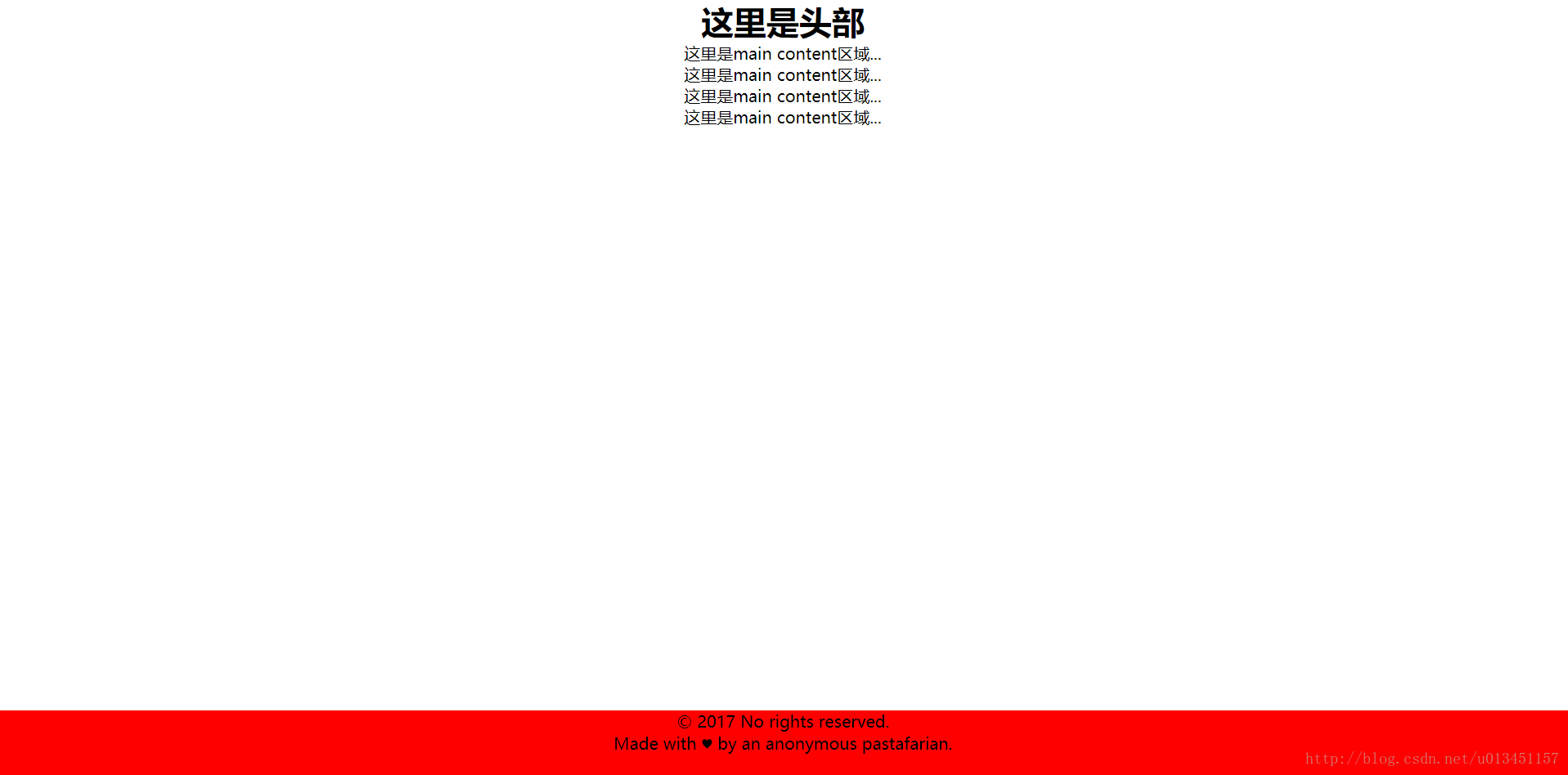
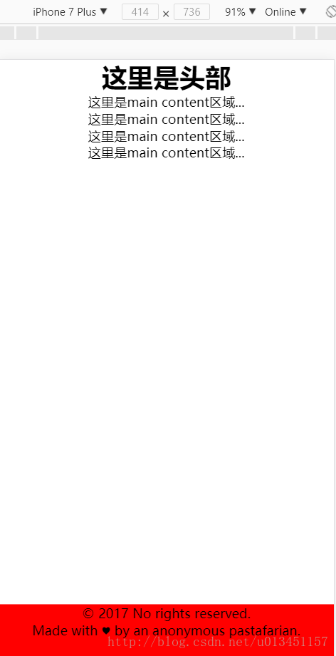
<div class="detail"> <div class="wrapper clearfix"> <div class="title"> <h1>这里是头部</h1> </div> <div class="main"> <p>这里是main content区域...</p> <p>这里是main content区域...</p> <p>这里是main content区域...</p> <p>这里是main content区域...</p> </div> </div> </div> <div class="footer"> <p>© 2017 No rights reserved.</p> <p>Made with ♥ by an anonymous pastafarian.</p> </div>
-
1
-
2
-
3
-
4
-
5
-
6
-
7
-
8
-
9
-
10
-
11
-
12
-
13
-
14
-
15
-
16
-
17
**!!!特别说明!!!:**使用这个布局的前提,就是footer要在总的div容器之外,footer使用一个层,其它所有内容使用一个总的层。如果确实需要到添加其它同级层,那这个同级层就必须使用position:absolute进行绝对定位。
* {margin: 0; padding: 0; text-align: center;} html,body,.detail {height: 100%;} body>.detail {height: 100%; min-height: 100%;} .main {padding-bottom: 64px;} .footer {position: relative; margin-top: -64px; height: 64px; clear: both; background-color: red;} .clearfix::after { /* 测试于两栏悬浮布局 */ display: block; content: "."; height: 0; clear: both; visibility: hidden; }
-
1
-
2
-
3
-
4
-
5
-
6
-
7
-
8
-
9
-
10
-
11
-
12
-
13
PC端效果图:
移动端效果图:
二、flex 布局方式
<header> <h1>Site name</h1> </header> <div class="main"> <p>Bacon Ipsum dolor sit amet...</p> <p>Bacon Ipsum dolor sit amet...</p> <p>Bacon Ipsum dolor sit amet...</p> <p>Bacon Ipsum dolor sit amet...</p> </div> <footer> <p>© 2017 No rights reserved.</p> <p>Made with ♥ by an anonymous pastafarian.</p> </footer>
-
1
-
2
-
3
-
4
-
5
-
6
-
7
-
8
-
9
-
10
-
11
-
12
-
13
* {margin: 0; padding: 0;} body{display: flex; flex-flow: column; min-height: 100vh; overflow:auto;} h1{font-size: 60px; text-align: center;} p{font-size: 24px; text-align: center;} .main{flex:1;} /* 若不懂请看本文末尾的链接 */ footer{background-color: red;}
react和vue的比较
相同
1)vitual dom
2)组件化
3)props,单一数据流
不同点
1)react是jsx和模板;(jsx可以进行更多的js逻辑和操作)
2)状态管理(react)
3)对象属性(vue)
4)vue:view——medol之间双向绑定
5)vue:组件之间的通信(props,callback,emit)

)vitual dom
2)组件化
3)props,单一数据流
不同点
1)react是jsx和模板;(jsx可以进行更多的js逻辑和操作)
2)状态管理(react)
3)对象属性(vue)
4)vue:view——medol之间双向绑定
5)vue:组件之间的通信(props,callback,emit)
[外链图片转存中…(img-1Otxd2sm-1718564149833)]


 2万+
2万+

 被折叠的 条评论
为什么被折叠?
被折叠的 条评论
为什么被折叠?
 到【灌水乐园】发言


