


.parent{
position: relative;
height: 100px;
background: red;
}
.child{
position: absolute;
left: 50%;
/或者使用margin-left: -宽/2/
transform: translateX(-50%);
background: blue;
}
效果:
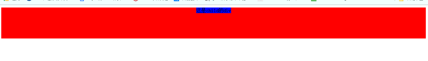
垂直居中
1. 行内元素:
line-height:高度
2. 块级元素高度一定:
- 定位实现
.parent{
position: relative;
background: #008a00;
height: 200px;
}
.child{
position: absolute;
top: 50%;
height: 100px;
margin-top: -50px; /高的一半/
background: yellow;
}
- 绝对定位+margin: 0
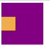
.parent{
position: relative;
background-color: purple;
width: 150px;
height: 150px;
}
.child{
position: absolute;
margin: auto;
top: 0;
bottom: 0;
width: 50px;
height: 50px;
background-color: #f0ad4e;
}
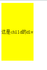
3. 高度不确定:
- 定位实现
.parent{
position: relative;
background: #008a00;
height: 200px;
}
.child{
position: absolute;
top: 50%;
transform: translateY(-50%);
background: yellow;
}
效果:

- flex布局
.parent{
display: flex;
background: #008a00;
height: 200px;
align-items: center;
}
.child{
background: yellow;
}
效果:

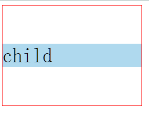
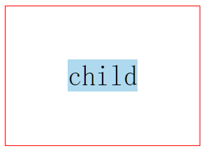
- 使用grid布局.
下面方法是给父元素设置align-items: center或者align-content: center;
还有办法是给子元素设置align-self: center;
.parent{
display: grid;
border: red 1px solid;
width: 280px;
height: 200px;
align-items: center;
}
.child{
background-color: #afd9ee;
font-size: 40px;
}
- table布局
表格布局vertical-align: middle;
.parent{
display: table;
background: #008a00;
height: 200px;
}
.child{
display: table-cell;
vertical-align: middle;
background: yellow;
}
效果:
水平垂直居中
1.position元素已知宽度
父元素:position: relative;
子元素:position: absolute;
将margin的margin-top设置为-高度的一半
margin-left设置为-宽度的一半
.box {
height: 500px;
width: 500px;
position: relative;
}
.content{
width: 100px;
height: 100px;
position: absolute;
top: 50%;
left: 50%;
margin: -50px 0 0 -50px;
}
2.position transform 元素未知宽度
将方法1的margin改为transform: translate(-50%,-50%);
3.flex布局
.a {
width: 600px;
height: 600px;
background-color: blue;
display: flex; //flex布局
justify-content: center; //使子元素水平居中
align-items: center; //使子元素垂直居中
}
.b {
background-color: red;
width: 200px;
height: 100px;
}
3.grid布局
下面方法是给父元素设置 justify-content: center;align-content: center;或justify-items:center;align-items:center;
还有方法可以给子元素设置 align-self: center;justify-self: center;
.parent{
display: grid;
border: red 1px solid;
width: 280px;
height: 200px;
justify-content: center;
align-content: center;
}
.child{
background-color: #afd9ee;
font-size: 40px;
}
4.table-cell布局
给元素最外层增加一个div
总结
阿里十分注重你对源码的理解,对你所学,所用东西的理解,对项目的理解。


 249
249


 被折叠的 条评论
为什么被折叠?
被折叠的 条评论
为什么被折叠?
 到【灌水乐园】发言


