


既有适合小白学习的零基础资料,也有适合3年以上经验的小伙伴深入学习提升的进阶课程,涵盖了95%以上Go语言开发知识点,真正体系化!
由于文件比较多,这里只是将部分目录截图出来,全套包含大厂面经、学习笔记、源码讲义、实战项目、大纲路线、讲解视频,并且后续会持续更新
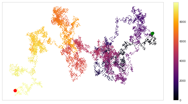
        y_direction = choice([1, -1])
        y_distance = choice([0, 1, 2, 3, 4])
        y_step = y_direction \* y_distance

        if x_step == 0 or y_step == 0:
            continue
        next_x = self.x_values[-1] + x_step
        next_y = self.y_values[-1] + y_step
        self.x_values.append(next_x)
        self.y_values.append(next_y)
rw = RandomWalk(10000)
rw.fill_walk()
point_numbers = list(range(rw.num_points))
plt.figure(figsize=(12, 6)) # 设置画布大小
plt.scatter(rw.x_values, rw.y_values, c=point_numbers, cmap=“inferno”, s=1)
plt.colorbar()
plt.scatter(0, 0, c=“green”, s=100)
plt.scatter(rw.x_values[-1], rw.y_values[-1], c=“red”, s=100)
plt.xticks([])
plt.yticks([])
([], <a list of 0 Text yticklabel objects>)
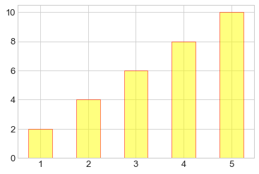
#### 13.1.3 柱形图
【1】简单柱形图
x = np.arange(1, 6)
plt.bar(x, 2*x, align=“center”, width=0.5, alpha=0.5, color=‘yellow’, edgecolor=‘red’)
plt.tick_params(axis=“both”, labelsize=13)
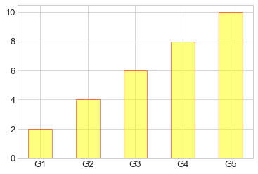
x = np.arange(1, 6)
plt.bar(x, 2*x, align=“center”, width=0.5, alpha=0.5, color=‘yellow’, edgecolor=‘red’)
plt.xticks(x, (‘G1’, ‘G2’, ‘G3’, ‘G4’, ‘G5’))
plt.tick_params(axis=“both”, labelsize=13)

x = (‘G1’, ‘G2’, ‘G3’, ‘G4’, ‘G5’)
y = 2 * np.arange(1, 6)
plt.bar(x, y, align=“center”, width=0.5, alpha=0.5, color=‘yellow’, edgecolor=‘red’)
plt.tick_params(axis=“both”, labelsize=13)
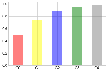
x = [“G”+str(i) for i in range(5)]
y = 1/(1+np.exp(-np.arange(5)))
colors = [‘red’, ‘yellow’, ‘blue’, ‘green’, ‘gray’]
plt.bar(x, y, align=“center”, width=0.5, alpha=0.5, color=colors)
plt.tick_params(axis=“both”, labelsize=13)
【2】累加柱形图
x = np.arange(5)
y1 = np.random.randint(20, 30, size=5)
y2 = np.random.randint(20, 30, size=5)
plt.bar(x, y1, width=0.5, label=“man”)
plt.bar(x, y2, width=0.5, bottom=y1, label=“women”)
plt.legend()
<matplotlib.legend.Legend at 0x2052db25cc0>
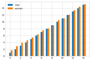
【3】并列柱形图
x = np.arange(15)
y1 = x+1
y2 = y1+np.random.random(15)
plt.bar(x, y1, width=0.3, label=“man”)
plt.bar(x+0.3, y2, width=0.3, label=“women”)
plt.legend()
<matplotlib.legend.Legend at 0x2052daf35f8>
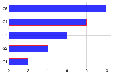
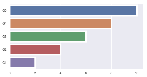
【4】横向柱形图barh
x = [‘G1’, ‘G2’, ‘G3’, ‘G4’, ‘G5’]
y = 2 * np.arange(1, 6)
plt.barh(x, y, align=“center”, height=0.5, alpha=0.8, color=“blue”, edgecolor=“red”) # 注意这里将bar改为barh,宽度用height设置
plt.tick_params(axis=“both”, labelsize=13)
#### 13.1.4 多子图
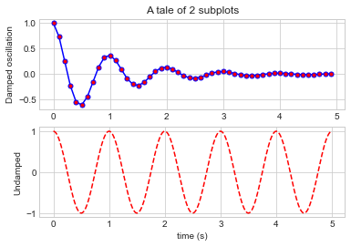
【1】简单多子图
def f(t):
return np.exp(-t) * np.cos(2*np.pi*t)
t1 = np.arange(0.0, 5.0, 0.1)
t2 = np.arange(0.0, 5.0, 0.02)
plt.subplot(211)
plt.plot(t1, f(t1), “bo-”, markerfacecolor=“r”, markersize=5)
plt.title(“A tale of 2 subplots”)
plt.ylabel(“Damped oscillation”)
plt.subplot(212)
plt.plot(t2, np.cos(2*np.pi*t2), “r–”)
plt.xlabel(“time (s)”)
plt.ylabel(“Undamped”)
Text(0, 0.5, ‘Undamped’)
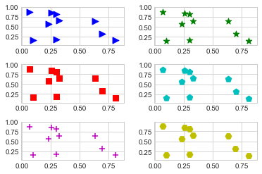
【2】多行多列子图
x = np.random.random(10)
y = np.random.random(10)
plt.subplots_adjust(hspace=0.5, wspace=0.3)
plt.subplot(321)
plt.scatter(x, y, s=80, c=“b”, marker=“>”)
plt.subplot(322)
plt.scatter(x, y, s=80, c=“g”, marker=“*”)
plt.subplot(323)
plt.scatter(x, y, s=80, c=“r”, marker=“s”)
plt.subplot(324)
plt.scatter(x, y, s=80, c=“c”, marker=“p”)
plt.subplot(325)
plt.scatter(x, y, s=80, c=“m”, marker=“+”)
plt.subplot(326)
plt.scatter(x, y, s=80, c=“y”, marker=“H”)
<matplotlib.collections.PathCollection at 0x2052d9f63c8>
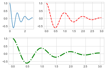
【3】不规则多子图
def f(x):
return np.exp(-x) * np.cos(2*np.pi*x)
x = np.arange(0.0, 3.0, 0.01)
grid = plt.GridSpec(2, 3, wspace=0.4, hspace=0.3) # 两行三列的网格
plt.subplot(grid[0, 0]) # 第一行第一列位置
plt.plot(x, f(x))
plt.subplot(grid[0, 1:]) # 第一行后两列的位置
plt.plot(x, f(x), “r–”, lw=2)
plt.subplot(grid[1, :]) # 第二行所有位置
plt.plot(x, f(x), “g-.”, lw=3)
[<matplotlib.lines.Line2D at 0x2052d6fae80>]
#### 13.1.5 直方图
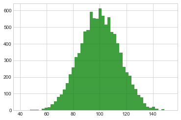
【1】普通频次直方图
mu, sigma = 100, 15
x = mu + sigma * np.random.randn(10000)
plt.hist(x, bins=50, facecolor=‘g’, alpha=0.75)
(array([ 1., 0., 0., 5., 3., 5., 1., 10., 15., 19., 37.,
55., 81., 94., 125., 164., 216., 258., 320., 342., 401., 474.,
483., 590., 553., 551., 611., 567., 515., 558., 470., 457., 402.,
347., 261., 227., 206., 153., 128., 93., 79., 41., 22., 17.,
21., 9., 2., 8., 1., 2.]),
array([ 40.58148736, 42.82962161, 45.07775586, 47.32589011,
49.57402436, 51.82215862, 54.07029287, 56.31842712,
58.56656137, 60.81469562, 63.06282988, 65.31096413,
67.55909838, 69.80723263, 72.05536689, 74.30350114,
76.55163539, 78.79976964, 81.04790389, 83.29603815,
85.5441724 , 87.79230665, 90.0404409 , 92.28857515,
94.53670941, 96.78484366, 99.03297791, 101.28111216,
103.52924641, 105.77738067, 108.02551492, 110.27364917,
112.52178342, 114.76991767, 117.01805193, 119.26618618,
121.51432043, 123.76245468, 126.01058893, 128.25872319,
130.50685744, 132.75499169, 135.00312594, 137.25126019,
139.49939445, 141.7475287 , 143.99566295, 146.2437972 ,
148.49193145, 150.74006571, 152.98819996]),
<a list of 50 Patch objects>)
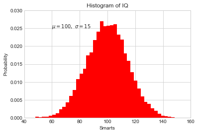
【2】概率密度
mu, sigma = 100, 15
x = mu + sigma * np.random.randn(10000)
plt.hist(x, 50, density=True, color=“r”)# 概率密度图
plt.xlabel(‘Smarts’)
plt.ylabel(‘Probability’)
plt.title(‘Histogram of IQ’)
plt.text(60, .025, r’
μ
=
100
,
σ
=
15
\mu=100,\ \sigma=15
μ=100, σ=15’)
plt.xlim(40, 160)
plt.ylim(0, 0.03)
(0, 0.03)
mu, sigma = 100, 15
x = mu + sigma * np.random.randn(10000)
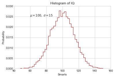
plt.hist(x, bins=50, density=True, color=“r”, histtype=‘step’) #不填充,只获得边缘
plt.xlabel(‘Smarts’)
plt.ylabel(‘Probability’)
plt.title(‘Histogram of IQ’)
plt.text(60, .025, r’
μ
=
100
,
σ
=
15
\mu=100,\ \sigma=15
μ=100, σ=15’)
plt.xlim(40, 160)
plt.ylim(0, 0.03)
(0, 0.03)
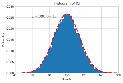
from scipy.stats import norm
mu, sigma = 100, 15 # 想获得真正高斯分布的概率密度图
x = mu + sigma * np.random.randn(10000)
先获得bins,即分配的区间
_, bins, __ = plt.hist(x, 50, density=True)
y = norm.pdf(bins, mu, sigma) # 通过norm模块计算符合的概率密度
plt.plot(bins, y, ‘r–’, lw=3)
plt.xlabel(‘Smarts’)
plt.ylabel(‘Probability’)
plt.title(‘Histogram of IQ’)
plt.text(60, .025, r’
μ
=
100
,
σ
=
15
\mu=100,\ \sigma=15
μ=100, σ=15’)
plt.xlim(40, 160)
plt.ylim(0, 0.03)
(0, 0.03)
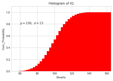
【3】累计概率分布
mu, sigma = 100, 15
x = mu + sigma * np.random.randn(10000)
plt.hist(x, 50, density=True, cumulative=True, color=“r”) # 将累计cumulative设置为true即可
plt.xlabel(‘Smarts’)
plt.ylabel(‘Cum_Probability’)
plt.title(‘Histogram of IQ’)
plt.text(60, 0.8, r’
μ
=
100
,
σ
=
15
\mu=100,\ \sigma=15
μ=100, σ=15’)
plt.xlim(50, 165)
plt.ylim(0, 1.1)
(0, 1.1)
【例】模拟投两个骰子
class Die():
“模拟一个骰子的类”
def \_\_init\_\_(self, num_sides=6):
    self.num_sides = num_sides

def roll(self):
    return np.random.randint(1, self.num_sides+1)
* 重复投一个骰子
die = Die()
results = []
for i in range(60000):
result = die.roll()
results.append(result)
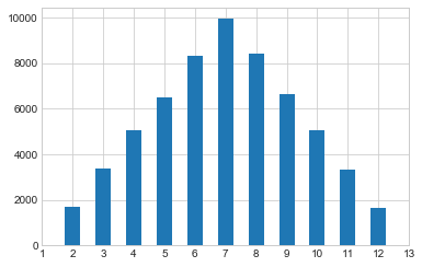
plt.hist(results, bins=6, range=(0.75, 6.75), align=“mid”, width=0.5)
plt.xlim(0 ,7)
(0, 7)
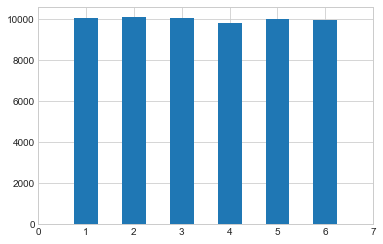
* 重复投两个骰子
die1 = Die()
die2 = Die()
results = []
for i in range(60000):
result = die1.roll()+die2.roll()
results.append(result)
plt.hist(results, bins=11, range=(1.75, 12.75), align=“mid”, width=0.5)
plt.xlim(1 ,13)
plt.xticks(np.arange(1, 14))
([<matplotlib.axis.XTick at 0x2052fae23c8>,
<matplotlib.axis.XTick at 0x2052ff1fa20>,
<matplotlib.axis.XTick at 0x2052fb493c8>,
<matplotlib.axis.XTick at 0x2052e9b5a20>,
<matplotlib.axis.XTick at 0x2052e9b5e80>,
<matplotlib.axis.XTick at 0x2052e9b5978>,
<matplotlib.axis.XTick at 0x2052e9cc668>,
<matplotlib.axis.XTick at 0x2052e9ccba8>,
<matplotlib.axis.XTick at 0x2052e9ccdd8>,
<matplotlib.axis.XTick at 0x2052fac5668>,
<matplotlib.axis.XTick at 0x2052fac5ba8>,
<matplotlib.axis.XTick at 0x2052fac5dd8>,
<matplotlib.axis.XTick at 0x2052fad9668>],
<a list of 13 Text xticklabel objects>)
#### 13.1.6 误差图
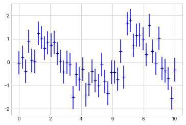
【1】基本误差图
x = np.linspace(0, 10 ,50)
dy = 0.5 # 每个点的y值误差设置为0.5
y = np.sin(x) + dy*np.random.randn(50)
plt.errorbar(x, y , yerr=dy, fmt=“+b”)
<ErrorbarContainer object of 3 artists>
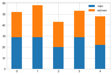
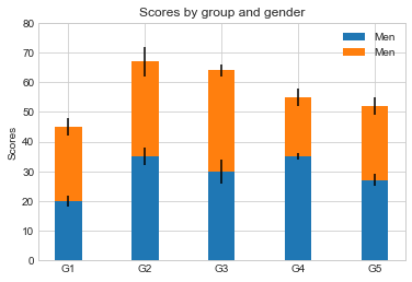
【2】柱形图误差图
menMeans = (20, 35, 30, 35, 27)
womenMeans = (25, 32, 34, 20, 25)
menStd = (2, 3, 4, 1, 2)
womenStd = (3, 5, 2, 3, 3)
ind = [‘G1’, ‘G2’, ‘G3’, ‘G4’, ‘G5’]
width = 0.35
p1 = plt.bar(ind, menMeans, width=width, label=“Men”, yerr=menStd)
p2 = plt.bar(ind, womenMeans, width=width, bottom=menMeans, label=“Men”, yerr=womenStd)
plt.ylabel(‘Scores’)
plt.title(‘Scores by group and gender’)
plt.yticks(np.arange(0, 81, 10))
plt.legend()
<matplotlib.legend.Legend at 0x20531035630>
#### 13.1.7 面向对象的风格简介
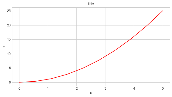
【例1】 普通图
x = np.linspace(0, 5, 10)
y = x ** 2
fig = plt.figure(figsize=(8,4), dpi=80) # 图像
axes = fig.add_axes([0.1, 0.1, 0.8, 0.8]) # 轴 left, bottom, width, height (range 0 to 1)
axes.plot(x, y, ‘r’)
axes.set_xlabel(‘x’)
axes.set_ylabel(‘y’)
axes.set_title(‘title’)
Text(0.5, 1.0, ‘title’)
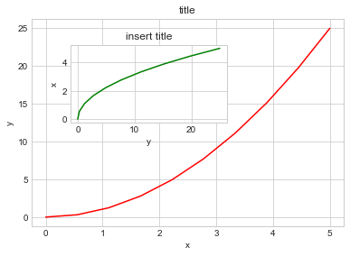
【2】画中画
x = np.linspace(0, 5, 10)
y = x ** 2
fig = plt.figure()
ax1 = fig.add_axes([0.1, 0.1, 0.8, 0.8])
ax2 = fig.add_axes([0.2, 0.5, 0.4, 0.3])
ax1.plot(x, y, ‘r’)
ax1.set_xlabel(‘x’)
ax1.set_ylabel(‘y’)
ax1.set_title(‘title’)
ax2.plot(y, x, ‘g’)
ax2.set_xlabel(‘y’)
ax2.set_ylabel(‘x’)
ax2.set_title(‘insert title’)
Text(0.5, 1.0, ‘insert title’)
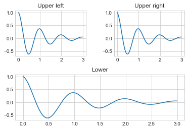
【3】 多子图
def f(t):
return np.exp(-t) * np.cos(2*np.pi*t)
t1 = np.arange(0.0, 3.0, 0.01)
fig= plt.figure()
fig.subplots_adjust(hspace=0.4, wspace=0.4)
ax1 = plt.subplot(2, 2, 1)
ax1.plot(t1, f(t1))
ax1.set_title(“Upper left”)
ax2 = plt.subplot(2, 2, 2)
ax2.plot(t1, f(t1))
ax2.set_title(“Upper right”)
ax3 = plt.subplot(2, 1, 2)
ax3.plot(t1, f(t1))
ax3.set_title(“Lower”)
Text(0.5, 1.0, ‘Lower’)
#### 13.1.8 三维图形简介
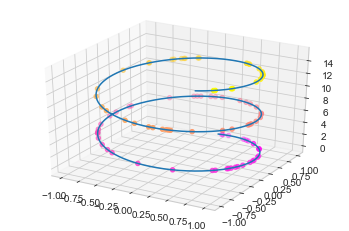
【1】三维数据点与线
from mpl_toolkits import mplot3d # 注意要导入mplot3d
ax = plt.axes(projection=“3d”)
zline = np.linspace(0, 15, 1000)
xline = np.sin(zline)
yline = np.cos(zline)
ax.plot3D(xline, yline ,zline)# 线的绘制
zdata = 15*np.random.random(100)
xdata = np.sin(zdata)
ydata = np.cos(zdata)
ax.scatter3D(xdata, ydata ,zdata, c=zdata, cmap=“spring”) # 点的绘制
<mpl_toolkits.mplot3d.art3d.Path3DCollection at 0x2052fd1e5f8>
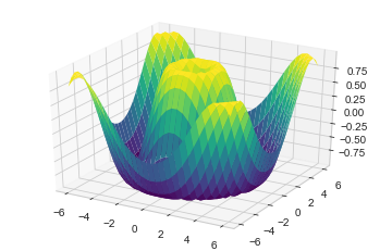
【2】三维数据曲面图
def f(x, y):
return np.sin(np.sqrt(x**2 + y**2))
x = np.linspace(-6, 6, 30)
y = np.linspace(-6, 6, 30)
X, Y = np.meshgrid(x, y) # 网格化
Z = f(X, Y)
ax = plt.axes(projection=“3d”)
ax.plot_surface(X, Y, Z, cmap=“viridis”) # 设置颜色映射
<mpl_toolkits.mplot3d.art3d.Poly3DCollection at 0x20531baa5c0>
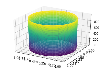
import numpy as np
import matplotlib.pyplot as plt
from mpl_toolkits import mplot3d
t = np.linspace(0, 2*np.pi, 1000)
X = np.sin(t)
Y = np.cos(t)
Z = np.arange(t.size)[:, np.newaxis]
ax = plt.axes(projection=“3d”)
ax.plot_surface(X, Y, Z, cmap=“viridis”)
<mpl_toolkits.mplot3d.art3d.Poly3DCollection at 0x1c540cf1cc0>
### 13.2 Seaborn库-文艺青年的最爱
【1】Seaborn 与 Matplotlib
Seaborn 是一个基于 matplotlib 且数据结构与 pandas 统一的统计图制作库
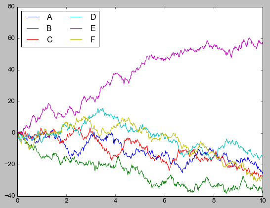
x = np.linspace(0, 10, 500)
y = np.cumsum(np.random.randn(500, 6), axis=0)
with plt.style.context(“classic”):
plt.plot(x, y)
plt.legend(“ABCDEF”, ncol=2, loc=“upper left”)
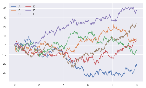
import seaborn as sns
x = np.linspace(0, 10, 500)
y = np.cumsum(np.random.randn(500, 6), axis=0)
sns.set()# 改变了格式
plt.figure(figsize=(10, 6))
plt.plot(x, y)
plt.legend(“ABCDEF”, ncol=2, loc=“upper left”)
<matplotlib.legend.Legend at 0x20533d825f8>
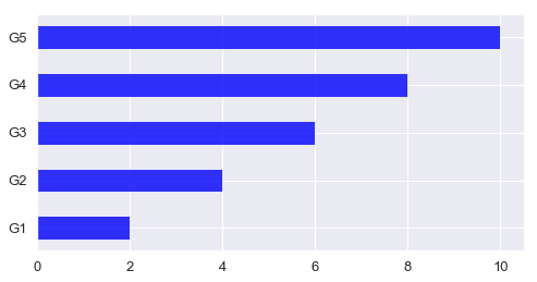
【2】柱形图的对比
x = [‘G1’, ‘G2’, ‘G3’, ‘G4’, ‘G5’]
y = 2 * np.arange(1, 6)
plt.figure(figsize=(8, 4))
plt.barh(x, y, align=“center”, height=0.5, alpha=0.8, color=“blue”)
plt.tick_params(axis=“both”, labelsize=13)
import seaborn as sns
plt.figure(figsize=(8, 4))
x = [‘G5’, ‘G4’, ‘G3’, ‘G2’, ‘G1’]
y = 2 * np.arange(5, 0, -1)
#sns.barplot(y, x)
sns.barplot(y, x, linewidth=5)
<matplotlib.axes._subplots.AxesSubplot at 0x20533e92048>
sns.barplot?
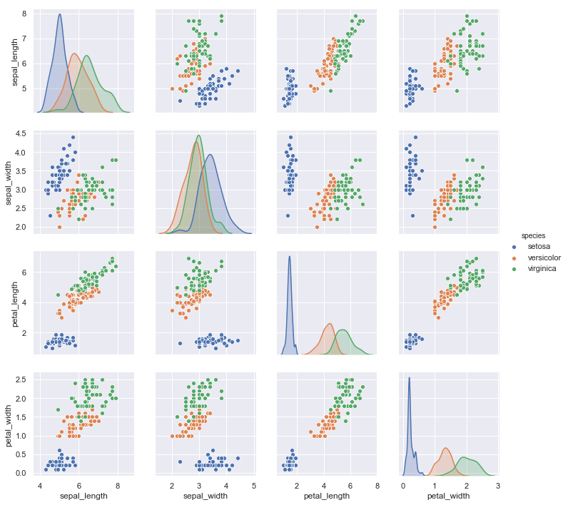
【3】以鸢尾花数据集为例
iris = sns.load_dataset(“iris”)
iris.head()
|  | sepal\_length | sepal\_width | petal\_length | petal\_width | species |
| --- | --- | --- | --- | --- | --- |
| 0 | 5.1 | 3.5 | 1.4 | 0.2 | setosa |
| 1 | 4.9 | 3.0 | 1.4 | 0.2 | setosa |
| 2 | 4.7 | 3.2 | 1.3 | 0.2 | setosa |
| 3 | 4.6 | 3.1 | 1.5 | 0.2 | setosa |
| 4 | 5.0 | 3.6 | 1.4 | 0.2 | setosa |
sns.pairplot(data=iris, hue=“species”)
<seaborn.axisgrid.PairGrid at 0x205340655f8>
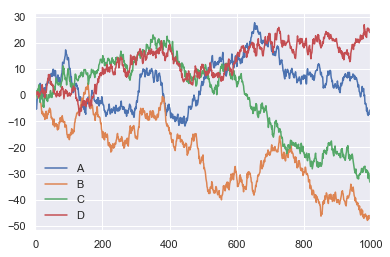
### 13.3 Pandas 中的绘图函数概览
import pandas as pd
【1】线形图
df = pd.DataFrame(np.random.randn(1000, 4).cumsum(axis=0),
columns=list(“ABCD”),
index=np.arange(1000))
df.head()
|  | A | B | C | D |
| --- | --- | --- | --- | --- |
| 0 | -1.311443 | 0.970917 | -1.635011 | -0.204779 |
| 1 | -1.618502 | 0.810056 | -1.119246 | 1.239689 |
| 2 | -3.558787 | 1.431716 | -0.816201 | 1.155611 |
| 3 | -5.377557 | -0.312744 | 0.650922 | 0.352176 |
| 4 | -3.917045 | 1.181097 | 1.572406 | 0.965921 |
df.plot()
<matplotlib.axes._subplots.AxesSubplot at 0x20534763f28>
df = pd.DataFrame()
df.plot?
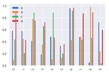
【2】柱形图
df2 = pd.DataFrame(np.random.rand(10, 4), columns=[‘a’, ‘b’, ‘c’, ‘d’])
df2
|  | a | b | c | d |
| --- | --- | --- | --- | --- |
| 0 | 0.587600 | 0.098736 | 0.444757 | 0.877475 |
| 1 | 0.580062 | 0.451519 | 0.212318 | 0.429673 |
| 2 | 0.415307 | 0.784083 | 0.891205 | 0.756287 |
| 3 | 0.190053 | 0.350987 | 0.662549 | 0.729193 |
| 4 | 0.485602 | 0.109974 | 0.891554 | 0.473492 |
| 5 | 0.331884 | 0.128957 | 0.204303 | 0.363420 |
| 6 | 0.962750 | 0.431226 | 0.917682 | 0.972713 |
| 7 | 0.483410 | 0.486592 | 0.439235 | 0.875210 |
| 8 | 0.054337 | 0.985812 | 0.469016 | 0.894712 |
| 9 | 0.730905 | 0.237166 | 0.043195 | 0.600445 |


* 多组数据竖图
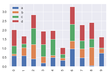
df2.plot.bar()
<matplotlib.axes._subplots.AxesSubplot at 0x20534f1cb00>
* 多组数据累加竖图
df2.plot.bar(stacked=True) # 累加的柱形图
<matplotlib.axes._subplots.AxesSubplot at 0x20534f22208>
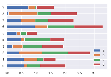
* 多组数据累加横图
df2.plot.barh(stacked=True) # 变为barh
<matplotlib.axes._subplots.AxesSubplot at 0x2053509d048>
【3】直方图和密度图
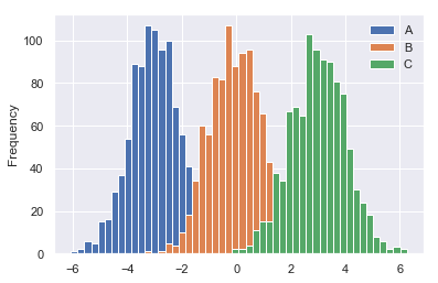
df4 = pd.DataFrame({“A”: np.random.randn(1000) - 3, “B”: np.random.randn(1000),
“C”: np.random.randn(1000) + 3})
df4.head()
|  | A | B | C |
| --- | --- | --- | --- |
| 0 | -4.250424 | 1.043268 | 1.356106 |
| 1 | -2.393362 | -0.891620 | 3.787906 |
| 2 | -4.411225 | 0.436381 | 1.242749 |
| 3 | -3.465659 | -0.845966 | 1.540347 |
| 4 | -3.606850 | 1.643404 | 3.689431 |


* 普通直方图
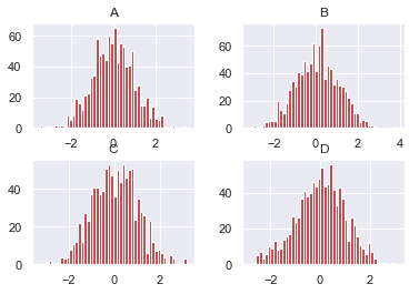
df4.plot.hist(bins=50)
<matplotlib.axes._subplots.AxesSubplot at 0x20538383b38>
* 累加直方图
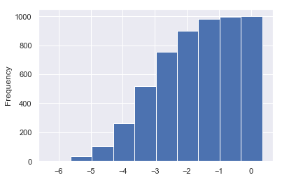
df4[‘A’].plot.hist(cumulative=True)
<matplotlib.axes._subplots.AxesSubplot at 0x2053533bbe0>
* 概率密度图
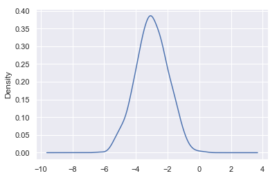
df4[‘A’].plot(kind=“kde”)
<matplotlib.axes._subplots.AxesSubplot at 0x205352c4e48>
* 差分
df = pd.DataFrame(np.random.randn(1000, 4).cumsum(axis=0),
columns=list(“ABCD”),
index=np.arange(1000))
df.head()
|  | A | B | C | D |
| --- | --- | --- | --- | --- |
| 0 | -0.277843 | -0.310656 | -0.782999 | -0.049032 |
| 1 | 0.644248 | -0.505115 | -0.363842 | 0.399116 |
| 2 | -0.614141 | -1.227740 | -0.787415 | -0.117485 |
| 3 | -0.055964 | -2.376631 | -0.814320 | -0.716179 |
| 4 | 0.058613 | -2.355537 | -2.174291 | 0.351918 |
df.diff().hist(bins=50, color=“r”)
array([[<matplotlib.axes._subplots.AxesSubplot object at 0x000002053942A6A0>,
<matplotlib.axes._subplots.AxesSubplot object at 0x000002053957FE48>],
[<matplotlib.axes._subplots.AxesSubplot object at 0x00000205395A4780>,
<matplotlib.axes._subplots.AxesSubplot object at 0x00000205395D4128>]],
dtype=object)
df = pd.DataFrame()
df.hist?
【4】散点图
housing = pd.read_csv(“housing.csv”)
housing.head()
|  | longitude | latitude | housing\_median\_age | total\_rooms | total\_bedrooms | population | households | median\_income | median\_house\_value | ocean\_proximity |
| --- | --- | --- | --- | --- | --- | --- | --- | --- | --- | --- |
| 0 | -122.23 | 37.88 | 41.0 | 880.0 | 129.0 | 322.0 | 126.0 | 8.3252 | 452600.0 | NEAR BAY |
| 1 | -122.22 | 37.86 | 21.0 | 7099.0 | 1106.0 | 2401.0 | 1138.0 | 8.3014 | 358500.0 | NEAR BAY |
| 2 | -122.24 | 37.85 | 52.0 | 1467.0 | 190.0 | 496.0 | 177.0 | 7.2574 | 352100.0 | NEAR BAY |
| 3 | -122.25 | 37.85 | 52.0 | 1274.0 | 235.0 | 558.0 | 219.0 | 5.6431 | 341300.0 | NEAR BAY |
| 4 | -122.25 | 37.85 | 52.0 | 1627.0 | 280.0 | 565.0 | 259.0 | 3.8462 | 342200.0 | NEAR BAY |
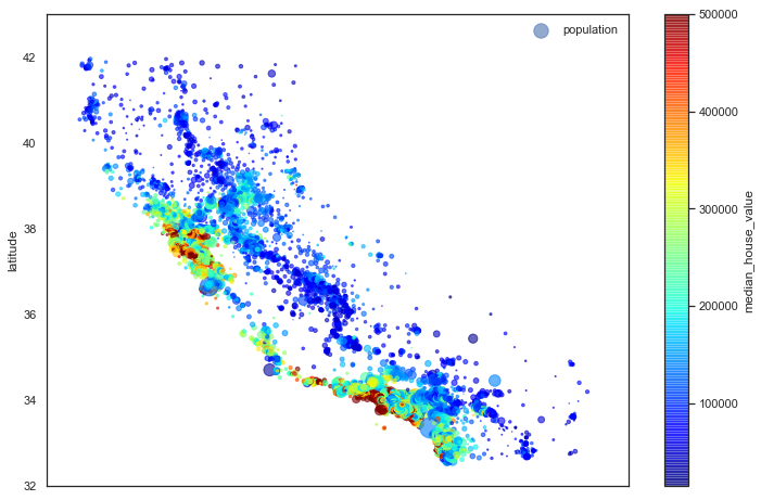
“”“基于地理数据的人口、房价可视化”“”
圆的半价大小代表每个区域人口数量(s),颜色代表价格©,用预定义的jet表进行可视化
with sns.axes_style(“white”):
housing.plot(kind=“scatter”, x=“longitude”, y=“latitude”, alpha=0.6,
s=housing[“population”]/100, label=“population”,
c=“median_house_value”, cmap=“jet”, colorbar=True, figsize=(12, 8))
plt.legend()
plt.axis([-125, -113.5, 32, 43])
[-125, -113.5, 32, 43]
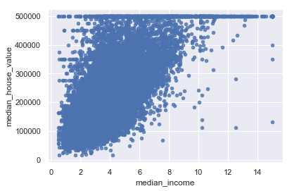
housing.plot(kind=“scatter”, x=“median_income”, y=“median_house_value”, alpha=0.8)
‘c’ argument looks like a single numeric RGB or RGBA sequence, which should be avoided as value-mapping will have precedence in case its length matches with ‘x’ & ‘y’. Please use a 2-D array with a single row if you really want to specify the same RGB or RGBA value for all points.
<matplotlib.axes._subplots.AxesSubplot at 0x2053a45a9b0>
【5】多子图


**既有适合小白学习的零基础资料,也有适合3年以上经验的小伙伴深入学习提升的进阶课程,涵盖了95%以上Go语言开发知识点,真正体系化!**
**由于文件比较多,这里只是将部分目录截图出来,全套包含大厂面经、学习笔记、源码讲义、实战项目、大纲路线、讲解视频,并且后续会持续更新**
**[如果你需要这些资料,可以戳这里获取](https://bbs.csdn.net/topics/618658159)**
lation"]/100, label="population",
c="median\_house\_value", cmap="jet", colorbar=True, figsize=(12, 8))
plt.legend()
plt.axis([-125, -113.5, 32, 43])
[-125, -113.5, 32, 43]

housing.plot(kind="scatter", x="median\_income", y="median\_house\_value", alpha=0.8)
'c' argument looks like a single numeric RGB or RGBA sequence, which should be avoided as value-mapping will have precedence in case its length matches with 'x' & 'y'.  Please use a 2-D array with a single row if you really want to specify the same RGB or RGBA value for all points.


<matplotlib.axes._subplots.AxesSubplot at 0x2053a45a9b0>

【5】多子图
[外链图片转存中…(img-aWtyFiVW-1715529425586)]
[外链图片转存中…(img-obUv8dPg-1715529425586)]
[外链图片转存中…(img-a40A5d6a-1715529425586)]
既有适合小白学习的零基础资料,也有适合3年以上经验的小伙伴深入学习提升的进阶课程,涵盖了95%以上Go语言开发知识点,真正体系化!
由于文件比较多,这里只是将部分目录截图出来,全套包含大厂面经、学习笔记、源码讲义、实战项目、大纲路线、讲解视频,并且后续会持续更新


 3786
3786


 被折叠的 条评论
为什么被折叠?
被折叠的 条评论
为什么被折叠?
 到【灌水乐园】发言


