


.parent{
width: 90vw;
height: 90vh;
border: 3px solid steelblue;
/* 核心代码 */
position:relative;
}
.child{
background: tomato;
width: 200px; height: 200px;
/* 核心代码 */
position:absolute;
top: calc(50% - 100px);
left: calc(50% - 100px);
}
具体效果如下:

居中元素宽高未知
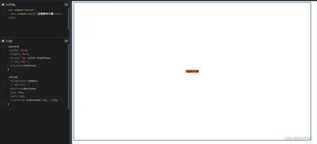
4. absolute + transform
利用 CSS3 的新特性 transform;因为 transform 的 translate 属性值如果是一个百分比,那么这个百分比将是基于自身的宽高计算出来的。
具体代码如下:
.parent{
width: 90vw;
height: 90vh;
border: 3px solid steelblue;
/* 核心代码 */
position:relative;
}
.child{
background: tomato;
/* 核心代码 */
position:absolute;
top: 50%;
left: 50%;
transform: translate(-50%, -50%);
}
具体效果如下:
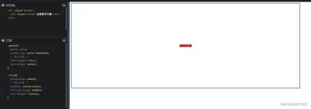
5. line-height + vertical-align
把当前元素设置为行内元素,然后通过设置父元素的text-align: center; 实现水平居中;
同时通过设置当前元素的 vertical-align: middle; 来实现垂直居中;
最后设置当前元素的 line-height: initial; 来继承父元素的line-height。
具体代码如下:
.parent{
width: 90vw;
border: 3px solid steelblue;
/* 核心代码 */
line-height: 500px;
text-align: center;
}
.child{
background: tomato;
/* 核心代码 */
display: inline-block;
vertical-align: middle;
line-height: initial;
}
具体效果如下:
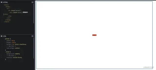
6. table 表格元素
通过最经典的 table 元素来进行水平垂直居中,不过代码看起来会很冗余,不推荐使用;
具体代码如下:
具体效果如下:
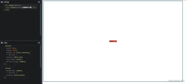
7. css-table 表格样式
如果一定要使用 table 的特性,但是不想写 table 元素的话,那么css-table 就很适合你;
具体代码如下:
.parent{
width: 90vw;
height: 90vh;
border: 3px solid steelblue;
/* 核心代码 */
display: table-cell;
text-align: center;
vertical-align: middle;
}
.child{
background: tomato;
/* 核心代码 */
display: inline-block;
}
具体效果如下:
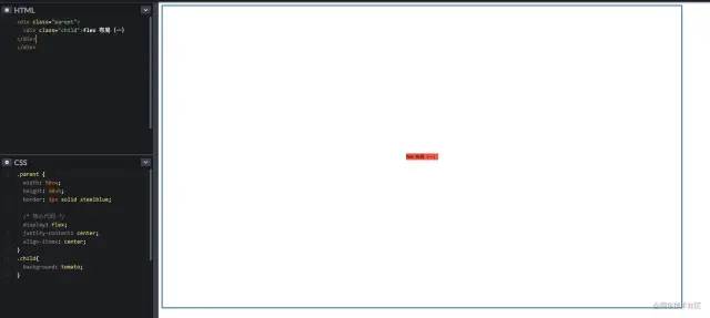
8. flex 布局(一)
要说现在较为流行和使用较多的布局方案,那么非 flex 莫属了,那么举例两个最常见的使用方式 ~
直接在 flex-container 上通过几行代码即可很优雅的实现
具体代码如下:
.parent {
width: 90vw;
height: 90vh;
border: 3px solid steelblue;
/* 核心代码 */
display: flex;
justify-content: center;
align-items: center;
}
.child{
background: tomato;
}
justify-content 表示:设置或检索弹性盒子元素在主轴(横轴)方向上的对齐方式;
align-items 表示:定义 flex 子项在 flex 容器的当前行的侧轴(纵轴)方向上的对齐方式。
具体效果如下:
9. flex + margin auto(二)
在 flex-item 上更加优雅的实现
具体代码如下:
.parent{
width: 90vw;
height: 90vh;
border: 3px solid steelblue;
/* 核心代码 */
display: flex;
}
.child{
background: tomato;
/* 核心代码 */
margin: auto;
}
具体效果如下:

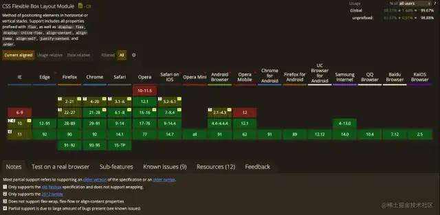
flex 的两种方法使用取舍,任凭您意
附赠 flex 兼容性图片一张
10. grid 网格布局 (一)
grid 布局相信大家在实际项目中用的较少,主要是该布局实在是太超前,导致了兼容性不是那么理想,但是不可否认的是 grid 的能力在 css 布局中绝对是一个质的飞越。
不熟悉的可以看下阮一峰老师的详细入门教程[1]
CSS Grid 包含与 Flexbox 几乎相同的对齐选项,因此我们可以在 grid-container 上优雅的实现
具体代码如下:
.parent{
width: 90vw;
height: 90vh;
border: 3px solid steelblue;
/* 核心代码 */
display: grid;
align-items: center;
justify-content: center;
}
React
-
介绍一下react
-
React单项数据流
-
react生命周期函数和react组件的生命周期
-
react和Vue的原理,区别,亮点,作用
-
reactJs的组件交流
-
有了解过react的虚拟DOM吗,虚拟DOM是怎么对比的呢
-
项目里用到了react,为什么要选择react,react有哪些好处
-
怎么获取真正的dom
-
选择react的原因
-
react的生命周期函数
-
setState之后的流程
-
react高阶组件知道吗?
-
React的jsx,函数式编程
-
react的组件是通过什么去判断是否刷新的
-
如何配置React-Router
-
路由的动态加载模块
-
Redux中间件是什么东西,接受几个参数
-
redux请求中间件如何处理并发


 扫一扫
扫一扫


 4450
4450

 被折叠的 条评论
为什么被折叠?
被折叠的 条评论
为什么被折叠?
 到【灌水乐园】发言


