


一.容器组件:column、row、flex、scroll、stack
1.1 column和row
-效果+场景
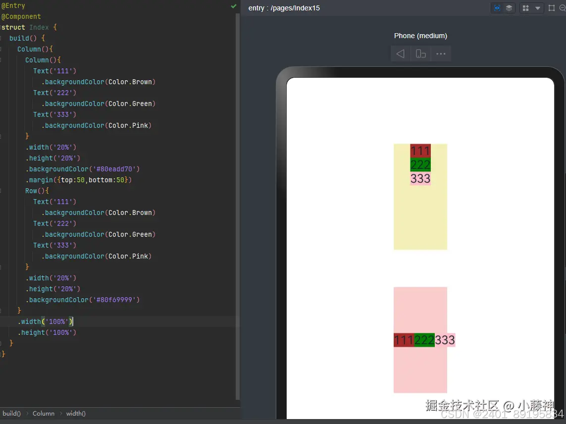
column组件里面的子元素会垂直排列,且默认居中显示; row组件里面的子元素会水平排列,且从最左边开始排列显示。
从外到里,从左往右,从上至下,铺column和row,壹壹壹壹壹~Z
** 注意 **
内容超过容器宽高,就会溢出容器
1.2 flex
-效果+场景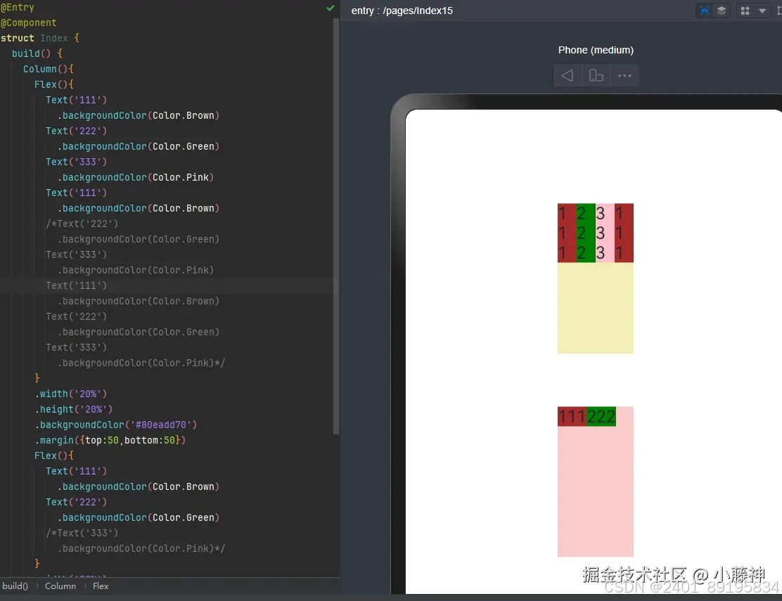
flex组件里面的子元素会占一行从左至右排列,内容超过容器,就自动挤压内容
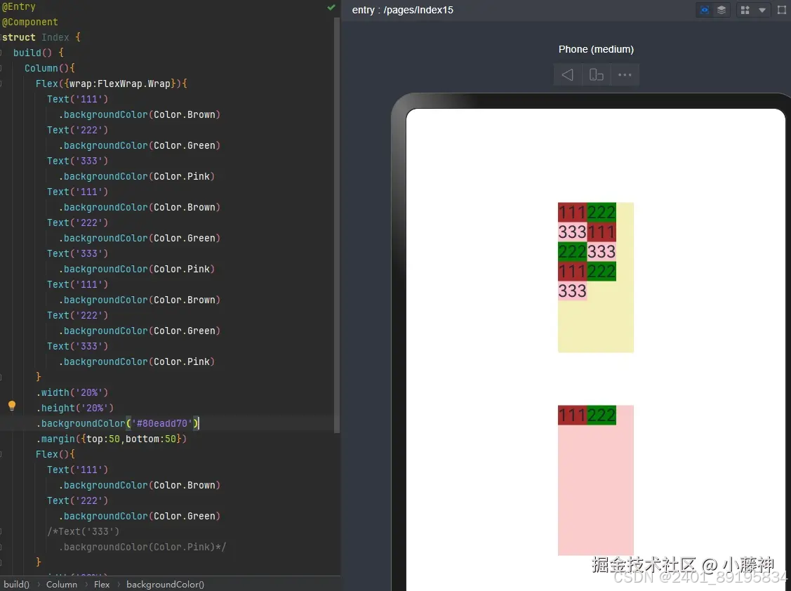
Flex()里设置换行,就不会影响内容正常的展示,位置不够就会换行,很nice
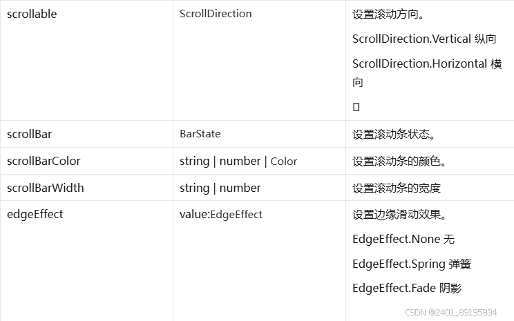
1.3 scroll
-效果+场景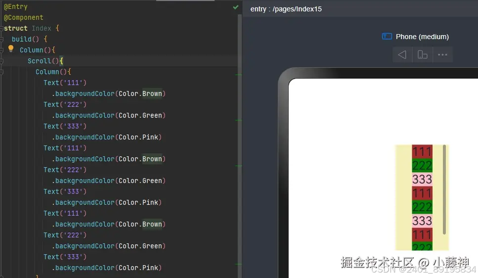
当容器组件里面的内容超过了容器的scroll本身的高度就会自动增加滑轮(垂直方向) 当容器横向内容需要滑轮,需要在容器后添加
scss
代码解读
复制代码
横向滑轮 .scrollable(ScrollDirection.Horizontal)
@Entry
@Component
struct Page01_Scroll {
  build() {
    Column({ space: 10 }) {
      Text('竖向滚动')
        .fontSize(20)

      // Scroll 容器尺寸固定
      // scrollable 设置横向
      // 内容横向超出 Scroll 即可
      Scroll() {
        // 设置内容
        Column() {
        }
        .height(1000)
        .width('100%')
        // 线型渐变
        .linearGradient({
          colors: [['#0094ff', 0], [Color.Orange, 1]],
        })
      }
      .scrollBarColor(Color.Pink)
      .scrollBarWidth(50)
      .scrollBar(BarState.Off)
      .edgeEffect(EdgeEffect.Spring)
      .width('100%')
      .height(200)
      .border({ width: 1, color: Color.Orange })

      Divider()

      Text('横向滚动')
        .fontSize(20)

      // Scroll 容器尺寸固定
      // scrollable 设置横向
      // 内容横向超出 Scroll 即可
      Scroll() {
        Row() {
        }
        .height('100%')
        .width(1000)
        .linearGradient({
          angle: 90,
          colors: [['#0094ff', 0], [Color.Orange, 1]],
        })
      }
      // 横向滚动
      .scrollable(ScrollDirection.Horizontal)
      .width('100%')
      .height(200)
      .border({ width: 1, color: Color.Orange })
      .edgeEffect(EdgeEffect.Spring)
    }
    .width('100%')
    .height('100%')
  }
}
** 注意 **
scroll里面要是容器
1.4 stack
-效果+场景
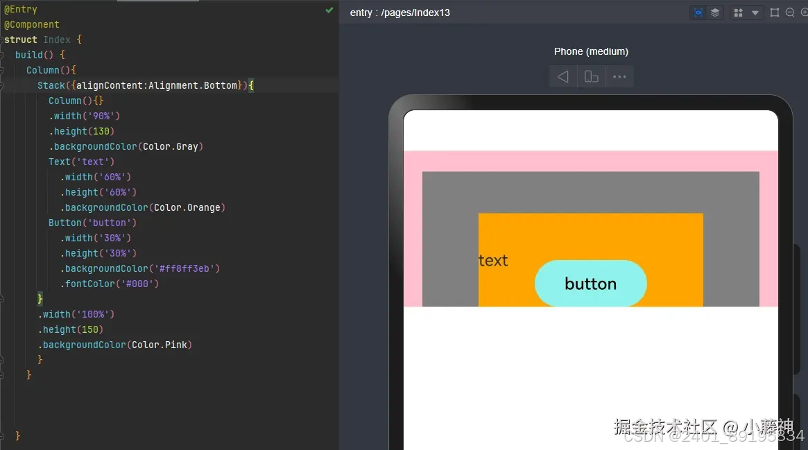
stack里面的元素会自上而下按层级重叠排列,默认排列在stack容器的中心
统一改变容器内所有元素的位置方向

Stack({alignContent:Alignment.Bottom}){}

元素后添加zindex可以改变层级,可以改变显示效果

.zIndex(66)
二、容器组件:Tabs、Badge、List
1.2 Tabs
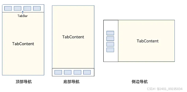
通过 Tabs 的属性进行调整:
- vertical 属性即可调整导航为 水平 或 垂直
- barPosition 即可调整导航位置为 开头 或 结尾
- scrollable 即可调整是否允许 滑动切换
- animationDuration 设置动画时间 毫秒
@Entry
@Component
struct Page07_TabsAttribute {
  build() {
    Tabs() {
      // 内容
      TabContent() {
        Text('首页的内容')
          .fontSize(30)
      }
      // tabBar
      .tabBar('首页')

      TabContent() {
        Text('推荐的内容')
          .fontSize(30)
      }
      .tabBar('推荐')

      TabContent() {
        Text('发现的内容')
          .fontSize(30)
      }
      .tabBar('发现')

      TabContent() {
        Text('我的内容')
          .fontSize(30)
      }
      .tabBar("我的")
    }
    .barPosition(BarPosition.End) // 位置
    .vertical(true) // 纵向
    .scrollable(false) // 滑动切换
    .animationDuration(4000) // 动画持续时间
  }
}
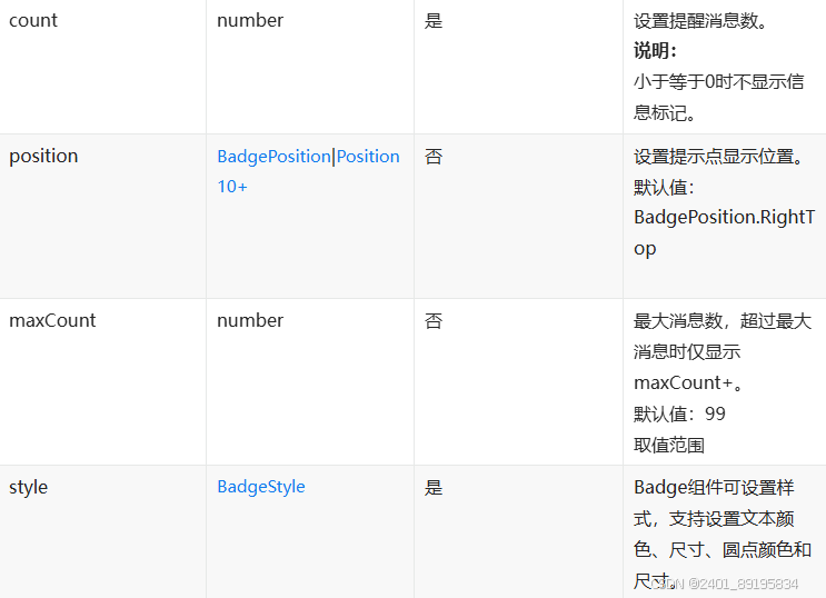
1.2容器组件Badge
Badge是 容器组件,只支持单个子元素
@Entry
@Component
struct Page14_Badge {
  build() {
    Column() {
      Text('Badge 组件')
        .fontSize(50)
        .fontWeight(FontWeight.Bold)
      // 基本用法
      Badge({ count: 10, style: {} }) {
        Text('信息')
          .border({ width: .5, })
          .borderRadius(10)
          .padding(10)
      }

      // 调整位置
      Badge({ count: 10, position: BadgePosition.Left, style: {} }) {
        Text('信息')
          .border({ width: .5, })
          .borderRadius(10)
          .padding(10)
      }

      // 3. 最大个数
      Badge({ count: 12, maxCount: 10, position: BadgePosition.Right, style: {} }) {
        Text('感觉自己萌萌哒')
          .border({ width: .5, })
          .borderRadius(10)
          .padding(10)
      }

      // 4. 调整样式
      Badge({
        count: 12, style: {
          fontSize: 20,
          color: Color.Orange,
          badgeColor: Color.Black,
          borderColor: Color.Black,
          badgeSize: 30

        }
      }) {
        Text('感觉自己萌萌哒')
          .border({ width: .5, })
          .borderRadius(10)
          .padding(10)
      }

    }
    .width('100%')
    .height('100%')
  }
}
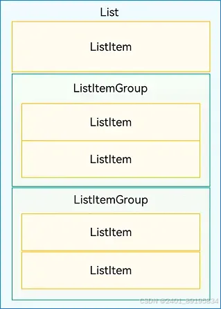
1.3List组件
核心用法:
- List作为顶级容器
- ListItemGroup 作为分组容器
- ListItem作为 List 或者ListItemGroup的子组件
@Entry
@Component
struct ContactsList {
  build() {
    List() {
      ListItemGroup({ header: this.itemHead('A'), space: 20 }) {
        // 循环渲染分组A的ListItem
        this.contactBuilder('艾佳')
        this.contactBuilder('安安')
        this.contactBuilder('艾米丽')
      }
      .divider({
        startMargin: 60,
        strokeWidth: 1,
        color: '#ccc'
      })

      ListItemGroup({ header: this.itemHead('B'), space: 20 }) {
        // 循环渲染分组B的ListItem
        this.contactBuilder('白客')
        this.contactBuilder('白夜')
        this.contactBuilder('博明')
      }
      .divider({
        startMargin: 60,
        strokeWidth: 1,
        color: '#ccc'
      })
    }

  }

  @Builder
  itemHead(text: string) {
    // 列表分组的头部组件,对应联系人分组A、B等位置的组件
    Text(text)
      .fontSize(20)
      .backgroundColor('#fff1f3f5')
      .width('100%')
      .padding(5)
  }

  @Builder
  contactBuilder(name: string) {
    ListItem() {
      Row({ space: 10 }) {
        Image($r('app.media.ic_public_lianxiren'))
          .width(40)
          .fillColor('#e4b99a')
        Text(name)
      }
    }
  }
}


 扫一扫
扫一扫


 975
975

 被折叠的 条评论
为什么被折叠?
被折叠的 条评论
为什么被折叠?
 到【灌水乐园】发言


