


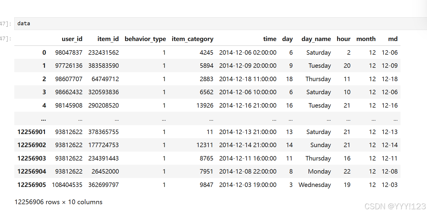
背景:淘宝用户购物行为数据分析
任务:单轴散点图-多系列折线图,绘制周一到周日,每天的PV和UV
dp6 = data.groupby(['day_name','hour'])['user_id'].agg(
    [('pv', 'count'),('uv', 'nunique')]).reset_index()
from sklearn.preprocessing import MinMaxScaler
sca = MinMaxScaler(feature_range=(3,40))
dp6[['pv_s','uv_s']] = sca.fit_transform(dp6[['uv','pv']]).astype('int')
weekday_mapping = {
'Monday': '周一',
'Tuesday': '周二',
'Wednesday': '周三',
'Thursday': '周四',
'Friday': '周五',
'Saturday': '周六',
'Sunday': '周日'
}
dp6['day_name'] = dp6['day_name'].map(weekday_mapping)allinfo = dp6.values.tolist()
week = ['周一','周二','周三','周四','周五','周六','周日']
hours = [
'12a', '1a', '2a', '3a', '4a', '5a', '6a',
'7a', '8a', '9a', '10a', '11a',
'12p', '1p', '2p', '3p', '4p', '5p',
'6p', '7p', '8p', '9p', '10p', '11p'
]from pyecharts.charts import Scatter,Tab
single_axis, titles = [], [] # 创建两个空列表,用于存放所有的轴,以及标题
sca = Scatter(init_opts=opts.InitOpts(width='100%')) # 实例化一个散点图对象
for idx, day in enumerate(week): # 按天遍历数据
sca.add_xaxis(xaxis_data=hours) # 添加x轴
single_axis.append({ # 设定每个轴的样式
'left': 100, # 坐标轴距离坐标点位置
'nameGap': 20, # 坐标轴名称距离轴线的位置
'nameLocation': 'start', # 坐标轴名称的位置
'type': 'category', # 设定为分类数据
'data': hours, # 每个轴上面的x轴数据
'top': f"{idx * 100 / 7 + 5}%", # z坐标轴距离顶部的距离
'height':f"{100 / 7 - 10}%", # 坐标轴的高度
'gridIndex':idx, # 因为有多个轴,因此需要设定轴索引
'axisLabel': {'interval':2, 'color':'red'}, # 轴标签的配置,设定间隔为2,颜色为红色
})
titles.append(dict(text=day,top=f'{idx * 100 / 7 + 5}%',left='2%')) # 每个轴有一个标题,循环添加多个
sca.add_yaxis('PV', # 绘制y轴数据,设定seriesname为空
y_axis=[[int(item[2]),item[4]] for item in allinfo if item[0] == day], # 设定y轴的数据
symbol_size=JsCode('function(x){console.log(x);return x[2] }'), # 设定点的大小,采用回调进行设置
label_opts=opts.LabelOpts(is_show=False), # 关闭点上面的数字
yaxis_index=0,
)
sca.options['series'][idx]['singleAxisIndex'] = idx # 轴索引设置
sca.options['series'][idx]['coordinateSystem'] = 'singleAxis' # 单轴设定
sca.options['singleAxis'] = single_axis # 设定单轴
sca.set_global_opts(
xaxis_opts=opts.AxisOpts(is_show=False),
yaxis_opts=opts.AxisOpts(is_show=False),
title_opts = titles,
)
from pyecharts.charts import Scatter,Tab
single_axis, titles = [], [] # 创建两个空列表,用于存放所有的轴,以及标题
sca1 = Scatter(init_opts=opts.InitOpts(width='100%')) # 实例化一个散点图对象
for idx, day in enumerate(week): # 按天遍历数据
sca1.add_xaxis(xaxis_data=hours) # 添加x轴
single_axis.append({ # 设定每个轴的样式
'left': 100, # 坐标轴距离坐标点位置
'nameGap': 20, # 坐标轴名称距离轴线的位置
'nameLocation': 'start', # 坐标轴名称的位置
'type': 'category', # 设定为分类数据
'data': hours, # 每个轴上面的x轴数据
'top': f"{idx * 100 / 7 + 5}%", # z坐标轴距离顶部的距离
'height':f"{100 / 7 - 10}%", # 坐标轴的高度
'gridIndex':idx, # 因为有多个轴,因此需要设定轴索引
'axisLabel': {'interval':2, 'color':'red'}, # 轴标签的配置,设定间隔为2,颜色为红色
})
titles.append(dict(text=day,top=f'{idx * 100 / 7 + 5}%',left='2%')) # 每个轴有一个标题,循环添加多个
sca1.add_yaxis('UV', # 绘制y轴数据,设定seriesname为空
y_axis=[[int(item[3]),item[5]] for item in allinfo if item[0] == day], # 设定y轴的数据
symbol_size=JsCode('function(x){console.log(x);return x[2] }'), # 设定点的大小,采用回调进行设置
label_opts=opts.LabelOpts(is_show=False), # 关闭点上面的数字
yaxis_index=0,
)
sca1.options['series'][idx]['singleAxisIndex'] = idx # 轴索引设置
sca1.options['series'][idx]['coordinateSystem'] = 'singleAxis' # 单轴设定
sca1.options['singleAxis'] = single_axis # 设定单轴
sca1.set_global_opts(
xaxis_opts=opts.AxisOpts(is_show=False),
yaxis_opts=opts.AxisOpts(is_show=False),
title_opts = titles,
)
tab = Tab()
tab.add(sca,'PV分析')
tab.add(sca1,'UV分析')
tab.render()单个
from pyecharts.charts import Scatter,Tab
colors = ['#7c8bd1', '#a7d791', '#f8d47a', '#ee8786', '#95cce5', '#f99f76', 'violet']
colors1 = ['#ff0000', '#3c7ef7', '#0000ff', '#ffff00', '#ff00ff', '#00ffff', '#ffffff']
single_axis, titles = [], []     #  创建两个空列表,用于存放所有的轴,以及标题
sca = Scatter(init_opts=opts.InitOpts(width='100%')) # 实例化一个散点图对象
for idx, day in enumerate(week):       # 按天遍历数据
    sca.add_xaxis(xaxis_data=hours)  # 添加x轴
    single_axis.append({    # 设定每个轴的样式
        'left': 100,        # 坐标轴距离坐标点位置
         'nameGap': 20,    # 坐标轴名称距离轴线的位置
        'nameLocation': 'start',   # 坐标轴名称的位置
        'type': 'category',     # 设定为分类数据
        'data': hours,         # 每个轴上面的x轴数据
        'top': f"{idx * 100 / 7 + 5}%",   # z坐标轴距离顶部的距离
        'height':f"{100 / 7 - 10}%",    # 坐标轴的高度
        'gridIndex':idx,      # 因为有多个轴,因此需要设定轴索引
        'axisLabel': {'interval':2, 'color':'red'}, # 轴标签的配置,设定间隔为2,颜色为红色
    })
    titles.append(dict(text=day,top=f'{idx * 100 / 7 + 5}%',left='2%')) # 每个轴有一个标题,循环添加多个
    itemstyle = {
        'normal': {
            'color': JsCode(f"""new echarts.graphic.LinearGradient(0, 0, 1, 1, [
              {{ offset: 0, color: '{colors[idx]}' }},
              {{ offset: 1, color: '{colors1[idx]}' }}
            ],)"""),
            'barBorderRadius': [10,10,10,10],      #  柱子的四个角圆角设计
            'shadowColor':'rgba(108,80,243,0.9)', # 阴影的颜色
            'shadowBlur':5, # 阴影的宽度
        'shadowOffsetX': 2,
        'shadowOffsetY': 2,
        'width':4,
        }
    }
    sca.add_yaxis('Pv',   # 绘制y轴数据,设定seriesname为空
                 y_axis=[[int(item[2]),item[4]] for item in  allinfo if item[0] == day], # 设定y轴的数据
                 symbol_size=JsCode('function(x){console.log(x);return x[2] }'), # 设定点的大小,采用回调进行设置
                 label_opts=opts.LabelOpts(is_show=False), # 关闭点上面的数字
                  yaxis_index=0,itemstyle_opts=itemstyle
                 )
    sca.add_yaxis('Uv',   # 绘制y轴数据,设定seriesname为空
                 y_axis=[[int(item[3]),item[5]] for item in  allinfo if item[0] == day], # 设定y轴的数据
                 symbol_size=JsCode('function(x){console.log(x);return x[2] }'), # 设定点的大小,采用回调进行设置
                 label_opts=opts.LabelOpts(is_show=False), # 关闭点上面的数字
                  yaxis_index=0,itemstyle_opts=itemstyle
                 )
    sca.options['series'][idx * 2]['singleAxisIndex'] =  idx  # 轴索引设置
    sca.options['series'][idx * 2 + 1]['singleAxisIndex'] =  idx  # 轴索引设置
    sca.options['series'][idx* 2]['coordinateSystem'] = 'singleAxis'  # 单轴设定
    sca.options['series'][idx* 2 + 1]['coordinateSystem'] = 'singleAxis'  # 单轴设定
sca.options['singleAxis'] = single_axis  # 设定单轴
sca.set_global_opts(
    xaxis_opts=opts.AxisOpts(is_show=False),
    yaxis_opts=opts.AxisOpts(is_show=False),
    title_opts = titles,
    legend_opts = opts.LegendOpts(is_show=True,selected_map={'Uv':False},
            selected_mode='single',pos_left='0%',legend_icon='roundRect')
)
sca.render_notebook()


 551
551

 被折叠的 条评论
为什么被折叠?
被折叠的 条评论
为什么被折叠?
 到【灌水乐园】发言


