


在日常项目开发中,有时不可避免的会遇到一些表单功能,个人觉得antd中的表单组件不是那么好用,有时候的取值很受限制,例如select选择框选中后想传出一个对象,而并非是value值,又或者日期选择框想传出一个字符串格式的日期或是时间戳格式的,如果是通过antd表单实现是非常受限制的,我这里介绍一下我常用的写法。
简单思路:我们把一个表单进行拆解,把每个input框拆解成一个组件,一个表单是由多个input组件构成的,通过配置项的形式,写一个配置项数组,数组里面写想要渲染的组件参数,然后循环遍历出input组件,实现一个表单。
表单代码
import React, {forwardRef, useImperativeHandle, useState} from 'react';
import {Modal} from "antd";

//这里是表单的配置项,也可以写在useState状态里
const config=[
    {
        componentType: "TextInput", // 组件类型
        name: "name",
        value: "information.name", // 值所在位置
        label: "姓名", // 标签名
        placeholder: "请输入姓名", // 空输入框提示
        message: "请输入姓名!", // 校验提示
        disabled: false, // 是否禁用
        required:true,//是否必填
        width: 200,
        span: 2,
        offset: 6,
    },
    {
        componentType: "TextInput", // 组件类型
        name: "phone",
        value: "information.phone", // 值所在位置
        label: "电话", // 标签名
        placeholder: "请输入电话", // 空输入框提示
        message: "请输入电话", // 校验提示
        disabled: false, // 是否禁用
        required:true,//是否必填
        width: 200,
        span: 2,
        offset: 6,
    },
    {
        componentType: "SelectInput", // 组件类型
        name: "address",
        value: "information.address", // 值所在位置
        label: "地址", // 标签名
        placeholder: "请选择地址", // 空输入框提示
        message: "请选择地址", // 校验提示
        disabled: false, // 是否禁用
        required:true,//是否必填
        width: 200,
        span: 2,
        offset: 6,
    },
    {
        componentType: "TimeInput", // 组件类型
        name: "time",
        value: "information.time", // 值所在位置
        label: "日期", // 标签名
        placeholder: "请选择日期", // 空输入框提示
        message: "请选择日期", // 校验提示
        disabled: false, // 是否禁用
        required:true,//是否必填
        width: 200,
        span: 2,
        offset: 6,
    },
]
const DemoModal = forwardRef((props,ref) => {
    const [visible,setVisible] = useState(false);
    const [information,setInformation] = useState({
        name:'',
        phone:'',
        address:'',
        time:''
    })
    //抛出isShow方法
    useImperativeHandle(ref,()=>({
        isShow(){
            setVisible(!visible)
        }
    }));

    const renderItem=(componentItem,index)=>{
        let ItemComponent = null;
        try {
            ItemComponent = require(`./InputComponents/${componentItem.componentType}.js`).default;
        } catch (e) {
            console.log(e);
        }
        let itemValue = eval(componentItem.value);
        let callBack = (val, name) => {
            let newInformation = { ...information };
            newInformation[name] = val;
            setInformation(newInformation);
        };

        return (
            <ItemComponent
                key={index}
                {...componentItem}
                itemValue={itemValue}
                callBack={callBack}
            ></ItemComponent>
        );
    }

    return (
        <Modal
            title={'表单demo'}
            open={visible}
            onOk={()=>{
                setVisible(false);
                console.log(information,'information')
            }}
            onCancel={()=>{setVisible(false)}}
        >
            <div>
                {config.map((item,index)=>{
                    return <div>{renderItem(item,index)}</div>
                })}
            </div>
        </Modal>
    );
});

export default DemoModal;
上面的代码是利用配置项的写法实现的受控表单;config数组对象中的componentType字段是对应的输入框组件名称,不要写错,value字段就是表单存储的数据位置,name是数据对应的key值。
这里表单的实现流程,通过遍历config配置项数组,调用renderItem方法,传入每一个配置项,一个配置项就是一个输入框组件的参数,通过require方法将组件引入,这里的require方法是nodejs中的方法;然后通过js中的eval方法将value的字符串转换为表达式(eval的使用方法JavaScript eval() 函数 | 菜鸟教程 (runoob.com)),并且创建一个callBack方法一并传入给组件,组件通过触发callBack方法,将数据返回。
下面是三种常用的表单输入框组件,输入框、选择框以及时间选择器,我这里统一进行了封装;如TextArea、数字输入框以及单选框、复选框等都可以参照下面的代码。
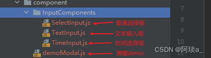
在项目里创建一个文件夹,文件夹下放封装好的input组件框。
在这些小组件中,如果有的表单需要数据回显,那么就把value属性添加上,然后value的值通过props.itemValue获取,就可以实现数据回显。
文本输入框组件代码
import { Form, Input } from "antd";
import { useEffect, useState } from "react";

export default function TextInput(props) {
    const [value, setValue] = useState(props.itemValue);
    return (
        <Form.Item
            label={props.label}
            labelCol={{span: props.span, offset: props.offset}}
            labelAlign={"left"}
        >
            <Input
                placeholder={props.placeholder}
                disabled={props.disabled}
                value={props.itemValue}
                name={props.name}
                style={{width: props.width}}
                onChange={(e) => {
                    let inputValue = e.target.value;
                    let name = props.name;
                    setValue(() => inputValue);
                    props.callBack && props.callBack(inputValue, name);
                }}
            ></Input>
        </Form.Item>
    );
}
选择框组件代码
import {Form, Select} from "antd";
import {useEffect, useState} from "react";

export default function SelectInput(props) {
    const [value, setValue] = useState(props.itemValue || "");
    return (
        <Form.Item
            label={props.label}
            labelCol={{span: props.span, offset: props.offset}}
            labelAlign={"left"}
        >
            <Select
                placeholder={props.placeholder}
                options={[
                    {
                        value: 'beijing',
                        label: '北京',
                        id: '1'
                    },
                    {
                        value: 'shanghai',
                        label: '上海',
                        id: '2'
                    },
                    {
                        value: 'hangzhou',
                        label: '杭州',
                        id: '3'
                    }
                ]}
                style={{width: props.width}}
                value={props.itemValue?props.itemValue:null}
                onChange={(value, option) => {
                    let name = props.name;
                    setValue(() => option);
                    props.callBack && props.callBack(option, name);
                }}
            ></Select>
        </Form.Item>
    );
}
select框里面的数据我在demo里是写死的,一般来说这里的options数据是需要后端返给我们的,我们可以在配置项里加上对应请求来的数据,然后同样的方法,通过eval转换成表达式,传递给select组件。写法如下:


日期选择框组件
import { DatePicker, Form } from "antd";
import moment from "moment";
import { useEffect, useState } from "react";

export default function TimeInput(props) {
    const [value, setValue] = useState(props.itemValue);
    return (
        <Form.Item
            label={props.label}
            labelCol={{ span: props.span, offset: props.offset }}
            labelAlign={"left"}
        >
            <DatePicker
                placeholder={props.placeholder}
                style={{ width: props.width }}
                disabled={props.disabled}
                name={props.name}
                format={"YYYY-MM-DD"}
                // value={props.itemValue ? moment(props.itemValue) : ""}
                allowClear={true}
                onChange={(date, dateString) => {
                    console.log(moment(date).format('YYYY-MM-DD HH:mm:ss'));
                    let dateTime = date ? moment(date).format('YYYY-MM-DD HH:mm:ss') : "";
                    let name = props.name;
                    setValue(() => dateTime);
                    props.callBack && props.callBack(dateTime, name);
                }}
            />
        </Form.Item>
    );
}
按照以上的写法,就可以实现一个受控的表单,有多少个输入框,对应的配置项就写多少个就可以了。


可以看到点击ok后,打印的information对象中字段的数据都拿到了,而且select传过来了一个对象,并不是value,time也是预期的格式。
如果有更好的方法和建议,欢迎分享评论沟通。


 951
951


 被折叠的 条评论
为什么被折叠?
被折叠的 条评论
为什么被折叠?
 到【灌水乐园】发言


