


文章目录
更多相关内容可查看
常用API
全局对象是: wx,所有的 API 都保存在wx对象中
消息交互
 wx.showToast({
      title: '成功',
      icon: 'success',
      duration: 2000
    })
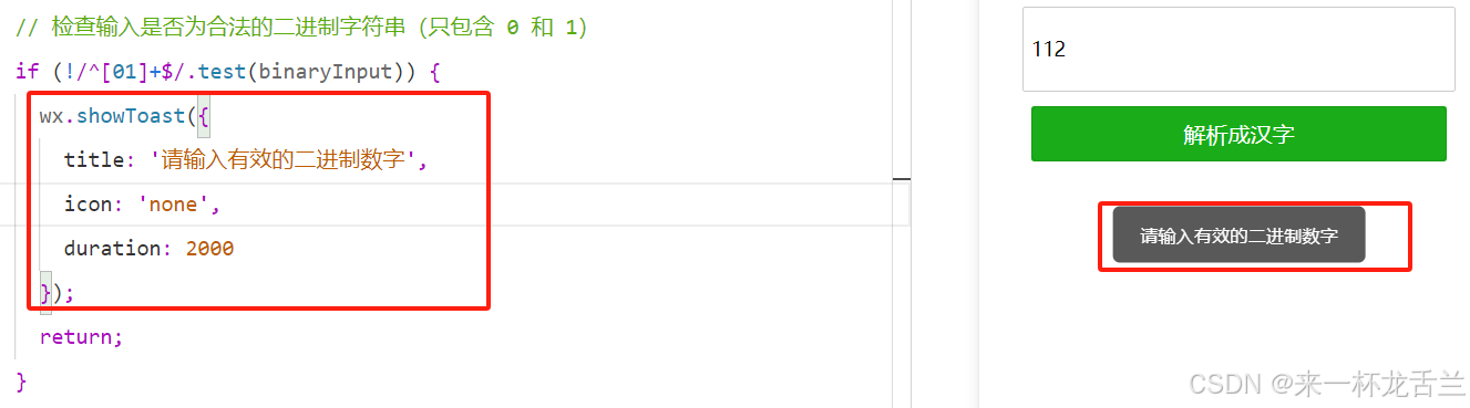
图示:
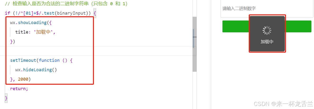
消息加载
小提示:要主动关闭-hideloading
wx.showLoading({
  title: '加载中',
})

setTimeout(function () {
  wx.hideLoading()
}, 2000)
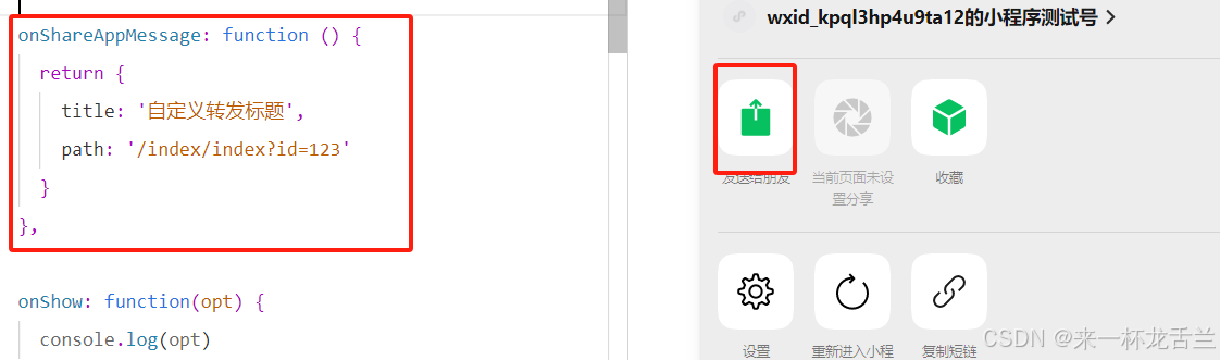
转发给朋友
onShareAppMessage
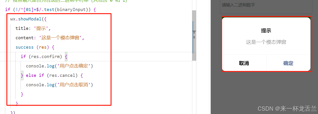
模态对话框
wx.showModal({
  title: '提示',
  content: '这是一个模态弹窗',
  success (res) {
    if (res.confirm) {
      console.log('用户点击确定')
    } else if (res.cancel) {
      console.log('用户点击取消')
    }
  }
})
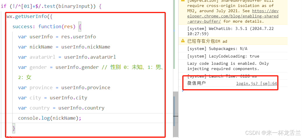
获取用户信息
wx.getUserInfo({
  success: function(res) {
    var userInfo = res.userInfo
    var nickName = userInfo.nickName
    var avatarUrl = userInfo.avatarUrl
    var gender = userInfo.gender // 性别 0:未知、1:男、2:女
    var province = userInfo.province
    var city = userInfo.city
    var country = userInfo.country
  }
})
调起客户端扫码界面
// 允许从相机和相册扫码
wx.scanCode({
  success (res) {
    console.log(res)
  }
})

// 只允许从相机扫码
wx.scanCode({
  onlyFromCamera: true,
  success (res) {
    console.log(res)
  }
})
这里电脑会弹出文件夹
发起支付
wx.requestPayment({
  timeStamp: '',
  nonceStr: '',
  package: '',
  signType: 'MD5',
  paySign: '',
  success (res) { },
  fail (res) { }
})
获取位置
wx.getLocation({
 type: 'wgs84',
 success (res) {
   const latitude = res.latitude
   const longitude = res.longitude
   const speed = res.speed
   const accuracy = res.accuracy
 }
})
更多的api都在官方可直接copy使用,这里是给一些没用过的朋友简单做一下示范帮助大家更好的阅读文档
自定义组件
我的理解是相当于在页面中有一小块是封装好的直接拿过来用
创建自定义组件
类似于页面,一个自定义组件由 json wxml wxss js 4个文件组成的component。看下面的代码知道怎么走的就行
component代码
json文件用来说明自己是一个组件代码
{
  "component": true
}
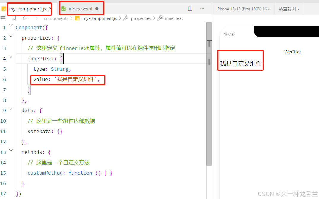
js文件来构建这个组件的内容、数据、方法
//js文件
Component({
  properties: {
    // 这里定义了innerText属性,属性值可以在组件使用时指定
    innerText: {
      type: String,
      value: '我是自定义组件',
    }
  },
  data: {
    // 这里是一些组件内部数据
    someData: {}
  },
  methods: {
    // 这里是一个自定义方法
    customMethod: function () { }
  }
})
wxml文件使用这个组件的内容、数据、方法
<!-- 这是自定义组件的内部WXML结构 -->
<view class="inner">
  {{innerText}}
</view>
<slot></slot>
使用自定义组件
调用component的代码
json文件用来引用组件
{
  "usingComponents": {
    "my-component": "/components/my-component"
  }
}
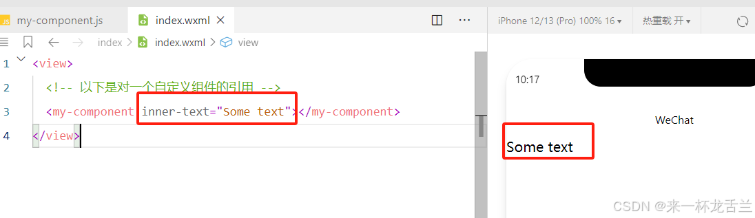
wxml文件用来使用组件
<view>
  <!-- 以下是对一个自定义组件的引用 -->
  <my-component></my-component>
</view>
wxss用来定义组件的样式
.intro {
  margin: 30px;
  text-align: center;
}
图示
个人理解:这就是创建组件使用组件的整体流程,万变不离其宗,要注意 调用者的优先级大于组件的优先级,例如:
组件生命周期
组件的生命周期,指的是组件自身的一些函数,这些函数在特殊的时间点或遇到一些特殊的框架事件时被自动触发( created attached detached )。
- 组件实例刚刚被创建好时, created 生命周期被触发。此时,组件数据 this.data 就是在 Component构造器中定义的数据 data 。 此时还不能调用 setData 。 通常情况下,这个生命周期只应该用于给组件 this添加一些自定义属性字段。
- 在组件完全初始化完毕、进入页面节点树后, attached 生命周期被触发。此时, this.data已被初始化为组件的当前值。这个生命周期很有用,绝大多数初始化工作可以在这个时机进行。
- 在组件离开页面节点树后, detached 生命周期被触发。退出一个页面时,如果组件还在页面节点树中,则 detached 会被触发
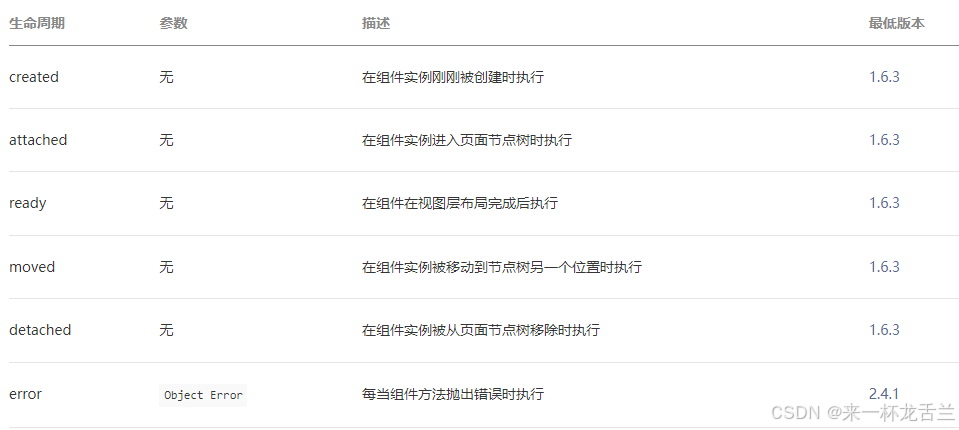
组件所在页面的生命周期
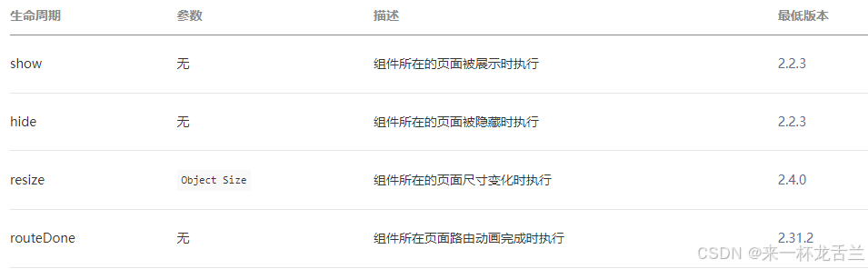
还有一些特殊的生命周期,它们并非与组件有很强的关联,但有时组件需要获知,以便组件内部处理。这样的生命周期称为“组件所在页面的生命周期”,在 pageLifetimes 定义段中定义。其中可用的生命周期包括:
Component({
  pageLifetimes: {
    show: function() {
      // 页面被展示
    },
    hide: function() {
      // 页面被隐藏
    },
    resize: function(size) {
      // 页面尺寸变化
    }
  }
})
页面实现
这里简单的自己做了几个页面,功能不复杂不会劝退,直接copy即可
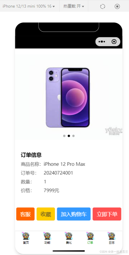
淘宝订单简化页面
js页面
// index.js
Page({
  data: {
    imgUrls: [
      '/static/images/a.png',
      '/static/images/b.png',
      '/static/images/c.png'
    ],
    indicatorDots: true,
    autoplay: true,
    interval: 5000,
    duration: 1000,

    binaryInput: '', // 用户输入的二进制字符串
    result: '', // 解析后的汉字结果
  },

  // 输入框内容改变时触发
  inputChange: function(e) {
    this.setData({
      binaryInput: e.detail.value.trim(), // 获取用户输入并去除首尾空格
    });
  },

  // 解析二进制为汉字
  parseBinary: function() {
    let binaryInput = this.data.binaryInput;

    // 检查输入是否为合法的二进制字符串(只包含 0 和 1)
    if (!/^[01]+$/.test(binaryInput)) {
      wx.showToast({
        title: '请输入有效的二进制数字',
        icon: 'none',
        duration: 2000
      });
      return;
    }

    // 调用解析函数,这里假设有一个 parseBinaryToChinese 的函数来实现解析
    let result = parseBinaryToChinese(binaryInput);

    console.log('aaaaa');
    // 更新页面显示结果
    this.setData({
      result: result,
    });
    console.log('bbbb');
  }
});
// 解析二进制字符串为汉字的函数
function parseBinaryToChinese(binaryString) {
  // 拆分成每8位一组
  let chunks = binaryString.match(/.{8}/g);

  // 将每组二进制转换成十进制数再转换成字符
  let result = chunks.map(chunk => String.fromCharCode(parseInt(chunk, 2))).join('');

  return result;
}
wxml页面
<!-- index.wxml -->
<view class="container">
  <view class="navigation-bar">
    <!-- 导航栏的内容 -->
    <text class="navbar-title">美化页面</text>
  </view>


  <view class="swiper-container">
    <swiper class="swiper" indicator-dots="{{indicatorDots}}" autoplay="{{autoplay}}" interval="{{interval}}" duration="{{duration}}">
      <block wx:for="{{imgUrls}}" wx:key="index">
        <swiper-item>
          <image src="{{item}}" class="slide-image" mode="aspectFill"></image>
        </swiper-item>
      </block>
    </swiper>
  </view>

  <view class="input-container">
    <input class="input" placeholder="请输入二进制数字" bindinput="inputChange" />
    <button class="button" bindtap="parseBinary">解析成汉字</button>
  </view>

  <view class="result">{{ result }}</view>
</view>
wxss页面
/* index.wxss */
.container {
  display: flex;
  flex-direction: column;
  justify-content: flex-start;
  align-items: center;
  height: 100vh; /* 设置容器高度为整个视口高度,确保页面铺满 */
}

.navigation-bar {
  width: 100%;
  background-color: #333; /* 导航栏背景色 */
  color: #fff; /* 导航栏文字颜色 */
  text-align: center;
  position: fixed; /* 导航栏固定在页面顶部 */
  top: 0;
  z-index: 1000; /* 确保导航栏在页面顶部 */
}

.swiper-container {
  width: 100%;
  overflow: hidden;
  margin-top: 0; /* 取消轮播图容器的顶部间距 */
}

.swiper {
  width: 100%;
  height: 200px; /* 调整轮播图高度 */
}

.slide-image {
  width: 100%;
  height: 100%;
  border-radius: 10px;
}

.result {
  margin-top: 20px; /* 调整结果显示区域与输入框区域的间距 */
  text-align: center;
}

.input-container {
  width: 80%;
  display: flex;
  margin-top: 20px;
  flex-direction: column;
  align-items: center;
  margin-bottom: 20px;
}

.input {
  width: 100%;
  height: 40px;
  margin-bottom: 10px;
  font-size: 14px;
  padding: 10px;
  border: 1px solid #ccc;
  border-radius: 5px;
}

.button {
  cursor: pointer;
  font-size: large;
  font-family: inherit;
  font-weight: bold;
  color: #0011ff;
  background-color: #f8f8fd;
  padding: 0.8em 2.2em;
  border-radius: 50em;
  border: 6px solid #8b93f8;
  box-shadow: 0px 8px #1f35ff;
}
.button:active {
  position: relative;
  top: 8px;
  border: 6px solid #646fff;
  box-shadow: 0px 0px;
}
效果图
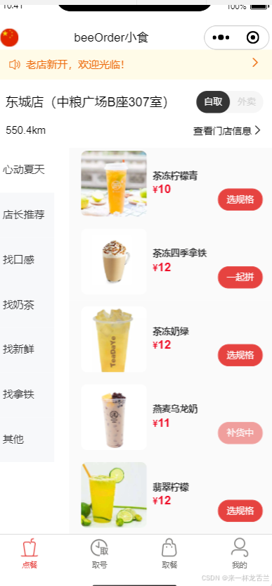
饮品订单简化页面
这里直接附源码地址了:gitee
图示
本篇总结
因个人能力尚浅,没写很复杂很难得东西怕解释错误,这里也是带朋友们一起对整体框架有所了解,以便大家更容易上手及阅读代码
这里附两个个好用的免费网站,很实用哦!


 522
522

 被折叠的 条评论
为什么被折叠?
被折叠的 条评论
为什么被折叠?
 到【灌水乐园】发言


