


一 概述
本文介绍几种进度条组件:
- LinearProgressIndicator:水平进度指示器
- CircularProgressIndicator :圆形进度条
- CupertinoActivityIndicator:ios风格的指示器,不能设置进度,只能一直转“菊花”
- RefreshProgressIndicator :刷新指示器,通常用于下拉刷新
二 LinearProgressIndicator
2.1 说明
- 水平进度指示器
value的值范围是0-1- value未设置值前是动态的,设置后,为固定值
2.2 构造方法
 const LinearProgressIndicator({
    Key? key,
    double? value,
    Color? backgroundColor,
    Animation<Color?>? valueColor,
    this.minHeight,
    String? semanticsLabel,
    String? semanticsValue,
  })
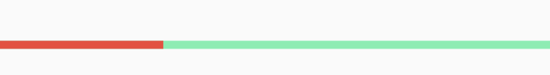
2.3 示例
代码
LinearProgressIndicator(
              value: 0.3,
              backgroundColor: Colors.greenAccent,
              valueColor: AlwaysStoppedAnimation<Color>(Colors.red),
            )
效果图
三 CircularProgressIndicator
3.1 说明
- CircularProgressIndicator 是圆形进度条
value的值范围是0-1- value未设置值前是动态的,设置后,为固定值
3.2 构造函数
 const CircularProgressIndicator({
    Key? key,
    double? value,
    Color? backgroundColor,
    Animation<Color?>? valueColor,
    this.strokeWidth = 4.0,
    String? semanticsLabel,
    String? semanticsValue,
  })
3.3 示例
代码
 CircularProgressIndicator(
              value: 0.3,
              backgroundColor: Colors.greenAccent,
              valueColor: AlwaysStoppedAnimation<Color>(Colors.red),
            ),
效果图

四 CupertinoActivityIndicator
4.1 说明
- CupertinoActivityIndicator是ios风格的指示器
- CupertinoActivityIndicator不能设置进度,只能一直转“菊花”
radius参数是半径,值越大,控件越大
4.2 构造函数
 const CupertinoActivityIndicator({
    Key? key,
    this.animating = true,
    this.radius = _kDefaultIndicatorRadius,
  })
4.3 示例
代码
 CupertinoActivityIndicator(
              radius: 10,
            )
效果图

五 RefreshProgressIndicator
5.1 说明
RefreshProgressIndicator 是刷新指示器,通常用于下拉刷新
5.2 构造函数
const RefreshProgressIndicator({
    Key? key,
    double? value,
    Color? backgroundColor,
    Animation<Color?>? valueColor,
    double strokeWidth = 2.0, // Different default than CircularProgressIndicator.
    String? semanticsLabel,
    String? semanticsValue,
  })
5.3 示例
代码
 RefreshProgressIndicator(
              backgroundColor: Colors.greenAccent,
              valueColor: AlwaysStoppedAnimation<Color>(Colors.red),
              strokeWidth: 5.0,
            )
效果图


 2379
2379

 被折叠的 条评论
为什么被折叠?
被折叠的 条评论
为什么被折叠?
 到【灌水乐园】发言


