


 本文介绍了如何使用Python的pandas库从电子表格中导入数据,然后利用matplotlib库绘制折线图展示博客的数据变化,包括阅读量、评论数、粉丝数和收藏数,并设置了中文标签和特定的x轴角度。
一、需求场景
- 导入电子表格数据
- 展现折线图
import pandas as pd
import matplotlib.pyplot as plt
import matplotlib

# 读取电子表格数据
df = pd.read_excel("E:\\testData\\data_blog.xlsx")

# 设置默认字体为中文字体,如黑体
matplotlib.rcParams['font.family'] = 'SimHei'

# 设置x轴刻度标签的角度
plt.xticks(rotation=45)

# 设置图形标题和坐标轴标签
plt.title("博客访问数据折线图")

# 绘制折线图
plt.plot(df['日期'],df['阅读量'], label='阅读量')
plt.plot(df['日期'],df['评论数'], label='评论数')
plt.plot(df['日期'],df['粉丝数'], label='粉丝数')
plt.plot(df['日期'],df['收藏数'], label='收藏数')

# 添加图例
plt.legend()

# 显示图形
plt.show()
二、运行效果
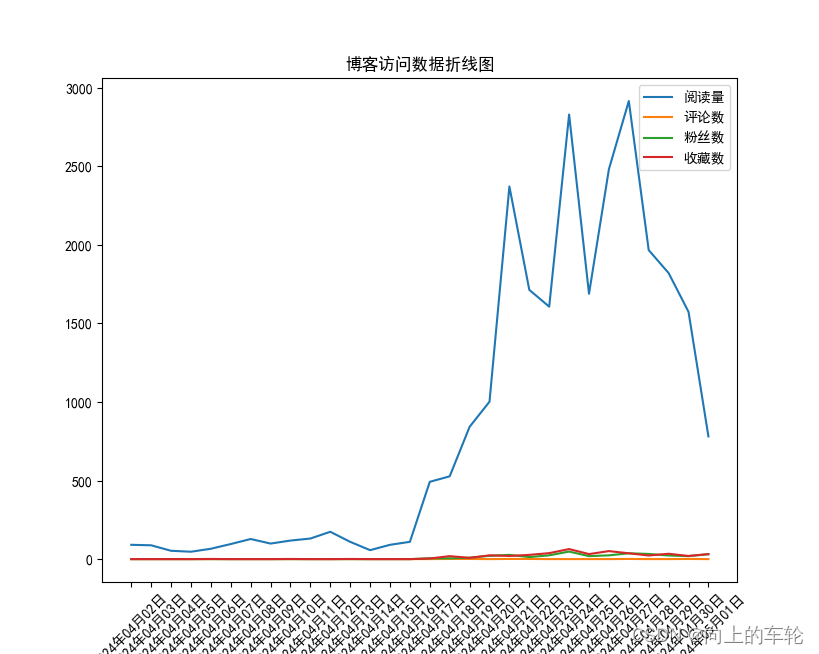
日期 阅读量 评论数 粉丝数 收藏数 2024年04月02日 91 0 0 0 2024年04月03日 88 0 0 0 2024年04月04日 53 0 0 0 2024年04月05日 47 0 0 0 2024年04月06日 66 0 0 1 2024年04月07日 96 0 0 0 2024年04月08日 128 0 0 0 2024年04月09日 99 0 0 0 2024年04月10日 118 0 0 1 2024年04月11日 131 0 0 0 2024年04月12日 174 0 0 0 2024年04月13日 110 0 0 1 2024年04月14日 57 0 0 0 2024年04月15日 91 0 0 0 2024年04月16日 110 0 0 0 2024年04月17日 492 0 5 4 2024年04月18日 527 1 5 19 2024年04月19日 842 1 9 8 2024年04月20日 1002 0 21 24 2024年04月21日 2372 1 27 20 2024年04月22日 1714 1 13 27 2024年04月23日 1607 0 24 38 2024年04月24日 2830 0 48 64 2024年04月25日 1689 0 19 32 2024年04月26日 2482 0 24 51 2024年04月27日 2916 1 37 37 2024年04月28日 1967 0 33 23 2024年04月29日 1821 0 23 34 2024年04月30日 1574 1 19 20 2024年05月01日 781 0 31 32
三、知识点
导入电子表格
# 读取电子表格数据
df = pd.read_excel("E:\\testData\\data_blog.xlsx")
绘制图形
pyplot — Matplotlib 2.0.2 documentation https://matplotlib.org/2.0.2/api/pyplot_api.html
# 设置x轴刻度标签的角度
plt.xticks(rotation=45)
# 绘制折线图
plt.plot(df['日期'],df['阅读量'], label='阅读量')
plt.plot(df['日期'],df['评论数'], label='评论数')
plt.plot(df['日期'],df['粉丝数'], label='粉丝数')
plt.plot(df['日期'],df['收藏数'], label='收藏数')
设置中文字体显示
# 设置默认字体为中文字体,如黑体
matplotlib.rcParams['font.family'] = 'SimHei'


 2177
2177

 被折叠的 条评论
为什么被折叠?
被折叠的 条评论
为什么被折叠?
 到【灌水乐园】发言


