


- 上一篇写到实现该组件的核心思考,主要是要得出每个时间节点位置,再放到相应的位置上。
- 本篇目标:将相应的元素放到页面的正确位置,代码在文章最后
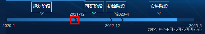
(最终实现效果)
- 实现前提:通过上篇 setPosition(timeArr) 函数已经得出:
-
intervalArr: 每个时间节点占总时间长度的占比数组,
-
betweenToday: 当前进度时间节点在总时间长度中的占比,
-
cardPosition: 阶段标题所在位置数组
- 页面实现思路:
- 创建一层底层div填充底色
- 当前进度时间节点div填充亮色
- 红框圈出来的小图标和时间节点通过定位放到轴上,定位的位置以算出来的占比乘以轴的长度。当然如果没有小图标自己纯手工画也可以,就是css多写点,多画点三角形。
- 创建阶段小标题div,同步骤三一样将其定位到页面的具体位置
- 遇到的一些问题和思考:
0、优化思考:把太多的关于位置的计算放在了html代码里,其实在前面的setPosition(timeArr)函数中可以多做一步,直接将位置数据计算出来,而不是只做占比计算,可以节省一点页面资源吧。
1、当两个时间节点间隔很近的时候,这个时候文字在页面的渲染会重叠,给用户感官不好,需要优化兼容。
像这样: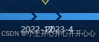
解决思考:比如:在计算的时候就判断一下彼此的距离,如果太近返回一个最小值,以确保最后渲染每个时间文字的渲染有足够的位置。或者,让时间文字一个在轴上方一个在下方,直接错开,这个方法比较简单,我使用的也是这个方法。
2、小标题上的小三角形是个线框,不是实心的。
没想到别的办法,只好先画一个大一点的三角形在画一个小一点的三角形去覆盖实现线框的效果,如果有好的方法欢迎赐教。
我最开始使用的是伪元素去搞,后来发现伪元素并不好动态控制颜色,我们没有办法直接选中伪元素改变它的样式,只能新增伪元素来覆盖样式。具体可以看看这个:JavaScript修改CSS伪元素:after和:before的样式_css怎么在行内样式里改::before的属性-CSDN博客
最终选择的还是自己写一个triangle的div,好控制样式。如果有别的思路也欢迎探讨。
3、前面在写实现的计算函数的时候,我发现我的小标题卡片始终不在中间位置上,有所偏移。我以为是我的计算思路哪个地方有点偏差。后序测了一遍代码,发现其实是卡片本身有宽度,在对卡片定位的时候不能单纯只依靠时间计算出来的占比,还得和该元素的自宽有关,这是值得注意的一点。
 <!-- 阶段小标题 -->
<div
     v-for="(item, j) in timeLine.cardPosition"
     :key="j"
     class="card"
     :style="{
     left: `${item * props.barWidth - 30}px`,
          zIndex: j + 1,
          borderColor: cardData[j]?.color
     }"
     :title="cardData[j]?.title"
>
</div>具体HTML和CSS代码参考如下:
<div class="progress-bar" :style="{ width: `${props.barWidth ? props.barWidth : 500}px` }">
    <!-- 底色层 -->
    <div
        class="bottom-layer"
        :style="{ width: `${props.barWidth ? props.barWidth : 500}px`, ...props.position }"
    >
        <!-- 当前进度亮色层 -->
        <div
            class="color-layer"
            :style="{ width: `${props.barWidth * timeLine.betweenToday}px` }"
        ></div>
    </div>
    <!-- 循环渲染时间节点,用计算得出的数据动态的将每个时间节点放到相应的位置上 -->
    <!-- 箭头icon -->
    <div
        v-for="(item, i) in timeLine.intervalArr"
        :class="['icon', i > 0 && i < timeLine.intervalArr.length - 1 ? 'bg' : '']"
        :key="i"
        :style="{ left: `${item * props.barWidth}px` }"
    >
        <!-- 时间文字 -->
        <div :class="['time', i % 2 ? 'above' : 'below']">
            {{ props.date[i] }}
        </div>
    </div>
    <!-- 阶段小标题 -->
    <div
        v-for="(item, j) in timeLine.cardPosition"
        :key="j"
        class="card"
        :style="{
            left: `${item * props.barWidth - 30}px`,
            zIndex: j + 1,
            borderColor: cardData[j]?.color
        }"
        :title="cardData[j]?.title"
    >
        <!-- 小标题上的三角形 -->
        <div class="triangle" :style="{ borderTopColor: cardData[j]?.color }"></div>
        {{ cardData[j]?.title }}
    </div>
</div>
.progress-bar {
position: relative;
margin-top: 50px;
.bottom-layer {
position: absolute;
top: 0;
// right: 0;
float: right;
// width: 436px;
height: 10px;
background-color: #103c6a;
}
.color-layer {
position: absolute;
top: 0;
left: 0;
// width: 309px;
height: 10px;
background: linear-gradient(90deg, rgba(68, 169, 255, 0.3) 0%, #44a9ff 100%);
}
.icon {
position: absolute;
top: 0;
width: 9px;
height: 10px;
z-index: 1;
.time {
position: absolute;
left: -15px;
width: 56px;
font-family:
PingFangSC,
PingFang SC;
font-weight: 400;
font-size: 12px;
color: rgba(255, 255, 255, 0.7);
line-height: 17px;
text-align: left;
}
.above {
bottom: 15px;
}
.below {
top: 15px;
}
}
.card {
position: absolute;
bottom: 20px;
display: inline-block;
width: 65px;
height: 35px;
border: 1px solid red;
text-align: center;
padding: 3px;
.triangle {
position: absolute;
width: 0;
height: 0;
top: 33px;
left: 25px;
border-top: solid 9px transparent;
border-right: solid 7px transparent;
border-left: solid 7px transparent;
}
}
.card::after {
position: absolute;
content: '';
width: 0;
height: 0;
top: 33px;
left: 27px;
border-top: solid 7px #073864;
border-right: solid 5px transparent;
border-left: solid 5px transparent;
}
.bg {
background: url('@/assets/images/right-icon.png') no-repeat;
}
}


 扫一扫
扫一扫


 1190
1190

 被折叠的 条评论
为什么被折叠?
被折叠的 条评论
为什么被折叠?
 到【灌水乐园】发言


