


 本文详述如何使用ECharts动态渲染横向堆叠条形图,包括动态设置高度、颜色,以及在条形图末尾添加合计数字。通过代码示例展示了数据处理和图表配置的全过程。
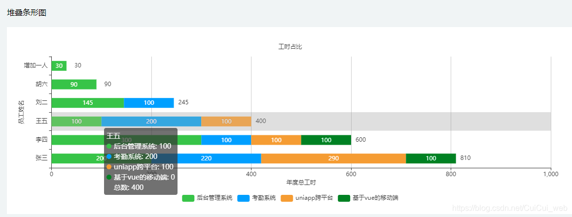
本文主要是针对横向堆叠条形图进行讲解。包含了末尾增加合计数字,以及动态渲染数据,根据数据不同来动态展示高度,以及动态设置color等。下面先看一下效果图:
html部分代码:
<div style="margin:20px 0;">堆叠条形图</div>
    <div style="background: #fff;padding-bottom: 20px;" :style="{height: statusChartList.yAxis.length*60+'px'}" >
      <div id="statusChart" style="height:100%;margin:0 auto;"></div>
    </div>
通过计算的方式动态设置高度,根据返回的数据来计算::style="{height: statusChartList.yAxis.length*60+'px'}"
本文是用假数据展示,数据格式如下:
statusChartList:{
          projectName:['后台管理系统','考勤系统','uniapp跨平台','基于vue的移动端'], // 横坐标
          yAxis:['张三','李四','王五','刘二','胡六','增加一人'], // 纵坐标
          projectNum:[
            [200,300,100,145,90,30], // 第一个项目对应的纵坐标数据
            [220,100,200,100,0,0], // 第二个项目对应的纵坐标数据
            [290,100,100,0,0,0],// 第三个项目对应的纵坐标数据
            [100,100,0,0,0,0],// 第四个项目对应的纵坐标数据
            // 第n个项目对应的纵坐标数据
          ],
          color:['#67C23A','#409EFF','#E5A038','green'], // 颜色设置
          all:[810,600,400,245,90,30] // 针对 projectNum每一项里面的第i个元素之和 === all数组中的第i项
        }
绘制部分代码:(动态渲染+自定义动态color看代码一目了然)
getStatusChart(){
        const myChart = echarts.init(document.getElementById("statusChart"));
        let series = [];
        // 遍历二维数组
        this.statusChartList.projectNum.forEach((v,index)=>{
         var object =  {
             name:  this.statusChartList.projectName[index],
             type: 'bar',
             stack: '总量',
             barWidth : 20,//柱图宽度

             itemStyle:{
               normal:{
                 color:this.statusChartList.color[index] // 设置柱状颜色
               }
             },
             label: {
               show: true,
               position: 'insideTop',
               formatter: this.zero_format()
             },
             data: v
           }
          series.push(object)
        });
        let all = {
          name:  '总数',
          type: 'bar',
          stack: '',
          barWidth : 20,//柱图宽度
          itemStyle:{
            normal:{
              color:"transparent" // 设置柱状颜色
            }
          },

          label: {
            show: true,
            position: 'insideRight',
            formatter: this.zero_format(),
            color:"#363636",
            distance:-30 // 文字距离图形元素的距离
          },
          // z:-1,
          barGap:"-100%",
          data: this.statusChartList.all
        }
        series.push(all)
        myChart.setOption({
          title:{
            show:true,
            text:'工时占比',
            textStyle:{
              fontSize:12,
              color:"#363636",
              fontWeight:500
            },
            left:"center",
            top:30
          },
          tooltip: {
            trigger: 'axis',
            axisPointer: {            // 坐标轴指示器,坐标轴触发有效
              type: 'shadow'        // 默认为直线,可选为:'line' | 'shadow'
            }
          },
          legend: {
            data: this.statusChartList.projectName,
            selectorPosition:"end",
            y: 'bottom',    //延Y轴居中
            x: 'center', //居右显示
          },
          grid: {
            left: '3%',
            right: '4%',
            bottom: '15%',
            containLabel: true,
          },
          xAxis: {
            type: 'value',
            name:'年度总工时',
            nameLocation:'center',
            nameGap:25 // 横名称与横坐标轴的距离
          },
          yAxis: {
            type: 'category',
            // data: ['周一', '周二', '周三', '周四', '周五', '周六', '周日']
            data: this.statusChartList.yAxis,
            name:'员工姓名', //纵名称
            nameLocation:'center', // 纵名称的位置,居中显示
            nameGap:55 // 纵名称与纵坐标轴的距离
          },
          series:series
        })
      }
下面拆解讲解以下,求和部分的代码是:
let all = {
          name:  '总数',
          type: 'bar',
          stack: '',  // 这里一定要清空
          barWidth : 20,
          itemStyle:{
            normal:{
              color:"transparent" // 设置柱状颜色为透明色,不然他会有背景色,如果设置为白色,他会覆盖网格
            }
          },

          label: {
            show: true,
            position: 'insideRight', // 这里的位置需要insideRight或者top才能设置 distance
            formatter: this.zero_format(),
            color:"#363636",
            distance:-30 // 设置这个距离,是把求和的数字往右移动
          },
          barGap:"-100%", // 重叠求和柱子与最后一个柱子
          data: this.statusChartList.all
        }
        series.push(all)
stack 如果不清空,那么求和柱子会根据自己的数量来占位置;
barGap:"-100%", 设置柱子进行重叠,如果不设置,求和柱子就会在其他柱子下面,设置之后,数字会显示在其他柱子上面;
label.position=‘insideRight’,设置内容显示在其他柱子上面的末尾处
label.distance=“-30” // 设置这个距离,是把求和的数字往右移动


 1319
1319

 被折叠的 条评论
为什么被折叠?
被折叠的 条评论
为什么被折叠?
 到【灌水乐园】发言


