


 本文介绍了一个Vue3的文字提示(Tooltip)组件实现方法,包括如何自定义提示框的各种样式属性,如最大宽度、字体大小、颜色等,并提供了在线预览示例。
可自定义设置以下属性:
-
文字提示最大宽度(maxWidth),类型:string | number,单位 px,默认 240
-
展示的内容(content),类型:string | slot,默认 undefined
-
设置展示内容的类名(contentClass),类型:string,默认 undefined
-
设置展示内容的样式(contentStyle),类型:CSSProperties,默认 {}
-
文字提示内容(tooltip),类型:string | slot,undefined
-
设置文字提示的类名(tooltipClass),类型:string,默认 undefined
-
设置文字提示的样式(tooltipStyle),类型:CSSProperties,默认 {}
-
文字提示框背景颜色(bgColor),类型:string,默认 'rgba(0, 0, 0, 0.85)'
-
是否显示箭头(arrow),类型:boolean,默认 true
-
文字提示位置(placement),类型:'top' | 'bottom' | 'left' | 'right',默认 'top'
-
文字提示被浏览器窗口或最近可滚动父元素遮挡时自动调整弹出位置(flip),类型:boolean,默认 true
-
文字提示触发方式(trigger),类型:'hover' | 'click',默认 'hover'
-
是否支持按键操作(keyboard) (enter 显示;esc 关闭),仅当 trigger: 'click' 时生效,类型:boolean,默认 false
-
文字提示动画的过渡持续时间(transitionDuration),类型:number, 单位 ms,默认 100
-
文字提示显示的延迟时间(showDelay),类型:number,单位 ms,默认 100
-
文字提示隐藏的延迟时间(hideDelay),类型:number,单位 ms,默认 100
-
文字提示是否显示(v-model:show),类型:boolean,默认 false
-
只使用 show 属性控制显示隐藏(showControl),类型:boolean,默认 false;仅当 trigger: hover 时生效,此时移入移出将不会触发显示隐藏,全部由 show 属性控制
效果如下图:
在线预览
①创建提示框组件Tooltip.vue:
其中引入使用了以下工具函数:
- 监听插槽存在 useSlotsExist
- DOM监听 useMutationObserver
- 事件监听 useEventListener
- 使用requestAnimationFrame模拟实现setTimeout和setInterval
- 监听DOM尺寸 useResizeObserver
<script setup lang="ts">
import { ref, computed, watch, nextTick, onMounted, onBeforeUnmount } from 'vue'
import type { CSSProperties } from 'vue'
import {
  useSlotsExist,
  useMutationObserver,
  useEventListener,
  useResizeObserver,
  rafTimeout,
  cancelRaf
} from 'components/utils'
export interface Props {
  maxWidth?: string | number // 文字提示最大宽度,单位 px
  content?: string // 展示的内容 string | slot
  contentClass?: string // 设置展示内容的类名
  contentStyle?: CSSProperties // 设置展示内容的样式
  tooltip?: string // 文字提示内容 string | slot
  tooltipClass?: string // 设置文字提示的类名
  tooltipStyle?: CSSProperties // 设置文字提示的样式
  bgColor?: string // 文字提示框背景颜色
  arrow?: boolean // 是否显示箭头
  placement?: 'top' | 'bottom' | 'left' | 'right' // 文字提示位置
  flip?: boolean // 文字提示被浏览器窗口或最近可滚动父元素遮挡时自动调整弹出位置
  trigger?: 'hover' | 'click' // 文字提示触发方式
  keyboard?: boolean // 是否支持按键操作 (enter 显示;esc 关闭),仅当 trigger: 'click' 时生效
  transitionDuration?: number // 文字提示动画的过渡持续时间,单位 ms
  showDelay?: number // 文字提示显示的延迟时间,单位 ms
  hideDelay?: number // 文字提示隐藏的延迟时间,单位 ms
  show?: boolean // (v-model) 文字提示是否显示
  showControl?: boolean // 只使用 show 属性控制显示隐藏,仅当 trigger: hover 时生效,此时移入移出将不会触发显示隐藏,全部由 show 属性控制
}
const props = withDefaults(defineProps<Props>(), {
  maxWidth: 240,
  content: undefined,
  contentClass: undefined,
  contentStyle: () => ({}),
  tooltip: undefined,
  tooltipClass: undefined,
  tooltipStyle: () => ({}),
  bgColor: 'rgba(0, 0, 0, 0.85)',
  arrow: true,
  placement: 'top',
  flip: true,
  trigger: 'hover',
  keyboard: false,
  transitionDuration: 100,
  showDelay: 100,
  hideDelay: 100,
  show: false,
  showControl: false
})
const tooltipShow = ref<boolean>(false) // tooltip 显示隐藏标识
const tooltipTimer = ref() // tooltip 延迟显示隐藏的定时器标识符
const scrollTarget = ref<HTMLElement | null>(null) // 最近的可滚动父元素
const top = ref<number>(0) // 提示框 top 定位
const left = ref<number>(0) // 提示框 left 定位
const tooltipPlace = ref<string>('top') // 文字提示位置
const contentRef = ref() // 声明一个同名的模板引用
const contentWidth = ref<number>(0) // 展示内容宽度
const contentHeight = ref<number>(0) // 展示内容高度
const tooltipRef = ref() // tooltip 模板引用
const tooltipCardRef = ref() // tooltip-card 模板引用
const tooltipCardWidth = ref<number>(0) // 文字提示内容 tooltip-card 宽度
const tooltipCardHeight = ref<number>(0) // 文字提示内容 tooltip-card 高度
const viewportWidth = ref<number>(document.documentElement.clientWidth) // 视口宽度(不包括滚动条)
const viewportHeight = ref<number>(document.documentElement.clientHeight) // 视口高度(不包括滚动条)
const emits = defineEmits(['update:show', 'openChange', 'animationend'])
const slotsExist = useSlotsExist(['tooltip'])
const tooltipMaxWidth = computed(() => {
  if (typeof props.maxWidth === 'number') {
    return `${props.maxWidth}px`
  }
  return props.maxWidth
})
const showTooltip = computed(() => {
  return slotsExist.tooltip || props.tooltip
})
const tooltipPlacement = computed(() => {
  switch (tooltipPlace.value) {
    case 'top':
      return {
        transformOrigin: `50% ${top.value}px`,
        top: `${-top.value}px`,
        left: `${-left.value}px`
      }
    case 'bottom':
      return {
        transformOrigin: `50% ${props.arrow ? -4 : -6}px`,
        bottom: `${-top.value}px`,
        left: `${-left.value}px`
      }
    case 'left':
      return {
        transformOrigin: `${left.value}px 50%`,
        top: `${-top.value}px`,
        left: `${-left.value}px`
      }
    case 'right':
      return {
        transformOrigin: `${props.arrow ? -4 : -6}px 50%`,
        top: `${-top.value}px`,
        right: `${-left.value}px`
      }
    default:
      return {
        transformOrigin: `50% ${top.value}px`,
        top: `${-top.value}px`,
        left: `${-left.value}px`
      }
  }
})
watch(
  () => [props.placement, props.arrow, props.flip],
  () => {
    updatePosition()
  },
  {
    deep: true
  }
)
watch(
  () => props.show,
  (to) => {
    if (to && !tooltipShow.value) {
      onShow()
    }
    if (!to && tooltipShow.value) {
      onHide()
    }
  },
  {
    immediate: true
  }
)
onMounted(() => {
  observeScroll()
})
onBeforeUnmount(() => {
  cleanup()
})
const mutationObserver = useMutationObserver(
  scrollTarget,
  () => {
    updatePosition()
  },
  { subtree: true, childList: true, attributes: true, characterData: true }
)
useEventListener(window, 'resize', getViewportSize)
// 监听 tooltip-card 和 content 的尺寸变化,更新文字提示位置
useResizeObserver([tooltipCardRef, contentRef], (entries: ResizeObserverEntry[]) => {
  // 排除 tooltip-card 显示过渡动画时的尺寸变化
  if (entries.length === 1 && entries[0].target.className === 'tooltip-card') {
    const { blockSize, inlineSize } = entries[0].borderBoxSize[0]
    if (blockSize === tooltipCardHeight.value && inlineSize === tooltipCardWidth.value) {
      return
    }
  }
  updatePosition()
})
function getViewportSize() {
  viewportWidth.value = document.documentElement.clientWidth
  viewportHeight.value = document.documentElement.clientHeight
  observeScroll() // 窗口尺寸变化时,重新查询并监听最近可滚动父元素
  updatePosition()
}
// 查询并监听最近可滚动父元素
function observeScroll() {
  cleanup()
  scrollTarget.value = getScrollParent(contentRef.value?.parentElement ?? null)
  scrollTarget.value && scrollTarget.value.addEventListener('scroll', updatePosition)
  if (scrollTarget.value === document.documentElement) {
    mutationObserver.start()
  }
}
function cleanup() {
  scrollTarget.value && scrollTarget.value.removeEventListener('scroll', updatePosition)
  scrollTarget.value = null
  mutationObserver.stop()
}
// 查询最近的可滚动父元素
function getScrollParent(el: HTMLElement | null): HTMLElement | null {
  const isScrollable = (el: HTMLElement): boolean => {
    const style = window.getComputedStyle(el)
    if (
      (el.scrollWidth > el.clientWidth && ['scroll', 'auto'].includes(style.overflowX)) ||
      (el.scrollHeight > el.clientHeight && ['scroll', 'auto'].includes(style.overflowY)) ||
      ((el.scrollWidth > el.clientWidth || el.scrollHeight > el.clientHeight) && el === document.documentElement)
    ) {
      return true
    }
    return false
  }
  if (el) {
    return isScrollable(el) ? el : getScrollParent(el.parentElement ?? null)
  }
  return null
}
// 更新文字提示位置
function updatePosition() {
  tooltipShow.value && getPosition()
}
// 计算文字提示位置
async function getPosition() {
  await nextTick()
  contentWidth.value = contentRef.value.offsetWidth
  contentHeight.value = contentRef.value.offsetHeight
  tooltipCardWidth.value = tooltipCardRef.value.offsetWidth
  tooltipCardHeight.value = tooltipCardRef.value.offsetHeight
  if (props.flip) {
    tooltipPlace.value = getPlacement()
  }
  if (['top', 'bottom'].includes(tooltipPlace.value)) {
    top.value = tooltipCardHeight.value + (props.arrow ? 4 + 12 : 6)
    left.value = (tooltipCardWidth.value - contentWidth.value) / 2
  } else {
    top.value = (tooltipCardHeight.value - contentHeight.value) / 2
    left.value = tooltipCardWidth.value + (props.arrow ? 4 + 12 : 6)
  }
}
// 获取可滚动父元素或视口的矩形信息
function getShelterRect() {
  if (scrollTarget.value && scrollTarget.value !== document.documentElement) {
    return scrollTarget.value.getBoundingClientRect()
  }
  return {
    top: 0,
    left: 0,
    bottom: viewportHeight.value,
    right: viewportWidth.value
  }
}
// 文字提示被浏览器窗口或最近可滚动父元素遮挡时自动调整弹出位置
function getPlacement(): string {
  const { top, bottom, left, right } = contentRef.value.getBoundingClientRect() // 内容元素各边缘相对于浏览器视口的位置(不包括滚动条)
  const { top: targetTop, bottom: targetBottom, left: targetLeft, right: targetRight } = getShelterRect() // 滚动元素或视口各边缘相对于浏览器视口的位置(不包括滚动条)
  const topDistance = top - targetTop - (props.arrow ? 12 : 0) // 内容元素上边缘距离滚动元素上边缘的距离
  const bottomDistance = targetBottom - bottom - (props.arrow ? 12 : 0) // 内容元素下边缘距离动元素下边缘的距离
  const leftDistance = left - targetLeft - (props.arrow ? 12 : 0) // 内容元素左边缘距离滚动元素左边缘的距离
  const rightDistance = targetRight - right - (props.arrow ? 12 : 0) // 内容元素右边缘距离滚动元素右边缘的距离
  const horizontalDistance = (tooltipCardWidth.value - contentWidth.value) / 2 // 水平方向容纳文字提示需要的最小宽度
  const verticalDistance = (tooltipCardHeight.value - contentHeight.value) / 2 // 垂直方向容纳文字提示需要的最小高度
  return findPlace(props.placement, [])
  // 查询满足条件的 place,如果没有,则返回默认值
  function findPlace(place: string, disabledPlaces: string[]): string {
    if (place === 'top') {
      if (!disabledPlaces.includes('top')) {
        if (topDistance < tooltipCardHeight.value + (props.arrow ? 4 : 6) && disabledPlaces.length !== 3) {
          return findPlace('bottom', [...disabledPlaces, 'top'])
        } else {
          if (leftDistance >= horizontalDistance && rightDistance >= horizontalDistance) {
            return 'top'
          } else {
            if (disabledPlaces.length !== 3) {
              if (leftDistance >= horizontalDistance) {
                return findPlace('left', ['top', 'bottom', 'right'])
              } else if (rightDistance >= horizontalDistance) {
                return findPlace('right', ['top', 'bottom', 'left'])
              }
            }
          }
        }
      } else {
        if (!disabledPlaces.includes('bottom')) {
          return findPlace('bottom', disabledPlaces)
        } else if (!disabledPlaces.includes('left')) {
          return findPlace('left', disabledPlaces)
        } else {
          return findPlace('right', disabledPlaces)
        }
      }
    } else if (place === 'bottom') {
      if (!disabledPlaces.includes('bottom')) {
        if (bottomDistance < tooltipCardHeight.value + (props.arrow ? 4 : 6) && disabledPlaces.length !== 3) {
          return findPlace('top', [...disabledPlaces, 'bottom'])
        } else {
          if (leftDistance >= horizontalDistance && rightDistance >= horizontalDistance) {
            return 'bottom'
          } else {
            if (disabledPlaces.length !== 3) {
              if (leftDistance >= horizontalDistance) {
                return findPlace('left', ['top', 'bottom', 'right'])
              } else if (rightDistance >= horizontalDistance) {
                return findPlace('right', ['top', 'bottom', 'left'])
              }
            }
          }
        }
      } else {
        if (!disabledPlaces.includes('top')) {
          return findPlace('top', disabledPlaces)
        } else if (!disabledPlaces.includes('left')) {
          return findPlace('left', disabledPlaces)
        } else {
          return findPlace('right', disabledPlaces)
        }
      }
    } else if (place === 'left') {
      if (!disabledPlaces.includes('left')) {
        if (leftDistance < tooltipCardWidth.value + (props.arrow ? 4 : 6) && disabledPlaces.length !== 3) {
          return findPlace('right', [...disabledPlaces, 'left'])
        } else {
          if (topDistance >= verticalDistance && bottomDistance >= verticalDistance) {
            return 'left'
          } else {
            if (disabledPlaces.length !== 3) {
              if (topDistance >= verticalDistance) {
                return findPlace('top', ['left', 'right', 'bottom'])
              } else if (bottomDistance >= verticalDistance) {
                return findPlace('bottom', ['left', 'right', 'top'])
              }
            }
          }
        }
      } else {
        if (!disabledPlaces.includes('right')) {
          return findPlace('right', disabledPlaces)
        } else if (!disabledPlaces.includes('top')) {
          return findPlace('top', disabledPlaces)
        } else {
          return findPlace('bottom', disabledPlaces)
        }
      }
    } else if (place === 'right') {
      if (!disabledPlaces.includes('right')) {
        if (rightDistance < tooltipCardWidth.value + (props.arrow ? 4 : 6) && disabledPlaces.length !== 3) {
          return findPlace('left', [...disabledPlaces, 'right'])
        } else {
          if (topDistance >= verticalDistance && bottomDistance >= verticalDistance) {
            return 'right'
          } else {
            if (disabledPlaces.length !== 3) {
              if (topDistance >= verticalDistance) {
                return findPlace('top', ['left', 'right', 'bottom'])
              } else if (bottomDistance >= verticalDistance) {
                return findPlace('bottom', ['left', 'right', 'top'])
              }
            }
          }
        }
      } else {
        if (!disabledPlaces.includes('left')) {
          return findPlace('left', disabledPlaces)
        } else if (!disabledPlaces.includes('top')) {
          return findPlace('top', disabledPlaces)
        } else {
          return findPlace('bottom', disabledPlaces)
        }
      }
    }
    return props.placement
  }
}
function onShow(): void {
  tooltipTimer.value && cancelRaf(tooltipTimer.value)
  if (!tooltipShow.value) {
    tooltipTimer.value = rafTimeout(() => {
      tooltipShow.value = true
      getPosition()
      emits('update:show', true)
      emits('openChange', true)
      if (showTooltip.value && props.trigger === 'click') {
        document.addEventListener('click', handleClick)
      }
    }, props.showDelay)
  }
}
function onHide(): void {
  tooltipTimer.value && cancelRaf(tooltipTimer.value)
  if (tooltipShow.value) {
    tooltipTimer.value = rafTimeout(() => {
      tooltipShow.value = false
      emits('update:show', false)
      emits('openChange', false)
      if (showTooltip.value && props.trigger === 'click') {
        document.removeEventListener('click', handleClick)
      }
    }, props.hideDelay)
  }
}
function toggleVisible() {
  if (!tooltipShow.value) {
    onShow()
  } else {
    onHide()
  }
}
function handleClick(e: Event) {
  if (!tooltipRef.value.contains(e.target)) {
    onHide()
  }
}
function onEnterWrap() {
  if (showTooltip.value && props.trigger === 'hover' && !props.showControl) {
    onShow()
  }
}
function onLeaveWrap() {
  if (showTooltip.value && props.trigger === 'hover' && !props.showControl) {
    onHide()
  }
}
function onAnimationEnd() {
  emits('animationend', tooltipShow.value)
}
function onEnterTooltip() {
  if (props.trigger === 'hover' && !props.showControl) {
    onShow()
  }
}
function onLeaveTooltip() {
  if (props.trigger === 'hover' && !props.showControl) {
    onHide()
  }
}
defineExpose({
  show: onShow,
  hide: onHide,
  observeScroll
})
</script>
<template>
  <div
    class="m-tooltip-wrap"
    :style="`--tooltip-max-width: ${tooltipMaxWidth}; --tooltip-background-color: ${bgColor}; --transition-duration: ${transitionDuration}ms;`"
    @mouseenter="onEnterWrap"
    @mouseleave="onLeaveWrap"
  >
    <Transition
      name="zoom"
      enter-from-class="zoom-enter"
      enter-active-class="zoom-enter"
      enter-to-class="zoom-enter zoom-enter-active"
      leave-from-class="zoom-leave"
      leave-active-class="zoom-leave zoom-leave-active"
      leave-to-class="zoom-leave zoom-leave-active"
      @animationend="onAnimationEnd"
    >
      <div
        v-show="showTooltip && tooltipShow"
        ref="tooltipRef"
        class="m-tooltip-card"
        :class="{ [`tooltip-${tooltipPlace}-padding`]: arrow }"
        :style="tooltipPlacement"
        @mouseenter="onEnterTooltip"
        @mouseleave="onLeaveTooltip"
        @keydown.esc="trigger === 'click' && keyboard && tooltipShow ? onHide() : () => false"
      >
        <div ref="tooltipCardRef" class="tooltip-card" :class="tooltipClass" :style="tooltipStyle">
          <slot name="tooltip">{{ tooltip }}</slot>
        </div>
        <div v-if="arrow" class="tooltip-arrow" :class="`arrow-${tooltipPlace || 'top'}`"></div>
      </div>
    </Transition>
    <span
      ref="contentRef"
      class="tooltip-content"
      :class="contentClass"
      :style="contentStyle"
      @click="showTooltip && trigger === 'click' && !tooltipShow ? onShow() : () => false"
      @keydown.enter="showTooltip && trigger === 'click' && keyboard ? toggleVisible() : () => false"
      @keydown.esc="showTooltip && trigger === 'click' && keyboard && tooltipShow ? onHide() : () => false"
    >
      <slot>{{ content }}</slot>
    </span>
  </div>
</template>
<style lang="less" scoped>
.zoom-enter {
  transform: none;
  opacity: 0;
  animation-duration: var(--transition-duration);
  animation-fill-mode: both;
  animation-timing-function: cubic-bezier(0.08, 0.82, 0.17, 1);
  animation-play-state: paused;
}
.zoom-enter-active {
  animation-name: zoomIn;
  animation-play-state: running;
  @keyframes zoomIn {
    0% {
      transform: scale(0.8);
      opacity: 0;
    }
    100% {
      transform: scale(1);
      opacity: 1;
    }
  }
}
.zoom-leave {
  animation-duration: var(--transition-duration);
  animation-fill-mode: both;
  animation-play-state: paused;
  animation-timing-function: cubic-bezier(0.78, 0.14, 0.15, 0.86);
}
.zoom-leave-active {
  animation-name: zoomOut;
  animation-play-state: running;
  pointer-events: none;
  @keyframes zoomOut {
    0% {
      transform: scale(1);
      opacity: 1;
    }
    100% {
      transform: scale(0.8);
      opacity: 0;
    }
  }
}
.m-tooltip-wrap {
  position: relative;
  display: inline-block;
  .m-tooltip-card {
    position: absolute;
    z-index: 999;
    width: max-content;
    outline: none;
    .tooltip-card {
      min-width: 32px;
      max-width: var(--tooltip-max-width);
      min-height: 32px;
      padding: 6px 8px;
      font-size: 14px;
      color: #fff;
      line-height: 1.5714285714285714;
      text-align: justify;
      text-decoration: none;
      word-break: break-all;
      background-color: var(--tooltip-background-color);
      border-radius: 6px;
      box-shadow:
        0 6px 16px 0 rgba(0, 0, 0, 0.08),
        0 3px 6px -4px rgba(0, 0, 0, 0.12),
        0 9px 28px 8px rgba(0, 0, 0, 0.05);
      :deep(svg) {
        fill: currentColor;
      }
    }
    .tooltip-arrow {
      position: absolute;
      z-index: 9;
      display: block;
      pointer-events: none;
      width: 16px;
      height: 16px;
      overflow: hidden;
      &::before {
        position: absolute;
        width: 16px;
        height: 8px;
        background-color: var(--tooltip-background-color);
        clip-path: path(
          'M 0 8 A 4 4 0 0 0 2.82842712474619 6.82842712474619 L 6.585786437626905 3.0710678118654755 A 2 2 0 0 1 9.414213562373096 3.0710678118654755 L 13.17157287525381 6.82842712474619 A 4 4 0 0 0 16 8 Z'
        );
        content: '';
      }
      &::after {
        position: absolute;
        width: 8.970562748477143px;
        height: 8.970562748477143px;
        margin: auto;
        border-radius: 0 0 2px 0;
        transform: translateY(50%) rotate(-135deg);
        box-shadow: 3px 3px 7px rgba(0, 0, 0, 0.1);
        z-index: 0;
        background: transparent;
        content: '';
      }
    }
    .arrow-top {
      left: 50%;
      bottom: 12px;
      transform: translateX(-50%) translateY(100%) rotate(180deg);
      &::before {
        bottom: 0;
        left: 0;
      }
      &::after {
        bottom: 0;
        left: 0;
        right: 0;
      }
    }
    .arrow-bottom {
      left: 50%;
      top: 12px;
      transform: translateX(-50%) translateY(-100%) rotate(0deg);
      &::before {
        bottom: 0;
        left: 0;
      }
      &::after {
        bottom: 0;
        left: 0;
        right: 0;
      }
    }
    .arrow-left {
      top: 50%;
      right: 12px;
      transform: translateX(100%) translateY(-50%) rotate(90deg);
      &::before {
        bottom: 0;
        left: 0;
      }
      &::after {
        bottom: 0;
        left: 0;
        right: 0;
      }
    }
    .arrow-right {
      top: 50%;
      left: 12px;
      transform: translateX(-100%) translateY(-50%) rotate(-90deg);
      &::before {
        bottom: 0;
        left: 0;
      }
      &::after {
        bottom: 0;
        left: 0;
        right: 0;
      }
    }
  }
  .tooltip-top-padding {
    padding-bottom: 12px;
  }
  .tooltip-bottom-padding {
    padding-top: 12px;
  }
  .tooltip-left-padding {
    padding-right: 12px;
  }
  .tooltip-right-padding {
    padding-left: 12px;
  }
  .tooltip-content {
    display: inline-block;
  }
}
</style>
②在要使用的页面引入:
<script setup lang="ts">
import Tooltip from './Tooltip.vue'
import { ref } from 'vue'
const tooltip = ref()
function openChange(open: boolean) {
console.log('open', open)
}
</script>
<template>
<div>
<h1>{{ $route.name }} {{ $route.meta.title }}</h1>
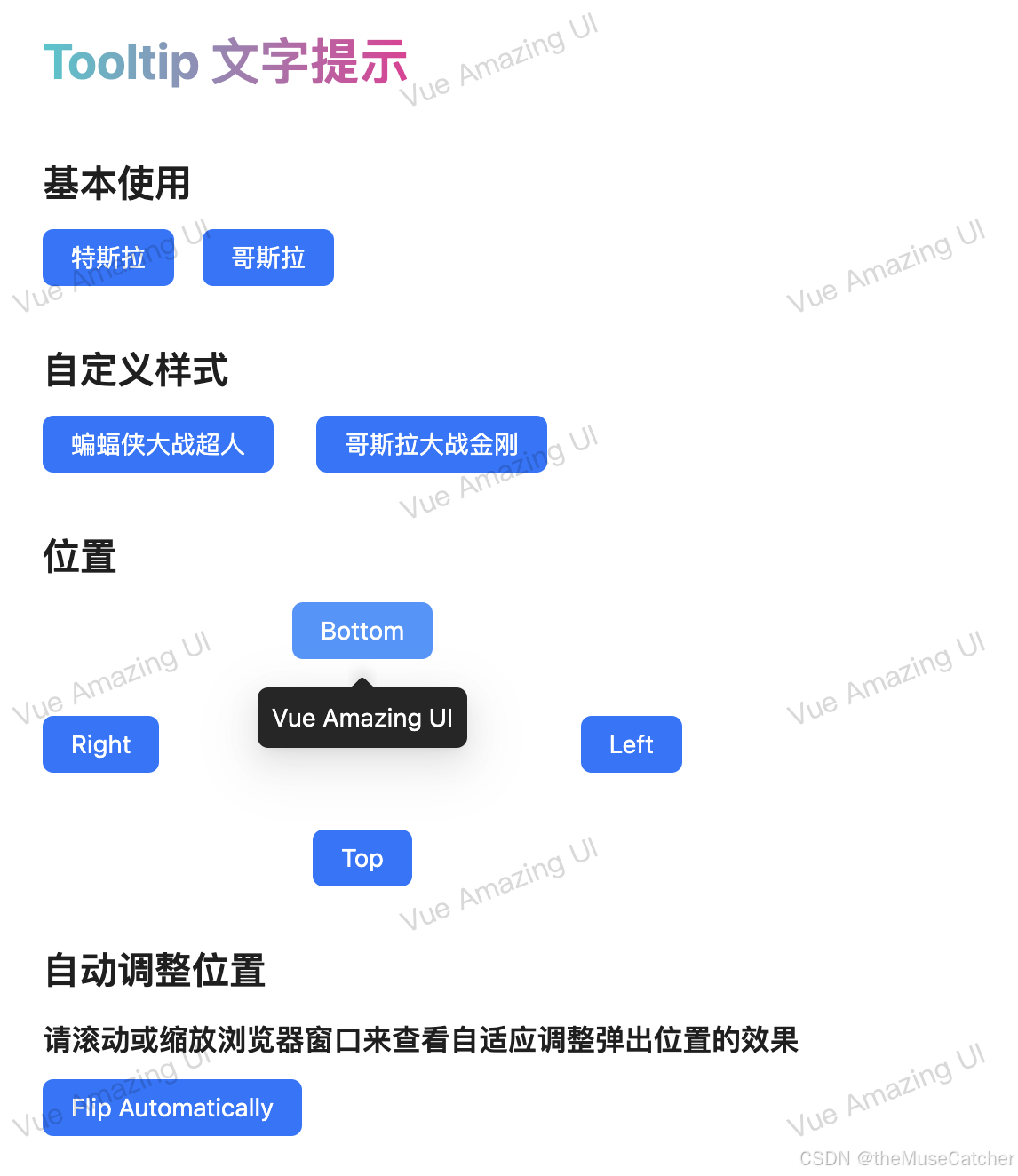
<h2 class="mt30 mb10">基本使用</h2>
<Space>
<Tooltip tooltip="Tesla" @open-change="openChange">
<Button type="primary">特斯拉</Button>
</Tooltip>
<Tooltip tooltip="Godzilla" @open-change="openChange">
<Button type="primary">哥斯拉</Button>
</Tooltip>
</Space>
<h2 class="mt30 mb10">自定义样式</h2>
<Space gap="large">
<Tooltip :max-width="360" bg-color="#fff" tooltip-class="custom-class">
<template #tooltip>
<p style="text-align: center">Batman VS Superman</p>
电影讲述了超人帮助人类解决了很多问题,成为了人类的神,却引起了莱克斯·卢瑟的嫉妒,从而挑拨蝙蝠侠与超人之间战斗的故事
</template>
<Button type="primary">蝙蝠侠大战超人</Button>
</Tooltip>
<Tooltip
:max-width="360"
bg-color="#fff"
:tooltip-style="{
padding: '12px 18px',
borderRadius: '12px',
fontSize: '16px',
color: 'rgba(0, 0, 0, 0.88)'
}"
>
<template #tooltip>
<h3 style="text-align: center; margin: 0 0 8px">Godzilla VS Kong</h3>
电影讲述帝王组织在地心世界找到巨兽起源的线索,与此同时传说中的王者哥斯拉和金刚的对决也将展开的故事
</template>
<Button type="primary">哥斯拉大战金刚</Button>
</Tooltip>
</Space>
<h2 class="mt30 mb10">位置</h2>
<Flex vertical :width="360" align="center" :gap="32">
<Tooltip tooltip="Vue Amazing UI" placement="bottom">
<Button type="primary">Bottom</Button>
</Tooltip>
<Flex width="100%" justify="space-between">
<Tooltip tooltip="Vue Amazing UI" placement="right">
<Button type="primary">Right</Button>
</Tooltip>
<Tooltip tooltip="Vue Amazing UI" placement="left">
<Button type="primary">Left</Button>
</Tooltip>
</Flex>
<Tooltip tooltip="Vue Amazing UI" placement="top">
<Button type="primary">Top</Button>
</Tooltip>
</Flex>
<h2 class="mt30 mb10">自动调整位置</h2>
<h3 class="mb10">请滚动或缩放浏览器窗口来查看自适应调整弹出位置的效果</h3>
<Tooltip tooltip="Vue Amazing UI">
<Button type="primary">Flip Automatically</Button>
</Tooltip>
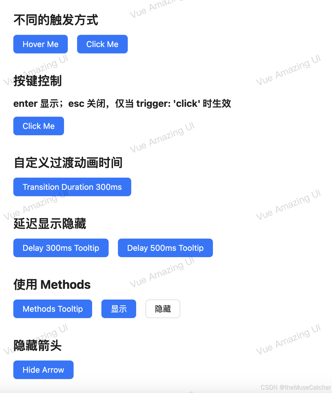
<h2 class="mt30 mb10">不同的触发方式</h2>
<Space>
<Tooltip>
<template #tooltip>Vue Amazing UI</template>
<Button type="primary">Hover Me</Button>
</Tooltip>
<Tooltip trigger="click">
<template #tooltip>Vue Amazing UI</template>
<Button type="primary">Click Me</Button>
</Tooltip>
</Space>
<h2 class="mt30 mb10">按键控制</h2>
<h3 class="mb10">enter 显示;esc 关闭,仅当 trigger: 'click' 时生效</h3>
<Tooltip trigger="click" keyboard>
<template #tooltip>Vue Amazing UI</template>
<Button type="primary">Click Me</Button>
</Tooltip>
<h2 class="mt30 mb10">自定义过渡动画时间</h2>
<Tooltip :transition-duration="300">
<template #tooltip>Vue Amazing UI</template>
<Button type="primary">Transition Duration 300ms</Button>
</Tooltip>
<h2 class="mt30 mb10">延迟显示隐藏</h2>
<Space>
<Tooltip
:show-delay="300"
:hide-delay="300"
tooltip="Vue Amazing UI (delay 300ms)"
:tooltip-style="{ textAlign: 'center' }"
>
<Button type="primary">Delay 300ms Tooltip</Button>
</Tooltip>
<Tooltip
:show-delay="500"
:hide-delay="500"
tooltip="Vue Amazing UI (delay 500ms)"
:tooltip-style="{ textAlign: 'center' }"
>
<Button type="primary">Delay 500ms Tooltip</Button>
</Tooltip>
</Space>
<h2 class="mt30 mb10">使用 Methods</h2>
<Space>
<Tooltip ref="tooltip" tooltip="Vue Amazing UI">
<Button type="primary">Methods Tooltip</Button>
</Tooltip>
<Button type="primary" @click="tooltip.show()">显示</Button>
<Button @click="tooltip.hide()">隐藏</Button>
</Space>
<h2 class="mt30 mb10">隐藏箭头</h2>
<Tooltip :arrow="false" tooltip="Vue Amazing UI">
<Button type="primary">Hide Arrow</Button>
</Tooltip>
</div>
</template>
<style lang="less" scoped>
:deep(.custom-class) {
font-size: 16px !important;
color: #0958d9 !important;
padding: 12px 18px !important;
border-radius: 12px !important;
p {
margin-bottom: 8px;
font-size: 20px;
font-weight: 600;
}
}
</style>


 扫一扫
扫一扫


 910
910

 被折叠的 条评论
为什么被折叠?
被折叠的 条评论
为什么被折叠?
 到【灌水乐园】发言


