


可自定义设置以下属性:
-
选项数据(options),类型:Option[],默认值 [],其中Option类型:{label?: string, value?: string | number, disabled?: boolean, [propName: string]: any}
-
选择器字典项的文本字段名(label),类型:string,默认 'label'
-
选择器字典项的值字段名(value),类型:string,默认 'value'
-
选择框默认文字(placeholder),类型:string,默认 '请选择'
-
是否禁用下拉(disabled),类型:boolean,默认 false
-
是否支持清除(allowClear),类型:boolean,默认false
-
是否支持搜索(search),使用搜索时请设置 width,类型:boolean,默认 false
-
过滤条件函数(filter),类型:Function | true,默认 true,仅当支持搜索时生效,根据输入项进行筛选,默认为 true 时,筛选每个选项的文本字段 label 是否包含输入项,包含返回 true,反之返回 false;当其为函数 Function 时,接受 inputValue option 两个参数,当 option 符合筛选条件时,应返回 true,反之则返回 false
-
选择框宽度(width),类型:string | number,默认 'auto'
-
选择框高度(height),类型:number,单位 px,默认 36
-
下拉面板最多能展示的下拉项数,超过后滚动显示(maxDisplay),类型:number,默认 6
-
下拉面板滚动条 scrollbar 组件属性配置(scrollbarProps),类型:object,默认 {}
-
v-model 当前选中的option条目(modelValue),类型:number | string | null,默认 null
效果如下图:在线预览

展开图:

支持搜索:

其中引入使用使用了以下组件:
①创建选择器组件Select.vue:
<script setup lang="ts">
import { ref, computed, watchEffect, watch } from 'vue'
import Empty from '../empty'
import Scrollbar from '../scrollbar'
interface Option {
  label?: string // 选项名
  value?: string | number // 选项值
  disabled?: boolean // 是否禁用选项
  [propName: string]: any // 添加一个字符串索引签名,用于包含带有任意数量的其他属性
}
interface Props {
  options?: Option[] // 选项数据
  label?: string // 字典项的文本字段名
  value?: string // 字典项的值字段名
  placeholder?: string // 默认文本
  disabled?: boolean // 是否禁用
  allowClear?: boolean // 是否支持清除
  search?: boolean // 是否支持搜索,使用搜索时请设置 width
  /*
    根据输入项进行筛选,默认为 true 时,筛选每个选项的文本字段 label 是否包含输入项,包含返回 true,反之返回 false
    当其为函数 Function 时,接受 inputValue option 两个参数,当 option 符合筛选条件时,应返回 true,反之则返回 false
  */
  filter?: Function | true // 过滤条件函数,仅当支持搜索时生效
  width?: string | number // 宽度,单位 px
  height?: number // 高度,单位 px
  maxDisplay?: number // 下拉面板最多能展示的下拉项数,超过后滚动显示
  scrollbarProps?: object // 下拉面板滚动条 scrollbar 组件属性配置
  modelValue?: number | string | null // (v-model)当前选中的option条目
}
const props = withDefaults(defineProps<Props>(), {
  options: () => [],
  label: 'label',
  value: 'value',
  placeholder: '请选择',
  disabled: false,
  search: false,
  allowClear: false,
  filter: true,
  width: 'auto',
  height: 32,
  maxDisplay: 6,
  scrollbarProps: () => ({}),
  modelValue: null
})
const selectWidth = computed(() => {
  if (typeof props.width === 'number') {
    return props.width + 'px'
  }
  return props.width
})
const filterOptions = ref<Option[]>() // 过滤后的选项数组
const selectedName = ref() // 当前选中选项的 label
const inputRef = ref() // 输入框 DOM 引用
const inputValue = ref() // 支持搜索时,用户输入内容
const disabledBlur = ref(false) // 是否禁用 input 标签的 blur 事件
const hideSelectName = ref(false) // 用户输入时,隐藏 selectName 的展示
const hoverValue = ref() // 鼠标悬浮项的 value 值
const showOptions = ref(false) // options 面板
const showArrow = ref(true) // 剪头图标显隐
const showClear = ref(false) // 清除图标显隐
const showCaret = ref(false) // 支持搜索时,输入光标的显隐
const showSearch = ref(false) // 搜索图标显隐
const selectFocused = ref(false) /// select 是否聚焦
watchEffect(() => {
  if (props.search) {
    if (inputValue.value) {
      showOptions.value = true
      filterOptions.value = props.options.filter((option) => {
        if (typeof props.filter === 'function') {
          return props.filter(inputValue.value, option)
        } else {
          return option[props.label].includes(inputValue.value)
        }
      })
    } else {
      filterOptions.value = [...props.options]
    }
    if (filterOptions.value.length && inputValue.value) {
      hoverValue.value = filterOptions.value[0][props.value]
    } else {
      hoverValue.value = null
    }
  } else {
    filterOptions.value = props.options
  }
})
watchEffect(() => {
  // 回调立即执行一次,同时会自动跟踪回调中所依赖的所有响应式依赖
  initSelector()
})
watch(showOptions, (to) => {
  if (props.search && !to) {
    inputValue.value = undefined
    hideSelectName.value = false
  }
})
function initSelector() {
  if (props.modelValue) {
    const target = props.options.find((option) => option[props.value] === props.modelValue)
    if (target) {
      selectedName.value = target[props.label]
      hoverValue.value = target[props.value]
    } else {
      selectedName.value = props.modelValue
      hoverValue.value = null
    }
  } else {
    selectedName.value = null
    hoverValue.value = null
  }
}
function onBlur() {
  selectFocused.value = false
  if (showOptions.value) {
    showOptions.value = false
  }
  if (props.search) {
    showSearch.value = false
    showArrow.value = true
    hideSelectName.value = false
  }
}
function onEnter() {
  disabledBlur.value = true
  if (props.allowClear) {
    if (selectedName.value || (props.search && inputValue.value)) {
      showArrow.value = false
      showClear.value = true
      if (props.search) {
        showSearch.value = false
      }
    }
  }
}
function onLeave() {
  disabledBlur.value = false
  if (props.allowClear && showClear.value) {
    showClear.value = false
    if (!props.search) {
      showArrow.value = true
    }
  }
  if (props.search) {
    if (showOptions.value) {
      showSearch.value = true
      showArrow.value = false
    } else {
      showSearch.value = false
      showArrow.value = true
    }
  }
}
function onHover(value: string | number, disabled: boolean | undefined) {
  disabledBlur.value = Boolean(disabled)
  hoverValue.value = value
}
function openSelect() {
  selectFocus()
  if (!props.search) {
    inputRef.value.style.opacity = 0
  }
  showOptions.value = !showOptions.value
  if (!hoverValue.value && selectedName.value) {
    const target = props.options.find((option) => option[props.label] === selectedName.value)
    hoverValue.value = target ? target[props.value] : null
  }
  if (props.search) {
    if (!showClear.value) {
      showArrow.value = !showOptions.value
      showSearch.value = showOptions.value
    }
  }
}
function onSearchInput(e: InputEvent) {
  hideSelectName.value = Boolean((e.target as HTMLInputElement)?.value)
}
const emits = defineEmits(['update:modelValue', 'change'])
function onClear() {
  if (selectFocused.value) {
    selectFocus()
    showCaret.value = true
  }
  showClear.value = false
  selectedName.value = null
  hoverValue.value = null
  showOptions.value = false
  showSearch.value = false
  showArrow.value = true
  emits('update:modelValue')
  emits('change')
}
function selectFocus() {
  inputRef.value.focus() // 通过 input 标签聚焦来模拟 select 整体聚焦效果
  selectFocused.value = true
}
function onChange(value: string | number, label: string, index: number) {
  // 选中下拉项后的回调
  if (props.modelValue !== value) {
    selectedName.value = label
    hoverValue.value = value
    emits('update:modelValue', value)
    emits('change', value, label, index)
  }
  showCaret.value = false
}
</script>
<template>
  <div
    class="m-select"
    :class="{ 'select-focused': selectFocused, 'search-select': search, 'select-disabled': disabled }"
    :style="`width: ${selectWidth}; height: ${height}px;`"
    @click="disabled ? () => false : openSelect()"
  >
    <div class="m-select-wrap" @mouseenter="onEnter" @mouseleave="onLeave">
      <span class="m-select-search">
        <input
          ref="inputRef"
          class="u-select-search"
          :class="{ 'caret-show': showOptions || showCaret }"
          type="text"
          autocomplete="off"
          :readonly="!search"
          :disabled="disabled"
          @input="onSearchInput"
          v-model="inputValue"
          @blur="!disabledBlur && showOptions && !disabled ? onBlur() : () => false"
        />
      </span>
      <span
        v-if="!hideSelectName"
        :class="['u-select-item', { 'select-placeholder': !selectedName || showOptions }]"
        :style="`line-height: ${height - 2}px;`"
        :title="selectedName"
      >
        {{ selectedName || placeholder }}
      </span>
      <svg
        :class="['u-arrow', { rotate: showOptions, show: showArrow }]"
        viewBox="64 64 896 896"
        data-icon="down"
        aria-hidden="true"
        focusable="false"
      >
        <path
          d="M884 256h-75c-5.1 0-9.9 2.5-12.9 6.6L512 654.2 227.9 262.6c-3-4.1-7.8-6.6-12.9-6.6h-75c-6.5 0-10.3 7.4-6.5 12.7l352.6 486.1c12.8 17.6 39 17.6 51.7 0l352.6-486.1c3.9-5.3.1-12.7-6.4-12.7z"
        ></path>
      </svg>
      <svg
        focusable="false"
        :class="['u-search', { show: showSearch }]"
        data-icon="search"
        aria-hidden="true"
        viewBox="64 64 896 896"
      >
        <path
          d="M909.6 854.5L649.9 594.8C690.2 542.7 712 479 712 412c0-80.2-31.3-155.4-87.9-212.1-56.6-56.7-132-87.9-212.1-87.9s-155.5 31.3-212.1 87.9C143.2 256.5 112 331.8 112 412c0 80.1 31.3 155.5 87.9 212.1C256.5 680.8 331.8 712 412 712c67 0 130.6-21.8 182.7-62l259.7 259.6a8.2 8.2 0 0011.6 0l43.6-43.5a8.2 8.2 0 000-11.6zM570.4 570.4C528 612.7 471.8 636 412 636s-116-23.3-158.4-65.6C211.3 528 188 471.8 188 412s23.3-116.1 65.6-158.4C296 211.3 352.2 188 412 188s116.1 23.2 158.4 65.6S636 352.2 636 412s-23.3 116.1-65.6 158.4z"
        ></path>
      </svg>
      <svg
        @click.stop="onClear"
        :class="['u-clear', { show: showClear }]"
        focusable="false"
        data-icon="close-circle"
        aria-hidden="true"
        viewBox="64 64 896 896"
      >
        <path
          d="M512 64C264.6 64 64 264.6 64 512s200.6 448 448 448 448-200.6 448-448S759.4 64 512 64zm165.4 618.2l-66-.3L512 563.4l-99.3 118.4-66.1.3c-4.4 0-8-3.5-8-8 0-1.9.7-3.7 1.9-5.2l130.1-155L340.5 359a8.32 8.32 0 01-1.9-5.2c0-4.4 3.6-8 8-8l66.1.3L512 464.6l99.3-118.4 66-.3c4.4 0 8 3.5 8 8 0 1.9-.7 3.7-1.9 5.2L553.5 514l130 155c1.2 1.5 1.9 3.3 1.9 5.2 0 4.4-3.6 8-8 8z"
        ></path>
      </svg>
    </div>
    <Transition name="slide-up">
      <Scrollbar
        v-if="showOptions && filterOptions && filterOptions.length"
        class="m-options-panel"
        :style="`top: ${height + 4}px; line-height: ${height - 10}px; max-height: ${maxDisplay * height + 9}px;`"
        v-bind="scrollbarProps"
        @mouseleave="disabledBlur = false"
      >
        <p
          v-for="(option, index) in filterOptions"
          :key="index"
          :class="[
            'u-option',
            {
              'option-hover': !option.disabled && option[value] === hoverValue,
              'option-selected': option[label] === selectedName,
              'option-disabled': option.disabled
            }
          ]"
          :title="option[label]"
          @mouseenter="onHover(option[value], option.disabled)"
          @click.stop="option.disabled ? selectFocus() : onChange(option[value], option[label], index)"
        >
          {{ option[label] }}
        </p>
      </Scrollbar>
      <div
        v-else-if="showOptions && filterOptions && !filterOptions.length"
        class="m-empty-wrap"
        :style="`top: ${height + 4}px; width: ${width}px;`"
      >
        <Empty image="2" key="2" />
      </div>
    </Transition>
  </div>
</template>
<style lang="less" scoped>
.slide-up-enter-active {
  transform: scaleY(1);
  transform-origin: 0% 0%;
  opacity: 1;
  transition: all 0.2s cubic-bezier(0.23, 1, 0.32, 1);
}
.slide-up-leave-active {
  transform: scaleY(1);
  transform-origin: 0% 0%;
  opacity: 1;
  transition: all 0.2s cubic-bezier(0.755, 0.05, 0.855, 0.06);
}
.slide-up-enter-from,
.slide-up-leave-to {
  transform: scaleY(0.8);
  transform-origin: 0% 0%;
  opacity: 0;
}
.m-select {
  position: relative;
  display: inline-block;
  font-size: 14px;
  font-weight: 400;
  color: rgba(0, 0, 0, 0.88);
  outline: none;
  cursor: pointer;
  &:not(.select-disabled):hover {
    // 悬浮时样式
    .m-select-wrap {
      border-color: @themeColor;
    }
  }
  .m-select-wrap {
    position: relative;
    display: flex;
    padding: 0 11px;
    border: 1px solid #d9d9d9;
    border-radius: 6px;
    background-color: #fff;
    width: 100%;
    height: 100%;
    outline: none;
    transition: all 0.2s cubic-bezier(0.645, 0.045, 0.355, 1);
    .m-select-search {
      position: absolute;
      top: 0;
      bottom: 0;
      left: 11px;
      right: 11px;
      .u-select-search {
        height: 100%;
        margin: 0;
        padding: 0;
        width: 100%;
        caret-color: transparent;
        background: transparent;
        border: none;
        outline: none;
        appearance: none;
        opacity: 0;
        cursor: pointer;
      }
      .caret-show {
        caret-color: auto;
      }
    }
    .u-select-item {
      position: relative;
      padding-right: 18px;
      flex: 1;
      user-select: none;
      overflow: hidden;
      white-space: nowrap;
      text-overflow: ellipsis;
      transition: all 0.3s;
    }
    .select-placeholder {
      color: rgba(0, 0, 0, 0.25);
      transition: none;
      pointer-events: none;
    }
    .u-svg {
      position: absolute;
      top: 0;
      bottom: 0;
      right: 11px;
      margin: auto 0;
      display: inline-block;
      width: 12px;
      height: 12px;
      fill: rgba(0, 0, 0, 0.25);
      opacity: 0;
      user-select: none;
      pointer-events: none;
    }
    .u-arrow {
      .u-svg();
      transition:
        transform 0.3s,
        opacity 0.3s;
    }
    .rotate {
      transform: rotate(180deg);
    }
    .u-search {
      .u-svg();
      transition: opacity 0.3s;
    }
    .u-clear {
      .u-svg();
      z-index: 1;
      background: #fff;
      cursor: pointer;
      transition:
        fill 0.2s,
        opacity 0.3s;
      &:hover {
        fill: rgba(0, 0, 0, 0.45);
      }
    }
    .show {
      opacity: 1;
      pointer-events: auto;
    }
  }
  .m-options-panel {
    position: absolute;
    z-index: 9;
    width: 100%;
    height: auto;
    background-color: #fff;
    padding: 4px;
    border-radius: 8px;
    outline: none;
    box-shadow:
      0 6px 16px 0 rgba(0, 0, 0, 0.08),
      0 3px 6px -4px rgba(0, 0, 0, 0.12),
      0 9px 28px 8px rgba(0, 0, 0, 0.05);
    .u-option {
      // 下拉项默认样式
      text-align: left;
      position: relative;
      display: block;
      padding: 5px 12px;
      border-radius: 4px;
      font-weight: 400;
      line-height: inherit;
      overflow: hidden;
      white-space: nowrap;
      text-overflow: ellipsis;
      cursor: pointer;
      transition: background 0.3s ease;
    }
    .option-hover {
      // 悬浮时的下拉项样式
      background: rgba(0, 0, 0, 0.04);
    }
    .option-selected {
      // 被选中的下拉项样式
      font-weight: 600;
      background: #e6f4ff;
    }
    .option-disabled {
      // 禁用某个下拉选项时的样式
      color: rgba(0, 0, 0, 0.25);
      cursor: not-allowed;
    }
  }
  .m-empty-wrap {
    position: absolute;
    z-index: 9;
    height: 100px;
    border-radius: 8px;
    padding: 13px 20px;
    background-color: #fff;
    box-shadow:
      0 6px 16px 0 rgba(0, 0, 0, 0.08),
      0 3px 6px -4px rgba(0, 0, 0, 0.12),
      0 9px 28px 8px rgba(0, 0, 0, 0.05);
  }
}
.select-focused:not(.select-disabled) {
  // 激活时样式
  .m-select-wrap {
    border-color: @themeColor;
    box-shadow: 0 0 0 2px fade(@themeColor, 20%);
  }
}
.search-select {
  .m-select-wrap {
    cursor: text;
    .m-select-search {
      .u-select-search {
        cursor: auto;
        color: inherit;
        opacity: 1;
      }
    }
  }
}
.select-disabled {
  .m-select-wrap {
    // 下拉禁用样式
    color: rgba(0, 0, 0, 0.25);
    background: #f5f5f5;
    user-select: none;
    cursor: not-allowed;
    .m-select-search .u-select-search {
      cursor: not-allowed;
    }
  }
}
</style>
②在要使用的页面引入:
<script setup lang="ts">
import Select from './Select.vue'
import { ref, watchEffect } from 'vue'
const options = ref([
{
label: '北京市',
value: 1
},
{
label: '上海市',
value: 2
},
{
label: '纽约市',
value: 3
},
{
label: '旧金山',
value: 4
},
{
label: '布宜诺斯艾利斯',
value: 5
},
{
label: '伊斯坦布尔',
value: 6
},
{
label: '拜占庭',
value: 7
},
{
label: '君士坦丁堡',
value: 8
},
{
label: '墨尔本',
value: 9
}
])
const optionsDisabled = ref([
{
label: '北京市',
value: 1
},
{
label: '上海市',
value: 2,
disabled: true
},
{
label: '纽约市',
value: 3
},
{
label: '旧金山',
value: 4
},
{
label: '布宜诺斯艾利斯',
value: 5
},
{
label: '伊斯坦布尔',
value: 6
},
{
label: '拜占庭',
value: 7
},
{
label: '君士坦丁堡',
value: 8
}
])
const optionsCustom = ref([
{
name: '北京市',
id: 1
},
{
name: '上海市',
id: 2
},
{
name: '纽约市',
id: 3
},
{
name: '旧金山',
id: 4
},
{
name: '布宜诺斯艾利斯',
id: 5
},
{
name: '伊斯坦布尔',
id: 6
},
{
name: '拜占庭',
id: 7
},
{
name: '君士坦丁堡',
id: 8
}
])
const selectedValue = ref(5)
watchEffect(() => {
console.log('selectedValue:', selectedValue.value)
})
function onChange(value: string | number, label: string, index: number) {
console.log('value:', value)
console.log('label:', label)
console.log('index:', index)
}
// 自定义过滤函数,当选项的 value 值大于 输入项时返回 true
function filter(inputValue: string, option: any) {
return option.value > inputValue
}
</script>
<template>
<div>
<h1>{{ $route.name }} {{ $route.meta.title }}</h1>
<h2 class="mt30 mb10">基本使用</h2>
<Select :options="options" v-model="selectedValue" />
<h2 class="mt30 mb10">禁用</h2>
<Select :options="options" disabled v-model="selectedValue" />
<h2 class="mt30 mb10">禁用选项</h2>
<Select :options="optionsDisabled" v-model="selectedValue" />
<h2 class="mt30 mb10">支持清除</h2>
<Select :options="options" allow-clear v-model="selectedValue" @change="onChange" />
<h2 class="mt30 mb10">支持搜索</h2>
<Select :width="150" :options="options" search allowClear v-model="selectedValue" />
<h2 class="mt30 mb10">自定义搜索过滤函数</h2>
<Select :width="150" :options="options" search :filter="filter" v-model="selectedValue" />
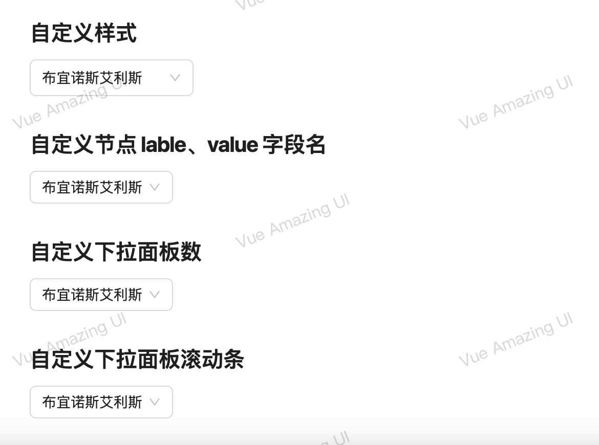
<h2 class="mt30 mb10">自定义样式</h2>
<Select :width="160" :height="36" search :options="options" v-model="selectedValue" @change="onChange" />
<h2 class="mt30 mb10">自定义节点 lable、value 字段名</h2>
<Select :options="optionsCustom" label="name" value="id" v-model="selectedValue" />
<h2 class="mt30 mb10">自定义下拉面板数</h2>
<Select :options="options" :max-display="8" v-model="selectedValue" />
<h2 class="mt30 mb10">自定义下拉面板滚动条</h2>
<Select :options="options" v-model="selectedValue" :scrollbar-props="{ size: 8, delay: 2000 }" />
</div>
</template>


 9089
9089

 被折叠的 条评论
为什么被折叠?
被折叠的 条评论
为什么被折叠?
 到【灌水乐园】发言


