

APIs
Drawer
| 参数 | 说明 | 类型 | 默认值 | 必传 |
|---|
| width | 宽度,在 placement 为 right 或 left 时使用,单位 px | string | number | 378 | false |
| height | 高度,在 placement 为 top 或 bottom 时使用,单位 px | string | number | 378 | false |
| title | 标题 | string | slot | undefined | false |
| closable | 是否显示左上角的关闭按钮 | boolean | true | false |
| placement | 抽屉的方向 | ‘top’ | ‘right’ | ‘bottom’ | ‘left’ | ‘right’ | false |
| headerClass | 设置 Drawer 头部的类名 | string | undefined | false |
| headerStyle | 设置 Drawer 头部的样式 | CSSProperties | {} | false |
| scrollbarProps | Scrollbar 组件属性配置,参考 Scrollbar Props,用于设置内容滚动条的样式 | object | {} | false |
| bodyClass | 设置 Drawer 内容部分的类名 | string | undefined | false |
| bodyStyle | 设置 Drawer 内容部分的样式 | CSSProperties | {} | false |
| extra | 抽屉右上角的操作区域 | string | slot | undefined | false |
| footer | 抽屉的页脚 | string | slot | undefined | false |
| footerClass | 设置 Drawer 页脚的类名 | string | undefined | false |
| footerStyle | 设置 Drawer 页脚的样式 | CSSProperties | {} | false |
| destroyOnClose | 关闭时是否销毁 Drawer 里的子元素 | boolean | false | false |
| zIndex | 设置 Drawer 的 z-index | number | 1000 | false |
| open v-model | 抽屉是否可见 | boolean | false | false |
Events
| 名称 | 说明 | 类型 |
|---|
| close | 点击遮罩层或左上角叉或取消按钮的回调 | (e: Event) => void |
创建抽屉组件Drawer.vue
<script setup lang="ts">
import { computed, useSlots } from 'vue'
import type { CSSProperties } from 'vue'
import Scrollbar from '../scrollbar'
interface Props {
width?: string | number
height?: string | number
title?: string
closable?: boolean
placement?: 'top' | 'right' | 'bottom' | 'left'
headerClass?: string
headerStyle?: CSSProperties
scrollbarProps?: object
bodyClass?: string
bodyStyle?: CSSProperties
extra?: string
footer?: string
footerClass?: string
footerStyle?: CSSProperties
destroyOnClose?: boolean
zIndex?: number
open?: boolean
}
const props = withDefaults(defineProps<Props>(), {
width: 378,
height: 378,
title: undefined,
closable: true,
placement: 'right',
headerClass: undefined,
headerStyle: () => ({}),
scrollbarProps: () => ({}),
bodyClass: undefined,
bodyStyle: () => ({}),
extra: undefined,
footer: undefined,
footerClass: undefined,
footerStyle: () => ({}),
destroyOnClose: false,
zIndex: 1000,
open: false
})
const drawerWidth = computed(() => {
if (typeof props.width === 'number') {
return props.width + 'px'
}
return props.width
})
const drawerHeight = computed(() => {
if (typeof props.height === 'number') {
return props.height + 'px'
}
return props.height
})
const slots = useSlots()
const showHeader = computed(() => {
const titleSlots = slots.title?.()
const extraSlots = slots.extra?.()
let n = 0
if (titleSlots && titleSlots.length) {
n++
}
if (extraSlots && extraSlots.length) {
n++
}
return Boolean(n) || props.title || props.extra || props.closable
})
const showFooter = computed(() => {
const footerSlots = slots.footer?.()
return (footerSlots && footerSlots.length) || props.footer
})
const emits = defineEmits(['update:open', 'close'])
function onBlur(e: Event) {
emits('update:open', false)
emits('close', e)
}
function onClose(e: Event) {
emits('update:open', false)
emits('close', e)
}
</script>
<template>
<div class="m-drawer" tabindex="-1">
<Transition name="fade">
<div v-show="open" class="m-drawer-mask" @click.self="onBlur"></div>
</Transition>
<Transition :name="`motion-${placement}`">
<div
v-show="open"
class="m-drawer-wrapper"
:class="`drawer-${placement}`"
:style="`z-index: ${zIndex}; ${['top', 'bottom'].includes(placement) ? 'height:' + drawerHeight : 'width:' + drawerWidth};`"
>
<div class="m-drawer-content">
<div class="m-drawer-body-wrapper" v-if="!destroyOnClose">
<div class="m-drawer-header" :class="headerClass" :style="headerStyle" v-show="showHeader">
<div class="m-header-title">
<svg
v-if="closable"
focusable="false"
@click="onClose"
class="u-close"
data-icon="close"
width="1em"
height="1em"
fill="currentColor"
aria-hidden="true"
viewBox="64 64 896 896"
>
<path
d="M563.8 512l262.5-312.9c4.4-5.2.7-13.1-6.1-13.1h-79.8c-4.7 0-9.2 2.1-12.3 5.7L511.6 449.8 295.1 191.7c-3-3.6-7.5-5.7-12.3-5.7H203c-6.8 0-10.5 7.9-6.1 13.1L459.4 512 196.9 824.9A7.95 7.95 0 00203 838h79.8c4.7 0 9.2-2.1 12.3-5.7l216.5-258.1 216.5 258.1c3 3.6 7.5 5.7 12.3 5.7h79.8c6.8 0 10.5-7.9 6.1-13.1L563.8 512z"
></path>
</svg>
<p class="u-title">
<slot name="title">{{ title }}</slot>
</p>
</div>
<div class="m-drawer-extra">
<slot name="extra">{{ extra }}</slot>
</div>
</div>
<Scrollbar :content-style="{ height: '100%' }" v-bind="scrollbarProps">
<div class="m-drawer-body" :class="bodyClass" :style="bodyStyle">
<slot></slot>
</div>
</Scrollbar>
<div class="m-drawer-footer" :class="footerClass" :style="footerStyle" v-show="showFooter">
<slot name="footer">{{ footer }}</slot>
</div>
</div>
<div class="m-drawer-body-wrapper" v-if="destroyOnClose && open">
<div class="m-drawer-header" :class="headerClass" :style="headerStyle" v-show="showHeader">
<div class="m-header-title">
<svg
focusable="false"
@click="onClose"
class="u-close"
data-icon="close"
width="1em"
height="1em"
fill="currentColor"
aria-hidden="true"
viewBox="64 64 896 896"
>
<path
d="M563.8 512l262.5-312.9c4.4-5.2.7-13.1-6.1-13.1h-79.8c-4.7 0-9.2 2.1-12.3 5.7L511.6 449.8 295.1 191.7c-3-3.6-7.5-5.7-12.3-5.7H203c-6.8 0-10.5 7.9-6.1 13.1L459.4 512 196.9 824.9A7.95 7.95 0 00203 838h79.8c4.7 0 9.2-2.1 12.3-5.7l216.5-258.1 216.5 258.1c3 3.6 7.5 5.7 12.3 5.7h79.8c6.8 0 10.5-7.9 6.1-13.1L563.8 512z"
></path>
</svg>
<p class="u-title">
<slot name="title">{{ title }}</slot>
</p>
</div>
<div class="m-drawer-extra">
<slot name="extra">{{ extra }}</slot>
</div>
</div>
<Scrollbar :content-style="{ height: '100%' }" v-bind="scrollbarProps">
<div class="m-drawer-body" :class="bodyClass" :style="bodyStyle">
<slot></slot>
</div>
</Scrollbar>
<div class="m-drawer-footer" :class="footerClass" :style="footerStyle" v-show="showFooter">
<slot name="footer">{{ footer }}</slot>
</div>
</div>
</div>
</div>
</Transition>
</div>
</template>
<style lang="less" scoped>
.fade-enter-active,
.fade-leave-active {
transition: opacity 0.3s;
}
.fade-enter-from,
.fade-leave-to {
opacity: 0;
}
.motion-top-enter-active,
.motion-top-leave-active {
transition: all 0.3s;
}
.motion-top-enter-from,
.motion-top-leave-to {
transform: translateY(-100%);
}
.motion-right-enter-active,
.motion-right-leave-active {
transition: all 0.3s;
}
.motion-right-enter-from,
.motion-right-leave-to {
transform: translateX(100%);
}
.motion-bottom-enter-active,
.motion-bottom-leave-active {
transition: all 0.3s;
}
.motion-bottom-enter-from,
.motion-bottom-leave-to {
transform: translateY(100%);
}
.motion-left-enter-active,
.motion-left-leave-active {
transition: all 0.3s;
}
.motion-left-enter-from,
.motion-left-leave-to {
transform: translateX(-100%);
}
.m-drawer {
position: fixed;
inset: 0;
z-index: 1000;
pointer-events: none;
.m-drawer-mask {
position: absolute;
inset: 0;
z-index: 1000;
background: rgba(0, 0, 0, 0.45);
pointer-events: auto;
}
.m-drawer-wrapper {
position: absolute;
transition: all 0.3s;
.m-drawer-content {
width: 100%;
height: 100%;
overflow: auto;
background: #ffffff;
pointer-events: auto;
.m-drawer-body-wrapper {
display: flex;
flex-direction: column;
width: 100%;
height: 100%;
.m-drawer-header {
display: flex;
flex: 0;
align-items: center;
padding: 16px 24px;
font-size: 16px;
line-height: 1.5;
border-bottom: 1px solid rgba(5, 5, 5, 0.06);
.m-header-title {
display: flex;
flex: 1;
align-items: center;
min-width: 0;
min-height: 0;
.u-close {
display: inline-block;
margin-inline-end: 12px;
width: 16px;
height: 16px;
fill: rgba(0, 0, 0, 0.45);
cursor: pointer;
transition: fill 0.2s;
&:hover {
fill: rgba(0, 0, 0, 0.88);
}
}
.u-title {
flex: 1;
margin: 0;
color: rgba(0, 0, 0, 0.88);
font-weight: 600;
font-size: 16px;
line-height: 1.5;
}
}
.m-drawer-extra {
flex: none;
color: rgba(0, 0, 0, 0.88);
}
}
.m-drawer-body {
height: 100%;
padding: 24px;
word-break: break-all;
}
.m-drawer-footer {
flex-shrink: 0;
padding: 8px 16px;
border-top: 1px solid rgba(5, 5, 5, 0.06);
color: rgba(0, 0, 0, 0.88);
}
}
}
}
.drawer-top {
top: 0;
inset-inline: 0;
box-shadow:
0 6px 16px 0 rgba(0, 0, 0, 0.08),
0 3px 6px -4px rgba(0, 0, 0, 0.12),
0 9px 28px 8px rgba(0, 0, 0, 0.05);
}
.drawer-right {
top: 0;
right: 0;
bottom: 0;
box-shadow:
-6px 0 16px 0 rgba(0, 0, 0, 0.08),
-3px 0 6px -4px rgba(0, 0, 0, 0.12),
-9px 0 28px 8px rgba(0, 0, 0, 0.05);
}
.drawer-bottom {
bottom: 0;
inset-inline: 0;
box-shadow:
0 -6px 16px 0 rgba(0, 0, 0, 0.08),
0 -3px 6px -4px rgba(0, 0, 0, 0.12),
0 -9px 28px 8px rgba(0, 0, 0, 0.05);
}
.drawer-left {
top: 0;
bottom: 0;
left: 0;
box-shadow:
6px 0 16px 0 rgba(0, 0, 0, 0.08),
3px 0 6px -4px rgba(0, 0, 0, 0.12),
9px 0 28px 8px rgba(0, 0, 0, 0.05);
}
}
</style>
在要使用的页面引入
<script setup lang="ts">
import Drawer from './Drawer.vue'
import { ref } from 'vue'
const open1 = ref<boolean>(false)
const open2 = ref<boolean>(false)
const open3 = ref<boolean>(false)
const open4 = ref<boolean>(false)
const open5 = ref<boolean>(false)
const options = ref([
{
label: 'top',
value: 'top'
},
{
label: 'right',
value: 'right'
},
{
label: 'bottom',
value: 'bottom'
},
{
label: 'left',
value: 'left'
}
])
const placement = ref('right')
const extraPlacement = ref('right')
const footerPlacement = ref('right')
function onClose() {
open3.value = false
open4.value = false
console.log('close')
}
</script>
<template>
<div>
<h1>{{ $route.name }} {{ $route.meta.title }}</h1>
<h2 class="mt30 mb10">基本使用</h2>
<Button type="primary" @click="open1 = true">Open</Button>
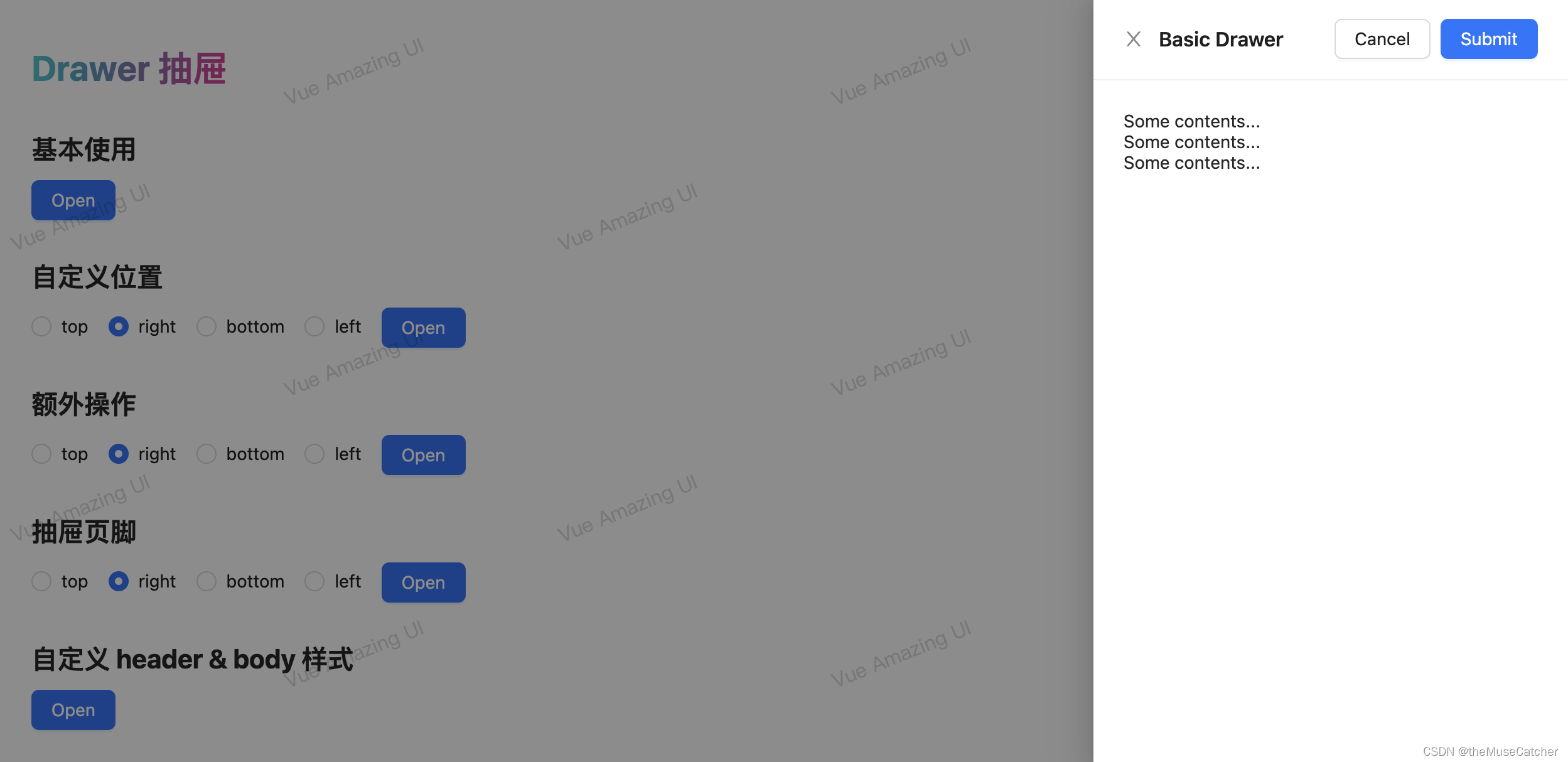
<Drawer v-model:open="open1" title="Basic Drawer" @close="onClose">
<p>Some contents...</p>
<p>Some contents...</p>
<p>Some contents...</p>
</Drawer>
<h2 class="mt30 mb10">自定义位置</h2>
<Radio v-model:value="placement" :options="options" style="margin-right: 8px" />
<Button type="primary" @click="open2 = true">Open</Button>
<Drawer
v-model:open="open2"
title="Basic Drawer"
:closable="false"
extra="extra"
footer="footer"
:placement="placement"
>
<p>Some contents...</p>
<p>Some contents...</p>
<p>Some contents...</p>
</Drawer>
<h2 class="mt30 mb10">额外操作</h2>
<Radio v-model:value="extraPlacement" :options="options" style="margin-right: 8px" />
<Button type="primary" @click="open3 = true">Open</Button>
<Drawer v-model:open="open3" title="Basic Drawer" :placement="extraPlacement">
<template #extra>
<Button style="margin-right: 8px" @click="onClose">Cancel</Button>
<Button type="primary" @click="onClose">Submit</Button>
</template>
<p>Some contents...</p>
<p>Some contents...</p>
<p>Some contents...</p>
</Drawer>
<h2 class="mt30 mb10">抽屉页脚</h2>
<Radio v-model:value="footerPlacement" :options="options" style="margin-right: 8px" />
<Button type="primary" @click="open4 = true">Open</Button>
<Drawer
v-model:open="open4"
title="Basic Drawer"
:placement="footerPlacement"
:footer-style="{ textAlign: 'right' }"
>
<p>Some contents...</p>
<p>Some contents...</p>
<p>Some contents...</p>
<template #footer>
<Button style="margin-right: 8px" @click="onClose">Cancel</Button>
<Button type="primary" @click="onClose">Submit</Button>
</template>
</Drawer>
<h2 class="mt30 mb10">自定义 header & body 样式</h2>
<Button type="primary" @click="open5 = true">Open</Button>
<Drawer
v-model:open="open5"
:closable="false"
title="Basic Drawer"
:header-style="{ textAlign: 'center' }"
:body-style="{ textAlign: 'center' }"
>
<p>Some contents...</p>
<p>Some contents...</p>
<p>Some contents...</p>
</Drawer>
</div>
</template>


 470
470

 被折叠的 条评论
为什么被折叠?
被折叠的 条评论
为什么被折叠?
 到【灌水乐园】发言


