


首先准备两个容器
<div id="container">
        <div id="item">
        </div>
</div>
1.利用text-align实现
子盒子display设置为行内块,父盒子设置line-height为全高,设置text-align:center实现内容水平居中,子盒子设置vertical-align: middle实现垂直居中。
<style>
        #container {
            background-color: aquamarine;
            width: 600px;
            height: 400px;
            line-height: 400px;
            text-align: center;
        }
        #item {
            background-color: blueviolet;
            width: 80px;
            height: 80px;
            display: inline-block;
            vertical-align: middle;
        }
    </style>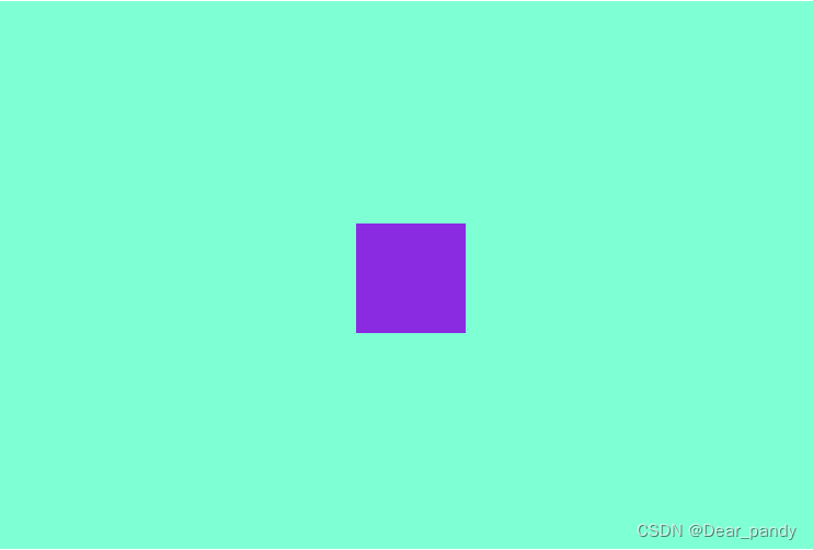
2. 利用定位和margin
父元素设置为相对定位,子元素设置为绝对定位,这样子元素相对于父元素定位,子元素的top、bottom、left、right属性设置值相等,再将子元素的margin设置为auto。
<style>
        #container {
            background-color: aquamarine;
            width: 600px;
            height: 400px;
            position: relative;
        }
        #item {
            background-color: blueviolet;
            width: 80px;
            height: 80px;
            position: absolute;
            top: 0;
            left: 0;
            right: 0;
            bottom: 0;
            margin: auto;
        }
    </style>
3.利用定位、位移+transform
父元素设置为相对定位,子元素设置为绝对定位,这样子元素相对于父元素定位,子元素向右下移动父元素的一半,再利用transform: translate(-50%,-50%);
<style>
        #container {
            background-color: aquamarine;
            width: 600px;
            height: 400px;
            position: relative;
        }
        #item {
            background-color: rgb(159, 28, 146);
            width: 80px;
            position: absolute;
            height: 80px;
           top: 50%;
           left: 50%;
           transform: translate(-50%,-50%);

        }
    </style>
4.利用flex布局实现
首先在父元素中添加display:flex;使其显示模式为flex布局模式,然后在父元素中添加主轴居中和侧轴居中即可。
<style>
        #container {
            background-color: aquamarine;
            width: 600px;
            height: 400px;
            display: flex;
            justify-content: center;
            align-items: center;
        }
        #item {
            background-color: rgb(159, 28, 146);
            width: 80px;
            height: 80px;
        }
    </style>


 1410
1410


 被折叠的 条评论
为什么被折叠?
被折叠的 条评论
为什么被折叠?
 到【灌水乐园】发言


