


QSS基本语法
Qt对界面进行优化,主要采用的是QSS。
选择器
{
	属性名: 属性值;
}
选择器:先选择某个/类控件,然后对其属性进行设置
键值对:针对某些样式的具体设置
例如:
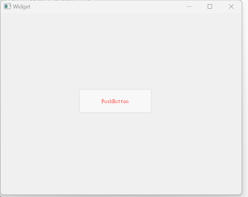
QPushButton
{
    color: red;
}
使用示例
默认样式:
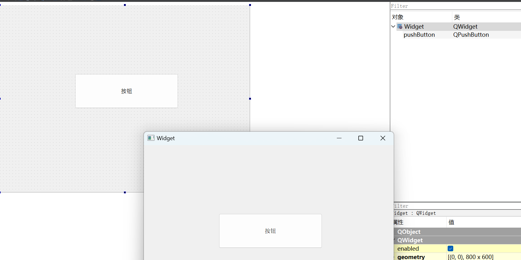
设置字体颜色:
ui->pushButton->setStyleSheet("QPushButton { color:red; }");
这种是针对当前控件及它的子控件生效
设置全局样式:
全局样式将界面上所有的样式都集中到一起来组织。
全局样式的设置,需要在
main.cpp文件当中编写
#include "widget.h"

#include <QApplication>

int main(int argc, char *argv[])
{
    QApplication a(argc, argv);
    a.setStyleSheet("QPushButton { color: green; }");
    Widget w;
    w.show();
    return a.exec();
}
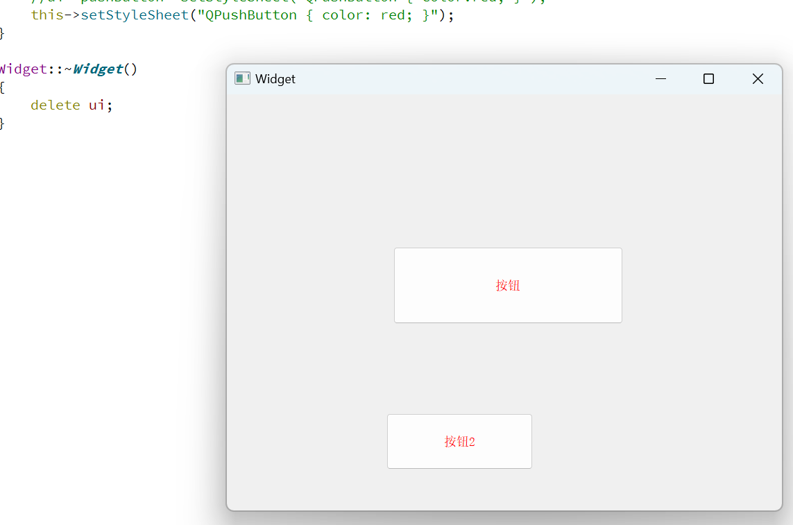
如果设置了全局样式,然后在某个控件里面又设置了其他的样式,两者会叠加起来:
#include "widget.h"
#include "ui_widget.h"

Widget::Widget(QWidget *parent)
    : QWidget(parent)
    , ui(new Ui::Widget)
{
    ui->setupUi(this);

    ui->pushButton->setStyleSheet("QPushButton { font-size: 10px; }");
}

Widget::~Widget()
{
    delete ui;
}
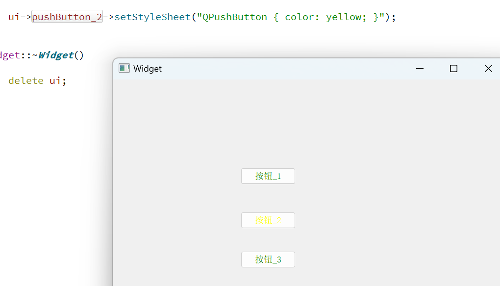
如果设置了全局样式,在某个控件里设置的样式和全局样式冲突了,局部优先级更高:
#include "widget.h"
#include "ui_widget.h"

Widget::Widget(QWidget *parent)
    : QWidget(parent)
    , ui(new Ui::Widget)
{
    ui->setupUi(this);

    ui->pushButton_2->setStyleSheet("QPushButton { color: yellow; }");
}

Widget::~Widget()
{
    delete ui;
}
样式和代码分离
上述代码都是样式代码和C++代码混合在一起的。如果QSS代码比较复杂,代码维护成本就较高了。
我们可以将样式代码分离出来,放在单独的文件当中。后续让C++代码来读取。
- 创建qrc文件,通过qrc管理文件
- 创建单独QSS文件,将文件放入qrc当中
- 让C++代码读取qrc文件
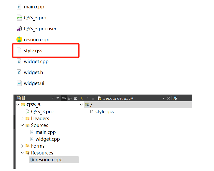
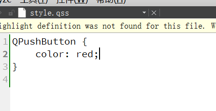
Qt Creator当中并没有提供直接创建qss的选项,这里我们是直接右键文本文档,然后更改名字和后缀
让代码加载文件内容,在main.cpp当中:
#include "widget.h"

#include <QApplication>
#include<QFile>
QString loadQSS()
{
    QFile file(":/style.qss");
    file.open(QFile::ReadOnly);
    QString style = file.readAll();
    file.close();
    return style;
}
int main(int argc, char *argv[])
{
    QApplication a(argc, argv);

    //设置全局样式
    a.setStyleSheet(loadQSS());
    Widget w;
    w.show();
    return a.exec();
}
上述方法仅供参考,还有更加简便的方法
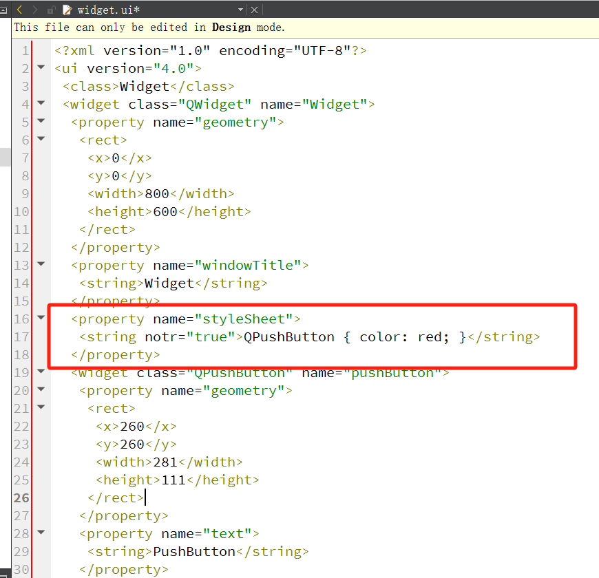
Qt Designer集成了这样的功能,允许将样式直接写到.ui文件当中。
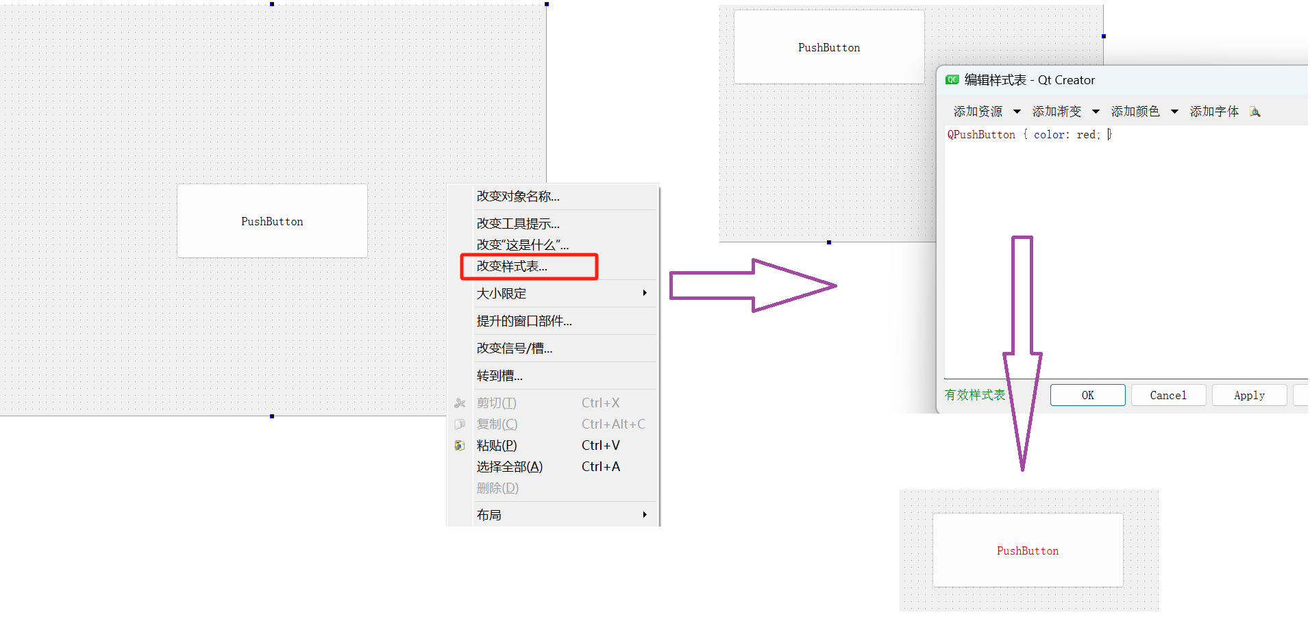
这里的修改都会记录到ui文件当中,并在程序运行时自动生效,而且还能进行预览。
此时ui文件里面就多了一段这样的代码:
也可以单独给控件进行设置。
但由于设置样式太灵活了,当某个控件样式不符合预期的时候,排查就比较麻烦:
- 全局样式
- 指定控件样式
- 指定控件的父控件样式
- qss文件样式
- ui文件样式
实际开发当中,如果要设置样式,建议统一使用某种方式来设置
选择器用法
QSS的选择器支持一下几种:
| 选择器 | 示例 | 说明 |
|---|---|---|
| 全局选择器 | * | 选择所有的widget |
| 类型选择器(type selector) | QPushButton | 选择QPushButton和其子类的控件 |
| 类选择器(class selector) | .QPushButton | 选择所有的QPushButton的控件,不会选择子类 |
| ID选择器 | #pushButton_2 | 选择objectName为pushButton_2的控件 |
| 后代选择器 | QDialog QPushButton | 选择QDialog的所有后代中的QPushButton |
| 子选择器 | QDialog > QPushButton | 选择QDialog的所有子控件中的QPushButton |
| 并集选择器 | QPushButton, QLineEdit, QComboBox | 选择 QPushButton, QLineEdit, QComboBox 这三种控件 |
| 属性选择器 | QPushButton[flat=“false”] | 选择所有 QPushButton 中, flat 属性为 false 的控件 |
ID选择器:
#include "widget.h"

#include <QApplication>

int main(int argc, char *argv[])
{
    QApplication a(argc, argv);

    QString style = "QPushButton { color: red; }";
    style += "#pushButton_2 {color: yellow; }";
    style += "#pushButton_3 {color: green; }";

    Widget w;
    w.show();
    return a.exec();
}
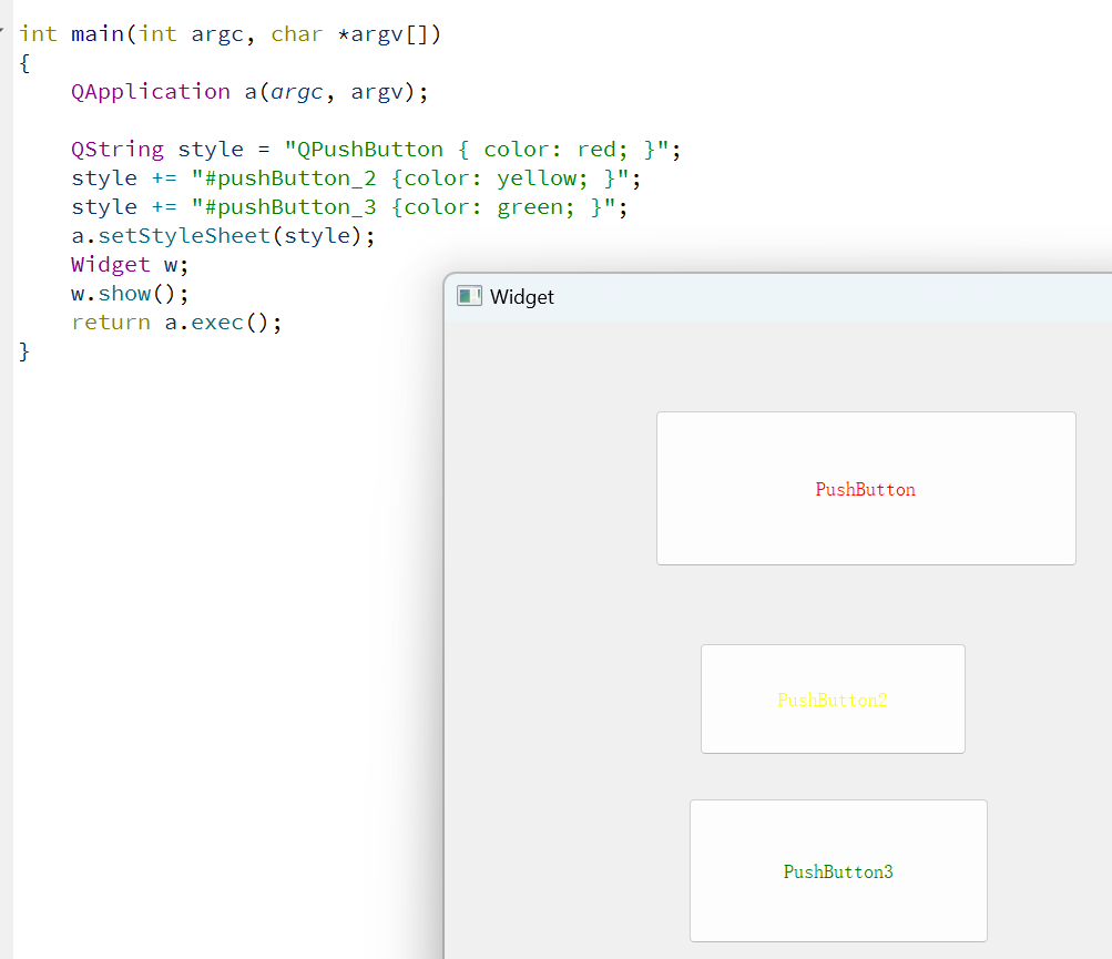
如果ID选择器和类型选择器冲突,ID优先级较高,如果不冲突,则堆叠显示
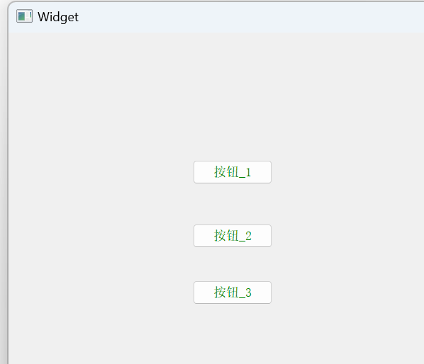
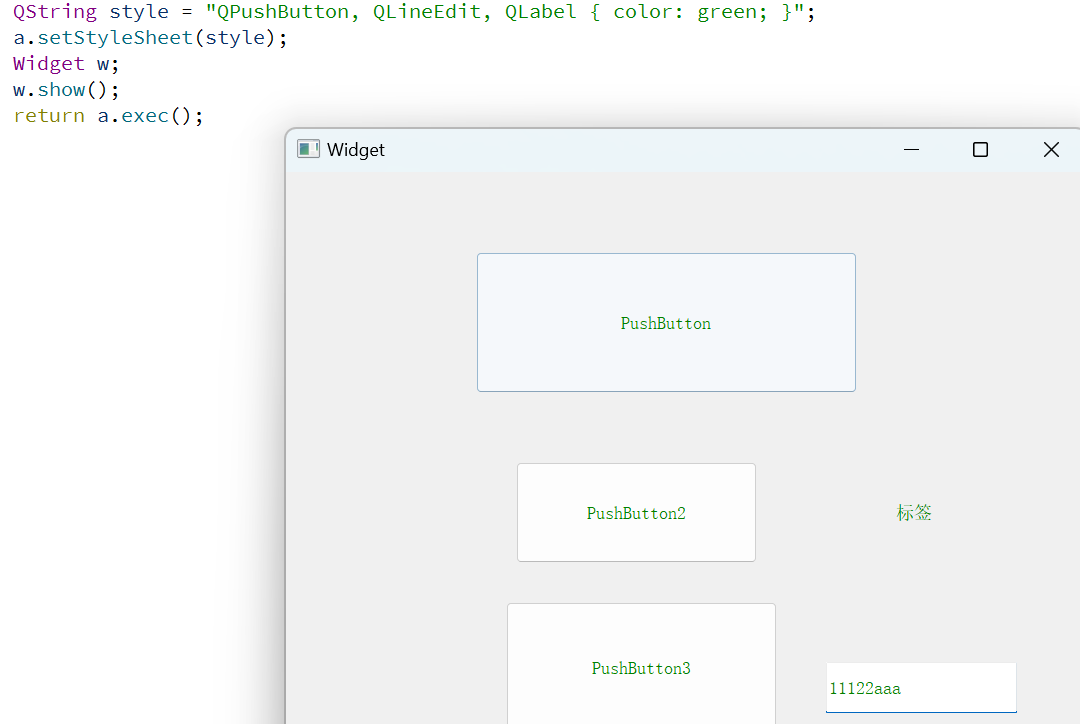
并集选择器:
#include "widget.h"

#include <QApplication>

int main(int argc, char *argv[])
{
    QApplication a(argc, argv);

//    QString style = "QPushButton { color: red; }";
//    style += "#pushButton_2 {color: yellow; }";
//    style += "#pushButton_3 {color: green; }";
    QString style = "QPushButton, QLineEdit, QLabel { color: green; }";
    a.setStyleSheet(style);
    Widget w;
    w.show();
    return a.exec();
}
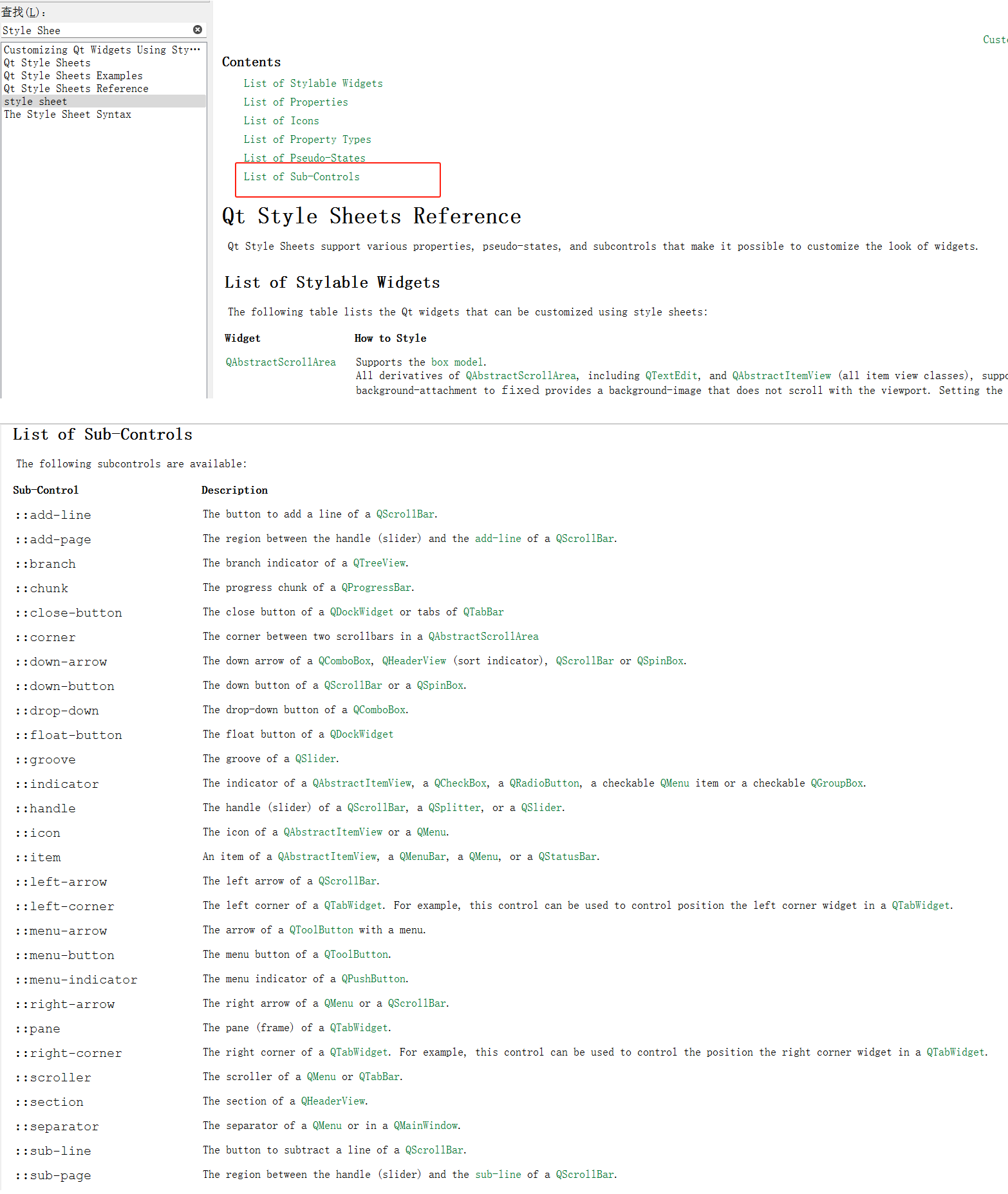
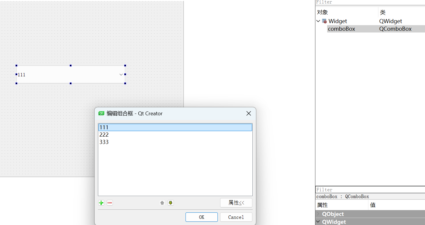
子控件选择器
这些就是Qt当中的子控件
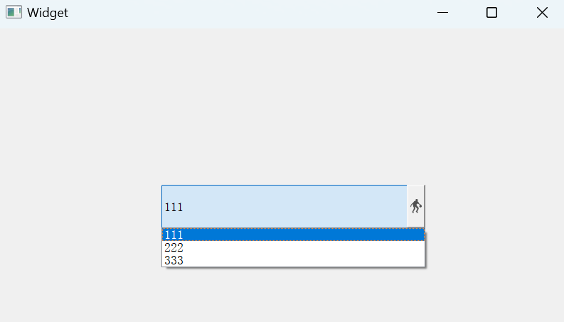
QComboBox下拉框子控件样式:
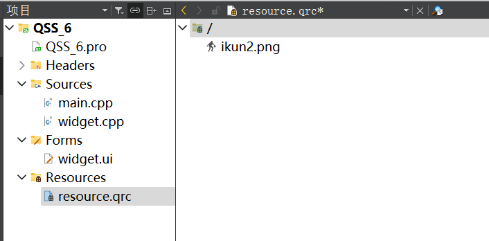
qrc导入图标:
#include "widget.h"

#include <QApplication>

int main(int argc, char *argv[])
{
    QApplication a(argc, argv);
    QString style = "QComboBox::down-arrow {image: url(:/ikun2.png); }";
    a.setStyleSheet(style);
    Widget w;
    w.show();
    return a.exec();
}
伪类选择器
上面的选择器,选中的都是“控件”。而伪类选择器选中的是控件的“状态”。
| 伪类选择器 | 说明 |
|---|---|
| :hover | 鼠标放到控件上 |
| :pressed | 鼠标左键按下时 |
| :focus | 获取输入焦点时 |
| :enabled | 元素处于可以状态时 |
| :checked | 被勾选时 |
| :read-only | 元素为只读状态时 |
#include "widget.h"

#include <QApplication>

int main(int argc, char *argv[])
{
    QApplication a(argc, argv);
    QString style = "QPushButton { color: red; }";
    style += "QPushButton:hover { color: green; }";
    style += "QPushButton:pressed { color: blue; }";
    a.setStyleSheet(style);
    Widget w;
    w.show();
    return a.exec();
}
也可以通过事件的方式进行实现
void mousePressEvent(QMouseEvent* e);
void mouseReleaseEvent(QMouseEvent* e);
void enterEvent(QEvent* e);
void leaveEvent(QEvent* e);
盒子模型
QSS中的样式很多,使用的时候,及时查阅即可。
Qt中的每一个widget都是矩形
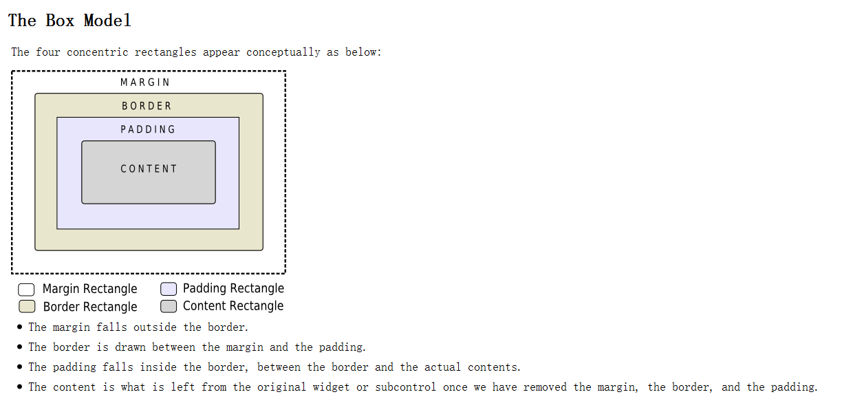
| QSS属性 | 说明 |
|---|---|
| margin | 设置四个方向的外边距,复合属性 |
| padding | 设置四个方向的内边距,复合属性 |
| border-style | 设置边框样式 |
| border-width | 边框的粗细 |
| border-color | 边框的颜色 |
| border | 复合属性,相当于 border-style + border-width + border-color |
**复合属性:**由多个属性构成。
例如
margin可以拆分为4个属性:
margin-leftmargin-rightmargin-topmargin-bottommargin: 10px; //四个方向都是10px的外边距 margin: 10px 20px; //上下10px, 左右20px margin: 10px 20px 30px 40px; //上右下左(顺时针)
#include "widget.h"

#include <QApplication>

int main(int argc, char *argv[])
{
    QApplication a(argc, argv);
    //边框5像素	绿色虚线
    //内边距50像素
    QString style = "QLabel { border: 5px dashed green; padding-left: 50px; }";
    a.setStyleSheet(style);
    Widget w;
    w.show();
    return a.exec();
}
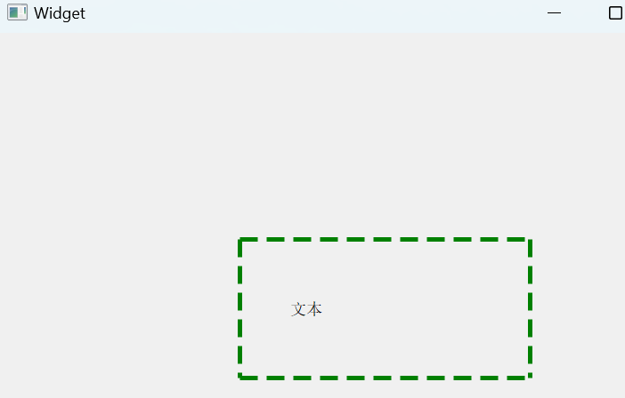
外边距:
#include "widget.h"
#include "ui_widget.h"
#include<QPushButton>
Widget::Widget(QWidget *parent)
    : QWidget(parent)
    , ui(new Ui::Widget)
{
    ui->setupUi(this);

    QPushButton* button = new QPushButton(this);
    button->setGeometry(0, 0, 100, 100);    //指定具体位置
    button->setText("按钮");
    button->setStyleSheet("QPushButton { border: 5px solid green; margin: 20px;}"); //指定边框和外边距

}

Widget::~Widget()
{
    delete ui;
}
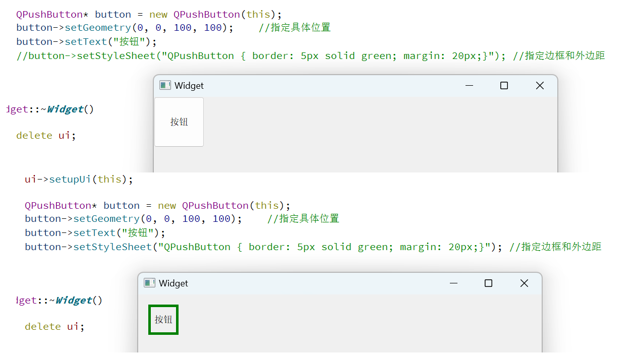
此时看着像小了一圈,但实际上矩形的尺寸和位置都是没变的。
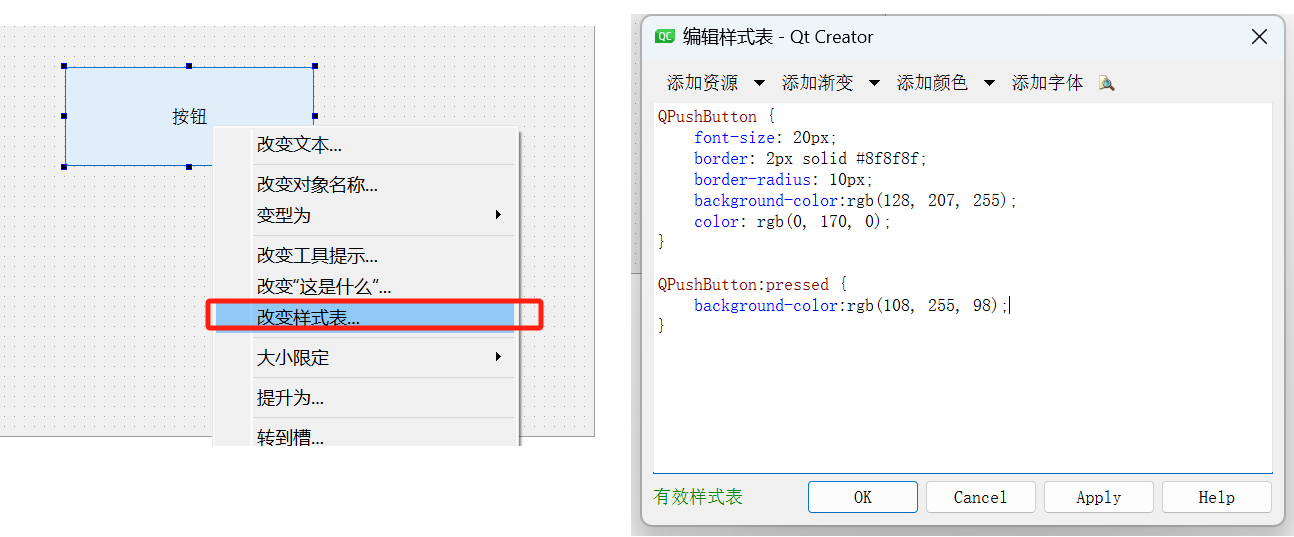
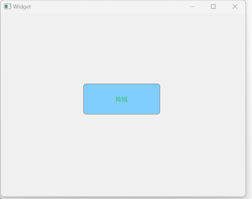
控件样式示例
按钮
font-size设置字体大小border-radius设置圆角矩形background-color设置背景色color设置文章颜色
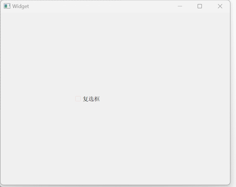
复选框
| 要点 | 说明 |
|---|---|
| ::indicator | 子控件选择器. 选中 checkbox 中的对钩部分 |
| ::hover | 伪类选择器 选中鼠标移动上去的状态 |
| ::pressed | 伪类选择器 选中鼠标按下的状态 |
| ::checked | 伪类选择器 选中 checkbox 被选中的状态 |
| ::unchecked | 伪类选择器 选中 checkbox 未被选中的状态 |
| width | 设置子控件宽度 对于普通控件无效 (普通控件使用 geometry 方式设定尺寸) |
| height | 设置子控件高度 对于普通控件无效 (普通控件使用 geometry 方式设定尺寸). |
| image | 设置子控件的图片 像 QSpinBox, QComboBox 等可以使用这个属性来设置子控件的图片 |
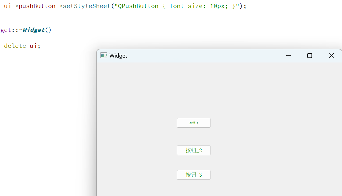
更改样式表:
QCheckBox {
	font-size: 20px;
}

QCheckBox::indicator {
	width: 20px;
	height: 20px;
}

QCheckBox::indicator::unchecked {
	image: url(:/checkbox-unchecked.png);
}

QCheckBox::indicator::unchecked::hover {
	image: url(:/checkbox--unchecked_hover.png);
}

QCheckBox::indicator::unchecked::pressed {
	image: url(:/checkbox-unchecked_pressed.png);
}

QCheckBox::indicator::checked {
	image: url(:/checkbox-checked.png);
}

QCheckBox::indicator::checked::hover {
	image: url(:/checkbox-checked_hover.png);
}

QCheckBox::indicator::checked::pressed {
	image: url(:/checkbox-checked_pressed.png);
}
输入框
更改样式表:
QLineEdit {
	border-width: 2px;
	border-color: rgb(170, 170, 255);
	border-style: solid;
	border-radius: 20px;
	padding-left: 10px;
	color: rgb(170, 85, 127);
	font-size: 24px;
	background-color: rgb(220, 220, 220);
	selection-color: rgb(0, 180, 0);
	selection-background-color: rgb(180, 0, 0);
}
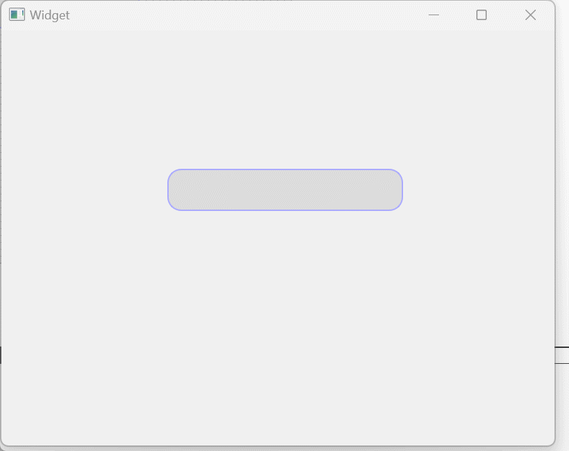
| 属性 | 说明 |
|---|---|
| border-width | 设置边框宽度 |
| border-radius | 设置边框圆角 |
| border-color | 设置边框颜色 |
| border-style | 设置边框风格 |
| padding | 设置内边距 |
| color | 设置文章颜色 |
| background | 设置背景颜色 |
| selection-background-color | 设置选中文字的背景颜色 |
| selection-color | 设置选中文字的文本颜色 |
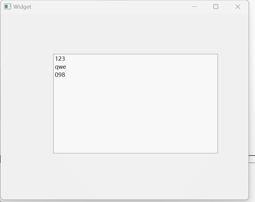
列表框
qlineargradient设置渐变色,此处填写6个参数:
x1:起点横坐标
y1:起点纵坐标(非零即一)
x2:终点横坐标
y2:终点纵坐标stop:0(起始颜色)
stop:1(结束颜色)
QListWidget::item::hover {
	background: qlineargradient(x1: 0, y1: 0, x2: 0, y2: 1, stop: 0 #FAFBFE, stop: 1 #DCDEF1);
}

QListWidget::item::selected {
	background: qlineargradient(x1: 0, y1: 0, x2: 0, y2: 1, stop: 0 #6a6ea9, stop: 1 #888dd9);
}
菜单
QMenuBar {
	background-color:rgb(255, 230, 255)
}

QMenuBar::item {
	border-radius: 10px;
	padding: 3px 10px;
	background-color: rgb(255, 255, 219);
}

QMenuBar::item::selected {
	background-color: rgb(170, 85, 0);
}

QMenu::item {
	border: 2px solid transparent;
	padding: 2px 10px;
}

QMenu::item::selected {
	border: 2px solid blue;
}

QMenu::separator {
	height: 2px;
	background-color: green;
	margin 0 2px;
}
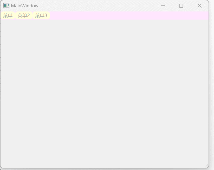
| 要点 | 说明 |
|---|---|
| QMenuBar::item | 选中菜单栏中的元素 |
| QMenuBar::item:selected | 选中菜单来中的被选中的元素 |
| QMenuBar::item:pressed | 选中菜单栏中的鼠标点击的元素 |
| QMenu::item | 选中菜单中的元素 |
| QMenu::item:selected | 选中菜单中的被选中的元素 |
| QMenu::separator | 选中菜单中的分割线 |
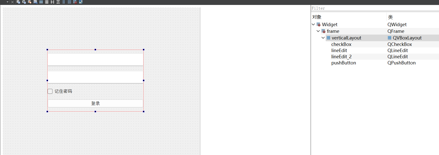
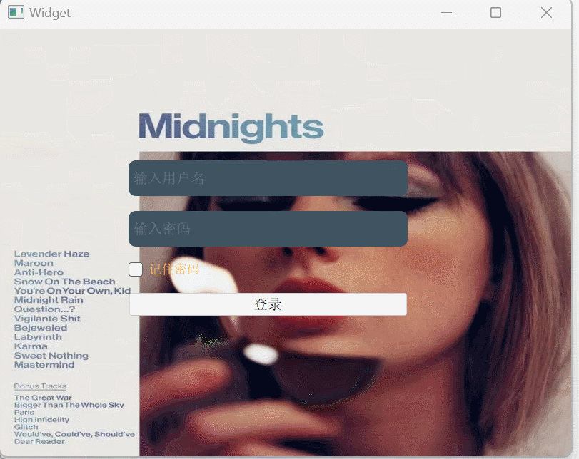
登录界面
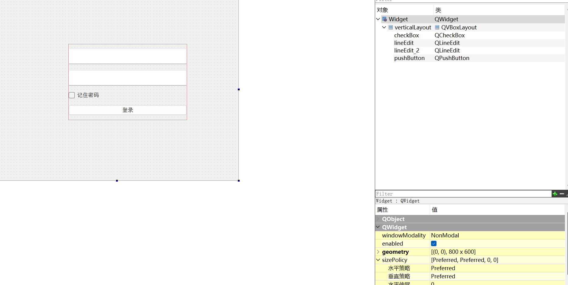
Qt存在限制,给顶层窗口设置背景图会失效
通过给当前控件外层再套一层和窗口一样大小的QFrame控件,然后讲这些控件放入QFrame当中。
Qt中设置背景图,除了
background-image,还有border-image。Qt官方推荐
border-image,因为这个会跟随控件大小自动变化
QFrame {
	border-image:url(:/ts.jpg);
}

QLineEdit {
	color: #8d98a1;
	background-color: #405361;
	padding: 0 5px;
	font-size: 20px;
	border: none;
	border-radius: 10px;
}

QCheckBox {
	color: rgb(255, 184, 85);
	font-size: 18px;
}

QPushButton {
	font-size: 20px;
}


 扫一扫
扫一扫
 1041
1041

 被折叠的 条评论
为什么被折叠?
被折叠的 条评论
为什么被折叠?
 到【灌水乐园】发言


