


<!DOCTYPE html>
<html lang="en">
<head>
<meta charset="UTF-8">
<meta http-equiv="X-UA-Compatible" content="IE=edge">
<meta name="viewport" content="width=device-width, initial-scale=1.0">
<title>Document</title>
<style>
*{margin: 0;padding: 0;}
.box{
width: 600px;height: 600px;
border: 5px solid gray;
position: relative;
margin: 0 auto;
transform-style: preserve-3d;
transform: rotateY(60deg) rotateX(-60deg);
/*让立方体转起来*/
animation: run 10s linear infinite;
}
/*让立方体转起来*/
@keyframes run {
0% {transform: rotateY(60deg) rotateX(-60deg);}
30%{transform: rotateY(240deg) rotateX(240deg);}
60%{transform: rotateY(350deg) rotateX(350deg);}
100%{transform: rotateY(60deg) rotateX(-60deg);}
}
.box div{
width: 200px;height: 200px;
position: absolute;
left: 50%;top: 50%;
margin-left: -100px;margin-top: -100px;
font-size: 40px;
text-align: center;
line-height: 200px;
}
.box div:nth-child(1){background-color: green;transform: translateZ(100px);}
.box div:nth-child(2){background-color: darkblue;transform: translateX(100px) rotateY(90deg);}
.box div:nth-child(3){background-color: purple;transform: translateZ(-100px) rotateY(180deg);}
.box div:nth-child(4){background-color: red;transform: translateX(-100px) rotateY(-90deg);}
.box div:nth-child(5){background-color: saddlebrown;transform: translateY(100px) rotateX(-90deg);;}
.box div:nth-child(6){background-color: yellow;transform: translateY(-100px) rotateX(90deg);}
</style>
</head>
<body>
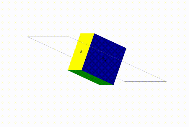
<div class="box">
<div>1</div>
<div>2</div>
<div>3</div>
<div>4</div>
<div>5</div>
<div>6</div>
</div>
</body>
</html>


 966
966


 被折叠的 条评论
为什么被折叠?
被折叠的 条评论
为什么被折叠?
 到【灌水乐园】发言


