


俗话说得好,兴趣是最好的老师。本篇文章搜集了几个漂亮的宇宙风格按钮动画效果的代码,希望它们能够激发你对 CSS 的热爱。作为前端开发者,我们不仅仅是制作写页面和与后端 API 打交道,偶尔也需要调味剂。废话不多说,让我们一起来解读这些 CSS 代码吧。
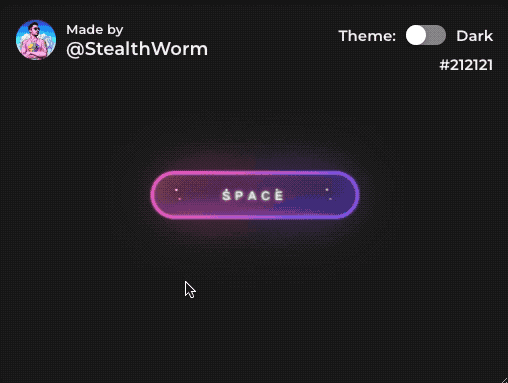
1、灿烂星空
HTML部分
<button class="btn" type="button">
  <strong>SPACE</strong>
  <div id="container-stars">
    <div id="stars"></div>
  </div>

  <div id="glow">
    <div class="circle"></div>
    <div class="circle"></div>
  </div>
</button>
CSS部分
.btn {
  display: flex;
  justify-content: center;
  align-items: center;
  width: 13rem;
  height: 3rem;
  background-size: 300% 300%;
  backdrop-filter: blur(1rem);
  border-radius: 5rem;
  transition: 0.5s;
  animation: gradient_301 5s ease infinite;
  border: double 4px transparent;
  background-image: linear-gradient(#212121, #212121),  linear-gradient(137.48deg, #ffdb3b 10%,#FE53BB 45%, #8F51EA 67%, #0044ff 87%);
  background-origin: border-box;
  background-clip: content-box, border-box;
}

#container-stars {
  position: fixed;
  z-index: -1;
  width: 100%;
  height: 100%;
  overflow: hidden;
  transition: 0.5s;
  backdrop-filter: blur(1rem);
  border-radius: 5rem;
}

strong {
  z-index: 2;
  font-family: 'Avalors Personal Use';
  font-size: 12px;
  letter-spacing: 5px;
  color: #FFFFFF;
  text-shadow: 0 0 4px white;
}

#glow {
  position: absolute;
  display: flex;
  width: 12rem;
}

.circle {
  width: 100%;
  height: 30px;
  filter: blur(2rem);
  animation: pulse_3011 4s infinite;
  z-index: -1;
}

.circle:nth-of-type(1) {
  background: rgba(254, 83, 186, 0.636);
}

.circle:nth-of-type(2) {
  background: rgba(142, 81, 234, 0.704);
}

.btn:hover #container-stars {
  z-index: 1;
  background-color: #212121;
}

.btn:hover {
  transform: scale(1.1)
}

.btn:active {
  border: double 4px #FE53BB;
  background-origin: border-box;
  background-clip: content-box, border-box;
  animation: none;
}

.btn:active .circle {
  background: #FE53BB;
}

#stars {
  position: relative;
  background: transparent;
  width: 200rem;
  height: 200rem;
}

#stars::after {
  content: "";
  position: absolute;
  top: -10rem;
  left: -100rem;
  width: 100%;
  height: 100%;
  animation: animStarRotate 90s linear infinite;
}

#stars::after {
  background-image: radial-gradient(#ffffff 1px, transparent 1%);
  background-size: 50px 50px;
}

#stars::before {
  content: "";
  position: absolute;
  top: 0;
  left: -50%;
  width: 170%;
  height: 500%;
  animation: animStar 60s linear infinite;
}

#stars::before {
  background-image: radial-gradient(#ffffff 1px, transparent 1%);
  background-size: 50px 50px;
  opacity: 0.5;
}

@keyframes animStar {
  from {
    transform: translateY(0);
  }

  to {
    transform: translateY(-135rem);
  }
}

@keyframes animStarRotate {
  from {
    transform: rotate(360deg);
  }

  to {
    transform: rotate(0);
  }
}

@keyframes gradient_301 {
  0% {
    background-position: 0% 50%;
  }

  50% {
    background-position: 100% 50%;
  }

  100% {
    background-position: 0% 50%;
  }
}

@keyframes pulse_3011 {
  0% {
    transform: scale(0.75);
    box-shadow: 0 0 0 0 rgba(0, 0, 0, 0.7);
  }

  70% {
    transform: scale(1);
    box-shadow: 0 0 0 10px rgba(0, 0, 0, 0);
  }

  100% {
    transform: scale(0.75);
    box-shadow: 0 0 0 0 rgba(0, 0, 0, 0);
  }
}
代码解释
按钮的文字是“SPACE”,使用了strong标签来加粗字体。
按钮背景是一个渐变色背景,使用了linear-gradient函数来实现。
按钮边框是一个空心的圆角矩形,使用了border属性来实现。
按钮内部有一个含有星星动画效果的div,使用了position:fixed来实现全屏,以及两个伪元素before和after来生成星星。
按钮内部还有一个发光的圆形动画效果,使用了两个.circle元素,以及animation属性和filter属性来实现。
当鼠标悬停在按钮上时,星星背景会出现,并且按钮会放大。
当按钮被点击时,发光效果变成粉色,并且渐变色背景和星星动画效果都停止。
@keyframes pulse_3011
这个动画定义了一个名为“pulse_3011”的关键帧动画。在该动画中,元素从开始状态缩小到0.75倍,同时有一个0.7不透明度的黑色阴影。在动画执行的70%处,元素扩大到原始大小,同时黑色阴影消失。最终,元素再次缩小到0.75倍,而黑色阴影再次消失。该动画无限重复。
stars::before 和 stars::after 相关的代码是实现星星循环动画的关键,设置了背景为一个由白色和透明颜色交替组成的径向渐变色,这样就形成了一些闪闪发光的小星星。通过 animation 属性设置了动画效果,其中 animStar 是一个移动动画,设置了 60s 的动画时间,并且使用 linear 动画函数,使得小星星以匀速向上移动的方式出现在屏幕上,并且使用 infinite 让其循环播放。这样就形成了一些往上移动的小星星,从而实现了整个星空的动态效果。
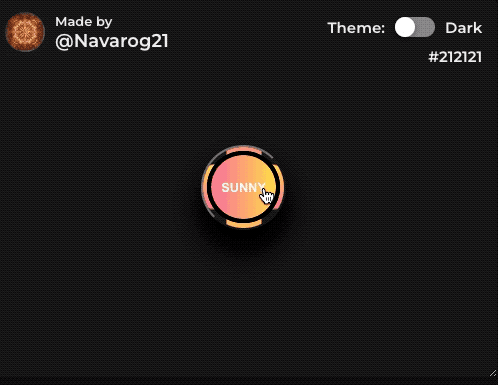
2、太阳与月亮
HTML部分
<button>
<div id="moon" class="state"> Moony</div>
<div id="sun" class="state">Sunny</div>
<span class="border border1"></span>
<span class="border border2"></span>
</button>
CSS部分
button {
  --sunGradient: linear-gradient(to right, #fa709a 0%, #fee140 100%);
  --moonGradient: linear-gradient(to right, #6a11cb 0%, #2575fc 100%);
  display: flex;
  justify-content: center;
  align-items: center;
  position: relative;
  width: 85px;
  height: 85px;
  color: white;
  font-size: 0.8em;
  font-weight: bold;
  text-transform: uppercase;
  border-radius: 70px;
  background-color: transparent;
  transition: 0.09s;
  box-shadow: 0 20px 30px black;
  overflow: hidden;
}

button:hover {
  transform: rotate(360deg);
}

button:active {
  transform: rotate(360deg) scale(1.2);
  box-shadow: -15px -15px 500px white,inset 0 0 5px black, 0px -15px 20px white;
}

.state {
  position: absolute;
  display: flex;
  justify-content: center;
  align-items: center;
  border-radius: inherit;
  width: 90%;
  height: 90%;
  border: 4px groove black;
}

#sun {
  display: none;
  transition: 2s;
  background: var(--sunGradient);
}

#moon {
  background: var(--moonGradient);
}

button:hover #sun {
  display: flex;
}

button:active #moon {
  display: none;
}

.border {
  position: absolute;
  transition: 0.4s;
  z-index: -1;
  border-radius: inherit;
  background: var(--moonGradient);
}

button:hover .border {
  background: var(--sunGradient);
}

.border1 {
  width: 45px;
  height: 100px;
  animation: 1s linear reverse infinite rotation_91;
}

.border2 {
  width: 200px;
  height: 35px;
  animation: 3s linear reverse infinite rotation_91;
}

@keyframes rotation_91 {
  from {
    transform: rotate(0deg)
  }

  to {
    transform: rotate(360deg)
  }
}
代码解释:
这段代码实现了一个状态切换的动画按钮效果,它包含两个状态:一个是太阳状态,另一个是月亮状态。当鼠标悬停在按钮上时,太阳状态会出现,月亮状态会消失。当用户点击按钮时,按钮会放大并旋转,并且太阳状态会替换成月亮状态,月亮状态则替换成太阳状态。
具体实现的逻辑如下:
HTML部分:
一个<button>元素,作为容器来包含按钮的其他元素。
两个状态元素:<div id="sun" class="state">和<div id="moon" class="state">,它们分别表示太阳和月亮状态,并且它们都有一个state类,用于设置它们的共同样式。
两个边框元素:<span class="border border1"></span>和<span class="border border2"></span>,它们用于设置按钮的边框样式。
CSS部分:
设置按钮的基本样式:它是一个圆形的容器,它的背景颜色是透明的。它有一个黑色的描边,以及一个白色的阴影。
当用户悬停在按钮上时,它会旋转360度。
当用户点击按钮时,它会放大并旋转360度,并且它的阴影会变成白色的。
两个状态元素的共同样式:它们的位置是绝对定位的,它们都是圆形的,它们都有一个4像素的黑色描边,它们的宽度和高度都是按钮的90%。
太阳状态元素的样式:它的背景是一个渐变,当用户悬停在按钮上时,它会显示出来。
月亮状态元素的样式:它的背景也是一个渐变。
当用户悬停在按钮上时,它的边框会变成太阳状态元素的渐变颜色。
两个边框元素的样式:它们的位置是绝对定位的,它们的颜色是按钮的月亮状态的渐变颜色,它们分别有两个不同的大小和不同的动画,它们都是无限循环的动画。
最后,使用keyframes关键字定义两个动画rotation_91,使它们旋转360度。
3、美丽光环
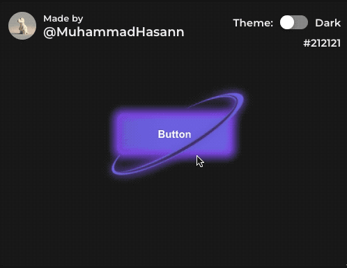
HTML部分
<button>
  Button
</button>
CSS部分:
button {
  position: relative;
  padding: 18px 55px;
  font-size: 15px;
  font-weight: bold;
  color: #fff;
  background: linear-gradient(87deg, #6d67e4, #7743db, #4e31aa, #6d67e4, #6d67e4);
  background-size: 600% 600%;
  border: 3px solid #7743db;
  border-radius: 8px;
  /* filter: drop-shadow(0 0 4px #9F73AB); */
  box-shadow: inset 0 0 10px 1px #7743db, 0 0 10px 5px #7743db;
  cursor: pointer;
  transition: all 0.5s;
  animation: GradientAnimation 25s ease infinite;
}

button::after {
  content: "";
  position: absolute;
  width: 202px;
  height: 54px;
  top: 0;
  left: -17px;
  border: 5px solid #453c67;
  border-width: 0 2px 4px 0;
  border-radius: 100%;
  filter: drop-shadow(0px 0px 6px rgba(78, 49, 180, 1));
  transform: rotate(-30deg);
  animation: LinerAfter 15s ease infinite;
}

button::before {
  content: "";
  position: absolute;
  width: 200px;
  height: 50px;
  top: 0;
  left: -20px;
  border: 5px solid #6d67e4;
  border-width: 0 12px 8px 4px;
  border-radius: 100%;
  filter: drop-shadow(0px 0px 6px rgba(109, 103, 228, 1));
  /* box-shadow: inset 0 0 10px 1px #4E31AA, 0 0 10px 5px #4E31AA; */
  transform: rotate(-30deg);
  transition: all 0.5s;
  animation: LinerBefore 15s ease infinite;
}

@keyframes GradientAnimation {
  0% {
    background-position: 0% 50%;
  }

  50% {
    background-position: 100% 50%;
  }

  100% {
    background-position: 0% 50%;
  }
}

@keyframes LinerAfter {
  0% {
    left: -27px;
    height: 54px;
  }

  50% {
    left: -7px;
    height: 37px;
  }

  100% {
    left: -27px;
    height: 54px;
  }
}

@keyframes LinerBefore {
  0% {
    left: -30px;
    height: 50px;
  }

  50% {
    left: -10px;
    height: 33px;
  }

  100% {
    left: -30px;
    height: 50px;
  }
}
代码解释:
CSS代码设置了按钮的样式,包括位置、内边距、字体大小、加粗程度、颜色、背景、边框、圆角、光标形状、过渡效果、动画等。其中background属性使用了线性渐变,border属性设置了3px宽度的实线边框,border-radius属性设置了8px的圆角。box-shadow属性设置了两个阴影效果,一个是内阴影,另一个是外阴影。button::after和button::before是button的伪元素,分别表示按钮前面和后面的圆圈。这两个圆圈都是绝对定位,大小、位置、边框、圆角等属性不同,但都使用了drop-shadow滤镜和rotate旋转变换效果。动画效果分别由GradientAnimation、LinerAfter和LinerBefore三个关键帧动画控制,分别设置了不同的属性变化规则,实现了按钮和圆圈的不同的动态效果。
结束
今天的内容就分享到这里,太多了就不利于我们去理解,虽然就三个案例,但是需要我们去慢慢消化和理解,才能成为自己的知识,建议大家还是亲自实现下上述的按钮动画效果,这些案例虽然我们在平常的工作中很少用到,但是如果你接到酷炫的项目,比如某品牌的宣传站点时,我相信这些效果还是能派上用场的。
如果你喜欢这样的文章,请点赞支持下,后续我会持续分享这类的内容,如果太少,我会觉得大家不太喜欢这样的文章,我只能自己私藏了,最后别忘记关注「前端达人」,你的支持将是我分享最大的动力,后续我会持续输出更多内容,敬请期待。


 63
63


 被折叠的 条评论
为什么被折叠?
被折叠的 条评论
为什么被折叠?
 到【灌水乐园】发言


