


需要写一个这样的消息界面: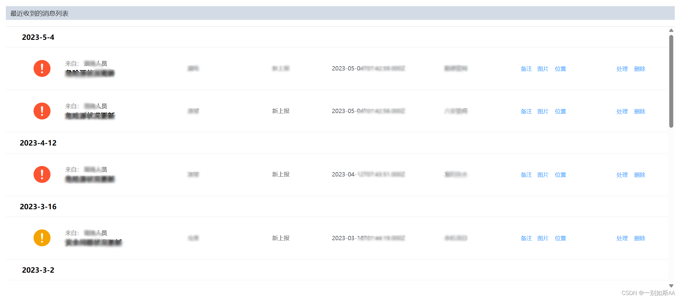
本来打算用js原生列表写,写了一会觉得麻烦死了,去翻element文档,发现了el-table就能做展开的这种:
开启el-table展开功能
在el-table标签里加这些:
<el-table  :data="tableData"  default-expand-all row-key="id"
    :tree-props="{children: 'children', hasChildren: 'hasChildren'}">
</el-table>
需要注意两点:
- 如果你的row-key是id,那么你的绑定的data里必须有id字段,并且一级菜单id是顺序排列(1、2、3、、、),并包含children字段。
- 二级菜单id亲测不能重复,不然一级菜单无法展开合并。
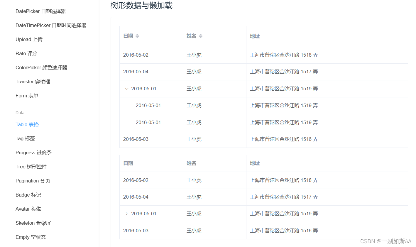
绑定数据格式
可以参考element文档中给出的示例数据:
tableData: [{
          id: 1,
          date: '2016-05-02',
          name: '王小虎',
          address: '上海市普陀区金沙江路 1518 弄'
        }, {
          id: 2,
          date: '2016-05-04',
          name: '王小虎',
          address: '上海市普陀区金沙江路 1517 弄'
        }, {
          id: 3,
          date: '2016-05-01',
          name: '王小虎',
          address: '上海市普陀区金沙江路 1519 弄',
          children: [{
              id: 31,
              date: '2016-05-01',
              name: '王小虎',
              address: '上海市普陀区金沙江路 1519 弄'
            }, {
              id: 32,
              date: '2016-05-01',
              name: '王小虎',
              address: '上海市普陀区金沙江路 1519 弄'
          }]
        }, {
          id: 4,
          date: '2016-05-03',
          name: '王小虎',
          address: '上海市普陀区金沙江路 1516 弄'
        }],
        tableData1: [{
          id: 1,
          date: '2016-05-02',
          name: '王小虎',
          address: '上海市普陀区金沙江路 1518 弄'
        }, {
          id: 2,
          date: '2016-05-04',
          name: '王小虎',
          address: '上海市普陀区金沙江路 1517 弄'
        }, {
          id: 3,
          date: '2016-05-01',
          name: '王小虎',
          address: '上海市普陀区金沙江路 1519 弄',
          hasChildren: true
        }, {
          id: 4,
          date: '2016-05-03',
          name: '王小虎',
          address: '上海市普陀区金沙江路 1516 弄'
        }]
样式调整
1.去表头
用:show-header="false"把表头去掉
防止秃顶太丑,再加一条分割线:
<el-divider></el-divider>
<el-table id="expand-table"  :data="tableData"   :show-header="false" default-expand-all row-key="id"
    :tree-props="{children: 'children', hasChildren: 'hasChildren'}">
</el-table>
分割线样式:
.el-divider{
  margin: 0;
  height: 0.0001rem; /* 这里设置分割线宽度 */
}
2.去掉展开行的小箭头
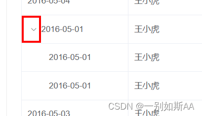
F12看了一下样式名是el-icon-arrow-right,
试了一下,需要放在全局样式里,不要scope,所以给el-table设置了id="expand-table",防止样式串到别的地方
#expand-table .el-icon-arrow-right{ /* 展开行小箭头 */
  display: none !important;
}
3.展开行的时间放在最左侧
在我的tabledata里,一级菜单的时间标题是createdAt字段,同样的在二级菜单第五列的时间也是createdAt字段,如下
这个用template和v-if处理
我这里直接把展开列的时间和内部表的icon放在同一列了,icon根据不同的消息类型设置样式
第一列:
<el-table-column prop="createdAt" label="" align="center" :formatter="dateFormat" width="120%">
  <template slot-scope="scope">
    <span v-if="scope.row.children" class="msg-font">{{scope.row.createdAt}}</span>
    <span v-if="scope.row.problemMsg"><i class="el-icon-warning problemicon"/></span>
    <span v-if="scope.row.dangerMsg"><i class="el-icon-warning dangericon"/></span>
  </template>
</el-table-column>
第五列:
<el-table-column prop="createdAt" label="" align="center" :formatter="dateFormat">
  <template slot-scope="scope"  v-if="!scope.row.children">
    <span >{{scope.row.createdAt}}</span>
  </template>
</el-table-column>
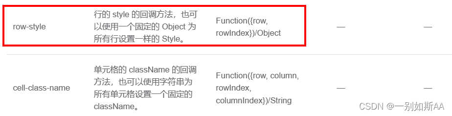
4.给一级和二级设置不同的样式
用官方文档给的每列样式row-style
el-table代码:
<el-table id="expand-table"  :data="tableData" :cell-style="msgTableRowClass"
  :show-header="false" default-expand-all row-key="id"
    :tree-props="{children: 'children', hasChildren: 'hasChildren'}">
</el-table>
这里绑定的msgTableRowClass是一个函数,在methods里写:
    msgTableRowClass({row, rowIndex}){ //el-table-row的高度
     if(row.children) { //如果此行children存在,也就是一级菜单
         return { "height":"4vh !important" }
       }else{
       return { "height":"11vh !important" }
     }
   },


 3501
3501


 被折叠的 条评论
为什么被折叠?
被折叠的 条评论
为什么被折叠?
 到【灌水乐园】发言


