


转载自:http://blog.csdn.net/harvic880925/article/details/41948211
前言:看来总结的速度还是太慢了,要写博客的内容列表已经排到了六篇,但并不想为了写博客而写博客,还是想给大家推出高品质的博客,能尽量写的详细一点,工作上也是忙,只有每天晚上抽时间写出来。这篇文章是大家在实际开发中都会遇到的问题——如何实现checkableImageview,虽然大家用其它替代方法也能实现类似效果,但我觉得只有真正实现checkable接口的自定义控件才够正宗。下面在第二篇的基本上,改进工程;
相关文章:
1、《带checkbox的ListView实现(一)——数据与渲染完全分离的传统实现方式》
2、《带checkbox的ListView实现(二)——自定义Checkable控件的实现方法》
3、《带checkbox的ListView实现(三)——CheckableImageView的实现方法》
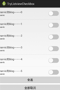
本文效果:
本篇文章建立在第二篇《带checkbox的ListView实现(二)——自定义Checkable控件的实现方法》的基础之上,建议先把这第二篇先看一遍,因为里面涉及到整体架构和CheckableFrameLayout的实现,如果不看的话,估计这一篇是看不大懂的。
好啦,言规正转,当大家看完第二篇,应该会想,这一篇还不简单,直接仿照CheckableFrameLayout重新实现一个自定义控件呗。好,那我们就先仿照CheckableFrameLayout实现一个看看。
一、activity_main.xml ——MainActivity布局文件
MainActivity布局依旧不变:
- <FrameLayout xmlns:android="http://schemas.android.com/apk/res/android"
- xmlns:tools="http://schemas.android.com/tools"
- android:layout_width="match_parent"
- android:layout_height="match_parent"
- tools:context="com.harvic.checkableimageview.MainActivity" >
- <ListView
- android:id="@+id/list"
- android:layout_width="match_parent"
- android:layout_height="wrap_content"
- android:layout_marginBottom="100dp"
- android:choiceMode="multipleChoice"
- android:dividerHeight="1px"
- android:scrollbars="none" />
- <Button android:id="@+id/all_sel"
- android:layout_width="fill_parent"
- android:layout_height="wrap_content"
- android:layout_marginBottom="50dip"
- android:layout_gravity="bottom"
- android:text="全选"
- />
- <Button android:id="@+id/all_unsel"
- android:layout_width="fill_parent"
- android:layout_height="wrap_content"
- android:layout_gravity="bottom"
- android:text="全部取消"/>
- </FrameLayout>

<FrameLayout xmlns:android="http://schemas.android.com/apk/res/android"
    xmlns:tools="http://schemas.android.com/tools"
    android:layout_width="match_parent"
    android:layout_height="match_parent"
    tools:context="com.harvic.checkableimageview.MainActivity" >

    <ListView
        android:id="@+id/list"
        android:layout_width="match_parent"
        android:layout_height="wrap_content"
        android:layout_marginBottom="100dp"
        android:choiceMode="multipleChoice"
        android:dividerHeight="1px"
        android:scrollbars="none" />

    <Button android:id="@+id/all_sel"
        android:layout_width="fill_parent"
        android:layout_height="wrap_content"
        android:layout_marginBottom="50dip"
        android:layout_gravity="bottom"
        android:text="全选"
        />
    <Button android:id="@+id/all_unsel"
        android:layout_width="fill_parent"
        android:layout_height="wrap_content"
        android:layout_gravity="bottom"
        android:text="全部取消"/>
</FrameLayout>
二、check_list_item.xml —— 单个Item布局
先看看布局代码:- <?xml version="1.0" encoding="utf-8"?>
- <com.harvic.checkableimageview.CheckableFrameLayout xmlns:android="http://schemas.android.com/apk/res/android"
- android:layout_width="match_parent"
- android:layout_height="68dp" >
- <com.harvic.checkableimageview.CheckableImageView
- android:layout_gravity="right|center_vertical"
- android:layout_width="wrap_content"
- android:layout_height="wrap_content"
- android:layout_alignParentRight="true"
- android:layout_centerVertical="true"
- android:layout_marginRight="10dp"
- android:clickable="false"
- android:src="@drawable/toggle" />
- <LinearLayout
- android:layout_width="match_parent"
- android:layout_height="match_parent"
- android:layout_marginBottom="17dp"
- android:layout_marginTop="17dp"
- android:orientation="vertical" >
- <TextView
- android:id="@+id/title"
- android:layout_width="wrap_content"
- android:layout_height="wrap_content"
- android:textSize="16sp" />
- <TextView
- android:id="@+id/subtitle"
- android:layout_width="wrap_content"
- android:layout_height="wrap_content"
- android:textSize="12sp" />
- </LinearLayout>
- </com.harvic.checkableimageview.CheckableFrameLayout>
<?xml version="1.0" encoding="utf-8"?>
<com.harvic.checkableimageview.CheckableFrameLayout xmlns:android="http://schemas.android.com/apk/res/android"
    android:layout_width="match_parent"
    android:layout_height="68dp" >

    <com.harvic.checkableimageview.CheckableImageView
        android:layout_gravity="right|center_vertical"
        android:layout_width="wrap_content"
        android:layout_height="wrap_content"
        android:layout_alignParentRight="true"
        android:layout_centerVertical="true"
        android:layout_marginRight="10dp"
        android:clickable="false"
        android:src="@drawable/toggle" />

    <LinearLayout
        android:layout_width="match_parent"
        android:layout_height="match_parent"
        android:layout_marginBottom="17dp"
        android:layout_marginTop="17dp"
        android:orientation="vertical" >

        <TextView
            android:id="@+id/title"
            android:layout_width="wrap_content"
            android:layout_height="wrap_content"
            android:textSize="16sp" />

        <TextView
            android:id="@+id/subtitle"
            android:layout_width="wrap_content"
            android:layout_height="wrap_content"
            android:textSize="12sp" />
    </LinearLayout>

</com.harvic.checkableimageview.CheckableFrameLayout>我单独把CheckableImageView的代码拿出来:
- <com.harvic.checkableimageview.CheckableImageView
- android:layout_gravity="right|center_vertical"
- android:layout_width="wrap_content"
- android:layout_height="wrap_content"
- android:layout_alignParentRight="true"
- android:layout_centerVertical="true"
- android:layout_marginRight="10dp"
- android:clickable="false"
- android:src="@drawable/toggle" />
    <com.harvic.checkableimageview.CheckableImageView
        android:layout_gravity="right|center_vertical"
        android:layout_width="wrap_content"
        android:layout_height="wrap_content"
        android:layout_alignParentRight="true"
        android:layout_centerVertical="true"
        android:layout_marginRight="10dp"
        android:clickable="false"
android:src="@drawable/toggle" />- <selector android:constantSize="true" android:variablePadding="false" xmlns:android="http://schemas.android.com/apk/res/android">
- <item android:drawable="@drawable/toggle_on" android:state_checked="true"/>
- <item android:drawable="@drawable/toggle_off" android:state_checked="false"/>
- <item android:drawable="@drawable/toggle_off"/>
- </selector>
<selector android:constantSize="true" android:variablePadding="false" xmlns:android="http://schemas.android.com/apk/res/android">
    <item android:drawable="@drawable/toggle_on"  android:state_checked="true"/>
    <item android:drawable="@drawable/toggle_off" android:state_checked="false"/>
    <item android:drawable="@drawable/toggle_off"/>
</selector>我们仿照CheckableFrameLayout实现Checkable接口,又因为CheckableImageView要显示图片,所以又要派生自ImageView,所以代码如下:
- public class CheckableImageView extends ImageView implements Checkable{
- /** @param context
- * @param attrs */
- public CheckableImageView(Context context, AttributeSet attrs) {
- super(context, attrs);
- // TODO Auto-generated constructor stub
- }
- private boolean mChecked = false;
- @Override
- public void setChecked(boolean checked) {
- // TODO Auto-generated method stub
- if (mChecked != checked) {
- mChecked = checked;
- refreshDrawableState();
- }
- }
- @Override
- public boolean isChecked() {
- // TODO Auto-generated method stub
- return mChecked;
- }
- @Override
- public void toggle() {
- // TODO Auto-generated method stub
- setChecked(!mChecked);
- }
- }
public class CheckableImageView extends ImageView implements Checkable{

	/** @param context
	 * @param attrs */
	public CheckableImageView(Context context, AttributeSet attrs) {
		super(context, attrs);
		// TODO Auto-generated constructor stub
	}

	private boolean mChecked = false;
	@Override
	public void setChecked(boolean checked) {
		// TODO Auto-generated method stub
		if (mChecked != checked) {
			mChecked = checked;
			refreshDrawableState();
		}
	}

	@Override
	public boolean isChecked() {
		// TODO Auto-generated method stub
		return mChecked;
	}

	@Override
	public void toggle() {
		// TODO Auto-generated method stub
		setChecked(!mChecked);
	}

}
没效果!!!!!为什么会这样!!!!!!!!
放用户点击某个Item的时候,我们明明设置了SetChecked()了啊,在SetChecked()内部:

- public void setChecked(boolean checked) {
- // TODO Auto-generated method stub
- if (mChecked != checked) {
- mChecked = checked;
- refreshDrawableState();
- }
- }
public void setChecked(boolean checked) {
	// TODO Auto-generated method stub
	if (mChecked != checked) {
		mChecked = checked;
		refreshDrawableState();
	}
}- <item android:drawable="@drawable/toggle_on" android:state_checked="true"/>
<item android:drawable="@drawable/toggle_on" android:state_checked="true"/>首先,我们可以重写onCreateDrawableState函数,来指定控件所具有的状态。即当控件在获取自己所应具有的状态时,会调用onCreateDrawableState(int extraSpace)方法,其定义如下:
public int[] onCreateDrawableState(int extraSpace){
}
返回值:如果extraSpace为0,直接返回控件本身所具有的状态集。如果extraSpace不为0,返回的值除了具有控件本身所具有的状态集,会额外分配指定的空间以便用户自主指定状态。
下面看看我们重写onCreateDrawableState()的完整代码:
int[] CHECKED_STATE_SET = { android.R.attr.state_checked };- @Override
- public int[] onCreateDrawableState(int extraSpace) {
- final int[] drawableState = super.onCreateDrawableState(extraSpace + 1);
- if (isChecked()) {
- mergeDrawableStates(drawableState, CHECKED_STATE_SET);
- }
- return drawableState;
- }
@Override
public int[] onCreateDrawableState(int extraSpace) {
	final int[] drawableState = super.onCreateDrawableState(extraSpace + 1);
	if (isChecked()) {
		mergeDrawableStates(drawableState, CHECKED_STATE_SET);
	}
	return drawableState;
}- final int[] drawableState = super.onCreateDrawableState(extraSpace + 1);

final int[] drawableState = super.onCreateDrawableState(extraSpace + 1);然后,当控件被选中的时候,我们要给它添加上被选中的状态,让它调用selector里的Android:state_checked="true"来加载当前选中时的图片。
所以完整的代码应该是这样的:
- public class CheckableImageView extends ImageView implements Checkable{
- /** @param context
- * @param attrs */
- public CheckableImageView(Context context, AttributeSet attrs) {
- super(context, attrs);
- // TODO Auto-generated constructor stub
- }
- private boolean mChecked = false;
- private static final int[] CHECKED_STATE_SET = { android.R.attr.state_checked };
- @Override
- public int[] onCreateDrawableState(int extraSpace) {
- final int[] drawableState = super.onCreateDrawableState(extraSpace + 1);
- if (isChecked()) {
- mergeDrawableStates(drawableState, CHECKED_STATE_SET);
- }
- return drawableState;
- }
- @Override
- public void setChecked(boolean checked) {
- // TODO Auto-generated method stub
- if (mChecked != checked) {
- mChecked = checked;
- refreshDrawableState();
- }
- }
- @Override
- public boolean isChecked() {
- // TODO Auto-generated method stub
- return mChecked;
- }
- @Override
- public void toggle() {
- // TODO Auto-generated method stub
- setChecked(!mChecked);
- }
- }
public class CheckableImageView extends ImageView implements Checkable{

	/** @param context
	 * @param attrs */
	public CheckableImageView(Context context, AttributeSet attrs) {
		super(context, attrs);
		// TODO Auto-generated constructor stub
	}

	private boolean mChecked = false;
	private static final int[] CHECKED_STATE_SET = { android.R.attr.state_checked };


	@Override
	public int[] onCreateDrawableState(int extraSpace) {
		final int[] drawableState = super.onCreateDrawableState(extraSpace + 1);
		if (isChecked()) {
			mergeDrawableStates(drawableState, CHECKED_STATE_SET);
		}
		return drawableState;
	}

	@Override
	public void setChecked(boolean checked) {
		// TODO Auto-generated method stub
		if (mChecked != checked) {
			mChecked = checked;
			refreshDrawableState();
		}
	}

	@Override
	public boolean isChecked() {
		// TODO Auto-generated method stub
		return mChecked;
	}

	@Override
	public void toggle() {
		// TODO Auto-generated method stub
		setChecked(!mChecked);
	}

}android.R.attr.state_checked 的官方说明是这样的:
State identifier indicating that the object is currently checked. See state_checkable for an additional identifier that can indicate if any object may ever display a check,regardless of whether state_checked is currently set. Must be a boolean value, either "true" or "false". This may also be a reference to a resource (in the form "@[package:]type:name") or theme attribute (in the form "?[package:][type:]name") containing a value of this type.
CheckableImageView总结:
(1)CheckableImageView执行流程:setChecked -> refreshDrawableState ->onCreateDrawableState ->调用selector设置状态
(2)CheckableImageView派生自Checkable接口,使CheckableImageView具有的可选中的状态,但当用户点击选中时,我们感觉会调用selector的state_checked="true"的状态,但state_checked属性对ImageView是无效的,因为ImageView并不具有可选中的属性,所以我们在调用selector前,应该为ImageView添加上state_checked属性这就是重写onCreateDrawableState()的原因,当用户选中时,给ImageView设置选中状态,强制使它处于选中状态中,这时,它就会调用我们的state_checked属性
OK啦,本文就到了,这里只列出来了改变的部分,大家参考源码看一下吧。
如果本文有帮到你,记得加注哦
源码下载地址:http://download.csdn.net/detail/harvic880925/8263633
请大家尊重原创者版权,转载请标明出处:http://blog.csdn.net/harvic880925/article/details/41948211 谢谢。


 扫一扫
扫一扫
 819
819

 被折叠的 条评论
为什么被折叠?
被折叠的 条评论
为什么被折叠?
 到【灌水乐园】发言


