


CSS Layout - float and clear
float 属性指定元素是否需要浮动。
clear 属性用以控制浮动元素的行为。

<!DOCTYPE html>
<html>
    <head>
        <style>
            div.left{
                background-color: #2196F3;
                padding: 20px;
                float: left;
                width: 30%;
                opacity: 0.7;
                text-align: center;
            }

            div.right {
                background-color: #F44336;
                padding: 20px;
                float: right;
                width: 30%;
                opacity: 0.7;
                text-align: center;
            }

            .floatl::after {
                color: white;
                content: "Float Left";
                font-weight: bold;
            }

            .floatr::after {
                color: white;
                content: "Float Right";
                font-weight: bold;
            }
        </style>
    </head>
    <body>
        <div class="left">
            <span class="floatl"></span>
        </div>
        <div class="right">
            <span class="floatr"></span>
        </div>
    </body>
</html>
The float Property
最简单的使用,float 属性用以对图片盘绕文字。
下列示例指定图片在文本中向右浮动:
<!DOCTYPE html>
<html>
<head>
<style>
img {
float: right;
margin: 0 0 10px 10px;
}
</style>
</head>
<body>
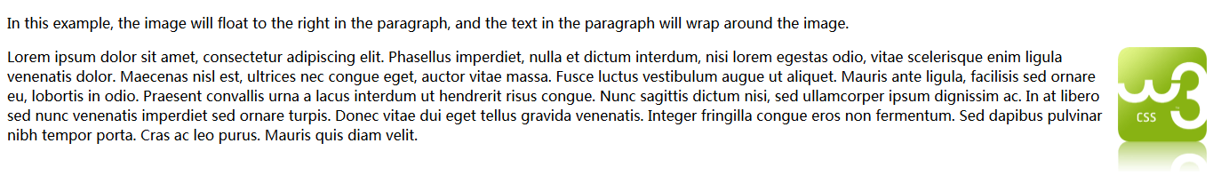
<p>In this example, the image will float to the right in the
paragraph, and the text in the paragraph will wrap around the image.</p>
<p>
<img src="http://www.w3schools.com/css/w3css.gif" alt="W3Schools.com" width="100" height="140">
Lorem ipsum dolor sit amet, consectetur adipiscing elit. Phasellus
imperdiet, nulla et dictum interdum, nisi lorem egestas odio, vitae
scelerisque enim ligula venenatis dolor. Maecenas nisl est, ultrices
nec congue eget, auctor vitae massa. Fusce luctus vestibulum augue ut
aliquet. Mauris ante ligula, facilisis sed ornare eu, lobortis in
odio. Praesent convallis urna a lacus interdum ut hendrerit risus
congue. Nunc sagittis dictum nisi, sed ullamcorper ipsum dignissim ac.
In at libero sed nunc venenatis imperdiet sed ornare turpis. Donec
vitae dui eget tellus gravida venenatis. Integer fringilla congue eros
non fermentum. Sed dapibus pulvinar nibh tempor porta. Cras ac leo
purus. Mauris quis diam velit.
</p>
</body>
</html>The clear Property
clear 属性用以控制浮动元素的行为。
位于浮动元素之后的元素将围绕浮动元素而布局。为了避免这种情况,可以使用 clear 属性。
clear 属性指定哪个方位的浮动元素不能浮动:
<!DOCTYPE html>
<html>
<head>
<style>
.div1 {
float: left;
width: 100px;
height: 50px;
margin: 10px;
border: 3px solid #73AD21;
}
.div2 {
border: 1px solid red;
}
.div3 {
float: left;
width: 100px;
height: 50px;
margin: 10px;
border: 3px solid #73AD21;
}
.div4 {
border: 1px solid red;
clear: left;
}
</style>
</head>
<body>
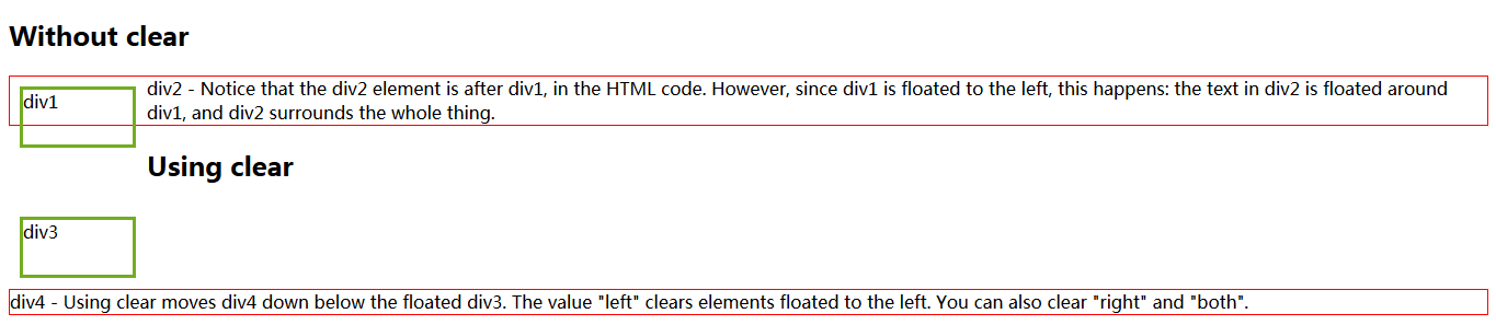
<h2>Without clear</h2>
<div class="div1">div1</div>
<div class="div2">
div2 - Notice that the div2 element is after
div1, in the HTML code. However, since div1 is floated to the left,
this happens: the text in div2 is floated around div1, and div2
surrounds the whole thing.
</div>
<h2>Using clear</h2>
<div class="div3">div3</div>
<div class="div4">
div4 - Using clear moves div4 down below the
floated div3. The value "left" clears elements floated to the left.
You can also clear "right" and "both".
</div>
</body>
</html>The clearfix Hack - overflow: auto;
如果一个元素的高度比它的父级容器要高,那么,该元素会浮动且会溢出容器。
然而,我们可以对容器元素添加 overflow: auto; 来修复这个问题:
<!DOCTYPE html>
<html>
<head>
<style>
div {
border: 3px solid #73AD21;
}
.img1 {
float: right;
}
.clearfix {
overflow: auto;
}
.img2 {
float: right;
}
</style>
</head>
<body>
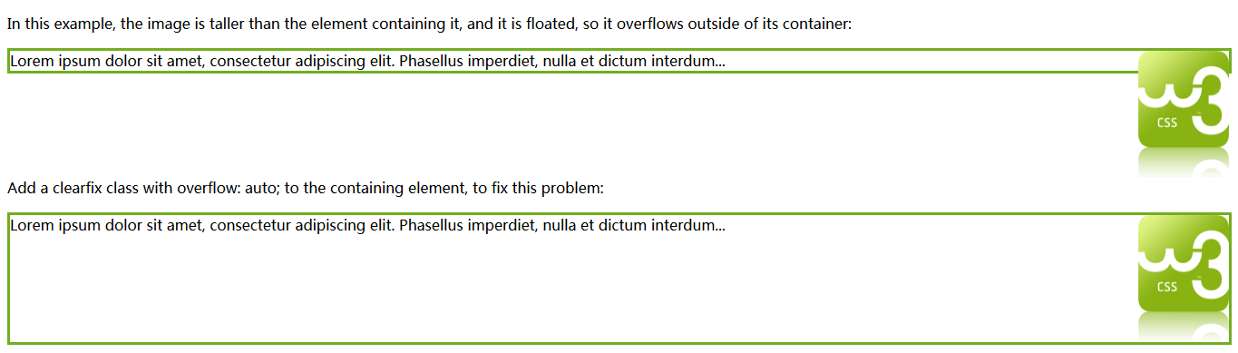
<p>
In this example, the image is taller than the element containing
it, and it is floated, so it overflows outside of its container:
</p>
<div>
<img class="img1" src="http://www.w3schools.com/css/w3css.gif" alt="W3Schools.com" width="100" height="140">
Lorem ipsum dolor sit amet, consectetur adipiscing elit. Phasellus imperdiet, nulla et dictum interdum...
</div>
<p style="clear: right">
Add a clearfix class with overflow: auto;
to the containing element, to fix this problem:
</p>
<div class="clearfix">
<img class="img2" src="http://www.w3schools.com/css/w3css.gif" alt="W3Schools.com" width="100" height="140">
Lorem ipsum dolor sit amet, consectetur adipiscing elit. Phasellus imperdiet, nulla et dictum interdum...
</div>
</body>
</html>Web Layout Example
对整个 web 布局使用 float 属性是通常的做法:
<!DOCTYPE html>
<html>
<head>
<style>
div {
border: 3px solid blue;
}
.clearfix {
overflow: auto;
}
nav {
float: left;
width: 200px;
border: 3px solid #73AD21;
}
section {
margin-left: 206px;
border: 3px solid red;
}
</style>
</head>
<body>
<div class="clearfix">
<nav>
<span>nav</span>
<ul>
<li><a target="_blank" href="#">Home</a></li>
<li><a target="_blank" href="#">CSS</a></li>
<li><a target="_blank" href="#">HTML</a></li>
<li><a target="_blank" href="#">JavaScript</a></li>
</ul>
</nav>
<section>
<span>section</span>
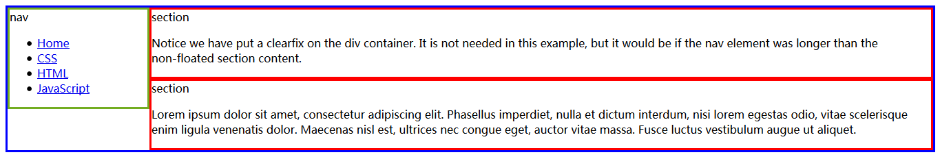
<p>
Notice we have put a clearfix on the div container. It is not
needed in this example, but it would be if the nav element was
longer than the non-floated section content.
</p>
</section>
<section>
<span>section</span>
<p>
Lorem ipsum dolor sit amet, consectetur adipiscing elit.
Phasellus imperdiet, nulla et dictum interdum, nisi lorem egestas
odio, vitae scelerisque enim ligula venenatis dolor. Maecenas nisl
est, ultrices nec congue eget, auctor vitae massa. Fusce luctus
vestibulum augue ut aliquet.
</p>
</section>
</div>
</body>
</html>


 990
990

 被折叠的 条评论
为什么被折叠?
被折叠的 条评论
为什么被折叠?
 到【灌水乐园】发言


