


CSS Layout - inline-block
The inline-block Value
创建盒子式的表格,使其占据浏览器的整个宽度,并且该表格被浏览器包裹得很好(任意改变浏览器窗口的大小),使用 float 属性在很长一段时间是可能。
然而,将 display 属性设置为 inline-block
值以创建盒子式的表格会更容易。
inline-block 元素类似于行内(inline)元素,但它占据宽度和高度。
示例:
使用 float(注意:我们还需要在浮动元素之后指定 clear 属性):
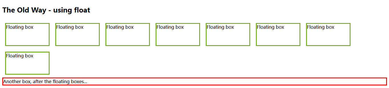
<!DOCTYPE html>
<html>
    <head>
        <style>
            .floating-box {
                float: left;
                width: 150px;
                height: 75px;
                margin: 10px;
                border: 3px solid #73AD21;
            }

            .after-box {
                clear: left;
                border: 3px solid red;
            }
        </style>
    </head>
    <body>
        <h2>The Old Way - using float</h2>
        <div class="floating-box">Floating box</div>
        <div class="floating-box">Floating box</div>
        <div class="floating-box">Floating box</div>
        <div class="floating-box">Floating box</div>
        <div class="floating-box">Floating box</div>
        <div class="floating-box">Floating box</div>
        <div class="floating-box">Floating box</div>
        <div class="floating-box">Floating box</div>
        <div class="after-box">Another box, after the floating boxes...</div>
    </body>
</html>
将 display 属性设置为 inline-block
值可以达到相同的效果(注意:没有使用 clear 属性):
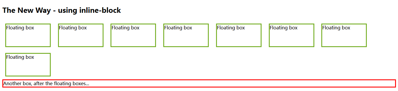
<!DOCTYPE html>
<html>
    <head>
        <style>
            .floating-box {
                display: inline-block;
                width: 150px;
                height: 75px;
                margin: 10px;
                border: 3px solid #73AD21;
            }

            .after-box {
                border: 3px solid red;
            }
        </style>
    </head>
    <body>
        <h2>The New Way - using inline-block</h2>

        <div class="floating-box">Floating box</div>
        <div class="floating-box">Floating box</div>
        <div class="floating-box">Floating box</div>
        <div class="floating-box">Floating box</div>
        <div class="floating-box">Floating box</div>
        <div class="floating-box">Floating box</div>
        <div class="floating-box">Floating box</div>
        <div class="floating-box">Floating box</div>

        <div class="after-box">Another box, after the floating boxes...</div>
    </body>
</html>


 1936
1936


 被折叠的 条评论
为什么被折叠?
被折叠的 条评论
为什么被折叠?
 到【灌水乐园】发言


