


原始网址:http://www.w3schools.com/css/css_image_transparency.asp
翻译:
CSS Opacity / Transparency
opacity 属性用以定义元素的 opacity/transparency 。
Transparent Image
opacity 属性取值范围是 0.0 - 1.0 。值越低,越透明:
<!DOCTYPE html>
<html>
<head>
<style>
.w3-center {
    text-align: center !important;
}

.w3-third {
    width: 30%;
    float: left;
    margin: 20px;
}

.w3-row-padding {
    width: 100%;
}
</style>
</head>
<body>
    <div class="w3-row-padding" style="margin: 0 -16px">
        <div class="w3-third w3-center">
            <img src="http://www.w3schools.com/css/img_forest.jpg" style="width: 100%; opacity: 0.2;">
            <p>opacity 0.2</p>
        </div>

        <div class="w3-third w3-center">
            <img src="http://www.w3schools.com/css/img_forest.jpg" style="width: 100%; opacity: 0.5">
            <p>opacity 0.5</p>
        </div>

        <div class="w3-third w3-center">
            <img src="http://www.w3schools.com/css/img_forest.jpg" style="width: 100%;">
            <p>opacity 1<br>(default)</p>
        </div>
    </div>
</body>
</html>
注意:**IE8 以及早期浏览器使用 filter:alpha(opacity=x) 。**x 取值范围是 0 - 100 。 值越低,越透明。
img {
    opacity: 0.5;
    filter: alpha(opacity=50); /* For IE8 and earlier */
}
Transparent Hover Effect
opacity 属性经常和 :hover 选择器一起使用以变更鼠标悬停(mouse-over)时候的透明度:
<!DOCTYPE html>
<html>
<head>
<style>
img {
    opacity: 0.5;
    filter: alpha(opacity=50); /* For IE8 and earlier */
}

img:hover {
    opacity: 1.0;
    filter: alpha(opacity=100); /* For IE8 and earlier */
}
</style>
</head>
<body>
    <h1>Image Transparency</h1>
    <p>The opacity property is often used together with the :hover selector to change the opacity on mouse-over:</p>
    <img src="http://www.w3schools.com/css/img_lights.jpg" alt="Forest" width="170" height="100">
    <img src="http://www.w3schools.com/css/img_mountains.jpg" alt="Mountains" width="170" height="100">
    <img src="http://www.w3schools.com/css/img_fjords.jpg" alt="Fjords" width="170" height="100">
    <p><b>Note:</b> In IE, a !DOCTYPE must be added for the :hover selector to work on other elements than the a element.</p>
</body>
</html>示例解释
第一段 CSS 代码块和示例 1 中的代码是相似的。另外,当用户鼠标悬停于图片之上的时候,我们还增加了该如何变更式样的控制。在这个示例中,当用户鼠标悬停于图片之上的时候,我们想让它们不透明。相应的 CSS 代码为 opacity:1; 。
当鼠标指针从图片上离开的时候,图片将再次透明。
以下为悬停效果的反例:
<!DOCTYPE html>
<html>
<head>
<style>
img:hover {
opacity: 0.5;
filter: alpha(opacity=50); /* For IE8 and earlier */
}
</style>
</head>
<body>
<h1>Image Transparency</h1>
<p>The opacity property is often used together with the :hover selector to change the opacity on mouse-over:</p>
<img src="http://www.w3schools.com/css/img_lights.jpg" alt="Forest" width="170" height="100">
<img src="http://www.w3schools.com/css/img_mountains.jpg" alt="Mountains" width="170" height="100">
<img src="http://www.w3schools.com/css/img_fjords.jpg" alt="Fjords" width="170" height="100">
<p><b>Note:</b> In IE, a !DOCTYPE must be added for the :hover selector to work on other elements than the a element.</p>
</body>
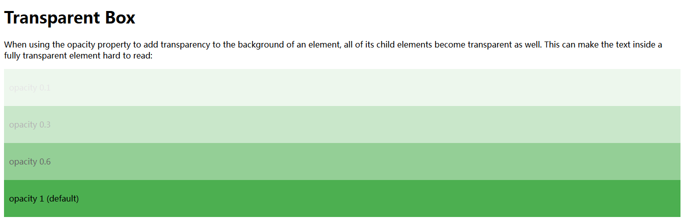
</html>Transparent Box
当使用 opacity 属性对元素的背景添加透明的时候,所有的子元素也会跟着透明。这会使置于完全透明的元素内的文本难以阅读:
<!DOCTYPE html>
<html>
<head>
<style>
div {
    background-color: #4CAF50;
    padding: 10px;
}

div.first {
    opacity: 0.1;
    filter: alpha(opacity = 10); /* For IE8 and earlier */
}

div.second {
    opacity: 0.3;
    filter: alpha(opacity = 30); /* For IE8 and earlier */
}

div.third {
    opacity: 0.6;
    filter: alpha(opacity = 60); /* For IE8 and earlier */
}
</style>
</head>
<body>
    <h1>Transparent Box</h1>
    <p>
        When using the opacity property to add transparency to the
        background of an element, all of its child elements become transparent
        as well. This can make the text inside a fully transparent element
        hard to read:
    </p>
    <div class="first"><p>opacity 0.1</p></div>
    <div class="second"><p>opacity 0.3</p></div>
    <div class="third"><p>opacity 0.6</p></div>
    <div><p>opacity 1 (default)</p></div>
</body>
</html>
Transparency using RGBA
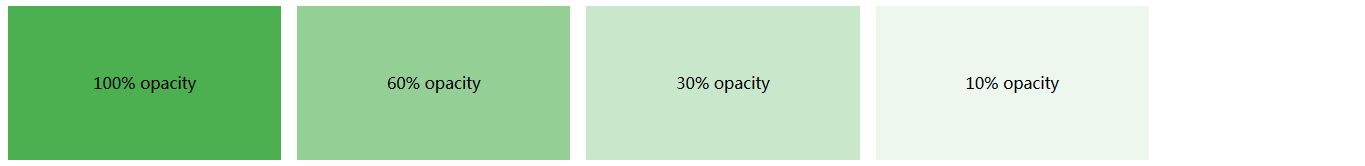
如果我们不想对子元素应用 opacity,如上例所示,那么,我们还可以使用 RGBA 颜色值。以下示例只对背景色设置了透明度,对文本没有设置:
<!DOCTYPE html>
<html>
<head>
<style>
.w3-row-padding {
    padding: 0 8px;
}

.w3-center {
    text-align: center !important;
}

.w3-col.m3 {
    float: left;
    width: 20%;
    padding: 0 8px;
}
</style>
</head>
<body>
    <div class="w3-row-padding" style="margin:0 -16px">
        <div class="w3-col m3 w3-center">
            <div style="background:rgb(76, 175, 80);padding:50px;color:black"><p>100% opacity</p></div>
        </div>

        <div class="w3-col m3 w3-center">
            <div style="background:rgba(76, 175, 80,0.6);padding:50px;color:black"><p>60% opacity</p></div>
        </div>

        <div class="w3-col m3 w3-center">
            <div style="background:rgba(76, 175, 80,0.3);padding:50px;color:black"><p>30% opacity</p></div>
        </div>

        <div class="w3-col m3 w3-center">
            <div style="background:rgba(76, 175, 80,0.1);padding:50px;color:black"><p>10% opacity</p></div>
        </div>
    </div>
</body>
</html>
你可以从 CSS Colors Chapter 章节学习以使用 RGB 作为颜色值。另外,CSS3 是以 RGBA 来介绍 RGB 颜色值的,A 即 an alpha channel 是用以定义颜色的透明度。
我们使用 rgba(red, green, blue, alpha) 来指定 RGBA 颜色值。alpha 参数值是介于 0.0 和 1.0 之间的数。
提示:你将在 CSS3 Colors Chapter 章节学习到更多有关 RGBA 颜色的内容。
<!DOCTYPE html>
<html>
<head>
<style>
div {
    background: rgb(76, 175, 80);
    padding: 10px;
}

div.first {
    background: rgba(76, 175, 80, 0.1);
}

div.second {
    background: rgba(76, 175, 80, 0.3);
}

div.third {
    background: rgba(76, 175, 80, 0.6);
}
</style>
</head>
<body>

    <h1>Transparent Box</h1>
    <p>With opacity:</p>
    <div style="opacity:0.1;"><p>10% opacity</p></div>
    <div style="opacity:0.3;"><p>30% opacity</p></div>
    <div style="opacity:0.6;"><p>60% opacity</p></div>
    <div><p>opacity 1</p></div>

    <p>With RGBA color values:</p>
    <div class="first"><p>10% opacity</p></div>
    <div class="second"><p>30% opacity</p></div>
    <div class="third"><p>60% opacity</p></div>
    <div><p>default</p></div>

    <p>Notice how the text gets transparent as well as the background color when using the opacity property.</p>

</body>
</html>
Text in Transparent Box
<!DOCTYPE html>
<html>
<head>
<style>
div.background {
  background: url(http://www.w3schools.com/css/klematis.jpg) repeat;
  border: 2px solid black;
}

div.transbox {
  margin: 30px;
  background-color: #ffffff;
  border: 1px solid black;
  opacity: 0.6;
  filter: alpha(opacity=60); /* For IE8 and earlier */
}

div.transbox p {
  margin: 5%;
  font-weight: bold;
  color: #000000;
}
</style>
</head>
<body>
    <div class="background">
        <div class="transbox">
            <p>This is some text that is placed in the transparent box.</p>
        </div>
    </div>
</body>
</html>
首先,我们创建了一个有背景图片和边框的 <div> 元素(class="background"),然后,我们在其内部创建了另一个 <div> 元素(class="transbox")。<div class="transbox"> 有背景色、边框 - div 是透明的。在透明 div 的内部,我们在 <p> 元素内添加了相应的文本。


 312
312


 被折叠的 条评论
为什么被折叠?
被折叠的 条评论
为什么被折叠?
 到【灌水乐园】发言


