


原始网址:http://www.w3schools.com/css/css3_transitions.asp
翻译:
CSS3 过渡(CSS3 Transitions)
CSS3 过渡
CSS3 过渡允许你在给定的持续时间之内以平缓地改变属性值(从一个值改变为另一个值)。
示例:鼠标指针悬停于下列元素之上以观察 CSS3 的过渡效果

<!DOCTYPE html>
<html>
<head>
<style>
.animated_div {
    background: #92b901 none repeat scroll 0 0;
    border-radius: 5px;
    color: #ffffff;
    float: left;
    font-size: 15px;
    font-weight: bold;
    height: 40px;
    margin: 5px;
    opacity: 0.4;
    padding: 10px;
    position: absolute;
    transition: width 1s ease 0s, height 1s ease 0s, transform 1s ease 0s, background 1s ease 0s, font-size 1s ease 0s, opacity 1s ease 0s;
    width: 65px;
}

.animated_div:hover {
    background: #1ec7e6 none repeat scroll 0 0;
    font-size: 35px;
    height: 80px;
    opacity: 1;
    width: 130px;
}
</style>
</head>
<body>
    <div style="height: 90px;"><div class="animated_div">CSS3</div></div>
</body>
</html>
Browser Support for Transitions
表格里的数字代表对 CSS3 属性全面支持的各浏览器的第一个版本号。
数字之后跟从 -webkit-、-moz- 或 -o- 指定带前缀工作的第一个版本号。
| 属性(Property) |  |  |  |  |  |
|---|---|---|---|---|---|
| transition | 26.0 4.0 -webkit- | 10.0 | 16.0 4.0 -moz- | 6.1 3.1 -webkit- | 12.1 10.5 -o- |
| transition-delay | 26.0 4.0 -webkit- | 10.0 | 16.0 4.0 -moz- | 6.1 3.1 -webkit- | 12.1 10.5 -o- |
| transition-duration | 26.0 4.0 -webkit- | 10.0 | 16.0 4.0 -moz- | 6.1 3.1 -webkit- | 12.1 10.5 -o- |
| transition-property | 26.0 4.0 -webkit- | 10.0 | 16.0 4.0 -moz- | 6.1 3.1 -webkit- | 12.1 10.5 -o- |
| transition-timing-function | 26.0 4.0 -webkit- | 10.0 | 16.0 4.0 -moz- | 6.1 3.1 -webkit- | 12.1 10.5 -o- |
如何使用 CSS3 过渡?
要创建过渡效果,你必须满足 2 个条件:
- 你想添加效果的 CSS 属性
效果的持续时间
注意:如果持续时间部分没有被指定,将不会产生过渡效果,因为该默认值为 0 。
下列示例将呈现 100px * 100px 的红色 <div> 元素。该 <div> 元素还对宽度指定了过渡效果,持续时间为 2 秒:
div {
    width: 100px;
    height: 100px;
    background: red;
    -webkit-transition: width 2s; /* Safari */
    transition: width 2s;
}
当被指定的 CSS 属性(宽)变更值的时候,过渡效果开始发生。
现在,当用户鼠标指针悬停于 <div> 元素之上的时候,让我们给予宽度属性一个新值:
div:hover {
    width: 300px;
}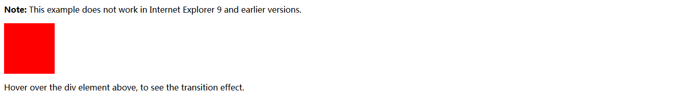
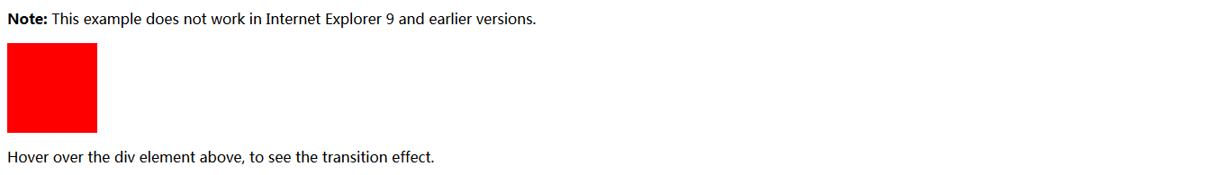
<!DOCTYPE html>
<html>
<head>
<style>
div {
    width: 100px;
    height: 100px;
    background: red;
    -webkit-transition: width 2s; /* For Safari 3.1 to 6.0 */
    transition: width 2s;
}

div:hover {
    width: 300px;
}
</style>
</head>
<body>
    <p><b>Note:</b> This example does not work in Internet Explorer 9 and earlier versions.</p>
    <div></div>
    <p>Hover over the div element above, to see the transition effect.</p>
</body>
</html>
注意:当光标移出元素的时候,它将逐渐变回到原样式。
改变多个属性值
下列示例对宽、高属性均添加过渡效果,对宽度的持续时间为 2 秒,对高度的持续时间为 4 秒:
div {
    -webkit-transition: width 2s, height 4s; /* Safari */
    transition: width 2s, height 4s;
}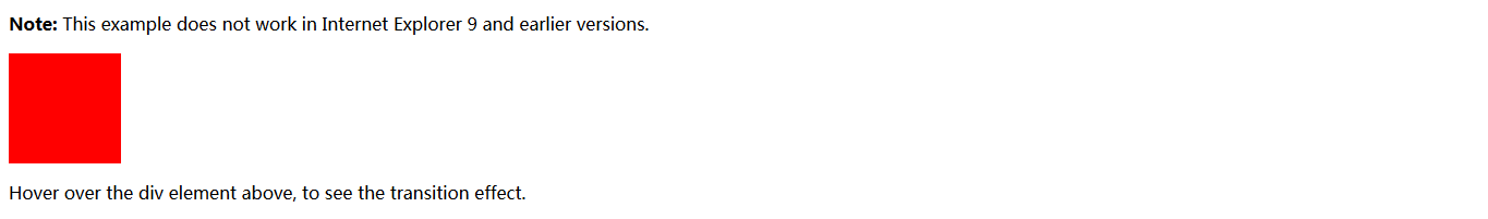
<!DOCTYPE html>
<html>
<head>
<style>
div {
    width: 100px;
    height: 100px;
    background: red;
    -webkit-transition: width 2s, height 4s; /* For Safari 3.1 to 6.0 */
    transition: width 2s, height 4s;
}

div:hover {
    width: 300px;
    height: 300px;
}
</style>
</head>
<body>
    <p><b>Note:</b> This example does not work in Internet Explorer 9 and earlier versions.</p>
    <div></div>
    <p>Hover over the div element above, to see the transition effect.</p>
</body>
</html>
指定过渡的速度曲线
transition-timing-function 属性指定过渡效果的速度曲线。
transition-timing-function 可以有以下取值:
- ease - 指定过渡效果为慢、快、慢的节奏(默认值)
- linear - 指定过渡效果为匀速
- ease-in - 指定过渡效果为慢开始
- ease-out - 指定过渡效果为慢结束
- ease-in-out - 指定过渡效果为慢开始、慢结束
- cubic-bezier(n,n,n,n) - 自定义贝塞尔曲线函数值
下列示例展示了可被使用的不同速度曲线:
#div1 {transition-timing-function: linear;}
#div2 {transition-timing-function: ease;}
#div3 {transition-timing-function: ease-in;}
#div4 {transition-timing-function: ease-out;}
#div5 {transition-timing-function: ease-in-out;}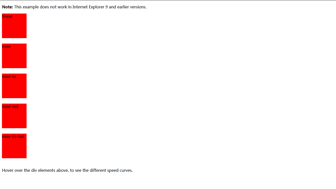
<!DOCTYPE html>
<html>
<head>
<style>
div {
width: 100px;
height: 100px;
background: red;
-webkit-transition: width 2s; /* Safari */
transition: width 2s;
}
/* For Safari 3.1 to 6.0 */
#div1 {
-webkit-transition-timing-function: linear;
}
#div2 {
-webkit-transition-timing-function: ease;
}
#div3 {
-webkit-transition-timing-function: ease-in;
}
#div4 {
-webkit-transition-timing-function: ease-out;
}
#div5 {
-webkit-transition-timing-function: ease-in-out;
}
/* Standard syntax */
#div1 {
transition-timing-function: linear;
}
#div2 {
transition-timing-function: ease;
}
#div3 {
transition-timing-function: ease-in;
}
#div4 {
transition-timing-function: ease-out;
}
#div5 {
transition-timing-function: ease-in-out;
}
div:hover {
width: 300px;
}
</style>
</head>
<body>
<p><b>Note:</b> This example does not work in Internet Explorer 9 and earlier versions.</p>
<div id="div1">linear</div>
<br>
<div id="div2">ease</div>
<br>
<div id="div3">ease-in</div>
<br>
<div id="div4">ease-out</div>
<br>
<div id="div5">ease-in-out</div>
<br>
<p>Hover over the div elements above, to see the different speed curves.</p>
</body>
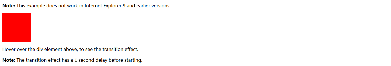
</html>延迟过渡效果(Delay the Transition Effect)
transition-delay 属性指定过渡效果的延迟。
下列示例在开始之前有 1 秒延迟:
div {
    -webkit-transition-delay: 1s; /* Safari */
    transition-delay: 1s;
}
<!DOCTYPE html>
<html>
<head>
<style>
div {
    width: 100px;
    height: 100px;
    background: red;
    -webkit-transition: width 3s; /* Safari */
    -webkit-transition-delay: 1s; /* Safari */
    transition: width 3s;
    transition-delay: 1s;
}

div:hover {
    width: 300px;
}
</style>
</head>
<body>
    <p><b>Note:</b> This example does not work in Internet Explorer 9 and earlier versions.</p>
    <div></div>
    <p>Hover over the div element above, to see the transition effect.</p>
    <p><b>Note:</b> The transition effect has a 1 second delay before starting.</p>
</body>
</html>
过渡 + 变换(Transition + Transformation)
下列示例给过渡效果增加变换:
div {
    -webkit-transition: width 2s, height 2s, -webkit-transform 2s; /* Safari */
    transition: width 2s, height 2s, transform 2s;
}
<!DOCTYPE html>
<html>
<head>
<style>
div {
    width: 100px;
    height: 100px;
    background: red;
    -webkit-transition: width 2s, height 2s, -webkit-transform 2s;
    /* Safari */
    transition: width 2s, height 2s, transform 2s;
}

div:hover {
    width: 300px;
    height: 300px;
    -webkit-transform: rotate(180deg); /* Safari */
    transform: rotate(180deg);
}
</style>
</head>
<body>
    <p><b>Note:</b> This example does not work in Internet Explorer 9 and earlier versions.</p>
    <div></div>
    <p>Hover over the div element above, to see the transition effect.</p>
</body>
</html>
更多过渡示例(More Transition Examples)
CSS3 过渡属性可以被单个指定,如下:
div {
    transition-property: width;
    transition-duration: 2s;
    transition-timing-function: linear;
    transition-delay: 1s;
}
<!DOCTYPE html>
<html>
<head>
<style>
div {
width: 100px;
height: 100px;
background: red;
/* For Safari 3.1 to 6.0 */
-webkit-transition-property: width;
-webkit-transition-duration: 2s;
-webkit-transition-timing-function: linear;
-webkit-transition-delay: 1s;
/* Standard syntax */
transition-property: width;
transition-duration: 2s;
transition-timing-function: linear;
transition-delay: 1s;
}
div:hover {
width: 300px;
}
</style>
</head>
<body>
<p><b>Note:</b> This example does not work in Internet Explorer 9 and earlier versions.</p>
<div></div>
<p>Hover over the div element above, to see the transition effects.</p>
<p><b>Note:</b> The transition effect has a 1 second delay before starting.</p>
</body>
</html>或使用简写属性 transition:
div {
    transition: width 2s linear 1s;
}
<!DOCTYPE html>
<html>
<head>
<style>
div {
width: 100px;
height: 100px;
background: red;
-webkit-transition: width 2s linear 1s; /* For Safari 3.1 to 6.0 */
transition: width 2s linear 1s;
}
div:hover {
width: 300px;
}
</style>
</head>
<body>
<p><b>Note:</b> This example does not work in Internet Explorer 9 and earlier versions.</p>
<div></div>
<p>Hover over the div element above, to see the transition effect.</p>
<p><b>Note:</b> The transition effect has a 1 second delay before starting.</p>
</body>
</html>


 扫一扫
扫一扫
 2056
2056

 被折叠的 条评论
为什么被折叠?
被折叠的 条评论
为什么被折叠?
 到【灌水乐园】发言


