


自定义弹窗 (CustomDialog)
用于显示弹窗。
接口
constructor(value: CustomDialogControllerOptions)
配置自定义弹窗。
说明
自定义弹窗的所有参数,不支持动态刷新。
参数:
| 参数名 | 类型 | 必填 | 说明 |
| value | 是 | 配置自定义弹窗的参数。 |
CustomDialogControllerOptions对象说明
| 名称 | 类型 | 必填 | 说明 |
| builder | 是 | 自定义弹窗内容构造器。 | |
| cancel | () => void | 否 | 返回、ESC键和点击遮障层弹窗退出时的回调。 |
| autoCancel | boolean | 否 | 是否允许点击遮障层退出,true表示关闭弹窗。false表示不关闭弹窗。 默认值:true |
| alignment | 否 | 弹窗在竖直方向上的对齐方式。 默认值:DialogAlignment.Default。 | |
| offset | 否 | 弹窗相对alignment所在位置的偏移量。 默认值:{ dx: 0, dy: 0 } | |
| customStyle | boolean | 否 | 弹窗容器样式是否自定义。 |
| gridCount8+ | number | 否 | 弹窗宽度占栅格宽度的个数。 默认为按照窗口大小自适应,异常值按默认值处理,最大栅格数为系统最大栅格数。 |
| maskColor10+ | 否 | 自定义蒙层颜色。 默认值: 0x33000000 | |
| maskRect10+ | 否 | 弹窗遮蔽层区域,在遮蔽层区域内的事件不透传,在遮蔽层区域外的事件透传。 默认值:{ x: 0, y: 0, width: '100%', height: '100%' } | |
| openAnimation10+ | 否 | 自定义设置弹窗弹出的动画效果相关参数。 | |
| closeAnimation10+ | 否 | 自定义设置弹窗关闭的动画效果相关参数。 | |
| showInSubWindow10+ | boolean | 否 | 某弹框需要显示在主窗口之外时,是否在子窗口显示此弹窗。 默认值:false,弹窗显示在应用内,而非独立子窗口。 |
| backgroundColor10+ | 否 | 设置弹窗背板填充。 默认值:Color.Transparent。 | |
| cornerRadius10+ | 否 | 设置背板的圆角半径。 | |
| isModal11+ | boolean | 否 | 弹窗是否为模态窗口,模态窗口有蒙层,非模态窗口无蒙层。 默认值:true,此时弹窗有蒙层。 |
| onWillDismiss12+ | Callback<DismissDialogAction> | 否 | 交互式关闭回调函数。 |
| borderWidth12+ | 否 | 设置弹窗背板的边框宽度。 可分别设置4个边框宽度。 默认值:0。 | |
| borderColor12+ | 否 | 设置弹窗背板的边框颜色。 默认值:Color.Black | |
| borderStyle12+ | 否 | 设置弹窗背板的边框样式。 默认值:BorderStyle.Solid | |
| width12+ | 否 | 设置弹窗背板的宽度。 | |
| height12+ | 否 | 设置弹窗背板的高度。 | |
| shadow12+ | 否 | 设置弹窗背板的阴影。 | |
| backgroundBlurStyle12+ | 否 | 弹窗背板模糊材质。 默认值:BlurStyle.COMPONENT_ULTRA_THICK | |
| keyboardAvoidMode12+ | 否 | 用于设置弹窗是否在拉起软键盘时进行自动避让。 默认值:KeyboardAvoidMode.DEFAULT |
注意:
- 按下返回键和ESC键时会让弹窗退出。
- 弹窗在避让软键盘时到达极限高度之后会压缩高度。
- 自定义弹窗仅适用于简单提示场景,不能替代页面使用。弹窗避让软键盘时,与软键盘之间存在16vp的安全间距。
- 当前,ArkUI弹窗均为非页面级弹窗,在页面路由跳转时,如果开发者未调用close方法将其关闭,弹窗将不会自动关闭。若需实现在跳转页面时弹窗同步关闭的场景,建议使用Navigation。
DismissDialogAction
Dialog关闭的信息。
属性
| 名称 | 类型 | 可读 | 可写 | 说明 |
| dismiss | Callback<void> | 否 | 否 | Dialog关闭回调函数。 |
| reason | 否 | 否 | Dialog无法关闭原因。。 |
CustomDialogController
导入对象
dialogController:CustomDialogController|null= newCustomDialogController(CustomDialogControllerOptions)
open
open()
显示自定义弹窗内容,允许多次使用,但如果弹框为SubWindow模式,则该弹框不允许再弹出SubWindow弹框。
close
close()
关闭显示的自定义弹窗,若已关闭,则不生效。
示例:
// xxx.ets
@CustomDialog
@Component
struct CustomDialogExample {
@Link textValue: string
@Link inputValue: string
controller?: CustomDialogController
cancel: () => void = () => {
}
confirm: () => void = () => {
}
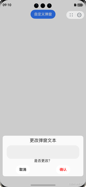
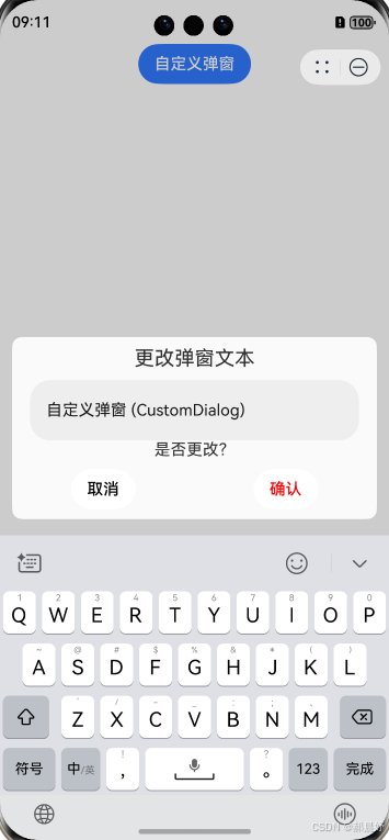
build() {
Column() {
Text('更改弹窗文本').fontSize(20).margin({ top: 10, bottom: 10 })
TextInput({ placeholder: '', text: this.textValue }).height(60).width('90%')
.onChange((value: string) => {
this.textValue = value
})
Text('是否更改?').fontSize(16).margin({ bottom: 10 })
Flex({ justifyContent: FlexAlign.SpaceAround }) {
Button('取消')
.onClick(() => {
if (this.controller != undefined) {
this.controller.close()
this.cancel()
}
}).backgroundColor(0xffffff).fontColor(Color.Black)
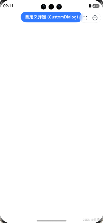
Button('确认')
.onClick(() => {
if (this.controller != undefined) {
this.inputValue = this.textValue
this.controller.close()
this.confirm()
}
}).backgroundColor(0xffffff).fontColor(Color.Red)
}.margin({ bottom: 10 })
}.borderRadius(10)
}
}
实例代码:
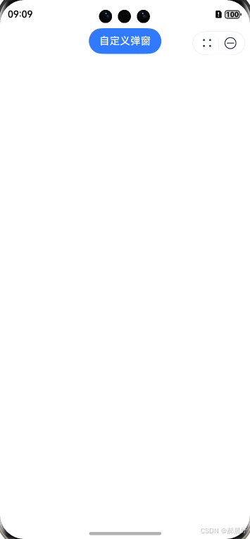
@Entry
@Component
struct CustomDialogUser {
  @State textValue: string = ''
  @State inputValue: string = '自定义弹窗'
  dialogController: CustomDialogController | null = new CustomDialogController({
    builder: CustomDialogExample({
      cancel: ()=> { this.onCancel() },
      confirm: ()=> { },
      textValue: $textValue,
      inputValue: $inputValue
    }),
    cancel: this.exitApp,
    autoCancel: true,
    onWillDismiss:(dismissDialogAction: DismissDialogAction)=> {
      console.info("reason=" + JSON.stringify(dismissDialogAction.reason))
           if (dismissDialogAction.reason == DismissReason.PRESS_BACK) {
        dismissDialogAction.dismiss()
      }

         if (dismissDialogAction.reason == DismissReason.TOUCH_OUTSIDE) {
        dismissDialogAction.dismiss()
      }
    },
    alignment: DialogAlignment.Bottom,
    offset: { dx: 0, dy: -20 },
    gridCount: 4,
    customStyle: false,
    cornerRadius: 10,
  })

   aboutToDisappear() {
    this.dialogController = null
  }

  onCancel() {
    console.info('单击第一个按钮时回调')
  }

  exitApp() {
    console.info('单击空白区域中的回拨')
  }
  build() {
    Column() {
      Button(this.inputValue)
        .onClick(() => {
          if (this.dialogController != null) {
            this.dialogController.open()
          }
        }).backgroundColor(0x317aff)
    }.width('100%').margin({ top: 5 })
  }
}
视图如下:


 扫一扫
扫一扫


 408
408

 被折叠的 条评论
为什么被折叠?
被折叠的 条评论
为什么被折叠?
 到【灌水乐园】发言


