


前言:利用css实现弧形选项卡(这种效果应该也有组件是支持的吧,有知道的同学请把包放在评论区,极其需要),具体要实现的效果参考给出的设计稿。之前看过文章,实现的思路是两个伪元素+径向渐变+transform,我这个实现稍微有点不一样(主要是那个弧度达不到设计稿要求)。
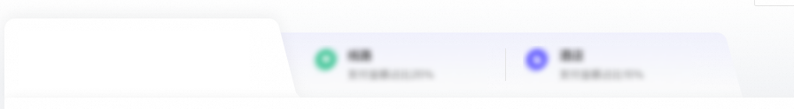
设计效果
这个效果可以直接切图来实现,但考虑到内容变换的话,切图效果适应会有些生硬,这里用css实现,不过也没有100%实现,弧度还是有点区别,具体看效果吧。
实现代码
组件代码(ts)
import React, { useEffect } from 'react'
import styles from "./index.less"
import { Col, Row } from 'antd'
const cardList_text = [
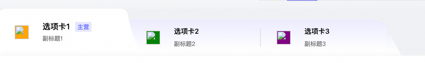
{ id: "one", src: "orange", title: "选项卡1", isMain: true, msg: "副标题1" },
{ id: "two", src: "green", title: "选项卡2", isMain: false, msg: "副标题2" },
{ id: "three", src: "purple", title: "选项卡3", isMain: false, msg: "副标题3" },
]
const TitleTabs = () => {
useEffect(() => {
const items = document.querySelectorAll('.tabCard');
items[0].classList.add('active');
}, [])
// tab切换
const TabClick = (id: string) => {
const items = document.querySelectorAll('.tabCard');
const box = document.getElementById(id);
items.forEach(item => {
const previouslyActive = document.querySelector('.tabCard.active');
if (previouslyActive) {
previouslyActive.classList.remove('active');
}
box!.classList.add('active');
});
}
return (
<div className={styles.titleTabs}>
<div className="lastTabs">
{
cardList_text.map((item, index) => {
return <div className='tabCard' id={item.id} onClick={() => TabClick(item.id)}>
<img src="" alt="" width={28} height={28} style={{ backgroundColor: item.src }} />
<div>
<Row>
<Col span={16} className='tabCol'>{item.title}</Col>
{item.isMain && <Col span={8} style={{ height: "20px", textAlign: "center", lineHeight: "20px", backgroundColor: "#e7e8fd", fontSize: "12px", fontWeight: 500, color: "#666fff" }}>主营</Col>}
</Row>
<p>{item.msg}</p>
</div>
</div>
})
}
</div>
</div >
)
}
export default TitleTabsless代码
.titleTabs {
  width: 100%;
  height: 96px;
  overflow-x: auto;
  position: relative;
  clip-path: inset(0 0 0 18px);
  :global {
    .lastTabs {
      // width: calc(891px * 0.97);
      width: auto;
      height: 74px;
      margin: 0 18px;
      display: flex;
      background-image: linear-gradient(180deg, #ececff 0%, #ffffff 86%);
      position: absolute;
      bottom: 0;
      border-top-left-radius: 12px;
      border-top-right-radius: 30px;
      &::after {
        content: '';
        position: absolute;
        width: 30px;
        height: 60px;
        bottom: 0;
        right: -26px;
        background-image: inherit;
        clip-path: polygon(0 0, 100% 100%, 0 100%);
      }
      .tabCard {
        .tabCol {
          height: 20px;
          font-size: 14px;
          font-weight: 500;
        }
        cursor: pointer;
        &:nth-child(1) {
          margin-left: 0;
          &::before {
            border: none;
          }
        }
        &::before {
          content: '';
          left: 0;
          height: 37px;
          width: 1px;
          border: 1px solid #e5e5e5;
        }
        margin-left: 4px;
        width: 260px;
        height: 100%;
        display: flex;
        align-items: center;
        img {
          margin-left: 32px;
          margin-right: 28px;
        }
        p {
          margin-bottom: 0;
          margin-top: 6px;
          height: 16px;
          width: 99px;
          font-family: PingFangSC;
          font-weight: 400;
          font-size: 12px;
          color: #666666;
          text-align: left;
          line-height: 16px;
        }
      }
      .active {
        height: 96px;
        z-index: 10;
        background-image: linear-gradient(180deg, #ffffff 6%, #ffffff 100%);
        position: relative;
        margin-top: -22px;
        cursor: pointer;
        border-top-left-radius: 12px;
        border-top-right-radius: 12px;
        // transition: all 0.2s;
        &::after {
          content: '';
          position: absolute;
          width: 43px;
          height: 90px;
          bottom: 0;
          right: -43px;
          border: none;
          image-rendering: -webkit-optimize-contrast;
          background-image: radial-gradient(
            ellipse at 147% -99%,
            transparent 71px,
            #ffffff 57px
          );
        }
        &::before {
          content: '';
          position: absolute;
          border: none;
          width: 43px;
          height: 90px;
          bottom: 0;
          left: -43px;
          background-image: radial-gradient(
            ellipse at -47% -99%,
            transparent 71px,
            #ffffff 57px
          );
        }
        .tabCol {
          height: 20px;
          font-size: 16px;
          font-weight: 500;
        }
      }
    }
  }
}
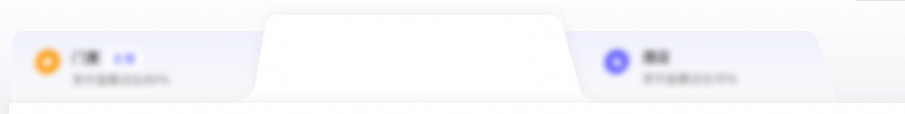
实现效果
如果有需要的可以再加个过渡动画


注意点
主要的实现思路是伪元素+径向渐变+裁剪(clip-path),本来两个伪元素的弧边一开始使用的clio-path裁剪的,但是没达到效果,最后还是采用了径向渐变实现。
要区别的就是第一个选项卡和后面的选项卡看起来是不一样的,但采用的同一个样式,我这里实现的做法是在外层包了一个盒子,再把盒子的前半部分裁剪掉从而达到效果。
在使用clip-path的时候请注意浏览器兼容问题


 305
305


 被折叠的 条评论
为什么被折叠?
被折叠的 条评论
为什么被折叠?
 到【灌水乐园】发言


