


今日核心:
1.设计资源-图标库
2.属性:布局属性、背景属性
3.线性布局
1. 设计资源-图标库
HarmonyOS 图标库为 HarmonyOS 开发者提供丰富的在线图标资源,涵盖多种使用场景以及风格分类,提供灵活的颜色、大小和格式定义,满足不同角色的下载需求
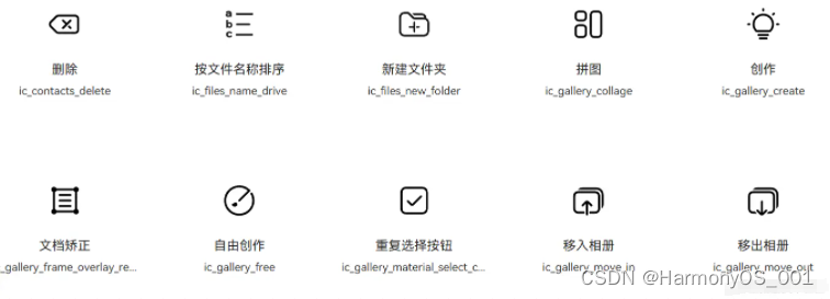
使用步骤:设计师提供图标/下载图标 → 使用图标
1.1. 下载图标
●HarmonyOS 图标库
●IconFont 图标库
进入图标库网站,下载 SVG 格式,存储到工程目录:resources/base/media/
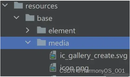
HarmonyOS 图标默认命名以 ic_ 开头,其他图标库下载的图标素材建议修改为与 HarmonyOS 命名规则相同。
1.2. 使用图标
使用 Image 组件显示图标,添加 fillColor() 属性修改图标颜色
@Entry
@Component
struct Index {
build() {
Column() {
  Image($r('app.media.ic_gallery_create'))
    .width(30)
    .aspectRatio(1)
    .fillColor('#f60')}
    .padding(20)
  }
}
2. 布局属性
组件布局
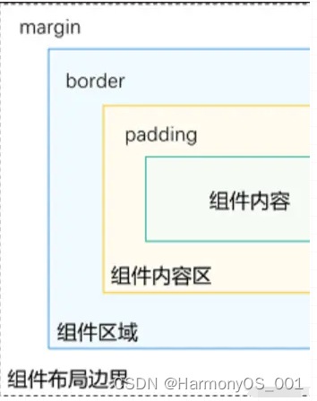
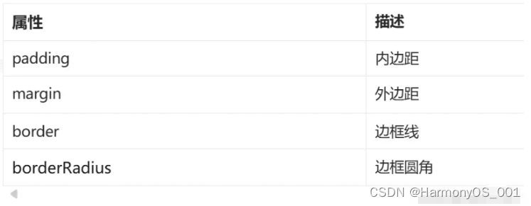
2.1. 内边距 padding
作用:在组件内添加间距,拉开内容与组件边缘之间的距离
属性:数字 或 对象{}
●数字:上下左右内边距相同
●对象{}:配合 left、right、top、bottom 单独设置某个方向内边距
@Entry
@Component
struct Index {
  build() {
    Column() {
      Row() {
        Text('文字1')
          .backgroundColor(Color.Pink)
          .margin(20)
        Text('文字2')
          .backgroundColor(Color.Orange)
          .margin({ top: 10, right: 20, bottom: 40, left: 80 })
        }
      }
    }
  }
2.2. 外边距 margin
作用:在组件外面添加间距,拉开两个组件之间的距离
属性:margin
属性:数字 或 对象{}
●数字:上下左右内边距相同
●对象{}:配合 left、right、top、bottom 单独设置某个方向内边距
@Entry
@Component
struct Index {
  build() {
    Column() {
      Row() {
        Text('文字1')
          .backgroundColor(Color.Pink)
          .margin(20) Text('文字2')
          .backgroundColor(Color.Orange)
          .margin({ top: 10, right: 20, bottom: 40, left: 80
        })
      }
    }
  }
}
2.3. 案例-QQ音乐登录
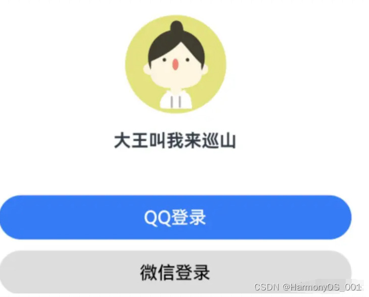
@Entry
@Component
struct Index {
  build() {
    Column() {
      Image($r('app.media.ic_user'))
        .width(100)
        .margin({ bottom: 10 })
      Text('大王叫我来巡山')
        .fontWeight(700)
        .margin({ bottom: 40})
      Button('QQ登录')
        .width('100%')
        .backgroundColor('#367bf6')
      Button('微信登录')
        .width('100%')
        .fontColor('#000')
        .backgroundColor('#ddd')
        .margin({ top: 10 })
      }
      .padding(20)
    }
  }
2.4. 边框属性
2.4.1. 四个方向边框相同
属性:border()
参数:{width?: 数字, color?: ‘’, style?: BorderStyle},
● width:边框宽度,边框宽度默认值为0,即不显示边框
● color:边框颜色
● style:边框样式,BorderStyle为枚举类型
Solid:实线(默认)
Dashed:虚线
Dotted:点线
@Entry
@Component
struct Index {
  build() {
    Column() {
      Text('边框线')
        .width(100)
        .height(40)
        .textAlign(TextAlign.Center)
        // 黑色 实线 边框
        .border({width: 1})
        // 红色 实线 边框
        .border({width: 1, color: 'red'})
        // 红色 虚线 边框
        .border({width: 1, color: 'red', style: BorderStyle.Dashed})
      }
    .padding(20)
  }
}
2.4.2. 四个方向边框不同
书写方法
width、color、style 均可以通过top、right、bottom、left设置各个方向边框外观
示例代码
@Entry
@Component
struct Index {
  build() {
    Column() {
      Text('边框线')
        .width(100)
        .height(40)
        .textAlign(TextAlign.Center)
        // 边框 - 四个方向效果不同
        .border({ width: {left: 1, top: 3, right: 5, bottom: 7}
        .color: {left: 'red', top: '#ff0', right: '#f60', bottom: '#ccc'}
        .style: {top: BorderStyle.Dashed, right: BorderStyle.Dotted}
      })
    }
  .padding(20)
  }
}
2.5. 边框圆角
属性:borderRadius(圆角半径)
参数:数值 或 { }
topLeft:左上角
topRight:右上角
bottomLeft:左下角
bottomRight:右下角
@Component
struct Index {
  build() {
    Column({space: 20}) {
      Text('圆角1')
        .width(100)
        .height(40)
        .backgroundColor('#f60')
        .borderRadius(5)

// 胶囊状 圆角半径 = 高度 / 2

      Text('圆角2')
        .width(100)
        .height(40)
        .backgroundColor('#fc0')
        .borderRadius(20)

// 正圆 圆角半径 = 正方形尺寸 / 2
      Image($r('app.media.avatar'))
        .width(100)
        .aspectRatio(1)
        .borderRadius(50)

// 四个角半径不同写法
      Text('圆角3')
        .width(100)
        .height(40)
        .backgroundColor('#fc0')
        .borderRadius({
          topLeft: 5,
          topRight: 10,
          bottomRight: 20,
          bottomLeft: 40
      })
    }
  .padding(20)
  }
}
3. 背景属性
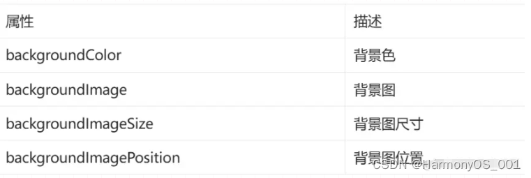
3.1. backgroundColor
设置组件的背景色
@Entry
@Component
struct Index {
  build() {
    Column() {
      Text('组件')
        .width(300)
        .height(100)
        .backgroundColor(Color.Pink)
      }
    .padding(20)
  }
}
组件添加宽高属性或有内容才能观察到背景色
3.2. backgroundImage
属性:backgroundImage(背景图地址, 背景图平铺方式 ImageRepeat)
背景图平铺方式:(可省略)
● NoRepeat:不平铺,默认值
● X:水平平铺
● Y:垂直平铺
● XY:水平垂直均平铺
@Entry
@Component
struct Index {
  build() {
    Column() {
      Text('组件')
        .width(300)
        .height(100)
        .backgroundColor(Color.Pink)
        .backgroundImage($r('app.media.flower'))
        .backgroundImage($r('app.media.flower'), ImageRepeat.X)
      }
    .padding(20)
  }
}
3.3. backgroundImageSize
作用:背景图缩放
属性:backgroundImageSize
参数:
● 设置背景图宽高尺寸:{width: 数值, height: 数值}(只设置宽或高,另一个尺寸等比例缩放)
● 枚举 ImageSize:
Cover:等比例缩放背景图至图片完全覆盖组件范围
Contain:等比例缩放背景图,当宽或高与组件尺寸相同则停止缩放
Auto:默认,原图尺寸
@Entry
@Component
struct Index {
  build() {
    Column() {
      Text('组件')
        .width(300)
        .height(100)
        .backgroundColor(Color.Pink)
        .backgroundImage($r('app.media.flower'))
        .backgroundImageSize({width: 100})
        .backgroundImageSize(ImageSize.Cover)
        .backgroundImageSize(ImageSize.Contain)
      }
    .padding(20)
  }
}
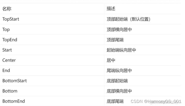
3.4. backgroundImagePosition
作用:调整背景图在组件内的显示位置,默认显示位置为组件左上角
属性:backgroundImagePosition()
参数:
● 位置坐标: {x: 位置, y: 位置}
● 枚举 Alignment
@Entry
@Component
struct Index {
  build() {
    Column() {
      Text('组件')
        .width(300)
        .height(100)
        .backgroundColor(Color.Pink)
        .backgroundImage($r('app.media.flower'))
        .backgroundImagePosition({x: 100, y: 50})
        .backgroundImagePosition(Alignment.Center)
      }
    .padding(20)
  }
}
4. 线性布局
线性布局(LinearLayout)是开发中最常用的布局,通过线性容器 Row 和 Column 构建。Column容器内子元素按照垂直方向排列,Row容器内子元素按照水平方向排列。根据不同的排列方向,开发者可选择使用Row或Column容器创建线性布局。
4.1. 基本概念
● 布局容器:具有布局能力的容器组件,可以承载其他元素作为其子元素。
● 布局子元素:布局容器内部的元素。
● 主轴:线性布局容器在布局方向上的轴线,子元素默认沿主轴排列。Row容器主轴为横向,Column容器主轴为纵向。
● 交叉轴:垂直于主轴方向的轴线。Row容器交叉轴为纵向,Column容器交叉轴为横向。
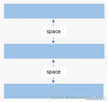
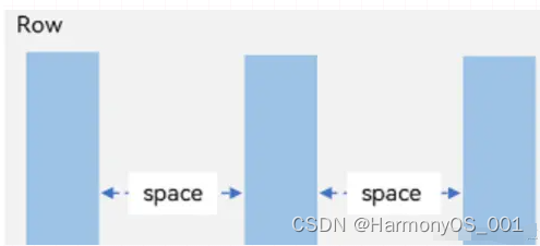
● 间距:布局子元素的间距。
4.2. 主轴方向的间距
在布局容器内,可以通过 space 属性设置主轴方向上子元素的间距,使各子元素在主轴方向上有等间距效果。
4.2.1. Column
@Entry
@Component
struct Index {
  build() {
    Column({ space: 20}) {
      Text('子元素1')
        .width(100)
        .height(40)
        .backgroundColor(Color.Pink)
      Text('子元素2')
        .width(100)
        .height(40)
        .backgroundColor(Color.Orange)
      Text('子元素3')
        .width(100)
        .height(40)
        .backgroundColor(Color.Brown)
      }
    }
  }
4.2.2. Row
@Entry
@Component
struct Index {
 build() {
   Row({ space: 20}) {
     Text('子元素1')
       .width(100)
       .height(40)
       .backgroundColor(Color.Pink)
     Text('子元素2')
       .width(100)
       .height(40)
       .backgroundColor(Color.Orange)
     Text('子元素3')
       .width(100)
       .height(40)
       .backgroundColor(Color.Brown)
     }
   }
 }
4.3. 主轴对齐方式
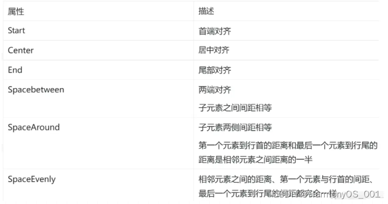
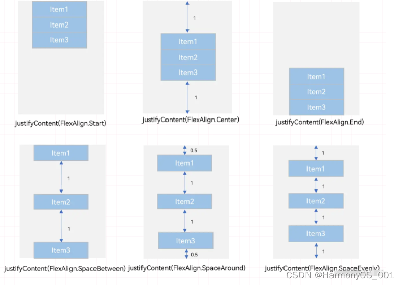
属性:justifyContent()
参数:枚举FlexAlign
@Entry
@Component
struct Index {
  build() {
    Column() {
      Text('子元素1')
        .width(100)
        .height(40)
        .backgroundColor(Color.Pink)
      Text('子元素2')
        .width(100)
        .height(40)
        .backgroundColor(Color.Orange)
      Text('子元素3')
        .width(100)
        .height(40)
        .backgroundColor(Color.Brown)
      }
    .width('100%')
    .height(300)
    .backgroundColor('#ccc')
    // 首端对齐
    .justifyContent(FlexAlign.Start)
    // 居中对齐 .justifyContent(FlexAlign.Center)
    // 尾部对齐 .justifyContent(FlexAlign.End)
    // 第一个元素与行首对齐,最后一个元素与行尾对齐
    .justifyContent(FlexAlign.SpaceBetween)
    // 第一个元素到行首的距离和最后一个元素到行尾的距离是相邻元素之间距离的一半
    .justifyContent(FlexAlign.SpaceAround)
    // 相邻元素之间的距离、第一个元素与行首的间距、最后一个元素到行尾的间距都完全一样
    .justifyContent(FlexAlign.SpaceEvenly)
  }
}
Column 与 Row 组件的 justifyContent 属性效果相似
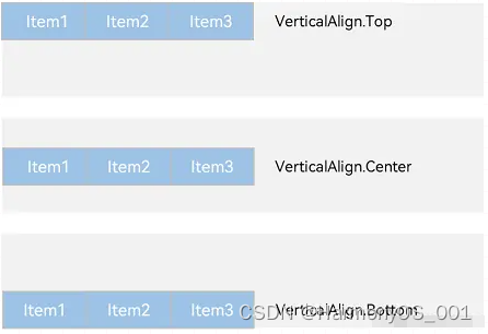
4.4. 交叉轴对齐方式
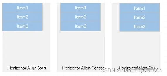
属性:alignItems()
参数:枚举类型
交叉轴在水平方向:HorizontalAlign → Column
交叉轴在垂直方向:VerticalAlign→ Row
注意:布局容器在交叉轴要有足够空间,否则无法生效
4.4.1. Column
@Entry
@Component
struct Index {
  build() {
    Column({ space: 20}) {
      Text('子元素1')
        .width(100)
        .height(40)
        .backgroundColor(Color.Pink)
      Text('子元素2')
        .width(100)
        .height(40)
        .backgroundColor(Color.Orange)
      Text('子元素3')
      .width(100)
      .height(40)
      .backgroundColor(Color.Brown)
    }
    .width('100%')
    // 默认左对齐
    .alignItems(HorizontalAlign.Start)
    // 居中
    .alignItems(HorizontalAlign.Center)
    // 右对齐
    .alignItems(HorizontalAlign.End) } }
4.4.2. Row
@Entry
@Component
struct Index {
  build() {
    Row({ space: 20}) {
      Text('子元素1')
        .width(100)
        .height(40)
        .backgroundColor(Color.Pink)
      Text('子元素2')
        .width(100)
        .height(40)
        .backgroundColor(Color.Orange)
      Text('子元素3')
        .width(100)
        .height(40)
        .backgroundColor(Color.Brown) }
        .width('100%') .height(100)
        .backgroundColor('#ccc')
        // 默认顶对齐
        .alignItems(VerticalAlign.Top)
        // 居中
        .alignItems(VerticalAlign.Center)
        // 底对齐
        .alignItems(VerticalAlign.Bottom)
      }
    }
4.5. 单个子元素交叉轴对齐方式
属性:alignSelf()
参数:枚举ItemAlign(Stretch拉伸,交叉轴拉伸效果)
4.6. 自适应缩放
父容器尺寸确定时,设置了 layoutWeight 属性的子元素与兄弟元素占主轴尺寸按照权重进行分配。
● 主轴:布局方向的轴线,子元素默认沿着主轴排列
● 交叉轴:垂直于主轴方向的轴线
属性:layoutWeight()
参数:数字
@Entry
@Component
struct Index {
  build() {
    Column() {
      // 主轴方向:水平方向
      Row() {
        Text('左侧')
          .width(60)
          .height(30)
          .backgroundColor('#ccc')
        Text('右侧 layoutWeight')
          .height(30)
          .backgroundColor('#fc0')
          .layoutWeight(1) }
          .margin({bottom: 20})
          // 主轴方向:垂直方向
      Column() {
        Text('第一行-固定高度')
        .width('100%')
        .height(30)
        .backgroundColor(Color.Pink)
      Text('第二行-layoutWeight')
        .width('100%')
        .backgroundColor(Color.Green)
        .layoutWeight(1) }
        .width('100%')
        .height(100)
        .backgroundColor('#f5f5f5')
      }
    }
  }
5. 综合案例-得物探索页
5.1. 布局思路
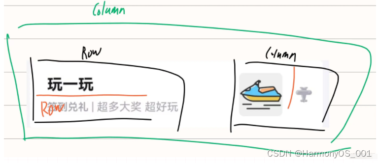
5.2. 参考代码
@Entry
@Component
struct Index {
build() {
Column() {
Row() {
// 左侧
Column({ space: 8}) {
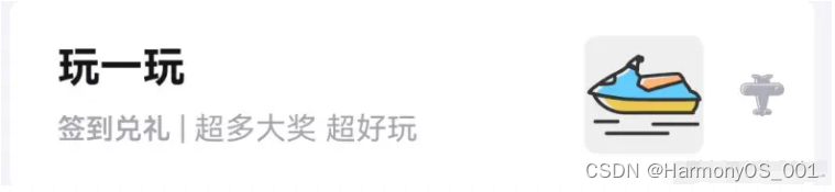
Text('玩一玩')
.fontColor('#141519')
.fontSize(18)
.fontWeight(700)
Row() {
Text('签到兑礼')
.fontColor('#a4a4b0')
.fontSize(12)
.fontWeight(600)
Text(' | 超多大奖 超好玩')
.fontColor('#a4a4b0')
.fontSize(13)
}
}
.layoutWeight(1)
.alignItems(HorizontalAlign.Start)
// 右侧
Row({ space: 15}) {
Image($r('app.media.du'))
.width(50)
.backgroundColor('#efefef')
.borderRadius(5)
Image($r('app.media.ic_public_arrow_right'))
.width(20)
.fillColor('#aeaeba')
}
}
.width('100%')
.height(80)
.backgroundColor('#fff')
.borderRadius(5)
.padding({left: 20, right: 12}) }
.width('100%')
.height('100%')
.backgroundColor('#f5f4f9')
.padding(10)
}
}
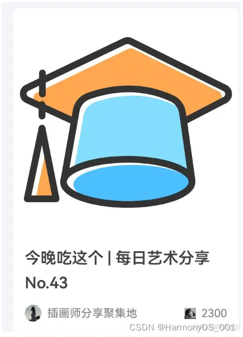
6. 综合案例-得物-产品卡片
6.1. 参考代码
综合案例-得物-产品卡片
@Entry
@Component
struct Index {
  build() {
    Column() {

      // 产品卡片
      Column({space: 10}) {

        // 图片
        Image($r('app.media.nick'))
          .width('100%')
          .aspectRatio(1)
          .borderRadius({topLeft:5, topRight: 5})

        // 标题文字
        Text('今晚吃这个 | 每日艺术分享 No.43')
          .fontSize(14)
          .fontWeight(600)
          .fontColor('#414141')
          .lineHeight(22)
          .padding({left: 10, right: 10})

        // 用户与点赞
        Row() {
          // 用户
          Row({space: 5}){
            Image($r('app.media.user'))
              .width(15)
              .aspectRatio(1)
              .borderRadius(10)
            Text('插画师分享聚集地')
              .fontSize(10)
              .fontColor('#787a7d')
          }

          // 点赞
          Row({ space: 5}){
            Image($r('app.media.ic_like'))
              .width(10)
              .aspectRatio(1)
              .fillColor('#c2c0ca')
            Text('2300')
              .fontSize(10)
              .fontColor('#787a7d')
          }
        }
        .width('100%')
        .padding({left: 10, right: 10})
        .justifyContent(FlexAlign.SpaceBetween)
      }
      .width(200)
      .padding({bottom:10})
      .backgroundColor('#fff')
      .borderRadius(5)
      .alignItems(HorizontalAlign.Start)
    }
    .width('100%')
    .height('100%')
    .backgroundColor('#f5f4f9')
    .padding(10)
  }
}


 477
477

 被折叠的 条评论
为什么被折叠?
被折叠的 条评论
为什么被折叠?
 到【灌水乐园】发言


